Excel Charting with gamification element Download Dashboard
Charts and graphs is a feature of Microsoft Excel that allows you to visually represent data in various types, such as bar graphs, line charts, pie charts, etc.
Excel visualization is a useful way to present data in a clear and easy-to-understand format that can help you quickly identify trends, patterns, and relationships between different data sets.
How create universal dashboard with Data Charting in Excel for Business
Why do you need data visualization? Here's an example. When you drive a car while driving, you have the opportunity to look with just one eye at the dashboard. In a fraction of a second you are able to receive and process a large amount of information about the state of your car: driving speed, engine temperature, fuel level, engine speed, etc. All this thanks to the visualization of the data on your dashboard. Imagine if these data were presented in a table format. How much more difficult and unsafe would it be to drive a car, plane, train, ship or any other mode of transport?
Business can be compared to a car. It has many interconnected processes that need to be monitored. Naturally, if you want to run your business safely, efficiently and quickly as an expensive car, you need a dashboard to visualize these indicators of the current state of the main processes and the project as a whole. A dashboard with data visualization will allow you to make better decisions faster, i.e. increase your reaction time. And you will also be able to avoid emergencies that await you in the future. They are difficult to notice in large tables with a multi-level data structure. And on the dashboard, critical values can be highlighted and exposed in color. This will give you extra time to make timely maneuvers in the right direction with the best outcome of the situation.
Excel data visualization tools are often used in business, finance and other areas where analysis is important. They can be used to create reports, presentations and other documents that communicate data information to others. But the visualization capabilities in Excel's most versatile analytical tool are much broader than they may seem at first glance. As an example, let's present a template with a universal visualization of production chain process data.
Gamification expands data visualization capabilities in Excel
Every business is a harmonious amalgamation of a group of interrelated processes. In the process of analysis, it is often necessary to decompose a business into all of its major individual processes. This is called decomposition. Every investor knows in spite of the immensely wide range of business types many of their processes are very similar. For example, it is always possible to observe production chains in the process of decomposition. Just as in gamification, where there is a conscious understanding that life is not a game, but there are very many elements of the game. Chief among these are the acquisition of resources, the identification of patterns, and the skills to manage them for effective application.
In the structure of our universal dashboard we will also add gamification elements in order to demonstrate the broader possibilities of Excel in the field of data visualization.
At first glance, the design of our universal dashboard inclines us to use it for the mining industries. But it's really just a metaphor. The visualization shows the processes of extracting resources from an imaginary mining source conventionally denoted by gold and diamonds. Each business has its own source for extracting resources, which are processed through production chains. This is the essence that this universal dashboard represents. In other words, in business as in life, there are many elements of a game with resources and patterns.
Introducing gamification into Excel Charting tools is a new trend, which is actively gaining popularity among designers and dashboard developers. After all, the second main function of data visualization is to effectively increase motivation for action and achievement of results. Gamification, the natural motivation of employees, has the same goal. Their synergy gives a new level of effective application. This has already been confirmed and proven in practice.
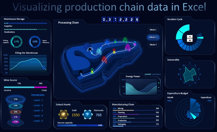
Structure of a universal dashboard with gamification elements
The Dashboard consists of 9 +1 blocks. Let's look at the purpose and principle of each of them.
In the center of the interactive presentation of the Data Charting of the basic indicators is the largest main block - Processing Chain:
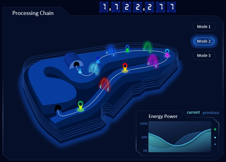
In the center of the block there is a schematic representation of the animated model of the business process pipeline:
- extracting resources from the source mine;
- passing through all stages of the production chain;
- warehousing and picking in the hangar.
You can present the model animation in three modes. To do this, use the menu buttons in the upper right corner.
At the very top of the block there is a capitalization counter, which changes its value at the end of the last link of the supply chain to the warehouse.
The main has a subsidiary block for displaying the consumption of energy resources - Energy Power:
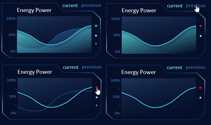
On the display in parallel we observe the dynamic change of the power consumption of energy resources for the current and previous periods. In this child block there are several switches for simple display settings:
- you can hide the indicator of the previous period;
- change the chart type;
- to return the initial view of indicators displaying.
In the main model, the warehouse-angar is displayed at the top, and the mine-source is displayed at the bottom. Accordingly, there are two blocks on the left - the upper provides data about the state of the warehouse, and the lower - about the resource source.
The upper left block is - Warehouse Storage:
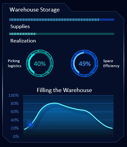
At the very top of the block there are two histograms:
- The level of filling of the warehouse.
- The level of emptying as a result of stock sales.
Below we observe two charts (speedometer style without arrows):
- On the left is the level of picking logistics efficiency in the warehouse.
- The diagram on the right shows the level of effective use of usable space in the storage area of stored material resources.
At the bottom of the block is a graph of the dynamics of filling the warehouse. A blue cursor with a marker exposes the selected current time period against the background of the total accounting period. The graph is updated with each new accounting period.
Below there is a block for the analysis of indicators of the source state - Mine Source:
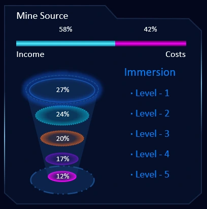
At the very top of the block is a histogram of the balance of income and expenses, which changes under the influence of various factors - energy costs, depth of immersion, etc.
Under the histogram is an interesting animated infographic for 5 levels of immersion into the source of resources. The deeper you dive, the lower the efficiency index, but the overall profit is greater. The efficiency index at each level is automatically recalculated depending on the depth of the dive into the mine for resources.
The next block next to the right gives us an idea of the mined resources - Subsoil Assets:

Gold and diamantes are just a metaphor for gamification. In fact, this block of the universal dashboard symbolizes to us that in most cases more than one type of resource (in this example 2) can be extracted from a single mine. Each business has different types of "gold" and "diamonds.
The diagram below shows the potential for mined resources.
On the right is another block with indicators of the functioning of all stages of the production chain on the dashboard, called - Manufacturing Chain:
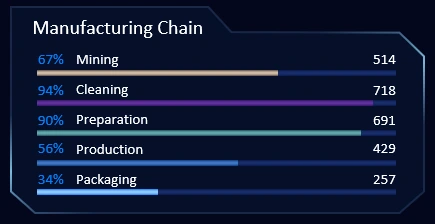
The indicators for each link are conditioned by the sequence and are tied with the corresponding colors with the main central block. The indicators are displayed simultaneously in absolute and relative (percentage) values.
In the lower right corner of the dashboard is a block - Expenditure Budget:
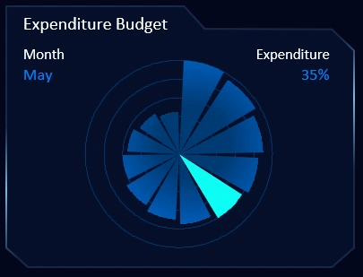
Here on the fan chart you can observe the dynamics of budget spending. The unit of time is one calendar month. Each petal of the diagram shows how much money is left. On the right side of the chart you can see the percentage of the total budget in the currently selected month. The chart is updated with each year.
Above the block is a measure of annual activity by month - Seasonality:
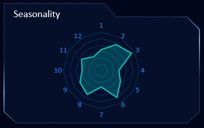
Here everything is simple. The type of chart is radar. The greater the deviation from the center, the more active month of the season. The data on the block is updated with each new year.
And the last block in the upper right corner is the Iteration Cycle:
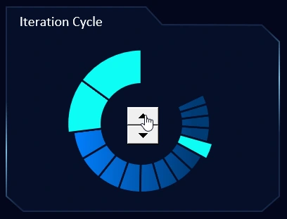
This is a complicated Excel Charting tool to understand. The simplest thing in this block is the dashboard control buttons. The diagram is a grouping of cycles of iterations. Every business process is cyclical and has its own iterations. Every business has its operating model. It is always an abstract representation of strategies for the day-to-day operations of a business.
All elements of the presentation to visualize the baseline data merge harmoniously into a coherent, universal dashboard:
 Download Excel Charting with gamification template
The main advantage of the universal dashboard is that it can be overlaid on the main principles of any activity or organization that produces goods or services for profit. After all, there are no business projects that last forever. Even a giant company like Amazon, which holds 43% of online commerce in the U.S., can lose 9% of its stock value after just one tweet from Donald Trump (a tweet about Axios). The services of the other largest Internet corporation are now provided by GPT artificial intelligence chat service as an alternative. Facebook could be replaced by Meta-Worlds.
Financial crisis, force majeure, emergency, black swan, unfair competition - there are many reasons to threaten the viability of a business. But there is good news! Let no type of business model is eternal, but eternal basic consumer needs, which are succinctly distributed at different levels in Maslow's pyramid:
- Physiological needs.
- The need for security.
- Socialization.
- Recognition.
- Self-actualization.
People will always buy food, need to maintain security, socialize, present achievements, and self-actualize toward development. The job of a business is to identify and meet people's needs in the best way possible. That's why not only niche dashboards are important, but universal ones as well. With tools like the universal dashboard, there are important opportunities:
- Control global goals.
- Reorient your business to meet the ever-changing conditions of today's world.
- Add gamification so that work is not only efficient, but also enjoyable.
The template for this universal dashboard is made without the use of macros. You don't need knowledge of programming languages to make this data visualization presentation in Excel. Everything is possible to implement with standard Excel functions.

Data Visualization Charts for Interactive Report Creation in Excel.
Dashboard Templates