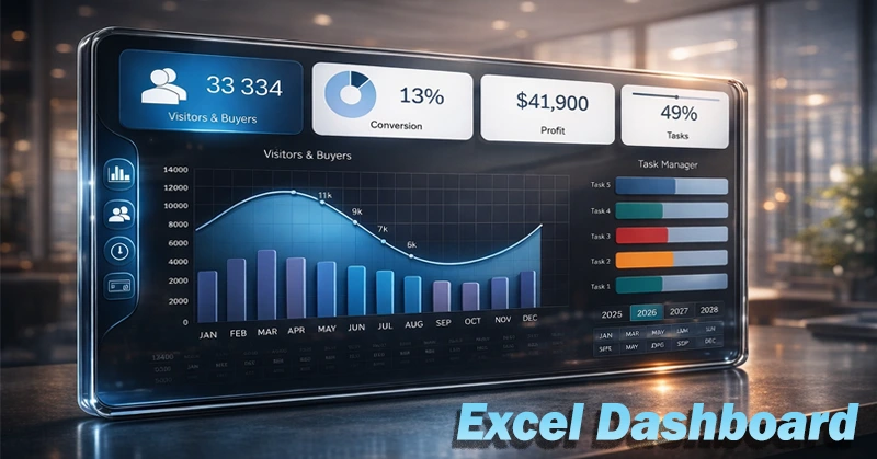
Excel dashboard for managing business projects from tablet
An example of a user-friendly dashboard design that's effective on tablets. Why do business owners love professional dashboards on tablets? For their simplicity, reliability, and efficiency.
You just take your tablet, open an interactive report, and instantly get a helicopter view of the overall picture and direction of goals—without diving into the complexities of the financial world. From above, everything looks different—even the potential to reach results on time. A business owner gains the ability to work quickly, efficiently, and most importantly—beautifully, with aesthetic pleasure.
Why a Beautiful Dashboard in Excel Helps Manage Your Business
Business is simple! Sell a high-demand product with added value and reinvest the profits. But despite these simple rules, business only works if you fall in love with it. That means finding a balance between enjoying the process and striving for results. A dashboard with interactive data visualization helps you find that balance and fall even more in love with your business.
The basic structure of any business is simple. The rules of the game are known and clear to everyone: sell a product that people buy so your income exceeds your expenses. Everything else is for scaling the project. That’s why a business project management dashboard shouldn’t be complicated or overloaded with information.
Data visualization has significantly simplified the lives of drivers. By glancing at the dashboard, a driver instantly gets a lot of information about the vehicle’s current condition in the moment and under specific road conditions—without losing focus on driving. A project manager’s dashboard should work the same way. One look should deliver key business insights for the current situation.
A tablet dashboard gives instant control over the business's current state without unnecessary burden. All you need to do is turn on the tablet and open the interactive report to see immediately where and how the company’s growth trend is moving.
A business owner doesn’t need to overload their mind with endless financial and accounting tables. Their mind should be free and open to creativity—to express their mastery in business without obstacles. To achieve this, a leader should be a little lazy in a good way—and always have a reserve of energy. At the same time, work should not become a well-paid hobby, because in work results matter, while in hobbies it’s the process that matters most.
In a successful company, everyone should be in their place doing their job. That’s why everyone should have their own specific dashboard with visualized KPIs that provide feedback from their focus area—their growth point.
This template shows what an Excel dashboard for a business owner could look like. It allows you to open a report on a tablet at any time, from anywhere, and check the company’s direction.
Visualizing Progress Toward Results
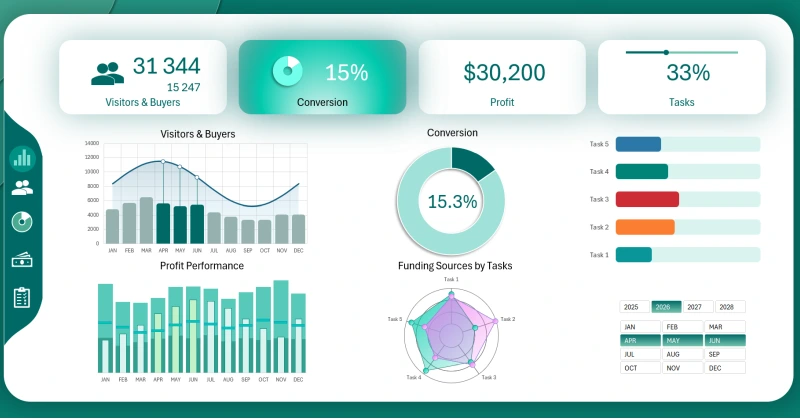
The main dashboard screen displays all summary charts and graphs. For detailed analysis of each data block, use the interactive menu. Each chart on the main screen has its own dedicated detailed analysis screen. Only one block—a horizontal bar chart—is duplicated across all dashboard screens:
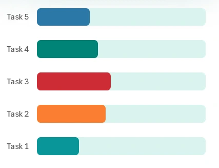
The progress block for the top 5 main tasks fits the context of every KPI in the report. That’s because here we analyze how changes affect results. It’s far more important to maintain focus on results rather than just effort. Results are what differentiate business from hobbies. All aspects are important—results, processes, growth points, efforts, experiments—but priorities must always be clear. Business isn’t a game, but it contains many game-like elements. For example, in both business and games, gaining and using resources effectively is key. But all of this should serve a meaningful purpose—helping people meet their needs. There is no business without sales. And to sell = to help. That’s the fair meaning behind all results.
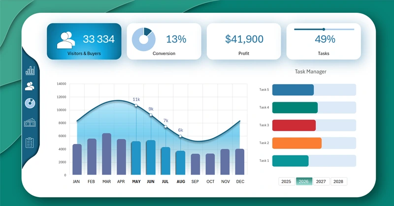
Visitor to Customer Conversion
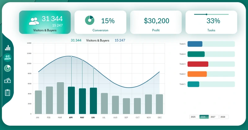
On this dashboard screen, the project’s lead manager tracks the dynamics of converting store visitors into buyers over a selected period—month, quarter, year, or half-year. The data selection buttons are built from Excel pivot table slicers. That means you can select multiple months or years at once.
ROI – Converting Investment into Profit
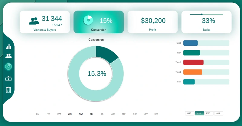
This one's simple. But maybe the menu item and doughnut chart title should have been labeled ROI. That’s what the user monitors on this screen—the project’s return on investment. The conversion of capital into net profit is measured by the key metric ROI.
Polygraph Chart for Profit Plan Tracking
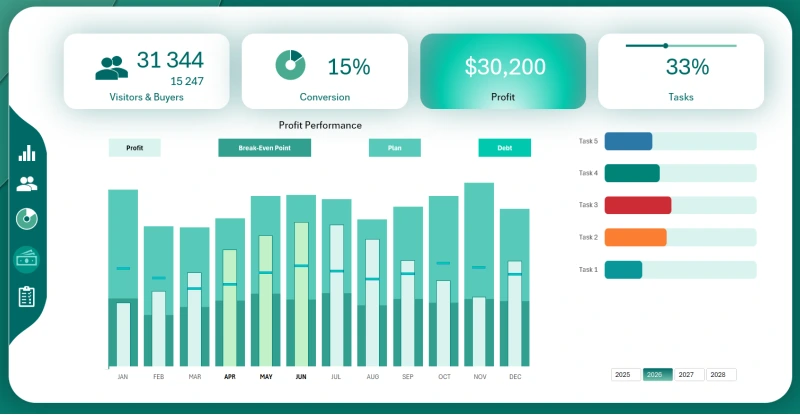
This combo chart lets us analyze changes in four metrics at once:
- Profit.
- Break-even level.
- Planned profit target.
- Level of borrowed capital.
It’s a very useful data visualization for interactive reports and can be easily created using standard Excel tools.
Allocating Equity and Borrowed Capital by Task
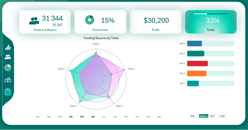
A radar chart is perfect for showing up to three metrics across multiple directions. In any other chart type, this would look complicated and confusing. Thankfully, Excel has this solution as part of its standard data visualization toolkit.
Presenting Key Business Metrics on a Tablet
Simple and beautiful design dashboard in Excel
All the metrics described above are very useful and work well together in an interactive report for a tablet PC. But one key metric is missing—expenses. You can download this ready-made dashboard template and add expense visualization to the structure. You can also expand it with your own presentations for custom KPIs.
Download the project management dashboard for tablet in Excel 
A video tutorial with step-by-step instructions for creating dashboards like this is available on the website’s YouTube channel. Everything you need to succeed is already within your reach. Just start here and now.

Data Visualization Charts for Interactive Report Creation in Excel.
Dashboard Templates