Excel Dashboard for Managing Customer Loyalty to Project
A template for strategic brand development planning by improving customer loyalty levels in Excel. An interactive report with the ability to adjust KPI plans directly on the data visualization during analysis. Try building your own models for optimal results forecasting using an Excel dashboard. The plan itself is nothing — planning is everything!
How to Interactively Manage Customer Loyalty in Excel
This dashboard is dedicated to analyzing the strategic development of customer loyalty to a business. If you know how to make sales — you're a salesperson. If you know how to build a sales system — you're a businessman. And if your customers recommend you — you're a brand. Many people ask: does a small business need a brand? That's the wrong question entirely. A brand is simply how your customers feel about you. Every business already has one — the only question is whether you're developing it or not. Customer loyalty to your business is critical to your success.
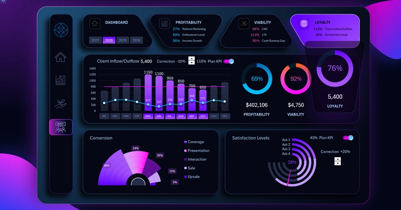
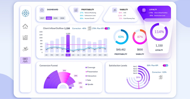
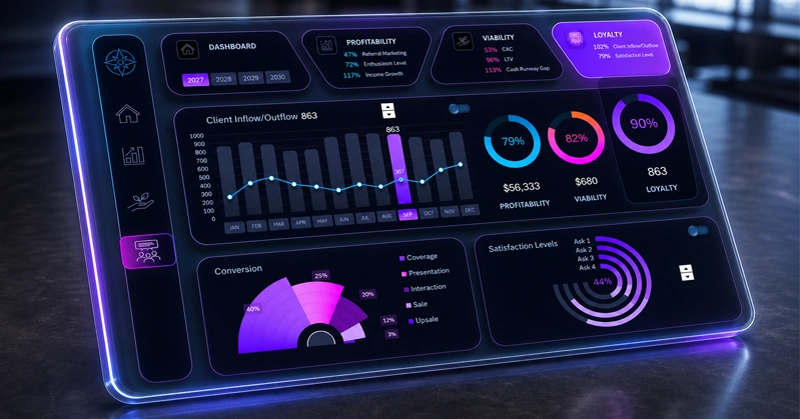
The dashboard structure consists of three analyzed data visualization blocks for KPI plan completion:
- Customer acquisition and churn.
- Conversion funnel.
- Customer satisfaction level.
The primary purpose of the dashboard is to support strategic planning for a new business or startup. That's why all KPI plan completion levels can be adjusted using interactive elements directly on the dashboard.
Let's first look at the value of each visualization block for developing a customer loyalty growth strategy with this dashboard. Why were these specific key metrics chosen?
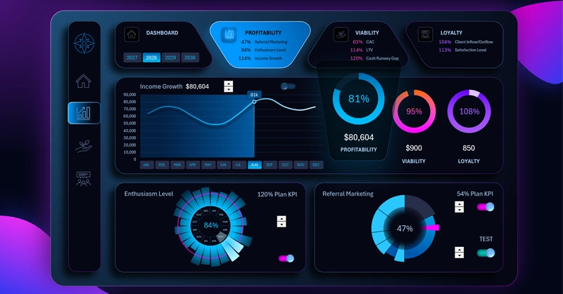
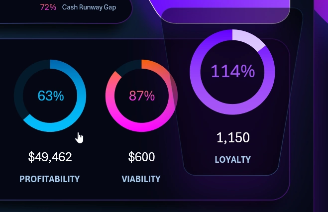
Excel KPI Dashboard — PROFITABILITY
1 Customer Acquisition and Churn
The first block is dedicated to monitoring and analyzing shifts in customer acquisition and churn dynamics.
Interesting fact: Retaining existing customers is more profitable than acquiring new ones. Increase your budget for supporting repeat buyers by just 5% and you'll see better returns than from increasing your advertising budget by +100%. There are several reasons for this:
- In virtually every business, the Pareto principle tends to apply: 20% of customers generate 80% of revenue.
- Repeat customers account for an average of 60% of profit.
- Loyal customers come back to purchase from you more frequently.
- Existing customers require less marketing spend and are more likely to refer you to others.
That's why the repeat customer churn rate always matters more than the new customer acquisition rate! Not all customers are equally valuable.
2 Conversion Funnel
Even the smallest improvements at the top of the sales funnel produce a massive effect at the bottom. Let's model a scenario as an example:
- 10,000 store visitors;
- Lead conversion rate: 10%;
- Sales conversion rate: 20%.
Total: 200 buyers.
Summary. If the first conversion rate is increased from 10% to 12% (just +2%), the result is already 240 buyers. A +2% change at the top of the funnel produced a +20% increase in sales at the bottom.
3 Satisfaction Level
Many believe that high customer satisfaction is driven by fast response times. But marketing research shows that FCR — first contact resolution — has a stronger impact on loyalty.
A customer would rather wait thirty minutes for a response that fully solves their problem than get an urgent reply in 30 seconds with no resolution. Build your strategy thoughtfully, select the best survey questions for your questionnaires, and set ambitious but achievable goals.
Combined Acquisition/Churn Bar Chart
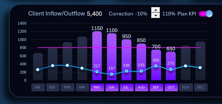
This is the main visualization block on this dashboard. The bars display the monthly number of new customer acquisitions, while the curved line shows churn of existing customers. The horizontal straight line represents the average annual plan level. The dashboard template gives users the ability to adjust the plan level directly on the chart using an interactive element — a spinner control (from the Excel Developer tab) for managing forms in Excel.
This makes it more convenient to analyze and find optimal values for strategic planning. If needed, the plan level can be temporarily hidden using the toggle in the upper right corner to keep the data visualization on the chart clean.
The toggle is a combination of elements including:
- shapes;
- a chart;
- an interactive checkbox element.
A checkbox is a form control tool in Excel and is also available from the Developer tab in the main menu.
Instead of month name labels along the horizontal X-axis, a block of buttons is used to control pivot table data slicers. Here it is designed for filtering data by month, quarter, half-year, and more, as well as for controlling the cursor on the combined acquisition and churn chart. The interactive authority of this button block extends across the entire dashboard. All other charts and data on the dashboard respond to its controls. When a month is selected using the slicer buttons, all data on the dashboard and across all charts updates automatically and accordingly.
The same principle applies to the slicer for switching dashboard data by year. The button block for this slicer is located above, in the dashboard header with summary information:
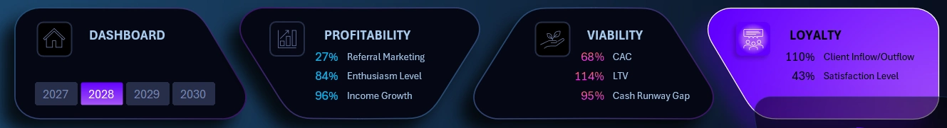
Users are also given multi-select functionality on the slicer for consolidated analysis spanning multiple years at once. Simply select several buttons on the slicer simultaneously, and all data on the dashboard will automatically update and sum accordingly.
Conversion Funnel Chart
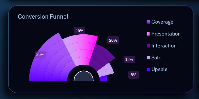
The funnel stages consist of 5 levels:
- Reach.
- Presentation.
- Customer engagement.
- Pre-sale.
- Upsell — the true goal of the sale.
The fourth level is presented to the customer as the product being sold at an accessible price — but in reality it is simply the hook for selling an upgraded version at a small price difference at the fifth level of the funnel. That was the true sales objective all along.
The fourth and fifth funnel levels generate profit. But the fourth level serves as the warm-up for financially qualified prospects, easing them toward a more considered and higher-value decision.
The appearance of this chart doesn't resemble a classic funnel shape — instead it is presented as a cascade, which looks distinctive while still preserving the informational context of the infographic.
Satisfaction Level Chart
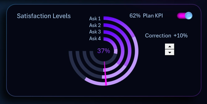
Customer satisfaction data is gathered through surveys. This chart displays a consolidated value based on results from a 4-question survey. The fewer questions in a survey, the easier it is to collect feedback. However, trimming it down too much risks reducing the effectiveness and reliability of the data.
The percentage value in the center (37% in this example image) is the average current satisfaction level across all four questions. The KPI plan is set relative to this value and is shown as a red arrow on the chart.
The plan level can be adjusted and temporarily hidden for a cleaner visualization when presenting the report.
Beautiful Dashboard Design for Customer Loyalty Analysis in Excel
This is a multi-screen dashboard template designed to analyze a startup's potential across three core metrics:
- Project profitability.
- Project survival potential.
- Customer loyalty level toward the business project.
To switch between dashboards, users rely not only on the menu but also on the summary chart highlight feature:
By clicking on each summary chart, we can use them as navigation to their corresponding main dashboard screens. This is a creative approach to functional interface design built entirely in Excel.
Each value on the chart is the average KPI plan completion across all blocks on the corresponding dashboard screen.
A light design version is included for use during daytime hours:
Dashboard design also plays an important role not only from the standpoint of aesthetic appeal and usable information presentation, but also as a source of motivation for the user.
Download the Customer Loyalty Management Dashboard in Excel 
Use this template to experience Excel's capabilities for interactive modeling of business strategies based on your own reports and source data. You are free to modify and improve the template to fit your specific needs.
On this site you'll find many more templates for strategic KPI plan modeling and beyond. New similar templates will also be published in the near future.

Data Visualization Charts for Interactive Report Creation in Excel.
Dashboard Templates