Excel Dashboard for presenting use KPI in personal finance
In an Excel dashboard template for tracking and managing personal finances, it's important to use KPI metrics. In this example, you can try out Excel's capabilities for interactive work using personal finance data visualization. You'll download the ready-made template at the end of the article, but first, a bit of theory on the topic: "Why use KPIs in personal finance management."
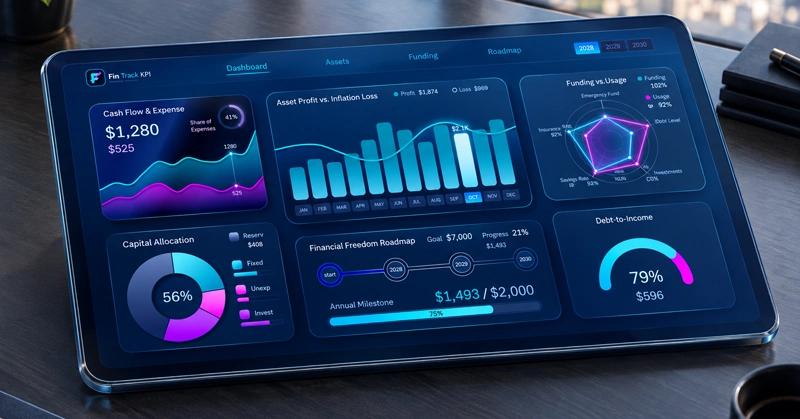
Example of a KPI dashboard for personal finance management in Excel
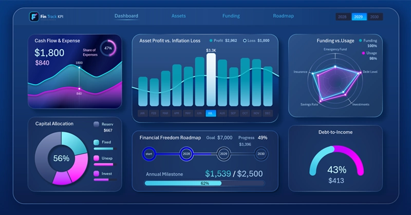
KPIs in personal finance are specific, measurable metrics that we have the greatest influence over. They help us assess our current financial "health," track cumulative growth, and make balanced, rational decisions without emotion.
Just like in business, personal finance KPI metrics turn abstract goals (for example: "I want to live more wealthily") into a clear, achievable, tangible, and manageable algorithm:
- Reduce expenses.
- Reach a surplus.
- Build a financial safety cushion.
- Accumulate starting capital for private investing.
- Increase income.
- Raise your level of financial autonomy.
- Get closer to financial independence indicators.
All personal finance KPI metrics can be conditionally divided into 3 categories.
Key financial KPI metrics for personal budgeting
- Stability and security metrics.
- Expense efficiency indicators.
- Savings and growth potential.
Why implement KPIs in personal finance tracking?
- To increase the efficiency of using your personal finances. Increasing efficiency means singling out what matters most. Focusing on what matters most frees you from the obligation of tracking every single cup of coffee. You start primarily tracking the most impactful expenses: debt interest, savings rate, and so on.
- To foresee dangerous financial situations for your personal budget in advance. For example: when the debt-to-income ratio starts rising above 50%, your risk of missing scheduled payments increases significantly.
- To find the best decisions for your current financial situation. For example, it helps answer the question of whether you can currently afford to invest or make an expensive purchase, and so on.
It's quite rational to use KPI metrics on dashboards for tracking and managing personal finances in Excel. Here is one such example. Let's examine this template in detail and go through each data visualization block built in Excel one by one.
Share of expenses in cash flow
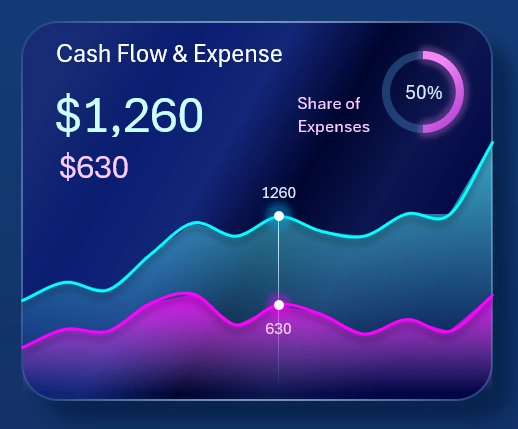
In personal finance, expenses are an important metric. After all, the main goal of personal finance tracking is a positive balance between expenses and income. How do you determine whether your personal income is sufficient? If you always spend less than you earn, you're financially comfortable. If you have a source of passive income that provides you with financial comfort, then you've achieved financial independence. But if you earn $1,000,000 a year and spend $1,500,000 a year, you're in a financial crisis.
That's why the first block of the dashboard is devoted to expenses. It shows the share that expenses take up in the total flow of funds passing through your personal finances over the course of one year.
The line chart displays the actual absolute figures, while the donut chart clearly shows the share of expenses in relative terms — percentages.
Dynamics of asset value changes against inflationary expenses
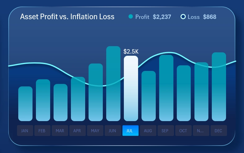
Investments usually yield lower returns than running your own business, but require minimal time involvement. Their effectiveness lies in passivity and diversification, not in absolute profitability. As a result, the inflation rate can have a significant impact on the relatively modest returns of an investment portfolio.
This chart tracks the correlation between changes in the value of investment assets against changes in monthly inflation over the course of a year.
Interesting fact: although in the short term a spike in inflation often causes a stock market decline due to rising bank interest rates, over the long run, stocks protect capital. Businesses pass increased costs on to consumers by raising prices, which over time restores growth in revenue and market capitalization.
So if you see a sharp rise in inflation on this chart, don't rush to immediately sell off your investment assets.
This is a very important data visualization block on the dashboard, and it's placed right in the center. What's more, this block has its own dedicated screen for detailed analysis:
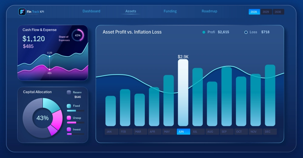
This makes it much easier to analyze the correlation between investment portfolio value and inflationary costs.
Tracking the accumulation and use of personal financial asset capital
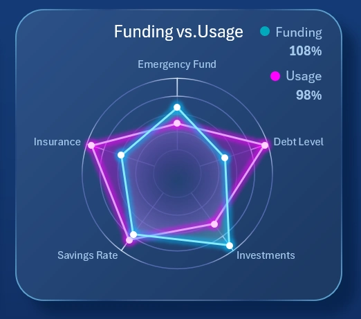
Here, the radar chart shows the sources of accumulation and the distribution of capital allocated for reinvestment according to the KPI plans. The chart simultaneously shows two areas for comparative analysis:
- The blue area – shows how much profit was collected from various sources according to the pre-established KPI plan.
- The pink area – shows how much in funds was allocated for reinvestment, with the goal of increasing income from these same assets in future reporting periods.
Very important KPI metrics! They deserve to be presented on a separate screen:
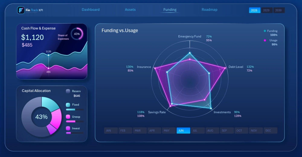
Here there's already a bit more detailed information for diving into a deeper level of analysis.
Chart of budget distribution by basic expense categories
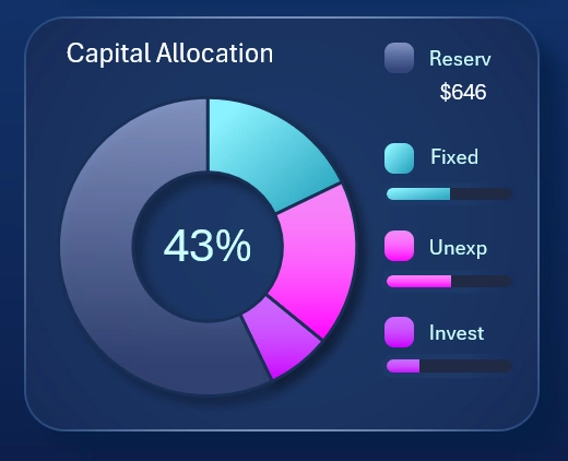
The chart segments the budget into different categories:
- Fixed expenses.
- Unforeseen expenses.
- Investment expenses.
- Unused reserved funds.
The horizontal progress bars show KPI plan completion for each corresponding expense category. If the plan exceeds 100%, the overspending portion of the scale is shown in red. If the expense level is too low, you may have forgotten to account for some scheduled payments, which could lead to late payments. The truth always lies close to balance.
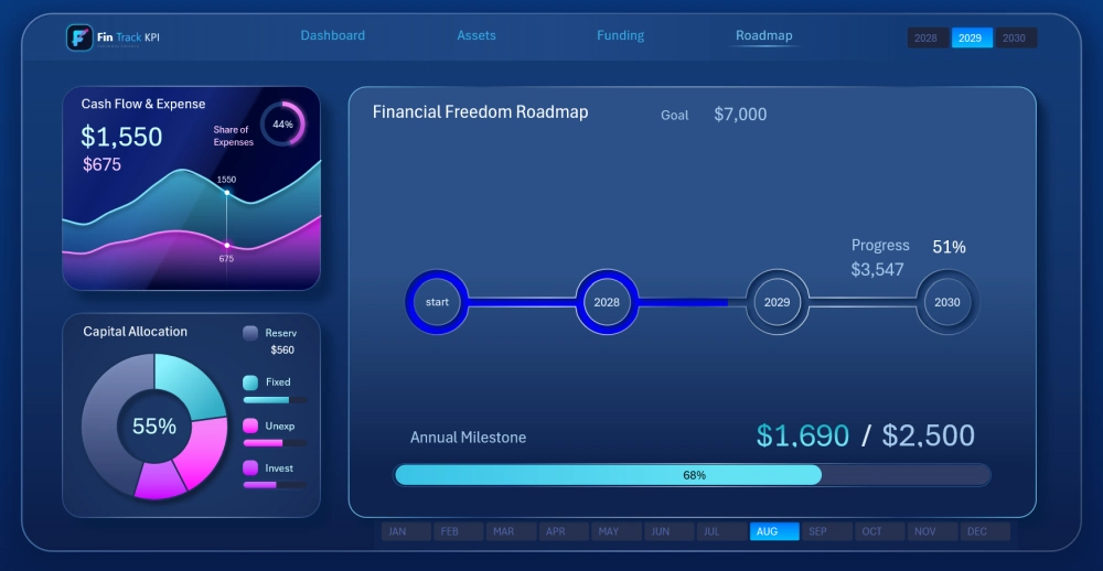
Roadmap for achieving personal financial goals
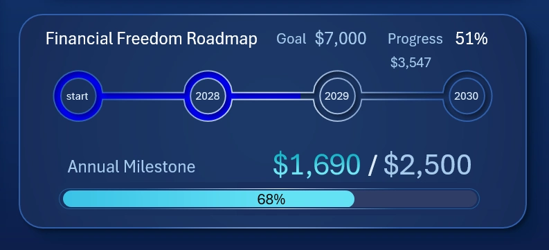
This visualization block is dedicated to the progress of achieving overarching personal financial goals — both long-term and intermediate.
The first decorative progress chart presents the overall picture of progress toward the overarching long-term financial goal over the course of 3 years.
The horizontal progress bar displays the progress toward the intermediate medium-term financial goal set for the current year.
Unmet annual goals may show up as a KPI deviation on the overall global goal chart. If the value shows overperformance, the scale accounts for this and is displayed in a different color, clearly showing the share by which the plan was exceeded.
This visualization block also has its own child screen on the dashboard:
Cash budget debt load indicator
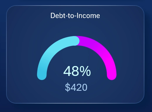
Debt obligations are already a part of modern life. The monetary policy of personal finances requires close monitoring of debt load.
This indicator is built in a speedometer-chart style. It's important to make sure this figure doesn't exceed 50%. Otherwise, it will quickly lead to financial difficulties that take a long time to climb out of due to compound interest.
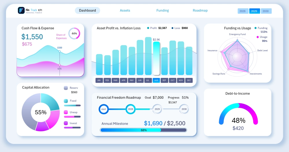
3 designs for a single dashboard interface
This template offers the user 3 design versions at once, for working at different times of day. The brightest one is for a sunny workday:
If it's already dusk outside or the weather is overcast, you can switch to the medium-contrast style:
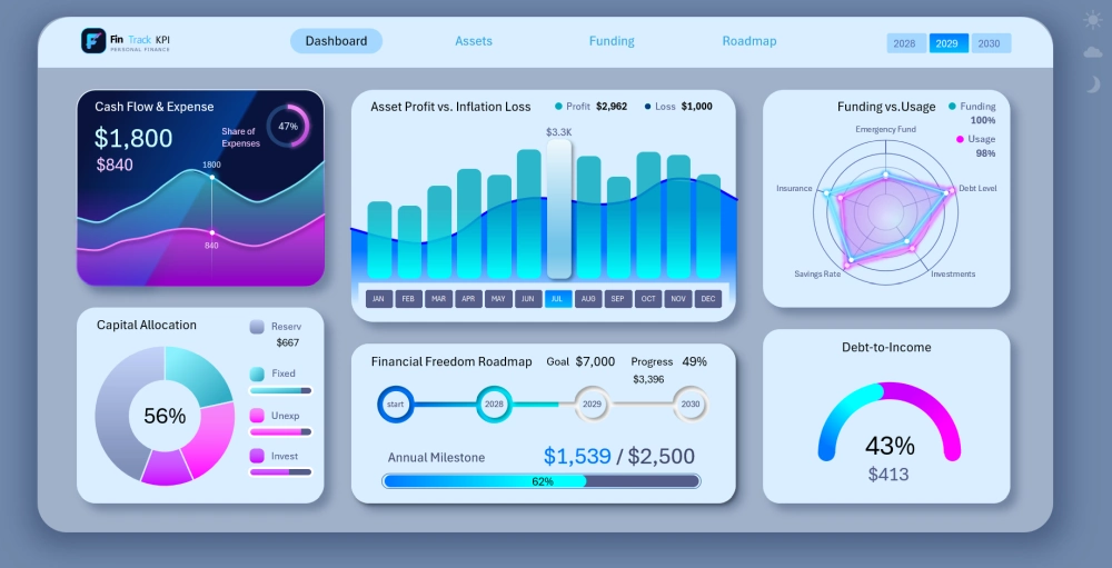
For working at night, it's convenient to use the dark version of the dashboard:
Download the personal finance KPI tracking dashboard in Excel 
The template is useful for learning how to build dashboards in Excel. It can be improved and modified to fit your specific needs. This UI design uses only vector graphics, which don't lose quality when scaled (even the logo). That's why the dashboard looks great presented on large widescreen displays or projectors.
Data Visualization Charts for Interactive Report Creation in Excel.
Dashboard Templates