Excel Dashboard for Weekly Personal Finance expense track
An example of a simple dashboard for analyzing weekly personal finance income and expenses. Data visualization in Excel offers many ways to organize financial tracking not only with formulas or pivot tables but also with powerful visual insights. For instance, in Excel you can quickly build a dashboard to monitor cash flow from income to expenses.
Example of a weekly income and expense analysis dashboard in Excel

It’s not as important how much we earn or spend, but how we track our expenses. If money isn’t counted – it doesn’t exist! As one of the most famous industrialists and philanthropists of the 19th and early 20th century Andrew Carnegie said: “The key is not money itself, but the ability to use and grow it.” When we monitor and manage our spending, it shows that we know how to use our personal capital.
To improve efficiency, you can use Excel. It’s not just a calculator but a universal analytics and calculation tool. By applying data visualization in Excel reports, you gain more motivation to save capital and achieve financial goals.
The dashboard uses 5 charts for a weekly tracking period:
- Weekly main expenses chart.
- Budget progress chart.
- Bar chart for three main income sources.
- Horizontal histogram ranking expense categories.
- Radar chart to analyze the expense structure.
Let’s take a closer look at each Excel data visualization block.
Dashboard control block with expense chart
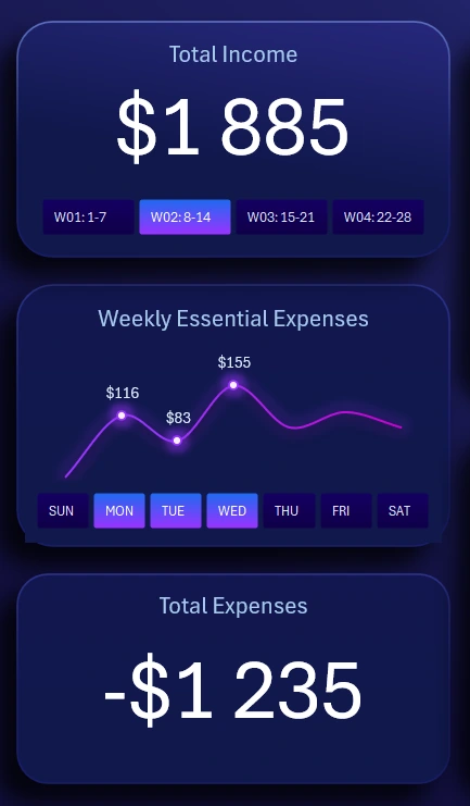
This section includes 3 blocks, with the central one being the weekly expense chart. The X-axis is represented by interactive labels as buttons. With this control, you can switch between weekdays not only on the chart but across the entire dashboard. Button panel functionality applies to all dashboard visualization blocks.
You can also make combined selections by pressing several buttons simultaneously with the left mouse button or by holding CTRL. In Excel, this feature is implemented with pivot table slicers – a standard interactive tool without macros.
The top block also includes slicer buttons for switching between week numbers in the current month. The report uses a 28-day accounting period. Extra days (29–31) are added to the last week or moved to the first week of the next month depending on business rules or personal preference. This calendar format is very popular, convenient for both analysts and developers. The block also shows the total accumulated income for the selected period. Controls here apply to the entire dashboard and support multi-selection.
The bottom block contains no buttons, only dynamic totals for expenses across selected days and weeks.
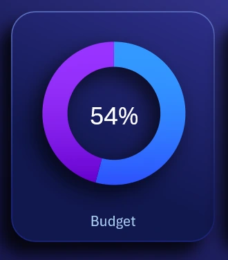
Data visualization of weekly personal finance budget structure
Budget spending progress chart:
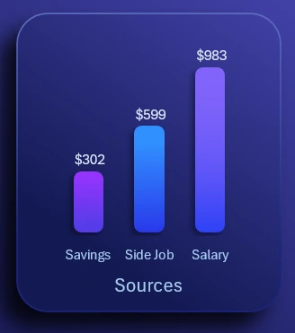
Bar chart of weekly income sources:
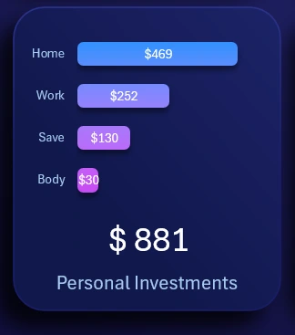
Expense categories ranking as a horizontal histogram, sorted descending:
Radar chart showing structure and distribution of expenses, best used with at least 5 categories:

These are all visualization blocks for analyzing weekly personal finance in Excel.
Dashboard template for interactive personal finance analysis

Excel Dashboard for Weekly Personal Finance Expense Tracking
To learn how to create these kinds of interactive weekly reports, start with a ready-to-use solution as an example. This way, you’ll build new skills much faster:
Download weekly personal finance dashboard in Excel 
Managing income and expenses is essential for everyone. This skill should be developed from childhood. Luckily, Excel lets us practice financial management without extra cost – and with the bonus of motivation through clear and aesthetic data visualization.

Data Visualization Charts for Interactive Report Creation in Excel.
Dashboard Templates