Excel Dashboard Template for Weekly Sales Team Meetings
Excel Dashboard for Weekly Planning Meetings. The template allows you to analyze sales results by day for the previous week and forecast short-term strategies for the upcoming week. Identify sales patterns based on customer activity on different weekdays, both for each individual salesperson and for the entire sales team.
Weekly Sales Planning for Salespeople in Excel
Why is it important to analyze sales in Excel by days of the week and hold weekly planning meetings based on the results? Regular weekly meetings help evaluate the results of the past weeks, set goals, and review mistakes to focus on the priorities for the upcoming week. It's not just a formality — it's a growth tool.
How a weekly Excel dashboard can be useful:
- Identify key sales patterns on time.
- Quickly assess individual productivity of salespeople.
- Optimize the work schedule for each salesperson based on their strengths and weaknesses.
- Boost motivation through competitive dynamics.
- React quickly to sudden changes.
Next, let’s look at the structure and principles of the weekly dashboard template for practical use.
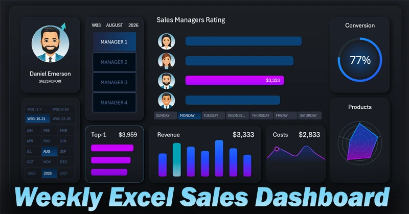
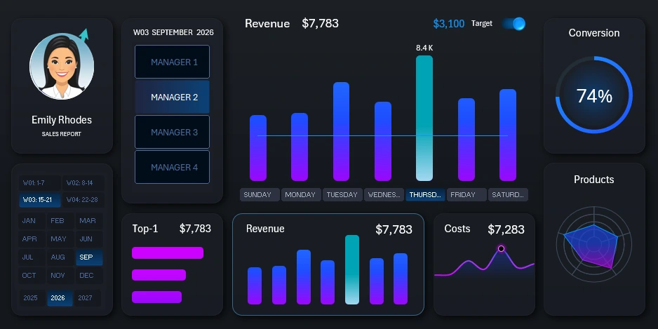
Sales Ranking with Salesperson Filter
On the main screen, at the center of the dashboard, is the salesperson ranking:
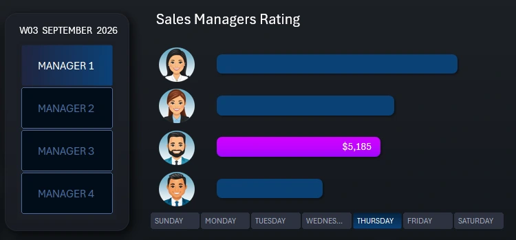
The central block displays a ranking sorted in descending order by revenue volume. There are two button panels to control the dashboard. The vertical panel on the left acts as a menu — a filter by salesperson. When you select a salesperson, their position in the ranking and their one-day revenue are automatically highlighted. You can select multiple salespeople or the entire team at once. The horizontal button panel allows you to switch between days of the week. When you click a button, the ranking chart is automatically sorted based on the relevant statistical data.
Salesperson photos on the Y-axis of the chart are also sorted in line with their bars. Everything is implemented without macros — only formulas and charts based on pivot tables are used.
Salesperson Card and Control Panel
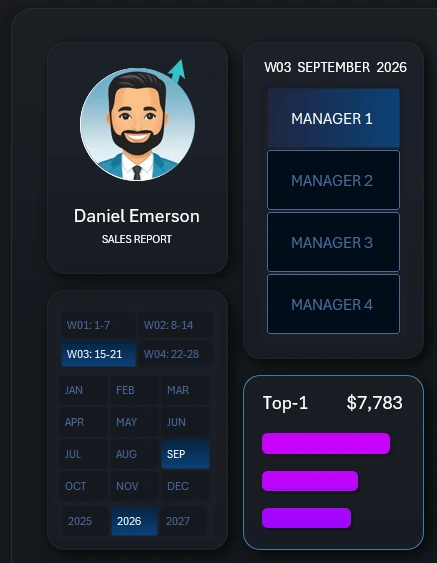
On the left side of the dashboard template is the salesperson card, which updates automatically according to the salesperson filter buttons on the right. In this version of the template, the card only shows the photo and name of the salesperson. If desired, you can download this template and add more important details to display in this infographic block — age, revenue, salary, etc.
In the bottom left corner of this block is a button panel to select the reporting period. You can choose:
- Year.
- Month.
- Week number in the month.
A 28-day calendar system is used — popular in financial reporting. 28 days equals four full weeks in a month. Sales data for remaining days is assigned to the final decisive week of the month.
Note! Dashboard control elements are implemented using pivot table slicer buttons. This makes the dashboard interactive without using macros. More importantly, slicer buttons allow for multi-selection of data. By holding the CTRL key on your keyboard, you can select reporting periods from several months and/or years at once.
This allows for a more accurate view of weekday performance over different time periods, taking into account seasonality, holidays, and other influencing factors.
Moreover, it helps us understand which salesperson was most or least effective on specific weekdays over multiple years.
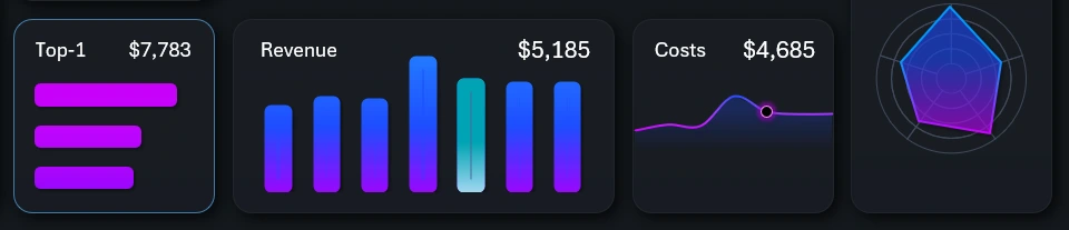
The remaining visualization blocks on the dashboard are KPI cards with summary performance indicators that also function as buttons to switch between dashboard screens:
Each screen deserves individual attention for further review.
Weekly Revenue Analysis Screen by Day of the Week
When switching to this screen, the center of the dashboard now displays a bar chart of revenue by day of the week for each salesperson instead of the ranking. It’s also convenient for analyzing revenue target completion.
The metric is analyzed alongside other important and related indicators on KPI cards with miniature data visualizations. Very convenient!
Daily Expenses and Limits Analysis
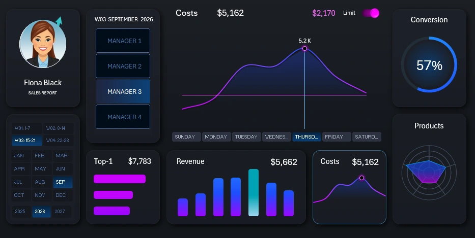
This next screen allows for the analysis of implementation expenses. Each salesperson has their own expense limit, which can be hidden from view using the pink toggle in the top right corner of the central block with the line chart.
Sales Volume Distribution by Product Categories
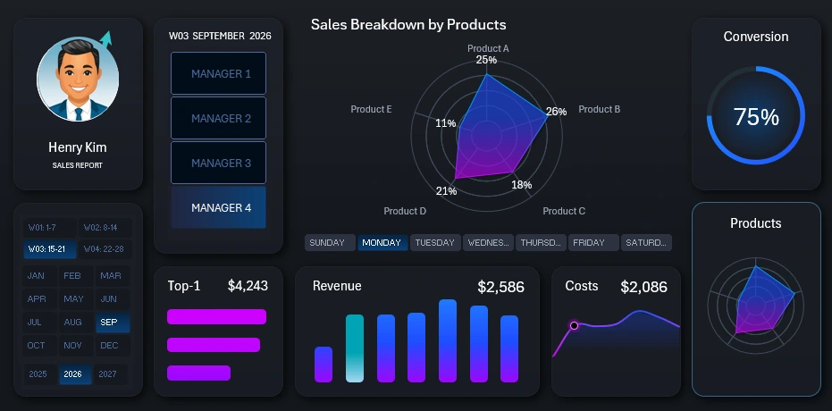
This dashboard screen allows you to analyze which salesperson sells which product category best on which day of the week. After all, sales volume is strongly influenced by the product itself, not just the salesperson or the day. This key part of the template helps the dashboard stand out among competitors.
Order-to-Sale Conversion Rate
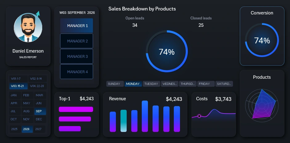
The conversion screen is an essential final part of any sales and salesperson report. Everything is transparent here, as the conversion rate is a salesperson’s business card.
Planning Meeting Presentation with an Interactive Dashboard
Thanks to the powerful capabilities of Excel, you can create useful and visually appealing reports like this one for your planning meetings:
Download the Dashboard for Weekly Sales Planning Meetings in Excel 
Planning in business is a critically important strategic task. As Sun Tzu once said: “Victorious warriors win first in the mind and strategy, then go to battle.” The wise first win with logic and planning, then prove their victory on the field. Use Excel’s interactive data visualization features to achieve your goals and drive motivation.

Data Visualization Charts for Interactive Report Creation in Excel.
Dashboard Templates