Excel KPI Dashboard with an Attention-Grabbing Design
An example of how to create an Excel KPI dashboard template with a unique design for maximum attention. Today it's not enough to be a useful product — it's just as important to be noticed. If quality were the main criterion for success, talented people would be the richest. We live in the age of the attention economy. Whoever knows how to attract attention knows how to attract money.
The most attractive KPI dashboard design in Excel
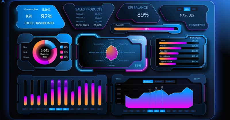
A futuristic cyberpunk-style UI design for an Excel dashboard is well suited for an eye-catching presentation of AI metrics. For example, KPI plan performance for AI agents. Or for an entire swarm of virtual employees.
To implement this design style in Excel, additional capabilities of the shape editor in PowerPoint were used. This made it possible to create charts with complex shapes, but in the end the goal justified the means.
Using Excel and PowerPoint together provides more opportunities for developing presentable data visualization.
This time, the dashboard's KPI cards have their own overall progress indicator:

The horizontal progress bar allows you to display data that exceeds a value of 100%. This is a very important feature for presenting KPI values.
As you can see in the image, if a value exceeds 100%, the excess portion is displayed in bright green so you can visually assess the share of plan overperformance relative to the size of the plan itself.
Each KPI card block also functions as a button for switching to the corresponding child screen of the dashboard, allowing you to dive into a deeper level of analysis for the selected report. This is how the dashboard header functions as the main menu.
The very last card on the right side has a block of buttons for switching the dashboard's values by year. That's how this multifunctional dashboard header is set up.
Customer base segmentation chart
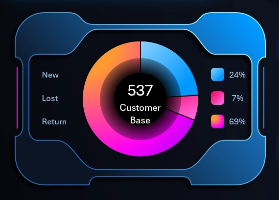
Every business needs sales — there's no such thing as a business without sales. The main source of sales is customers. That's why the first chart is dedicated to segmenting the customer base into three categories:
- New customers.
- Lost customers.
- Repeat customers who come back for new purchases.
On average, in a business, 60% of profit comes from repeat customers.
Distribution chart of KPI plan performance by quality metrics
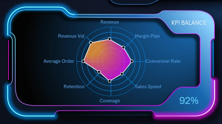
This is a KPI dashboard, so at its center is a radar chart that clearly shows the strengths and weaknesses of your business relative to key sales metrics.
Each metric has its own plan, and the chart shows the level of completion for each plan relative to the other metrics. This makes it possible to equalize relative values simultaneously for 8 metrics at once on a single chart:
| Metric | Actual value (Actual) | KPI Plan (Plan) | % KPI completion |
| Revenue | $10,537 | $10,000 | 105.4% |
| Margin Plan (Margin) | 28.50% | 30.00% | 95.0% |
| Conversion Rate | 3.20% | 3.50% | 91.4% |
| Sales Speed (deals/month) | 15 | 12 | 125.0% |
| Coverage (Audience coverage) | 85.00% | 80.00% | 106.3% |
| Retention (Customer retention) | 68.00% | 70.00% | 97.1% |
| Average Order | 42 | 42 | 100.0% |
| Revenue Vol (Sales volume, units) | 2,500 | 2,500 | 100.0% |
How was this achieved? At first glance, these might seem like incomparable values. For example, average order value is always presented in absolute values. And margin and conversion metrics, although presented as percentages, are too different in nature to compare. For online sales, a 1% conversion rate is an excellent result, while for margin, that same 1% would be very low. But to evaluate their quality on a single chart, they first need to be translated into the plane of KPI plan completion, and then everything falls into place.
To clearly show the level of plan completion for each metric, switch to the corresponding child screen of the dashboard:
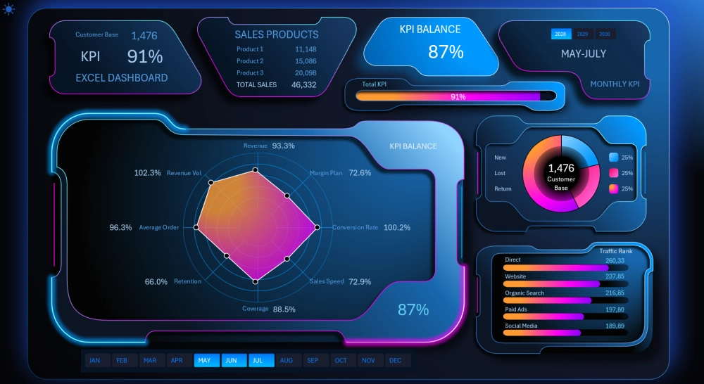
Now we can analyze not just intuitively, but in detail. Here we can see which metric is performing well or even overperforming the plan (>100%). And which qualities are lagging significantly behind and represent a weak point in our business.
Descending bar chart ranking of traffic sources
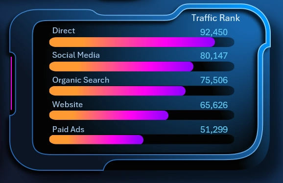
The next visualization block presents a sorted ranking of the volume of traffic attracted from each source, from highest to lowest. Here we assess and identify growth points — whether the main source of customers is social media, organic search traffic, or advertising.
When you change the reporting periods on the dashboard, the ranking chart automatically sorts in descending order to showcase the top traffic source — highlighting it as the leader. This traffic source may well be a sales growth point, and advertising campaign experiments should probably start right there.
Monthly KPI indicators
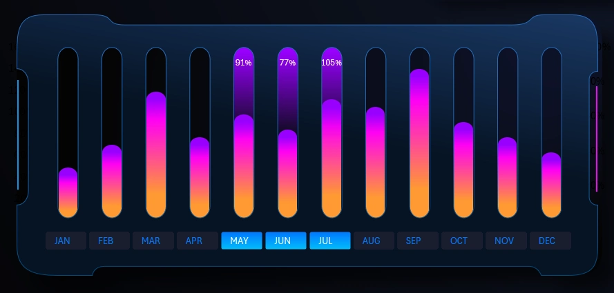
Below, using a bar chart, the dashboard user can track the dynamics of monthly overall KPI plan completion throughout the year.
This visualization block has its own child screen:
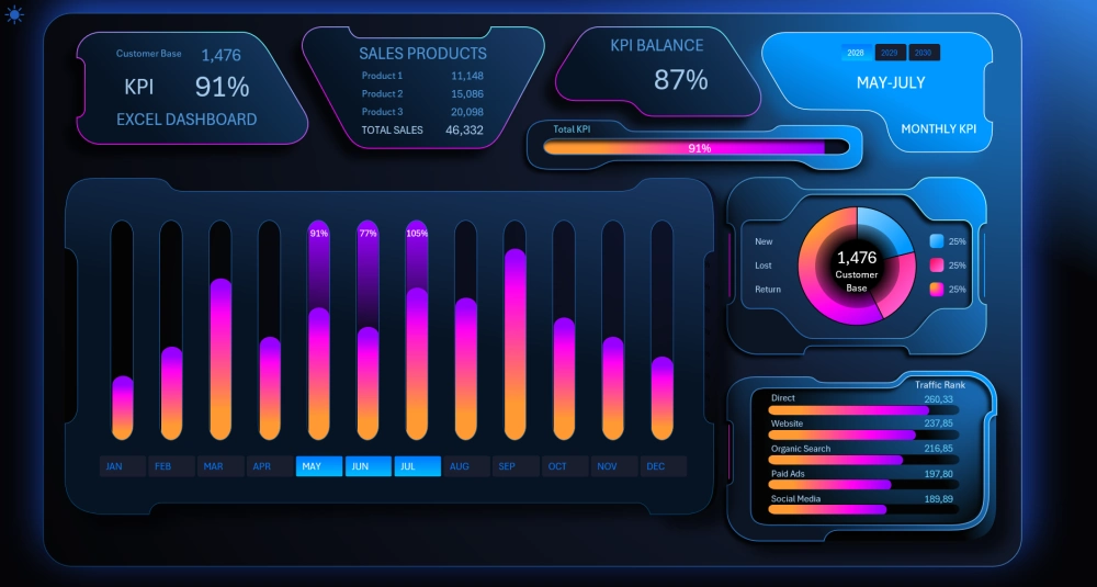
When switching data by year, the bar chart updates automatically according to the source data specified on the "Data" worksheet.
If you change the source data, don't forget to refresh all pivot tables with CTRL + ALT + F5, on the Excel worksheet called "Control."
Line chart of monthly sales dynamics in Excel
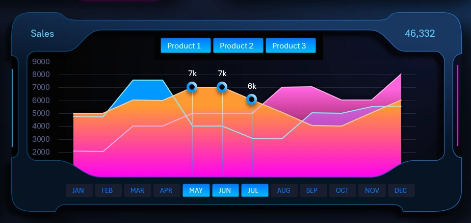
We've raised our KPI plan completion results, but it's also important now to assess the correlation of their influence on sales outcomes. For this, the dashboard must include a chart showing sales dynamics over time.
This way, we can evaluate whether the achievement levels set for the plans are fair. If we're satisfied with the sales figures, that means they aren't set too low, and we can keep using our current strategy. Otherwise, it's worth making adjustments or completely changing the sales growth strategy.
This is an important report and it also deserves its own dedicated dashboard screen:
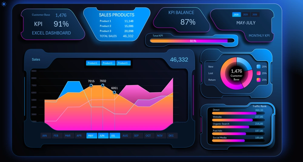
Now the intersections of the lines are much easier to see.
This visualization block contains filter buttons by product category. We can hide any curve on the chart to add clarity to the workflow when needed.
The filter block only affects one visualization block, and its authority is limited and does not extend across the whole dashboard. This is sometimes also useful to implement on interactive dashboards powered by Excel pivot tables.
Beautiful KPI dashboard design in Excel
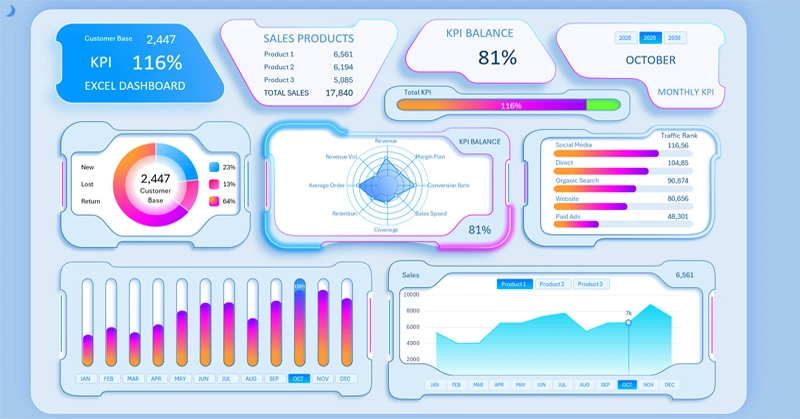
Despite the overall boldness of the futuristic main dashboard design, we also managed to develop a light style for daytime work with up-to-date sales data.
PowerPoint has significantly expanded the design possibilities for data visualization in Excel. We'll be using this method again many times going forward — it's hard to overstate its value. Our imagination has gained more creative freedom. It's a great way to make your Excel template stand out from the competition. A style like this never goes unnoticed:
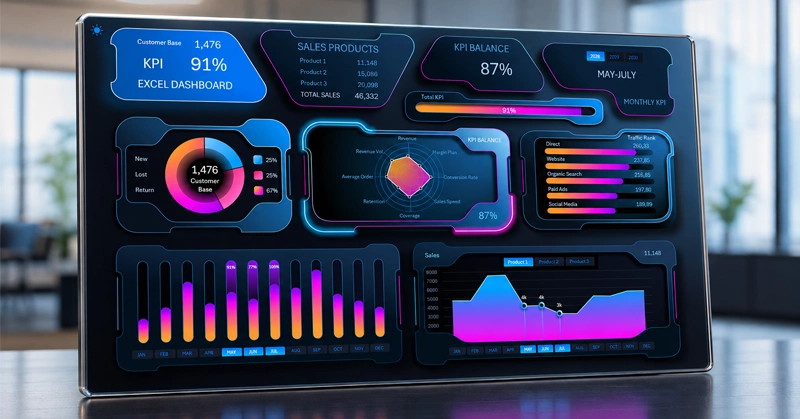
Download the KPI dashboard with an eye-catching design in Excel 
As you've probably already guessed, all the interactive buttons on the dashboard are pivot table slicers. We don't need to use complex VBA macros. Standard Excel solutions for managing pivot tables with filter buttons are enough.
Data Visualization Charts for Interactive Report Creation in Excel.
Dashboard Templates