How to make dashboard reports for Instagram metrics in Excel
Despite the fact that Instagram provides its users with tools for analyzing statistics and visualizing data, new needs will arise over time. Thanks to Excel, we can fully satisfy our analytical needs. A striking example of this is the following dashboard.
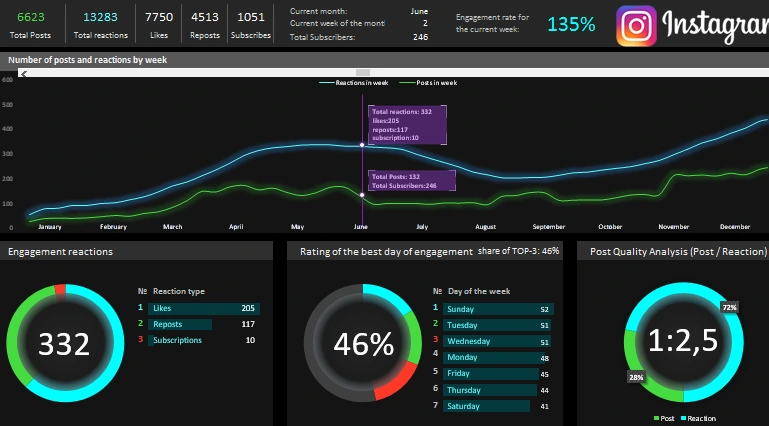
Example report on Instagram on the dashboard Excel
We will simulate a situation for which it will be useful to use data visualization tools in Excel in the field of analyzing channel development statistics in Instagram with SMM promotion. Moreover, in this example you will find out under what circumstances data visualization cannot be replaced even with the most accurate mathematical calculations!
There are initial statistics from the metric for the accounting period of 1 year. During this accounting period, the channel on Instagram was actively developing where new interesting posts were published daily. As a result, the channel attracted new subscribers who reacted differently to publications by likes and reposts. It is necessary to analyze the relative values for the following metric indicators:
- audience engagement;
- post quality;
- quality of subscribers;
- Active days of the week for channel topics, etc.
It is important to note! In order to reduce the noise of indicators (excluding statistical emissions, errors and anomalies) and look at the big picture as a whole, the data should be presented on a weekly chart. It will also help plan short-term marketing strategies for a period of one week. And set new weekly goals.
Dashboard report structure for metrics received from Instagram in Excel
In the title part (heading) of the dashboard, the main relative indicator of post engagement (ERpost - Engagement Rate post) is displayed in large print:
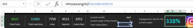
It is calculated for each week throughout the year. Thus, we can track the quality of subscribers. To calculate the rate of engagement of posts, the formula is used:
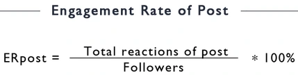
That is, the total number of user reactions to published posts for the current week is divided by the current indicator of the total number of subscribers for the entire period of the current week. And at the end, we multiply by 100 to translate into percentages (in this case, the percentage format of the cells is simply applied).
The lower the relative value of ERpost, the lower the quality of the target audience among subscribers on the channel. The controversial question naturally arises: “Does the quality of the posts themselves do not affect the reaction of the audience ???”! Of course it affects, moreover, all SMM indicators such as ER, ERR, ERday, ERpost, etc. cannot be absolute, but only relative values. Since there are many interrelated factors that prevent obtaining accurate calculations. Therefore, it is important to use data visualization tools in developing marketing strategies that will quickly lead to more accurate results!
Here is a concrete example for you. Jumping ahead, we will consider the very last block of this dashboard, “Analysis of the quality of posts”, which displays the ratio of the ratio of posts and user reactions to them:
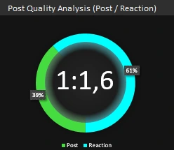
It displays how many reactions 1 post causes for the current number of channel subscribers. And their percentage.
Here we can put back the proportional controversial question: “Doesn’t the quality of the audience affect the reaction for the posts ???”. Of course it does. But using the dashboard as a data visualization tool, we track and analyze how these two interrelated indicators change when we move the cursors on the main chart. As a result, we can visually see in what period and which factor had a greater influence on the growth or decline of the channel’s promotion on Instagram. Without any calculation formulas, visualization helped us see what happened in the history of the blog. And on the basis of our experience, we quickly make fresh and best decisions for building new strategies. A vivid example of the power of data visualization in practice!
In second place in terms of the importance of information in the title part of the dashboard are the values of general indicators for the entire academic period of 1 year:
- The total number of posts.
- The total number of reactions to posts and further distributed by type:
- Likes;
- Reposts;
- Subscriptions.
Further in the “header” of the dashboard is detailed information about the current date under the cursor:
- Current month;
- Current week of the month.
Each month in the calendar consists of 5 incomplete weeks. But sometimes it happens more, for example, as in March 2020 (6 incomplete weeks) or less than in February. The week number of the month allows you to better orient on the chart relative to the whole accounting period.
Below is the current value of the total number of subscribers on the Instagram channel as of the end of the current week. And at the very end of the title part there is a logo with a link to the Excel Visual channel on Instagram, there you will find many ready-made free dashboard templates and diagrams with charts for data visualization.
Charts and charts of the channel’s promotion history with new publications
In the center on the dashboard there is the main weekly chart where the curves of indicators of the number of posts (green) and reactions (blue) to them of the channel’s audience are traced:
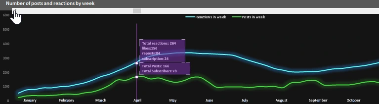
The chart itself is interactive, it contains 2 cursors that are controlled using the scroll bar, like the entire dashboard. Near each cursor notes are displayed where summarized information for the current week for each curve is briefly presented. On the X axis - the names of the months of the current accounting period, and on the Y axis - quantitative values.
Under the chart are 3 blocks of charts with line histograms. The first block of the Engagement Reaction:
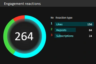
The histogram displays the rating of the types of reactions of subscribers, and their shares are visually presented on the diagram. In the center of the diagram is the total value of all types of reactions to posts.
The second block “Rating of the best day of engagement”:
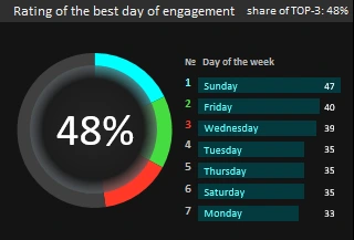
Here the bar chart shows the rating of days of the week by activity. You can evaluate the most active days for your audience. The diagram visually displays the proportion of the first three days of the rating. As seen in the figure this week, Sunday, Tuesday, and Wednesday brought in nearly half of the weekly user engagement. Perhaps it makes sense not to do daily publication on the channel or to reduce the number of posts on inactive days and change the strategy.
The third block is reviewed and described above.
Fill in the source data of the dashboard template in Excel
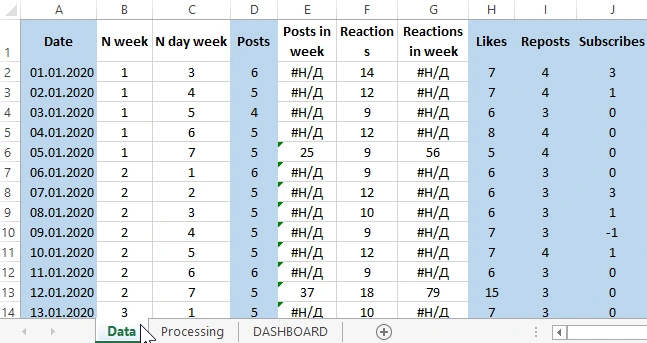
This dashboard is provided in the form of a template and by downloading its example below the link you can use it for your source data. On the “Data” sheet in the blue columns the cells are filled with the source data:
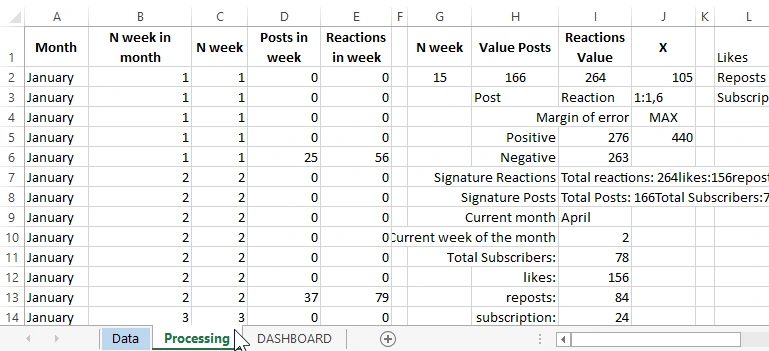
On the “Processing” sheet, formulas are used to process the data in a visual graphical representation for the “DASHBOARD” sheet:
Naturally, this is the easiest dashboard option for marketing analysis of Instagram channel development statistics:
This dashboard does not contain a single VBA macro, everything is done and configured using standard MS Excel tools - a program with unlimited possibilities.
 Download dashboard reports on Instagram metrics in Excel
The purpose of this dashboard is to show the practical application of data visualization in Excel. If you are an Instagramgram blogger and use only the standard statistical analysis tools that this social network offers, it will be difficult for you to break away from your competitors without additional tools. You always need to do a little more than others to see more and know to achieve leadership. I wish everyone sparking to become flagships in their craft with the help of the universal analytical software tool Excel.

Data Visualization Charts for Interactive Report Creation in Excel.
Dashboard Templates