How to Choose Bank for Small Business using Excel Dashboard
Loans to support small businesses can affect profit margin indicators in different ways. This Excel dashboard template was developed to analyze and model various scenarios of using services from different banks. A key factor for successful small business growth in today’s economy is the right choice of banks and banking products. However, under certain conditions, additional financing through loans can negatively impact not only the scaling of a small business but also its risk resilience.
Dashboard for Selecting the Best Banks for Small Business in Excel
Use this Excel dashboard as a tool for modeling strategic development scenarios under different lending conditions. This tool helps reduce risk and minimize mistakes. Make smart, practical decisions that support the growth of your business while you stay focused on your company’s success.
You can compare up to four banks at the same time. This template includes many control buttons for flexible analysis of how banking loan products affect small business profit margins. Let’s go through everything step by step.
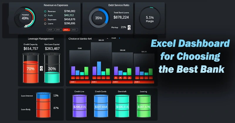
KPI Summary Panel on the Dashboard
At the top of the template are interactive KPI cards with final analysis results.
Analysis of Loan Impact on Revenue and Expenses
The first card shows the capital turnover broken down by:
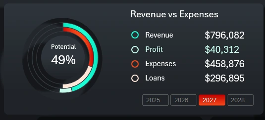
- Revenue.
- Profit.
- Expenses.
- Share of borrowed capital.
The chart uses bright colors to show actual revenue and expense figures, while pastel colors represent expenses for repaying total bank debt when using borrowed funds and the resulting profit.
The first card also includes a button block to switch values between years on the dashboard. It supports selecting accounting periods across multiple years at once.
Debt Load Analysis
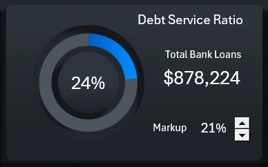
The central card at the top of the dashboard displays the final value of the share of borrowed funds in working capital. Here we analyze the debt load level from the selected banks — more specifically, from their banking products. We also control the total amount of loan capital injected into working capital.
This card includes a spinner control to select the markup level. We can adjust the markup to balance the creditworthiness of the small business and maintain an optimal sales volume. The higher the markup, the better the creditworthiness, but the lower the sales volume.
What’s the Final Margin?
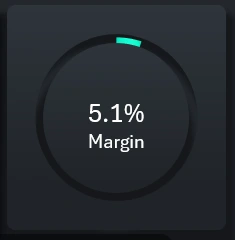
The last card summarizes the growth of the small business due to credit capital injections into working capital. At the top of the dashboard, we see the revenue volume and margin value, which ultimately determines the profit in money. If the results of this financial activity are unsatisfactory, we can adjust the markup to increase the margin — and therefore the profit.
Fun Fact! To double your profit, you don’t need to double your sales. You only need to increase your markup by the value of your current margin.
In this example: if we increase the markup by 5.1%, our profit will grow by 100%, assuming that the sales volume remains the same.
Fun Fact – 2! To increase profit by 100%, you could also reduce expenses by an amount equal to your current margin. Again, assuming sales volume remains unchanged.
In finance, even minor adjustments can have a major impact on the final outcome — whether positive or negative. That’s why it's essential to create and use dashboards in Excel with strong data visualizations. These templates enable effective analysis of various strategic development scenarios.
Managing the Injection of Loan Capital into Working Capital
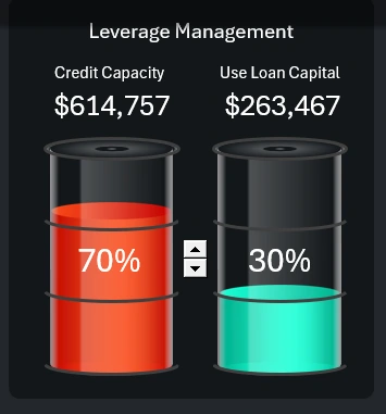
If you choose banks with attractive loan products and optimal lending conditions, a certain level of financial potential is formed. But don’t rush to use all the available funds right away. You may have good creditworthiness, but using the full potential can still be inefficient, even with very favorable lending conditions. It’s better to inject small portions of loan capital into working capital under certain conditions. Evaluate the results and gradually increase the dose to the nominal efficiency level.
This visualization block allows you to simulate the use of borrowed funds at different levels to test potential risk outcomes for the banks. If the goal justifies the means, more capital can be used—highlighted in bright orange in the vessel on the infographic. But if markup can no longer be increased and costs can’t be reduced—and there’s always a risk of extra expenses—then it's better to reduce the share of loan funds in working capital—indicated in bright green. Manage risks and seek balance to ensure reliable profit levels above all.
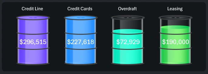
Selecting Banks and Loan Products with Different Lending Conditions
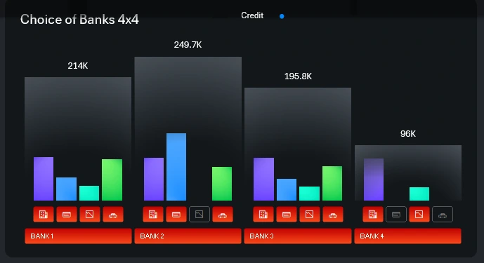
At the center of the dashboard is the main data visualization block with the most functional design. In this section, you can include or exclude a partner bank from the financial operations of a small business.
The structured grouped bar chart clearly presents the bank’s potential for long-term cooperation. Let's break down the block with many buttons and the logic behind bank selection.
The optimal selection is based on the 4 x 4 formula. The dashboard allows you to analyze and select 4 banks, each offering 4 types of loan products. Banks are labeled by name and number, and products are shown with compact thematic icons (to maintain dashboard ergonomics). The button layout is consistent for all banks:
- Credit line.
- Business cards.
- Overdraft.
- Leasing.
Large buttons let you include or exclude an entire bank with all its loan conditions. Smaller buttons let you include or exclude specific loan products within a selected bank. Everything depends on the conditions and profitability of using the product. Hold down CTRL on your keyboard to select multiple values at once.
The volume of potentially available loan capital for a small business is displayed as color bars for each product in each bank. Larger bars show the total capital volume based on the selected loan products.
This visualization block also includes a small but useful button for toggling between absolute and relative value display modes.
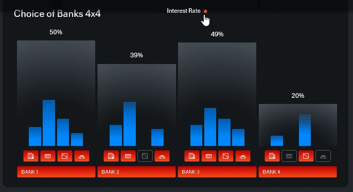
The amount of loan capital is analyzed using absolute monetary values. Loan conditions are determined by interest rates, which we analyze as relative values.
The bright orange potential volume in the infographic from the previous block depends not only on capital transfer into working capital but also on including or excluding banks and loan services. Everything on this dashboard is interconnected to ensure no influencing factor is overlooked during safe analysis.
Stylish Infographic for Excel Bar Chart
Below is the visualization block for the usage levels of loan products from the banks being considered. If you select all banks and all their loan products, all levels will be fully filled. Levels decrease only when banks and/or loan products are excluded. This block is also closely linked to the bank selection block.
The four-bar chart was enhanced with a unique infographic design that fits seamlessly into the dashboard’s polished appearance. Otherwise, such a small bar chart might look dull.
Ratio of Loan Principal and Interest Payments
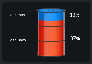
The final data visualization block—modest in size, but on-theme and useful in practice. Here we get the ratio of principal repayment to interest cost for small businesses. If the principal covers the cost of goods sold and/or services, then interest must be covered only by profit. That’s why it’s so important to monitor debt servicing costs. In this case, a markup below 13% is not acceptable, as shown in the graphics.
This final block is also connected to the bank and product selection blocks. It displays an intermediate result of your choices, which can significantly affect further business performance.
Dashboard Presentation for Small Business Bank Selection
All visualization blocks come together in one cohesive interactive dashboard with a functional design.
Download the bank selection dashboard for small business in Excel 
It’s crucial to manage risks, model optimistic and pessimistic scenarios, and build strategic development plans for your small business. Use this dashboard with interactive data visualization as a simulator game for financial model behavior. Then you’ll never again face boring reports in your analysis and day-to-day work.

Data Visualization Charts for Interactive Report Creation in Excel.
Dashboard Templates