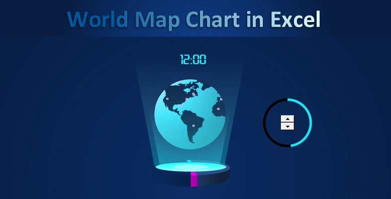
How to make World Map Chart presentation in Excel template
MS Excel allows us to create creative presentations to visualize table data. For example, let's create a dashboard template for international logistics with World Map Chart in the center. It is important to make a simple solution, but with expressive concrete design benefits.
Creating a World Map Chart template for dashboards in Excel
To create a World Map Chart we will use:
- A creative idea for the design.
- The interactive functionality of standard Excel features (formulas, controls, and charts).
- Additional features of the shape editor from MS PowerPoint.
At first glance, a spectacular interactive presentation with world map animation elements looks complicated. At first it's even hard to believe that it was created with standard Excel tools without using VBA macros. In fact, it is a simple but effective solution to expose the World Map Chart design against the background of other competitors. All genius is in the simple. Any complex thing can always be simplified and there is only one way to do it - to divide it into simpler parts. It's like eating an elephant in pieces. In the environment of developers this process is professionally called - decomposed.
Let's decompose the structure of World Map Chart visualization into separate constituent elements:
- World Map of vector shapes.
- Linear histogram with data grouping.
- 3D Diagram.
- Freeform figure made in the PowerPoint editor.
- The control element is a counter.
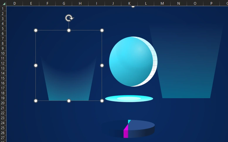
- Additional shapes for decoration.
Now you can see that it's not all that complicated. Next let's make all the details step by step and assemble them as a constructor into a coherent model of the World Map Chart for an interactive presentation.
Step-by-step development of an infographic presentation with data visualization in Excel
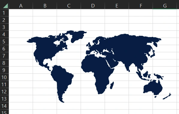
The first element is a group of world map figures. You can draw it yourself in Excel by outlining a 2D picture.
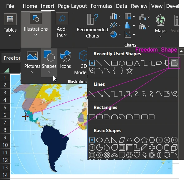
Step 1 - Drawing a vector map in the editor
To do this you should use the tool - Insert → Illustrations → Shapes → Freedom Shape:
You can also use ready shapes created in vector graphics editors.
Step 2 - Animating map movement
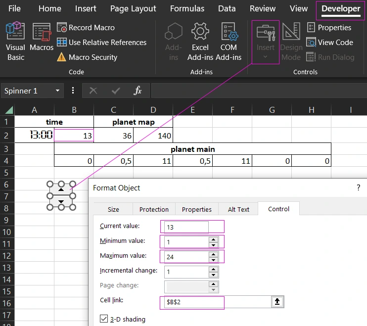
Let's move smoothly on to creating the next element - a linear histogram with grouping of values. We will create it based on the changing values (under the control of the form element - counter) of the table with formulas:
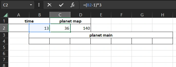
At this point there are 3 values in our table:
- In cell B2 the first value is Time. In 24 hours, the planet makes a revolution of 360 degrees around its axis. The value in cell B2 will change the control - counter with settings of minimum value of 1 and maximum value of 24.
- The next cell C2 contains the second value, which is returned by the formula that determines the speed of animation:
- The last value of cell D2 defines the size of the world map width.
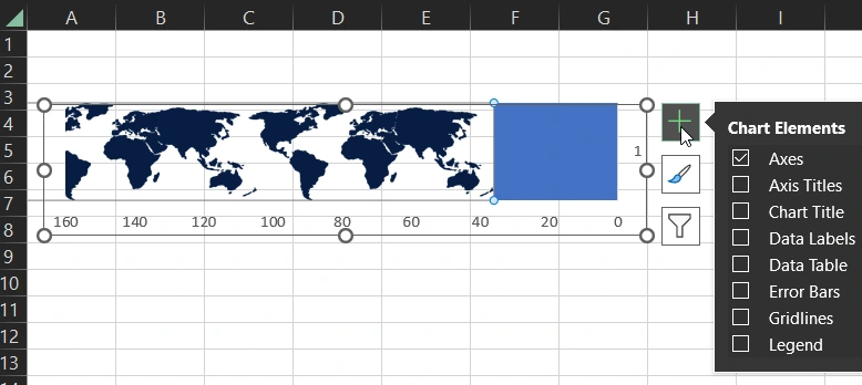
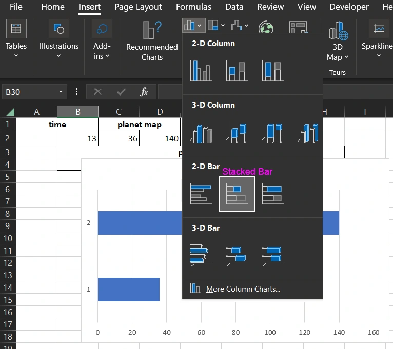
We need only the last 2 values from the range of cells C2:D2 in order to build the histogram. Select the range C2:D2 and select the tool - Insert → Charts → 2-D Bar → Stacked Bar:
Now let's make the necessary settings for the infographic step by step:
Let's switch the XY axis values. Highlight the histogram and select the tool from the option that appears in the main menu of the Excel interface - Chart Design → Data → Switch Row/Column. Or in another way: Chart Design → Data → Select Data. In the window that appears, click the button in the center of the Switch Row/Column:
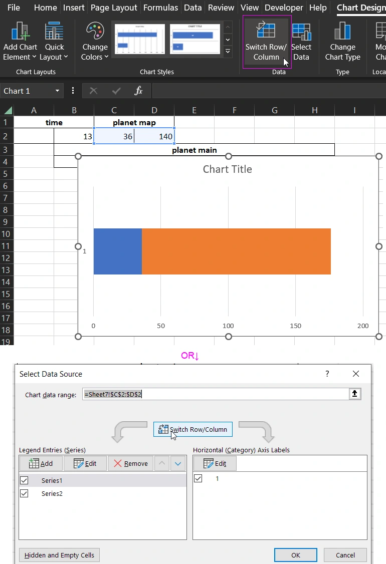
Thus, the blue area changes under the control of the value in cell C2, and the orange area is static.
Next we should change the direction of movement, for this we change the reverse order of the values on the X-axis. Select the X-axis on the histogram with one click and press CTRL+1. In the sidebar that appears, check the Values in reverse order option:
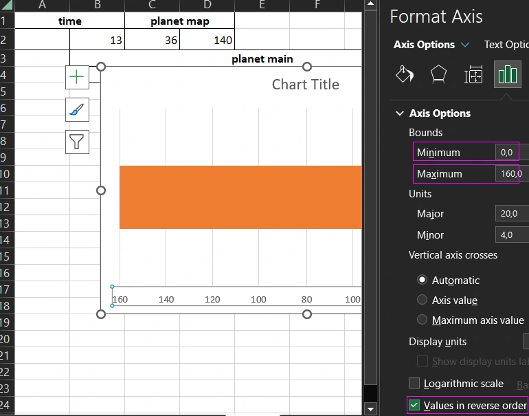
Here we also set the minimum 0 and maximum 160 values of the X-axis to fix the size of the histogram blocks. As shown above in the figure. Otherwise, the map picture will be distorted in the process of changing the initial values for the histogram.
Now let's color the orange area into the drawing of our pre-drawn map. But first we need to prepare it a little bit.
The planet earth will make a complete revolution in the animation scenario. We need to extend the map image with additional copies of the shapes and group them all together:
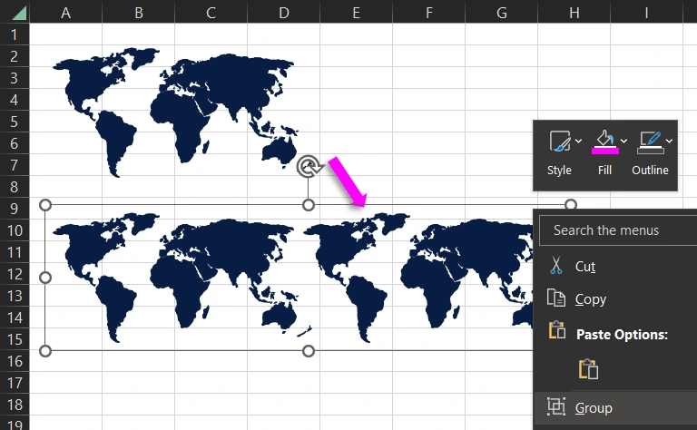
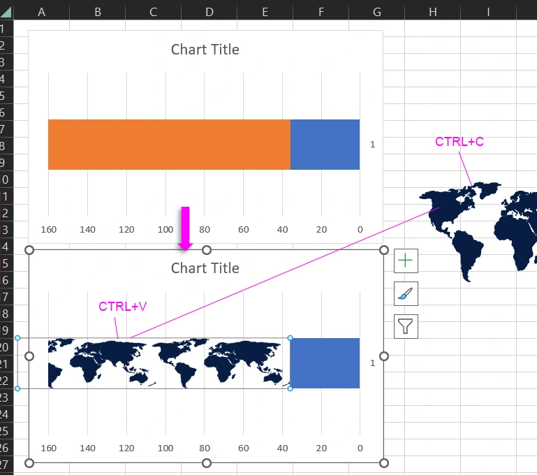
Copy the map and place it on the same level. Select all the necessary shapes, right-click the mouse and from the context menu select the Group option. As shown above in the figure.
Then just copy the group CTRL+C and paste CTRL+V directly to the orange area of the histogram:
At the end of creating this infographic element, make the last settings. You need to make the background of the histogram transparent, so that the background of the map shows the figures of decoration. Select the histogram and choose the tool from the menu - Format → Shape Styles → Shape Fill → No Fill:
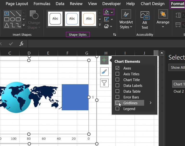
The grid lines should also be removed as shown above in the figure.
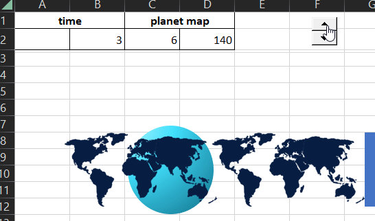
Now when you change the number in cell B2, the values for the histogram in range C2:D2 will change. The map will move from right to left:
The second element in the second step is ready, let's move on to the third step.
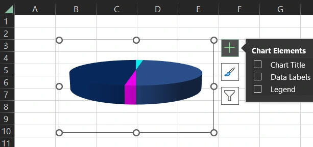
Step 3 - 3D base rotation effect
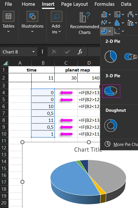
Now let's create the basis from a 3D diagram. But first let's build a table with formulas for its rotation when you change the value in cell B2:
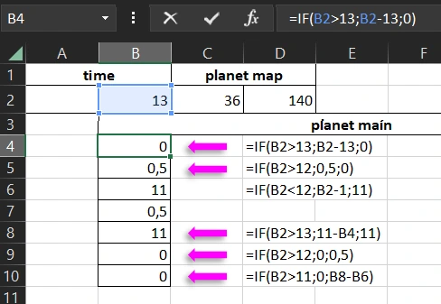
These formulas will generate cell values in the range B4:B10 when you change the value in cell B2 (time). Select the range of values B4:B10 and build a 3D diagram by selecting the tool - Insert → Charts → 3-D Pie:
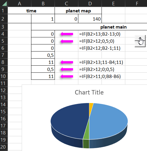
Now when you change a value in cell B2, the values in the range B4:B10 will change, and the visualization of the 3D Diagram will change accordingly, creating a rotation effect:
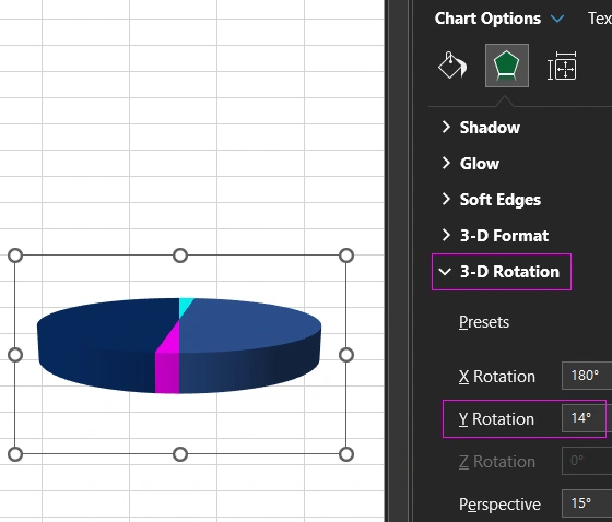
At the end, we change the slope of the 3D chart on the Y-axis to 14 degrees. And paint all the segments in beautiful colors, and make a transparent background:
The 3D base is ready, let's move on to the next step.
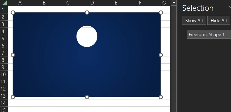
Step 4 - creating complex vector shapes in MS PowerPoint
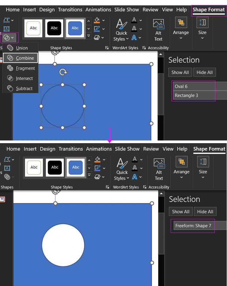
We need PowerPoint to create a complex Freeform shape. The vector shape editor in PowerPoint is a bit different from Excel and has the obvious advantages of the tools. For example, we need to make a rectangle shape with a round hole. Let's open MS PowerPoint and get to work.
First, we draw a rectangle shape and put a circle shape on top and select them both. Then select the tool:
Now all the parts are ready. Copy the figure of the square with a hole from MS PowerPoint in MS Excel and assemble the World Map Chart as a constructor in the appropriate sequence of all parts.
Step 5 - Assemble all the parts as a construction set
This is how you can present an infographic element for developing interactive dashboards.
 Download World Map Chart presentation template in Excel
An example of practical application of this template on a dashboard is presented in the following article:
 Excel Dashboard Template planet same day logistic Download.
MS Excel has many interesting possibilities for creative developers to visualize data from boring big table reports. In the following lessons, let's look at new and even more spectacular step-by-step examples of creating beautiful presentations with pictures and detailed descriptions. You can download them all for free from Google Drive. Just follow the link above and select the option in the File → Download → Microsoft Excel (XLSX) main menu.

Data Visualization Charts for Interactive Report Creation in Excel.
Dashboard Templates