Excel Dashboard Template planet same day logistic Download
An example of a dashboard for the presentation of the dynamics of key indicators of international logistics over 24 hours. We will use elements of infographics to effectively display data visualization. This will allow us to be most noticeable against competitors of visual Excel report developers.
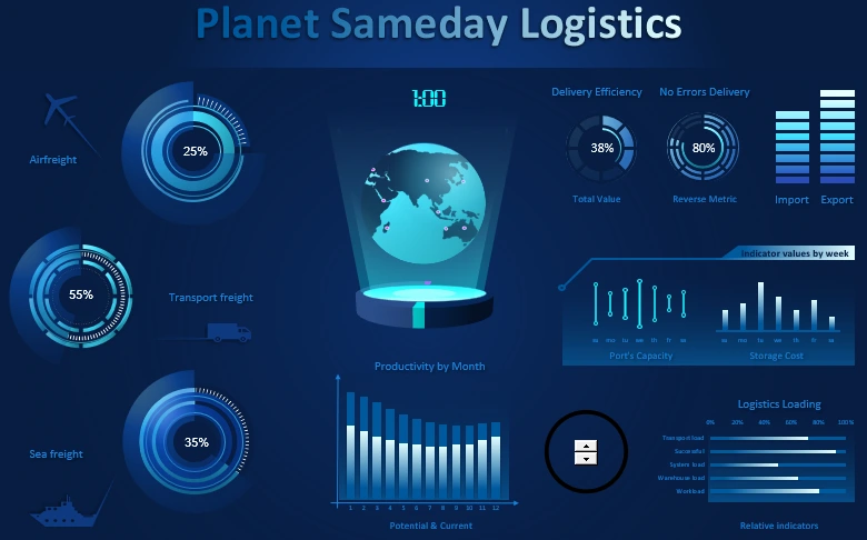
An example of a dashboard for the presentation of logistics efficiency in Excel
Let's simulate a situation to inspire the developer's terms of reference. A presentation needs to be made for an international express mail delivery company around the world. The presentation should be in a dashboard style and deliver the main message about the changes in the state of the company's logistics over the course of a day. For the developer provided all the necessary data on key logistics indicators for the accounting period of 1 year. All data is pre-structured in terms of time - one day:
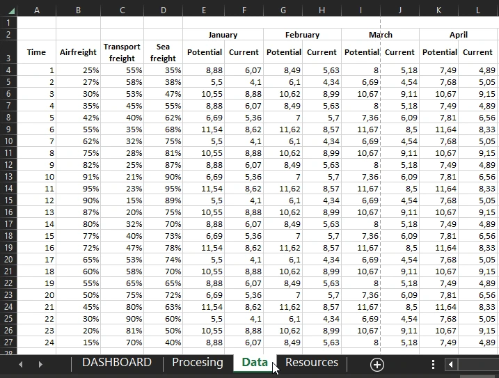
All source data are in the table on the "Data" sheet.
No macros are used in the template. All interactive functionality is implemented with the standard tools available in Excel.
Description of the dashboard presentation structure in Excel
In the very center of the dashboard is the interactive World Map Chart infographic element in the form of the levitating planet Earth. It is designed to show the localization of all supply departments in the entire logistics chain around the world:

When you change the data on the dashboard, the planet rotates, respectively, the time of sampling from the database for the presentation of indicators at the current moment changes. The marks on the base under the planet symbolize the beginning and the middle of the day, i.e. 0:00 and 12:00 o'clock. The different sides of the base are colored differently. This shows the first and second half of the day.
An example of developing a planet in Excel step by step and with pictures is described here:
 How to make World Map Chart in Excel.
On the left side of the dashboard are 3 charts to show the current load for the three types of parcel shipments:
- Air freight.
- Freight transportation.
- Maritime logistic freight transportation routes.
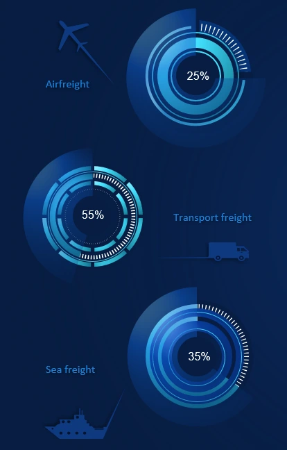
An example of how to create beautiful combo charts is detailed and illustrated in this article:
 Example of Cash Flow visual analysis on Combo Chart Excel.
At the bottom of the planet is a Bar Chart for a comparative analysis of the productivity of all logistics for the current time of day in each month throughout the year.
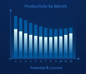
For example, what was the current productivity as of 14:00 in January, February, March... etc. And also what is its maximum productivity potential? This bar chart block answers these questions.
In the bottom right corner of the dashboard is a control for the hourly period of the day on the dashboard. And a block of 5 important indicators of the load on the warehouse, picking and transport logistics:
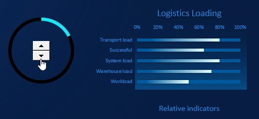
- Transport load - transport load level. Number of accepted packages. The volume and weight of the total cargo.
- Successful - percentage of successfully transported cargo in accordance with all norms of internal transportation service policy without compromises, limitations and other unforeseen conditions.
- System load - The load of the logistics service system. Indicators from forklift gauges, scales, and other measuring devices.
- Warehouse load - warehouse load. Percentage utilization of total space for temporary storage of cargo.
- Workload - percentage of labor usage.
In the upper left corner of the dashboard is a block with basic logistics status indicators for the current period of the day:
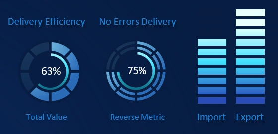
- Total logistical efficiency. The indicator is calculated on the basis of the total transport load.
- Percentage of successfully delivered shipments without errors or corrections. An inverse metric to the percentage of problematic shipments with errors.
- Ratio of imports to exports as of the current time of day.
And consider the last block of weekly values:
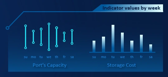
The left side shows the average throughput of the logistics ports on a particular day of the week, relative to the selected time of day. The wider the distance between the points, the greater the throughput. The histogram is used for relative visual analysis.
To the right is an indicator of the level of cost of temporary storage of goods during the picking process in the warehouse. Also Chart Bar is used for comparative visual analysis relative to the days of the week by current time.
All dashboard blocks are harmoniously combined into a spectacular presentation of key logistics performance indicators:
 Download Excel dashboard with a planet for logistics presentation
The dashboard demonstrates the data visualization capabilities of MS Excel. Download from the link above and use its individual elements for your presentations. The template contains no macros and all interactive features are implemented with formulas.

Data Visualization Charts for Interactive Report Creation in Excel.
Dashboard Templates