How to Manage Personal Finances in an Excel Dashboard
Effective personal budget management not only increases your level of financial security but also expands your opportunities for financial growth. Expense control is very important and should always come first, but having a goal is equally essential. This dashboard template allows you to analyze two types of progress simultaneously:
- Reducing expenses.
- Achieving a financial goal.
At the end of the article, you can download the dashboard template in Excel format, but first, let's review all its interactive features and data visualization purposes.
How to manage financial expenses and achievements simultaneously in Excel
This dashboard is designed not only for monitoring personal financial expenses but also for managing personal financial risks. Its capabilities are enhanced with tools for planning and tracking progress toward achieving financial goals.
Expense control is only one important part of risk management. If we want a more effective tool for managing personal capital risks, it should include not only expense control but also:
- planning,
- budgeting,
- insurance,
- investing,
- reserving,
- achievement.
You will always be more effective and productive when your activity is focused not AGAINST negative scenarios but FOR positive ones. Yes, risk management reduces the likelihood of financial shocks and losses, but there must always be a goal. Without a clear goal, any action leads only to confusion and loss. If a sailboat drifts aimlessly in open water, no wind will be favorable. A goal protects us from distractions and keeps us moving forward. You cannot leave your current point if you don’t see the next one—direction is always necessary to move.
This version of the dashboard template harmoniously combines data visualization blocks for expense control and goal achievement analysis. Let’s explore them in more detail.
Dashboard structure for managing personal finances and goals in Excel
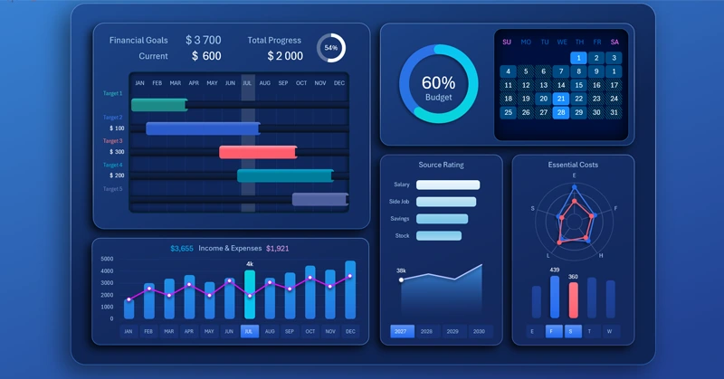
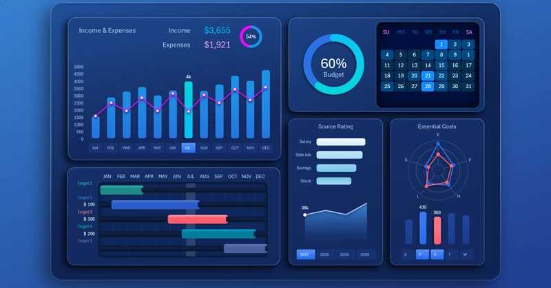
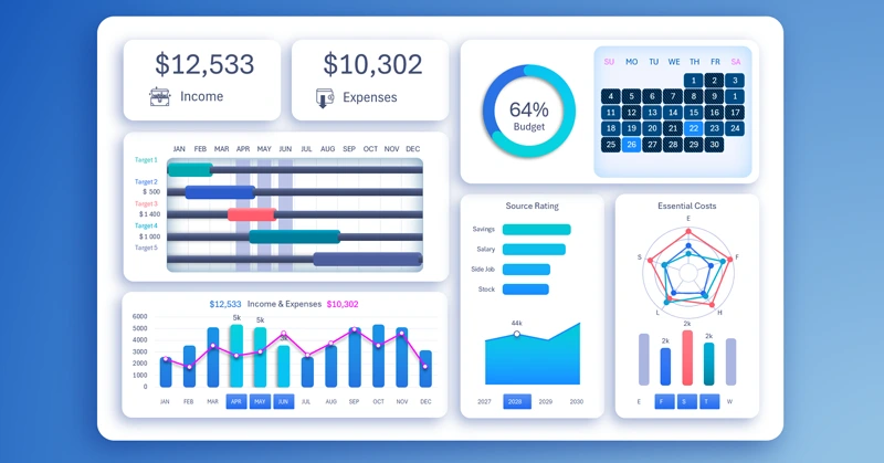
As in any classic dashboard version, the most important summary information is presented at the top on KPI cards with dynamic data labels. Here, they display income and expenses:

The summary information is displayed only on the main dashboard screen for efficient use of interface space.
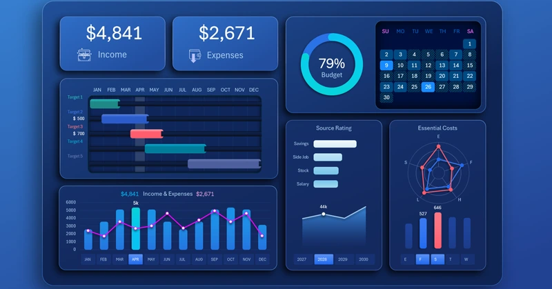
Gantt chart for analyzing personal capital financial goals
Next comes the Gantt chart to visualize and track the execution of the annual financial goals plan:
Each goal requires time and investment. On the right side of the chart, you can analyze the time distribution of goals throughout the year. On the left side, you can see the current monthly investment volumes allocated to each goal.
On the main dashboard screen, the Gantt chart shows only current monthly investments highlighted by cursors. For a more detailed analysis, click the chart. This opens an extended Gantt view, where you can analyze the total amount invested and the overall progress toward financial goals.
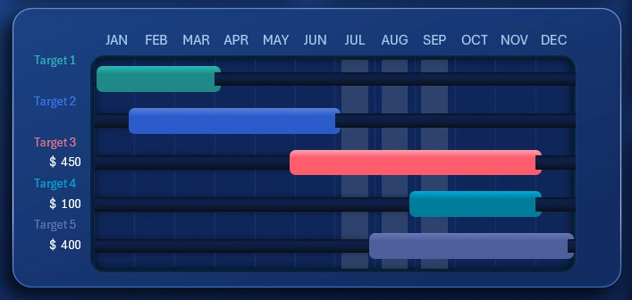
Interactive income and expense chart in Excel
The visualization block for analyzing the ratio of income and expenses is no less important:
Interactive button blocks are used as month name labels on the X-axis of the chart to switch between monthly data. The control authority of this element extends across the entire dashboard. This means that when a specific month is selected on the chart, all dashboard data automatically updates to match that month. The same button block also controls the cursors on the Gantt chart from the previous dashboard element.
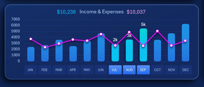
Income source ranking
Ranking Bar Chart with Sorting in Excel
The horizontal bar chart is designed for comparative visual analysis of four income sources sorted in descending order:
- Savings.
- Salary.
- Securities.
- Side jobs.
The chart below shows the annual income trend over the years. On the X-axis, interactive buttons are used as data labels to switch the dashboard by year. When a year is selected, all dashboard data automatically updates to reflect that year. A multi-select function is also supported—allowing simultaneous selection of several or all years. This feature is implemented using the standard Excel Pivot Table slicer (without macros).
Segmentation of expense items by category
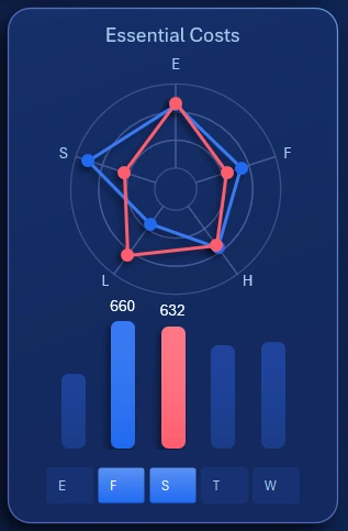
The Radar chart allows you to effectively compare multiple data categories within a compact visualization block—making it an essential tool for this type of analysis. For detailed analysis, you can click the visualization block to open a screen with an expanded interactive view of expense segmentation.
The dashboard analyzes five basic categories of personal financial expenses:
- Entertainment.
- Food court.
- Supermarket.
- Travel.
- Workspace.
Each expense category is segmented into five subcategories:
- Food.
- Fuel.
- Hobby.
- Leisure.
- Shopping.
For example, under the “Entertainment” category, funds could be spent on food, fuel, hobbies, leisure, and shopping. Similarly, the food court can be segmented (for example, a hobby could involve cooking or eating while engaging in the hobby). The same logic applies to supermarket trips, travel, and so on.
To switch between expense categories, use the button block. However, in this case, its control is limited and does not affect the rest of the dashboard. This slicer is intended for local use only within this visualization block.
Heatmap of effort activity and budget spending
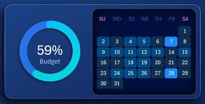
The chart allows you to monitor what portion of the annual budget remains available for spending in the following months.
The heatmap shows daily activity levels related to efforts made toward achieving financial goals within a selected month. The heatmap is displayed in a calendar format. If multiple months are selected, the calendar of the latest month is displayed. Naturally, the higher the activity, the higher the expenses.
Activity statistics for the heatmap are entered on a separate sheet called heatmap-DATA:
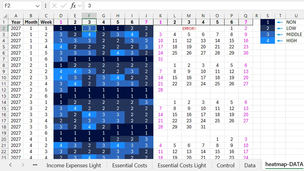
You need to fill the cell range D1:J289 with numbers from 1 to 4, depending on the activity level:
- No activity.
- Low activity level.
- Medium level.
- High level.
The table represents a structured layout where you should enter these statistical data according to:
- year,
- month,
- week number of the month,
- day number of the week in the month.
Fill in the table correctly. If a day of the week doesn’t exist in the calendar, enter 1, which means no activity. To verify the day of the week, refer to the calendar on the right side of the table. It includes calendar dates and a verification formula.
For example, the image shows that cell F2 incorrectly contains the number 3 for the third day of the week (Tuesday – U.S. calendar format). As a result, the corresponding calendar cell M2 displays “ERROR!”. In 2027, in the first month (January), during the first week of the month, there cannot be a third day of the week (Tuesday, U.S. calendar system). This month starts on the sixth day of the week – Friday (U.S. calendar layout starts on Sunday).
All dashboard screens
Gantt chart for analyzing financial goal achievement throughout the year:
Combined chart showing the correlation of monthly income and expenses:
Screen for interactive analysis of expense structure segmented by categories and subcategories:
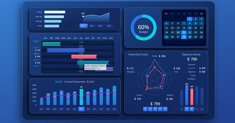
On this screen, the Radar chart visualization block includes two sets of buttons for interactive data selection of expenses for the current year and month.
The left button block allows excluding expense categories to evaluate how the situation would change if certain personal spending were reduced or eliminated. Each button label represents the first letter of the expense category.
The right button block switches between expense items. You can select all or several at once. The letters on the buttons correspond to the first letters of the expense item names.
Personal finance management presentation in Excel
Personal finance dashboard in Excel for tracking goals
The personal finance management dashboard allows you not only to track expenses but also to achieve your personal financial goals:
Download the personal finance management dashboard template in Excel 
This template has distinctive features that set it apart from competitors — such as a heatmap, interactive expense structure analysis, and a financial goal planner using a Gantt chart, similar to project management. More templates for family budget management and other purposes will be published on this site.

Data Visualization Charts for Interactive Report Creation in Excel.
Dashboard Templates