How to make an interactive calendar in Excel template download
When you select data from an Excel spreadsheet by condition, indicating the beginning and end of the accounting period of time, there is often not enough visualization on the interactive calendar. Usually, on dashboards, the user is provided with only 2 input fields where you need to specify the start and end date of data selection from the table for further analysis. But this time, consider an interesting example for convenient work when visually analyzing sample data with dates of accounting periods.
An example of an interactive calendar dashboard in Excel
First of all, it is important to note that the data of the interactive calendar template with data visualization for the dashboard does not contain macros. And this means that you are not limited by the corporate security policy and you can safely use all the visualization functions to the full.
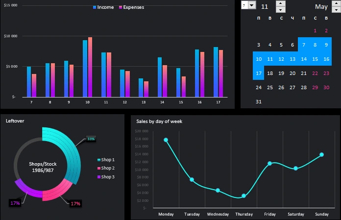
It is also worth emphasizing that the interactive calendar control unit is the main one, and all other blocks are just for the example of its use as an element on any dashboard. Therefore, we start the review from the main upper block of the interactive calendar:
In the calendar itself and the sample template as a whole, we do not use macros to generate and arrange the months. Therefore, to solve this problem, in this example, a range of cells with array formulas is used. And conditional formatting allows us to automatically visualize selected time periods immediately when managing an interactive calendar.
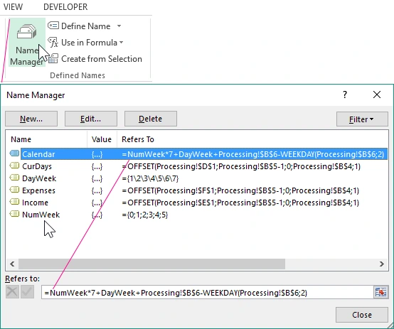
More important moment! Array formula arguments contain references to Excel name ranges with formulas, and some of them refer to other names in their formulas. To see the entire list of names used, select the tool: "FORMULAS" - "Defined Names" - "Name Manager" (CTRL + F3):
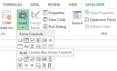
The interactive calendar itself is controlled using Excel form controls. All of them are available from the tools: “DEVELOPER” - “Controls” - “Insert”.
Consider 3 dashboard interactive calendar controls:
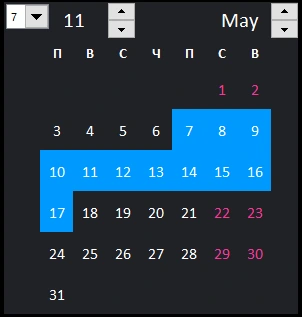
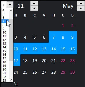
- The first element of the “combo box” allows you to indicate on the calendar the number of months at the beginning of the accounting period from which the selection will begin. In this case, this is the seventh of May, respectively, from this date the accounting period of time will begin to select data from the table on the “Data” sheet:
- The second control is “Counter”. We use it to indicate the duration of the accounting period. For example, 11 days. When using the counter, conditional formatting is automatically activated to highlight the selected time range. In this case, it is from the 7th to the 17th of May. Such visualization increases the usability (usability) of the calendar.
- A counter is also used as the third control, but for the purpose of choosing a calendar month.
To illustrate how to use the interactive calendar in action on a schematic dashboard, an example added 2 more charts and 1 chart.
Interactive data visualization in Excel without macros
The first chart is automatically filled with data on income and expenses, depending on the sample under the control of a range of numbers on the interactive calendar:
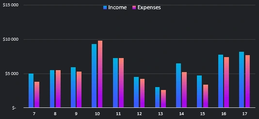
That is, how many calendar days are selected in the accounting period, the same number of indicators are displayed in a graph in the form of a histogram with a grouping. All values are changed automatically and correspond to changes on the calendar.
In the lower left corner is a diagram of the distribution of the shares of the remaining goods in three stores and one warehouse of the company:
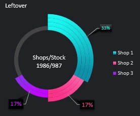
All values depend on the selection of data from the table by the condition of dates of accounting periods, which are set using the calendar.
The last graph clearly shows the volume of sales by day of the week (Monday to Sunday), which are included in the interactive calendar only in the accounting period:
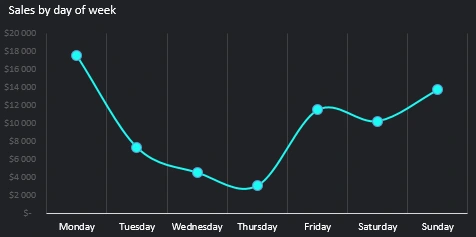
For example, if the accounting period lasting less than 7 days means one of the days of the week will be zero.
Download sample example with interactive calendar in Excel
As a result, when managing the calendar, all parameters on the dashboard chart and graphs are updated automatically and according to the dates of the selected accounting period:
 Download an interactive calendar with visualization in Excel
Using this interactive calendar template, you can add it to your dashboards by simply selecting a range of L2:T9 cells on the DASHBOARD sheet, then copy CTRL + C and paste CTRL + V into your dashboard template. You only need to configure the links to the cells in the array formula and in the properties of the controls. And the name ranges are copied along with their prescribed internal formulas - automatically (to check for the presence of names, press CTRL + F3). The calendar will fully work on your dashboard.

Data Visualization Charts for Interactive Report Creation in Excel.
Dashboard Templates