KPI Dashboard for Digital Marketing analysis in Excel
A dashboard for quickly analyzing basic digital marketing metrics in Excel. The report is balanced between leading (KPI) and lagging (revenue) types of metrics. You can dive into in-depth analysis by switching to isolated reports on the dashboard's child screens.
Leading and lagging indicators in digital marketing
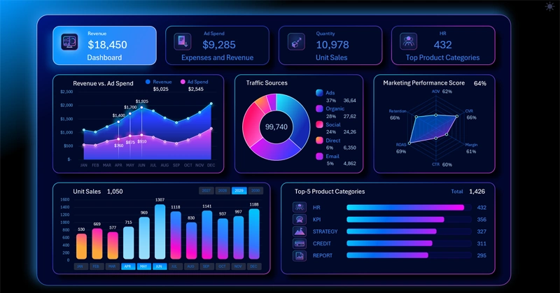
Let's look at an example of a simple dashboard for analyzing basic leading and lagging digital marketing metrics in Excel.
Always plan from the final goal back to the first step, so that every action has a clear meaning and direction. Move backward from the desired result — this way you'll only see the necessary steps. After all, increasing efficiency means singling out what matters most!
That's why the analysis of digital marketing results on the dashboard starts precisely with the lagging indicators.
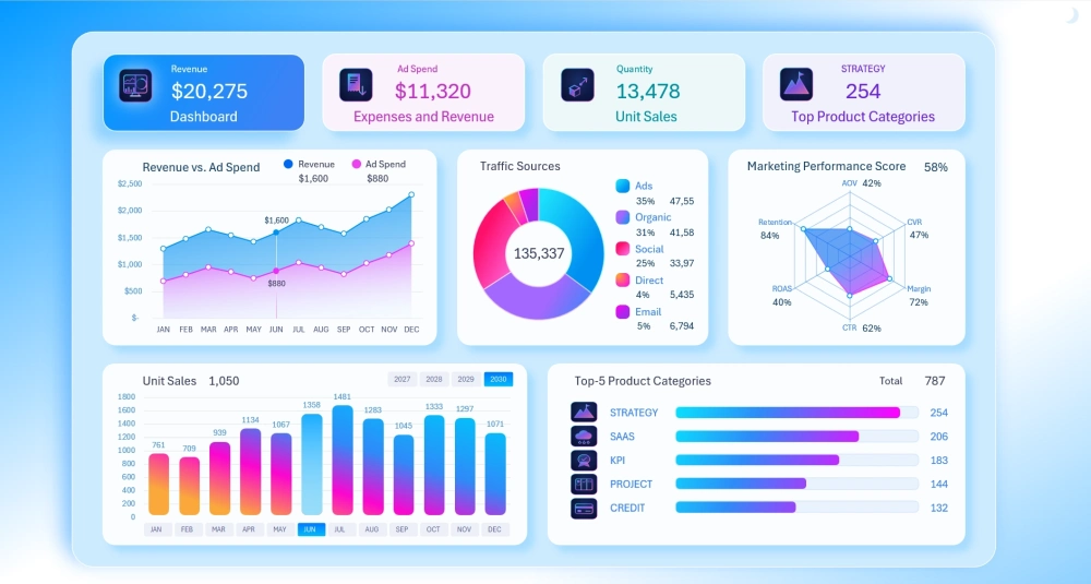
The left side of the dashboard uses data visualization blocks intended primarily for lagging indicators, which are responsible for final results:
- Current revenue dynamics.
- Actual sales in units of goods sold.
- Monthly advertising expenses.
That is, here we primarily track:
goals – where we want to get to, which metrics we're aiming for;
dynamics – how well we're doing and how much of the journey is left;
correlation – confirming whether we chose the right growth points.
The right side is intended for analyzing leading indicators:
- Percentage of KPI plan completion by quality metrics.
- Segmentation of the customer base by acquisition source.
- Identifying sales headliners to use as points for applying effort.
Naturally, we have the greatest influence over leading indicators, but attention should be evenly split across both sides of the report.
The T-Shaped Analytics concept: Overview and Deep Dive
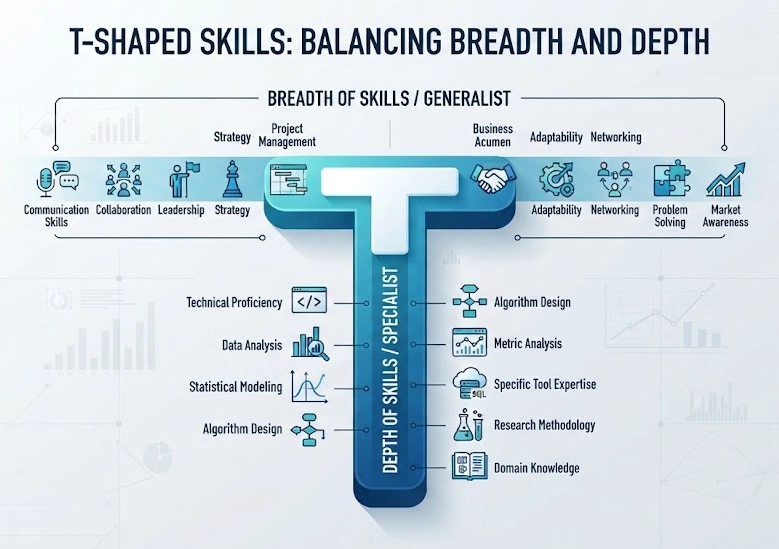
The dashboard's architecture is built on the principle of T-shaped attention (T-Shaped View).
The T-shaped concept (T-shaped specialist) describes a profile through two axes — horizontal and vertical:
- Horizontal bar ("—" width): this is the overall vision and broad scope of the data.
- Vertical bar ("I" depth): this is the narrow purpose and specialization, or data expertise.
This lets you use the dashboard for quick KPI monitoring or for full-fledged analysis of the data in each report:
Horizontal level – the dashboard's main page (broad overview of current values):
- Why it's needed: To give you an overall picture of business health in 5 seconds, without overloading you with detail.
- What you get: You can immediately see which metrics are in the "green zone" and which require urgent attention.
- Your benefit: Saving energy and time. You don't need to open dozens of reports to quickly and easily understand the overall picture of the current sales situation.
Vertical level: – child screens (deep dive into analysis):
- Why it's needed: To give you comprehensive answers to questions like "Why did this metric change, what does it correlate with, and what does it affect?" without needing to pull your attention away from the dashboard and spend time on other reports in other documents and programs.
- How to get there: In one click — just click on the KPI card you're interested in on each page, using them as the dashboard's main menu.
- What you get: An isolated environment for working with one specific metric: expanded, easy-to-read charts and graphs, expense/income breakdowns, micro-trends, and drill-down to individual transactions.
- Your benefit: A comfortable environment for making more accurate decisions. You dive into context only when you truly need to, and find the root cause of deviations without unnecessary informational noise.
It's recommended that all dashboards initially be built as multi-screen dashboards following the T-shaped principle — this matters a lot for the user. Especially since Excel makes it possible to implement this using worksheets and internal links, without using macros.
Correlation between revenue and advertising expenses
The first data visualization block is dedicated to advertising expenses:
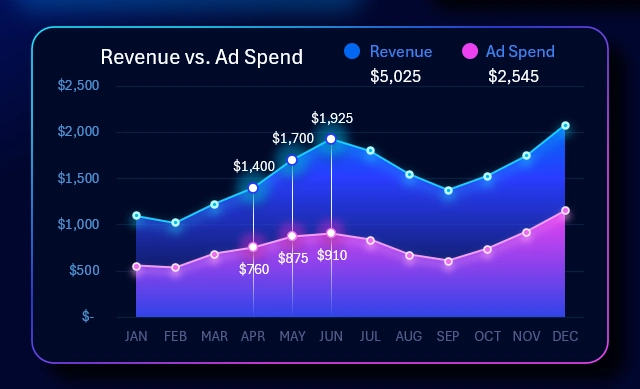
Prioritizing attention to expenses is very wise in digital marketing. If expenses cause a 50% drawdown in capital, then restoring that capital to its previous level will require 100% net profit growth.
Be careful with advertising expenses! Digital marketing is always a zone of risk and hypotheses, where there are no guarantees, and responsibility is easily shifted around.
If you want to track the correlation between revenue and advertising expenses in detail, use the dashboard's child screen for a deep dive:
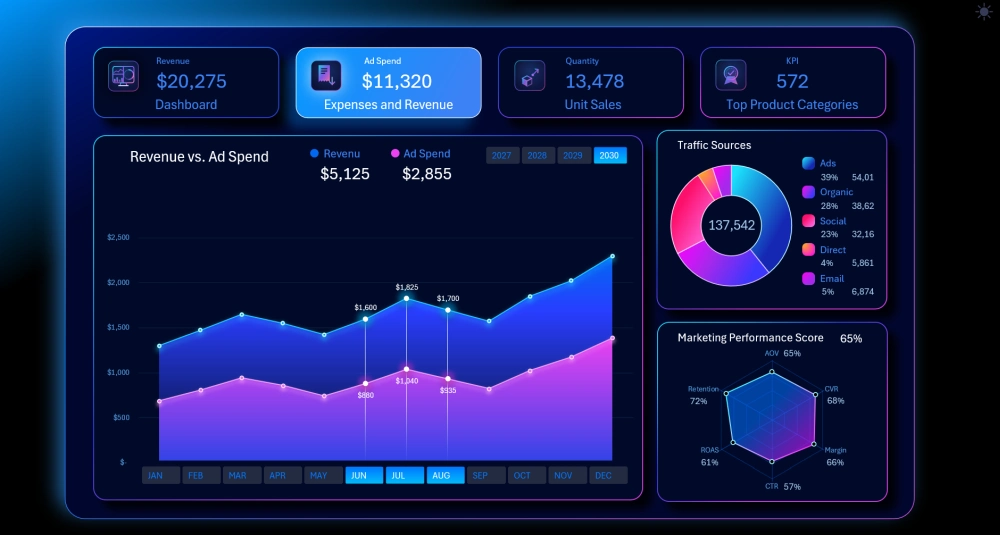
In the dashboard header, click on the corresponding KPI card.
Product sales in units
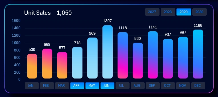
A sales report in units should not be underestimated compared to sales in dollars. After all, this is how we get the ability to evaluate the popularity of our products.
Example: Selling 100 units of a product at $10 each and selling 1 product for $1,000 both generate the same revenue ($1,000). But in the first case, you have 100 touchpoints with customers:
- Packaging-based advertising works better.
- Your base for repeat orders grows.
- The number of reviews increases.
- The word-of-mouth effect grows — the main source of trust, which can't be bought with advertising.
Meanwhile, in the second case there's only 1 touchpoint, and that's far too little for meaningful analytics statistics.
And in digital marketing analytics, this is very important — it's called demand volume analysis (Volume / Units) in conjunction with LTV (Lifetime Value) and Customer Acquisition Cost (CAC).
If needed, monitor unit sales volumes on the corresponding dashboard screen:
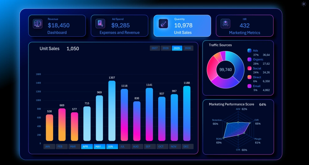
There's a joking expression among business analysts: "There's no statistic more deceptive than one measured in dollars." Every joke has a grain of truth, and the rest is true too. That's because a sales report measured in dollars is very easy for managers to manipulate to create a nice-looking picture of sales at the end of the month in order to receive bonus rewards for exceeding plans. That's why it's also important to track unit sales figures for products sold.
Ranking of the best product categories
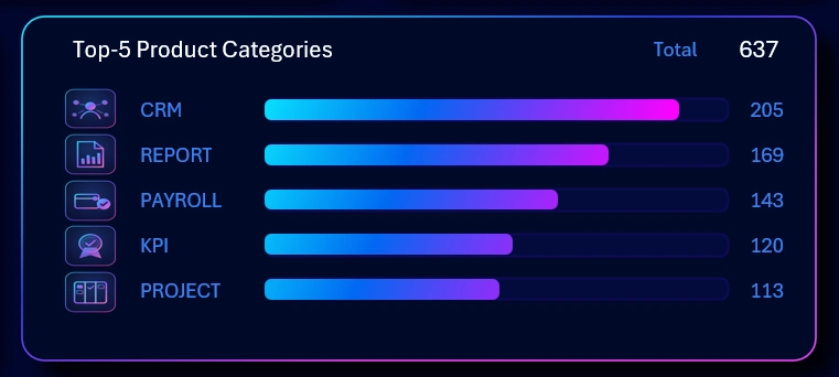
Here, the visualization is built so well that it barely needs words to describe it. The further the bar chart's scale shifts to the right, the stronger the sales skew toward a single top category. It's highlighted in bright red accordingly, to draw attention to the imbalance. Sometimes that's good, sometimes it's bad. It all depends on the current tasks of marketers and salespeople.
The main screen shows a ranking of the top 5 most successful product categories. Each category has not only its own name, but also a unique themed icon.
All the category icons are created in vector graphics. This means the metrics presentation can be used on large-format screens without any loss of graphic quality when scaling.
The child screen already displays a ranking of the top 10 best-selling product categories:
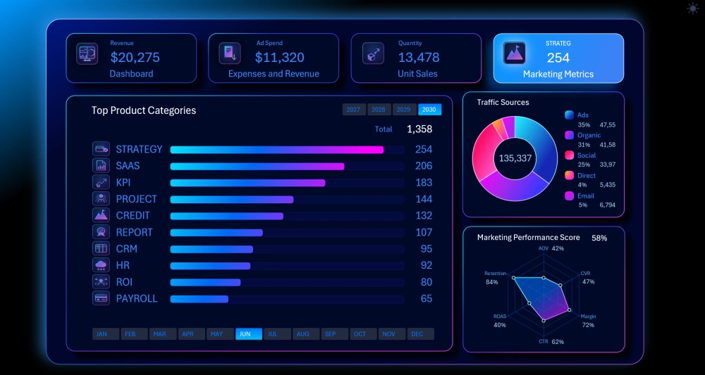
This makes analyzing the sales success of product categories even more convenient and informative for the user.
The value of graphic design for data visualization
Different dashboards require different designs. Understated minimalism in pastel colors, or a bold, eye-catching futuristic neumorphism for impactful presentations, or any other UI design, is always valuable in its own way. Each of them has its own role. And it's not just style or direction that determines value — it can also be the structure, color palette, or overall character of the design.
For example, light tones are valuable for the user working during the daytime. Here's what the light version of our template looks like:
To see all of the above in action, try the ready-made solution:
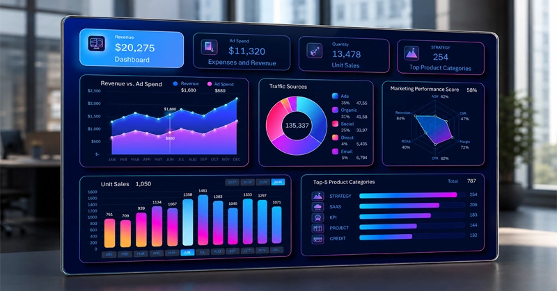
Download the digital marketing dashboard template in Excel 
Use this template for hands-on learning of data visualization development in Excel. Change the settings and formulas to fit your specific needs and conditions. Fill in the source values on the Data worksheet. But afterward, don't forget to refresh all pivot tables using the CTRL + ALT + F5 shortcut, on the Control sheet.
Data Visualization Charts for Interactive Report Creation in Excel.
Dashboard Templates