Medical Dashboard for analysis of patient history in Excel
Interactive data visualization for analyzing health indicators based on medical history data will be useful not only for the doctor, but also for the patient himself. After all, it is the patient who is primarily responsible for his health.
Visualization of medical history analysis data in Excel
In order to understand the principle of operation of the medical dashboard template in Excel, we first simulate the situation.
We have baseline data obtained from the patient's medical history for a period of 1 month (November 2020). It is necessary to fill in the table in the template so that the dashboard visualizes certain basic indicators of the patient's health on the main sheet.
In the medical dashboard, it is possible to group daily values data in periods of up to 7 days (for example, by weeks or 5 days, and at least 1 day) to get their average values. This will prevent the so-called statistical “noise” and also filter out statistical outliers.
The table for filling in the template is on the “Data” sheet. And it consists of 17 columns:
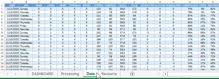
- DATE is the current day in history.
- DAY is the day of the week.
- BRAIN - indicators of the state of the brain (level 5 - excellent, 1 - very bad).
- LUNGS - indicators of the level of lung condition according to a five-point assessment system.
- HEART - indicators of heart health.
- STOMACH - a condition of the gastrointestinal tract.
- KIDNEY - the current state of the kidneys.
- SYSTOLIC - systolic blood pressure.
- DIASTOLIC - dystonic pressure values.
- CELSIUS - Celsius body temperature.
- PULSE is the average daily heart rate per minute.
- LEUKOCYTES - the number of points of deviation from the norm of leukocytes in the blood (value 0 means normal, -3 deviation downward from the norm, 3 - above the norm).
- GLUCOSE - blood glucose level.
- HEMOGLOBIN - the level of deviation from the norm of the hemoglobin indicator.
- CHEERFULNESS - results of cheerfulness tests.
- STRESS is the patient's stress level.
- REACTION - indicators of the patient's neurological response.
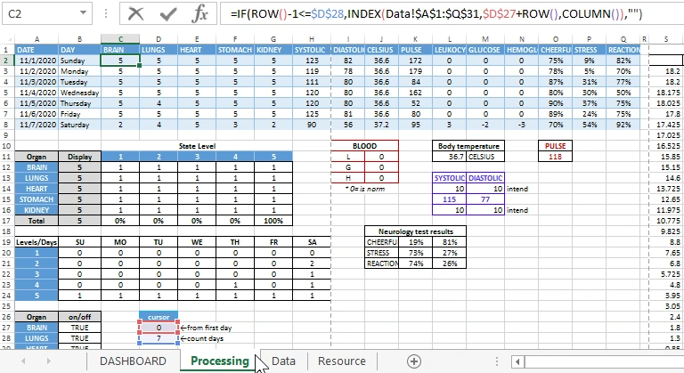
All data on the history of the disease from the table, by the sample formulas, are transmitted and processed on the “Processing” sheet:
Further, after the selection of processing, the health history data is presented on the main sheet "DASHBOARD".
Instructions for working with visual analysis on a Dashboard
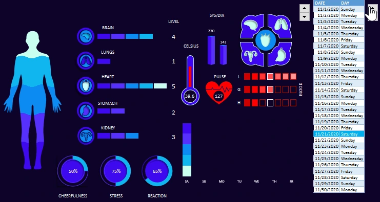
All 15 indicators of the patient's health status are visualized on the dashboard:
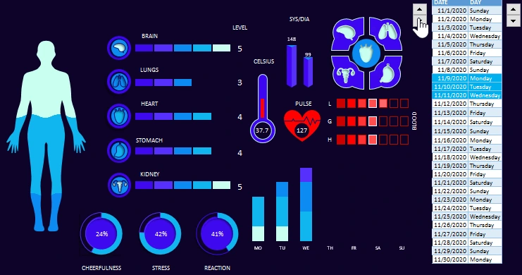
How to read this dashboard? As an example, let's start analyzing the patient's condition by visualizing data from left to right.
The infographics in the form of a silhouette of a human aura informs us that, in general, the patient's health is below average. The proportion of the state of work of organs requiring attention is more than 50%.
Next to the aura are the scales of the state levels of 5 organs:
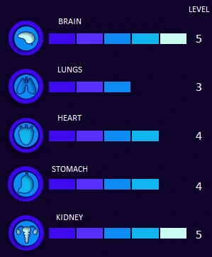
Each level has its own color, and it corresponds to the colors of the aura. The maximum level of 5 has the lightest color, and the minimum is 1 - the darkest shade (worst indicator).
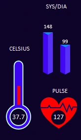
On the right side are the values:
- temperature;
- systolic and dystonic blood pressure;
- indicators of the average daily heart rate.
And also 3 scales - these are the states of the levels of blood indicators (increased / decreased and 0-normal white square):
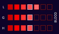
A general blood test can immediately determine whether a person is healthy and or sick. There is not a single disease that has not affected the patient's blood condition. By the blood of a person, you can determine a lot of data about his health and well-being. In this example, the 3 most important blood indicators are considered:
Leukocytes (L) are white blood cells that ideally kill viruses and bacteria:
- above the norm - there is a fight against bacteria and viruses;
- below normal - the immune system is weakened.
Glucose (G) is an energy source for cells:
- above the norm - metabolism is disturbed;
- below normal - the work of the brain and nervous system is disrupted.
- Hemoglobin (H) is a protein that transports oxygen from the lungs:
- above normal - increased blood density and viscosity;
- below normal - a lack of iron and oxygen in the human body.
Above, there is a panel for turning off and attracting indicators of the state of organs in a visual analysis on a dashboard:
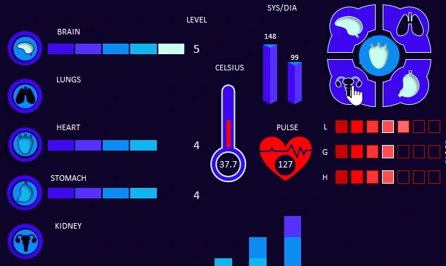
If the organ icon is not highlighted in color, but only dark (as in this case, the lungs and kidneys are turned off in the figure), then the data on this organ are excluded from the analysis of the patient's current state.
Below are 3 diagrams showing the psychological and neurological state of the patient according to the test results:

- Cheerfulness.
- Stress level.
- The patient's physical response.
In modern medicine, it is equally important to evaluate, monitor and improve indicators of the neuropsychiatric state. Positive therapy is actively gaining popularity and has already proven itself successfully. Re-tuning the patient's mood allows the release of the right vital hormones to be naturally and naturally stimulated.
It is not for nothing that the ancient yogis called harmonious glands energy centers. The human psyche is strengthened, new forces appear to fight diseases.
A holistic approach in medicine today can increase the chances of recovery by more than 30% without side effects. It is important to note that this result is achieved without medical intervention, which in 100% of cases gives side effects - since any medicines and pharmaceutical preparations are harmful to human health.
On the very right side of the dashboard is a table, which is a timeline with an interactive cursor:
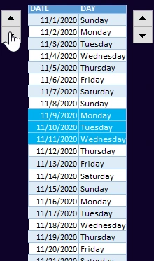
The interactive “counter” cursor control on the left side allows you to move the cursor along the scale to select a date range from the medical history for analysis on the dashboard.
The second interactive element on the right allows you to control the size of the cursor, thus setting the span of the range of selected dates. In this case, it is 3 days - as shown in the figure (maximum - 7 days, and minimum - 1 day). This means that all the values on the dashboard are the average for the selected accounting period.
And finally, the last graph is a display of the presence of days with poor indicators of the level of organ health:
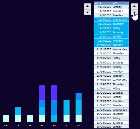
This graph should be read like this:
- If there are no bad indicators then only one lightest color tone.
- If there are, in addition to good and bad indicators, then light tone plus dark colors are bad with their share in relation to the number.
- If there is no good indicator then there is no lightest color tone (as for example on Sunday in the picture).
Despite the fact that the dashboard data is grouped by expanding the cursor range (up to 7 days), thanks to this schedule, you can control each day of the group in a section, so as not to miss special days that require attention. Then you can reduce the range of dates selected by the cursor to the 1st day and analyze in detail only one day for all 15 indicators on the medical dashboard.
This dashboard is not a perfect solution, but it encourages new ideas in the field of visualizing medical analysis data:
 Download a medical dashboard for visualizing patient analyzes in Excel
This dashboard template will not be a perfect tool, but it does generate interest for modernization and refinement. It can serve as a good prototype for a real healthcare software product. That is why macros are not used in it, and all tables with formula processing are detailed with headers and comments. Use this prototype freely to implement the best data visualization ideas for medicine.

Data Visualization Charts for Interactive Report Creation in Excel.
Dashboard Templates