Payroll Report Template with Example for Salary Summary
A payroll report is important for a company. It helps effectively track and manage employee payments. This article features an interactive dashboard template for presenting the report with a payroll summary example. This visually appealing and functional report will help you structure data to improve key metrics analysis. By using this template, you can quickly consolidate data from different reports to effectively present results to management.
Structure of the Payroll Summary Report Template in Excel
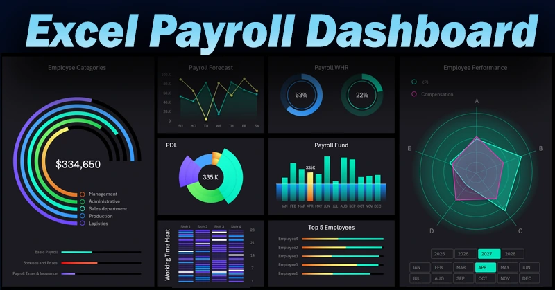
This beautiful and interactive dashboard template serves as a control panel for payroll summary reports, providing a helicopter view of budget efficiency. Business management can quickly assess the situation and make reactive strategic decisions.
The structure of the payroll summary report consists of eight data visualization blocks:
- Employee categories.
- Payroll expense forecast.
- Work time analysis.
- Salary budget distribution across company departments.
- Payroll fund.
- Heatmap of daily work activity within the company.
- Top 5 best-performing employees ranking.
- Distribution of KPI metrics and compensation across employee categories.
Next, we will examine each data visualization block on the employee payroll dashboard in detail.
Financial Distribution by Employee Categories
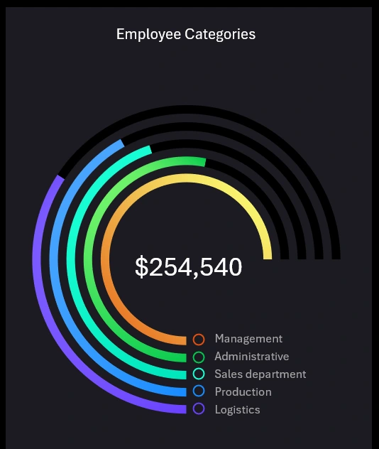
In this data visualization block, we analyze which employee category received what share of financial resources as an investment in payroll during each accounting period. This example presents five basic employee categories within the company:
- Management.
- Administrative staff.
- Sales department.
- Production department.
- Logistics and supply department.
Below is a horizontal bar chart for a comparative analysis of overall expense components:

- Base payroll.
- Bonus and incentive payments.
- Tax expenses and insurance contributions.
Useful Tip! Abnormal fluctuations and statistical outliers in overall figures are easily tracked over short time-frame accounting periods.
Weekly Payroll Expense Forecast
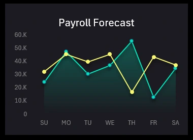
This chart allows for a comparative analysis of projected average payroll expenses for the upcoming workweek, as planned during Monday’s briefing. The graph shows the difference between the forecast and actual reality. The green line represents the forecast, while the yellow line shows actual values.
Statistics always reveal work hour activity trends by day of the week. However, when predicted hypotheses collide with reality, business operations often introduce unexpected adjustments to our plans.
Comparative Work Time Analysis
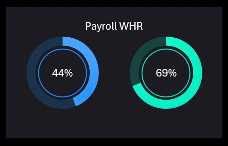
Two charts are displayed for comparison based on two indicators:
- Blue chart – Normative worked hours as a percentage of total working hours.
- Green chart – Payroll based on actual worked hours as a percentage of the total payroll fund.
When changing the accounting period on the dashboard, the data updates automatically according to historical statistics.
Payroll Budget Allocation by Company Departments
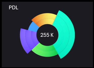
The example presents only 5 department categories. Each department is assigned its own sector color in the chart:
- Head Office – turquoise.
- Regional Offices – green.
- Regional Branches – purple.
- Remote Employees – blue.
- Outsourcing – yellow.
The center displays the total allocated payroll budget for company department employees.
Summary Report: Payroll Fund
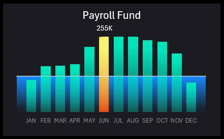
The chart visualizes payroll fund deviations from the planned average annual level. Here, you can analyze how the payroll fund changes throughout the year. You can also compare each month to the annual average level. This helps identify peaks and declines, understand seasonal fluctuations, and detect potential anomalies.
Practical Application: This visualization helps HR or financial analysts track payroll overspending or underspending. This scenario is useful for analyzing salary trends, overtime, or other factors.
Heatmap of Daily Work Activity at the Company
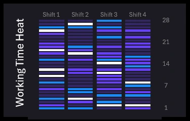
The heatmap displays four work shifts over a 28-day reporting period.
Reports often use a 28-day reporting period. This is a standard timeframe for monthly calculations used in financial and operational cycles.
The 28-day period is also based on the average number of days in a month. While most months have 30 or 31 days, 28 days (or 4 weeks) is a more convenient number for calculations as it divides into even weeks. The Y-axis on the right shows the start and end days of the workweek (1,7,14,28).
Additionally, a 28-day period allows for clear, repetitive cycles, such as weekly data analysis or weekly metric calculations, making reporting more convenient.
Data for a 28-day period is also easy to visualize on a dashboard since each data segment forms a structured and visually appealing design. As a result, everything fits neatly into any presentation design while maintaining the economic meaning of indicators. This is the ideal solution for calendar discrepancies.
Each cell in the heatmap is assigned a color representing deviations from the standard number of worked hours per shift for one workday:
- Underwork.
- Standard hours.
- Overtime.
- Excessive overtime.
This visualization helps identify how work hours are distributed across shifts and detect potential scheduling or efficiency issues in the company's labor organization system.
Top 5 Most Successful Employees at the Company
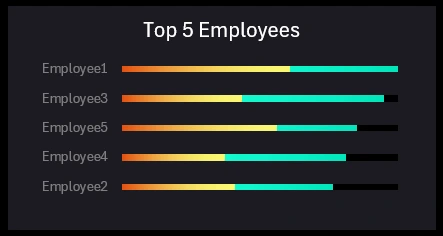
Employees should be rewarded based on their level of responsibility and the complexity of assigned tasks. This is important for maintaining motivation—not only to complete tasks effectively but also to stay engaged in their role. Payroll supports only external motivation, while job status, aligned with proven professional skills, enhances internal motivation. Bonuses and incentives highlight an employee's well-earned status. In essence, bonuses and incentives provide feedback, signaling that management has recognized and fairly rewarded the employee's professional contributions.
Employee success is primarily measured in money. There are no successful yet poorly paid managers. This employee ranking visualization block presents not only their income in descending order but also segments payroll into two components:
- Bonus and incentive payments – yellow.
- Base monthly salary – green.
The sum of these two components determines an employee's success level at the company. If an employee frequently receives well-earned bonuses exceeding their base salary, their professional achievements should be examined. It may be worth considering a salary increase or even a promotion (depending on the situation).
Distribution of KPI Metrics and Compensation by Employee Categories
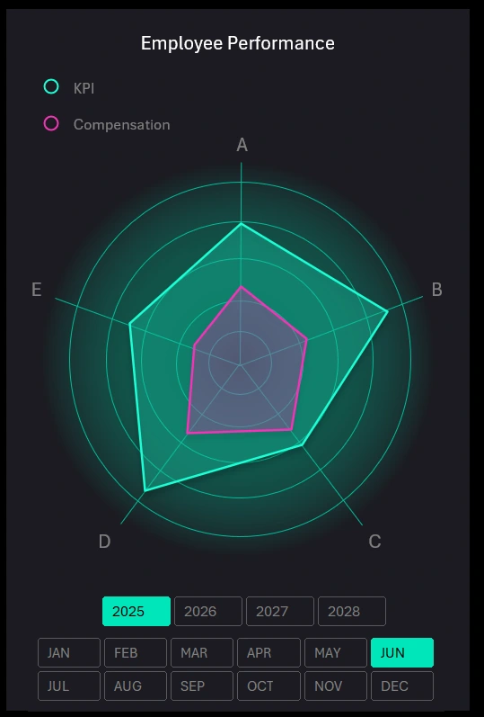
This is a radar chart displaying five categories for two interrelated metrics.
The five categories represent the same employee groups (A - Management, B - Administrative Staff, C - Sales Department, D - Production Department, E - Logistics Department). The two distribution curves represent two linked indicators.
- Key Performance Indicators (KPIs): Productivity, number of completed tasks, or achieved goals – green line.
- Employee Costs: Base salary, bonuses, incentives, travel expenses, etc. – pink line.
In a well-organized employee compensation system, KPI metrics should determine compensation levels. This report helps track and maintain a balance between work results and payments. Comparing KPIs and compensation helps assess how effectively company resources are allocated based on employee performance.
Visualization of inefficiencies or overspending: For example, if employees with high KPIs receive fewer bonuses, it may indicate an issue with the compensation system.
This visualization block also includes dashboard control elements through interactive slicer buttons in Excel pivot tables.
Payroll Analysis Dashboard in Excel
This payroll report scenario is useful for analyzing how well the motivation and compensation system aligns with actual employee performance. The Excel dashboard helps HR departments and managers identify discrepancies, assess payment efficiency, and monitor employee engagement.

Download the Payroll Report Template in Excel 
This interactive dashboard approach to Excel reports allows for detailed exploration of the link between work performance and actual payments. A timely visual report can be a key factor in optimizing the motivation system and improving overall company productivity.
Download the payroll dashboard template. Analyze employee salary data interactively in Excel.
