Personal Finance Management with Envelope System in Excel
One of the most effective techniques for managing personal finances is considered to be the Cash Envelope System. We've transferred its advantages to an integrated dashboard in order to increase the effectiveness of achieving personal financial goals with multi-level control of income and expenses.
Cash Envelope System dashboard in Excel
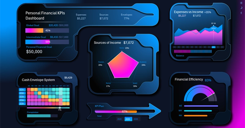
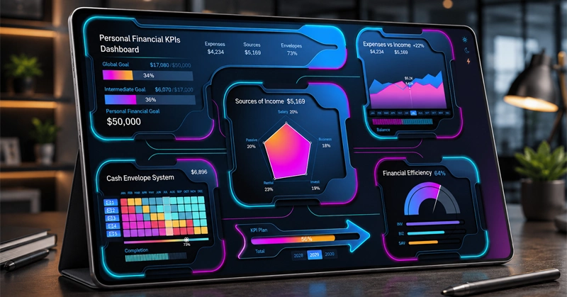
The dashboard is designed for managing personal finances using the 5-envelope technology — the Cash Envelope System.
How the classic envelope system works
- Defining categories: You prepare physical (or digital) envelopes for flexible everyday expenses: "Groceries," "Basic Needs / Utilities," "Leisure and Entertainment," "Short-Term Goals (up to 1 year)," "Long-Term Goals (1+ year)."
- Limit per period: At the beginning of the month (or after each paycheck), cash is withdrawn and divided among the envelopes in strictly defined amounts.
- The main rule: When the money in a particular envelope runs out, the limit is exhausted — you can no longer spend on that category until next month (or you'll have to move money over from another envelope, cutting other spending).
To manage the 5-envelope system, the dashboard uses a heat map with an interactive legend that clearly shows the state of your personal financial health. The closer to green, the better your personal finance management metrics.
The remaining visualization blocks are no less important, so let's go through them all step by step.
Financial goals summary
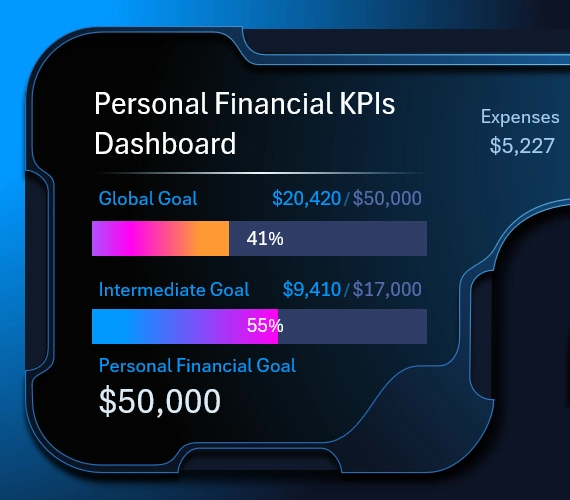
In this version of the dashboard design, the summary information blends seamlessly with the header and main menu into a single data visualization block.
The horizontal bar chart consists of just two progress bars:
- The top progress bar – is responsible for progress toward the global long-term goal: for example, building an investment portfolio of $50,000.
- The bottom bar – visually shows progress toward closing the intermediate goal for the current year.
All big goals need to be broken down into smaller intermediate tasks.
Every goal should be ambitious so that it serves as a source of energy — that's the job of the big, global, long-term goal. At the same time, a goal should be achievable so that it serves as a source of belief in the outcome — that's the job of the intermediate goals. That's all you need in this life! Set your goals correctly and live playfully.
If you don't know what to do to achieve your goals, you need to experiment. But if you know what to do and aren't doing it, you need to set your goal correctly. Then it will give you the energy to take action and the belief to defend against obstacles on the way to achieving it.
The expense-to-income ratio — a mandatory indicator
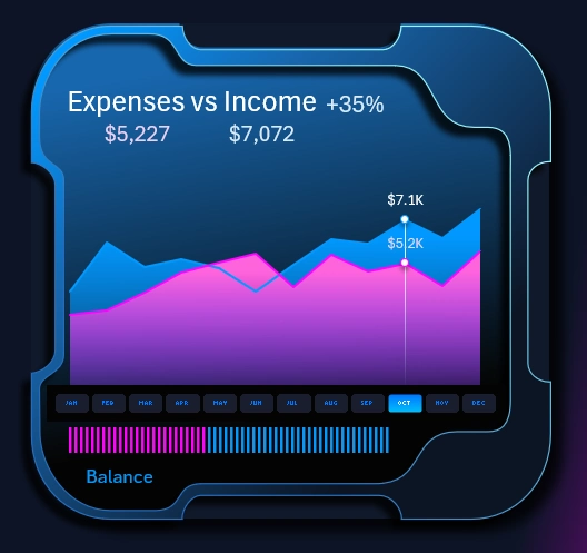
If the dashboard's main purpose is working with personal finances, you should always add a chart for monitoring the ratio of expenses to income. Persistence matters more than genius! No matter how brilliant your goal is, you must stick to the main rule of financial well-being — income must always exceed expenses. Everything else is just a matter of scaling. Don't let yourself be blinded by the brightness of an ambitious goal, so that you don't forget to regularly monitor your expenses.
This visualization block contains control buttons for selecting the month to analyze on the dashboard. The authority of the button block extends to all the other visualization blocks on the dashboard and on all its child screens.
The dashboard provides you with an entire separate screen for diving into the expense and income report:
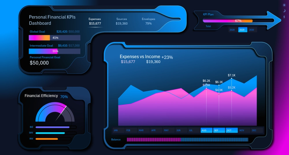
The line chart displays the dynamics of changes in the metrics. The horizontal bar chart at the bottom shows the final balance of the income-to-expense ratio for the currently selected reporting period.
Distribution of income structure by source on a Radar chart
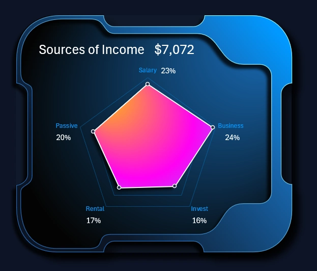
Controlling expenses is very important, but controlling income is just as important. After all, you can't keep cutting expenses indefinitely in response to a drop in income. You'll quickly hit a minimum plateau. That's why income needs to be scaled and controlled.
This radar chart lets you perform a comparative analysis across five income metrics from different sources at the same time. Here you can easily identify your best growth points by comparing the top sources against the rest.
You can see more detailed information about income sources on the corresponding dashboard screen:
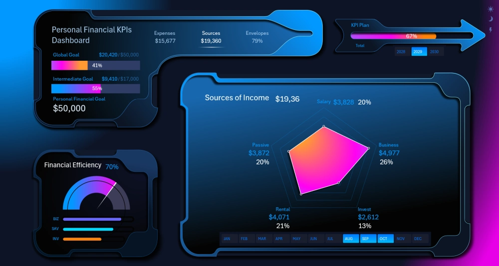
In this format, the report is convenient to showcase and present when needed.
Heat map for the Cash Envelope System
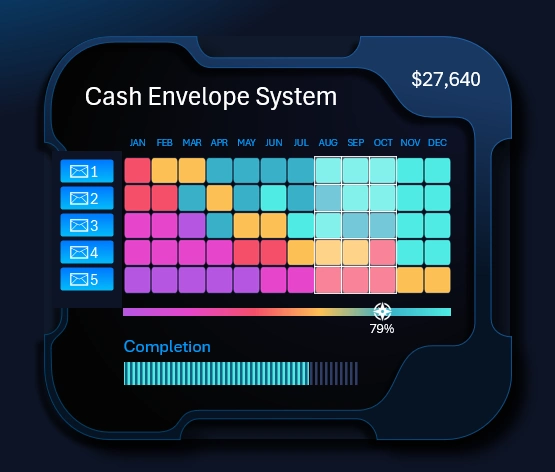
Let's look at how to analyze your personal financial health using the five-envelope system in Excel.
The Y axis shows the 5 envelopes, and the X axis shows the 12 months of the current year. Each cell of the heat map is colored according to the envelope's fill level. The interactive legend clearly shows that purple at the beginning means a low level, and bright green at the end means a high fill level.
When you select any envelope or group of envelopes for any month or quarter, the interactive legend's cursor shows the corresponding color for the average value of that data.
The transparent cell cursor highlights the selected months and envelopes directly on the heat map for convenient analysis. If you click on one of the envelopes, only that one selected envelope will be highlighted by the cursor on the chart. And the legend will show its average fill level for the selected reporting period: a month, quarter, half-year, or full year.
The envelope control buttons work strictly locally. Their authority doesn't extend beyond the boundaries of the heat map visualization block. In this template, the envelopes don't affect other visualization blocks. But they also have their own personal screen for a deep dive into the system's results:
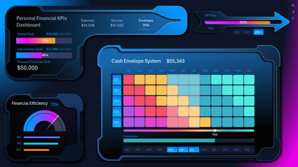
How is the color scheme interpreted?
The colors show the status / fill percentage (or the percentage of remaining/accumulated funds) of the envelope in each month, following a gradient principle:
- Purple: Critical / zero level (minimum balance).
- Magenta: More than 0 left at the end of the month.
- Coral: Low level (the envelope has too little, needs attention, or was overspent).
- Orange: Medium / transitional level (moderate balance / partial fill).
- Azure: Good / high level (high fill level, excellent savings progress).
- Light turquoise: Full / close to 100% fill (goal achieved, the color of maximum stash).
The main pattern: A smooth trend diagonal
The chart clearly shows a diagonal wave of budget recovery (moving left to right and top to bottom from purple-red tones to blue ones):
1. Envelope 1 (Top row — Groceries):
- January: Red (a rough start to the year, likely heavy holiday overspending).
- February — April: orange (stabilization, basic management).
- May — December: Consistently azure / turquoise (full control over food spending through the end of the year).
2. Envelopes 2 and 3 (Basic Expenses and Entertainment):
- At the start of the year (January–March) they had a deficit / overspending ( red/pink).
- By May–June they confidently moved into the blue (safe) zone.
3. Envelopes 4 and 5 (Bottom rows — Short-Term and Long-Term Goals):
- January — April: In the purple-red zone (there were no savings, or the funds were taken from them for current needs).
- May — July: The savings process began ( orange color predominates).
- August — December: Reached the stable blue savings zone.
Main takeaway of the Cash Envelope System analysis
- First third of the year (Jan–Apr): A period of cash gaps and ramp-up. Money went mostly to basic consumption, and the savings envelopes sat empty ( pink-purple colors).
- Turning point (May): The system started delivering results. Filling began from the top down.
- Second half of the year (Jul–Dec): The financial model reached ideal capacity. All 5 envelopes are in the green-blue safe zone (savings are growing, and operating envelopes aren't being emptied early).
Next, we'll analyze the heat map alongside other indicators.
Speedometer chart of personal finance efficiency
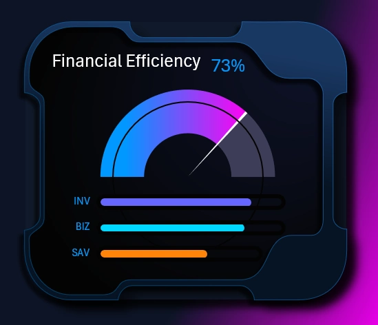
On the speedometer chart, we can see how efficiently personal funds are being used when spent on:
- Investments.
- Business.
- Savings.
The higher the return on investment, the higher the efficiency.
These three assets for personal investing are shown below individually and are automatically sorted in descending order by efficiency, depending on the reporting period selected on the dashboard.
KPI plan progress toward the global goal
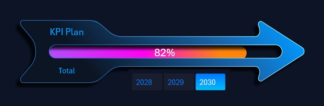
On this stylishly designed progress bar, we can see how we're progressing on the tasks set for achieving the long-term global goal across all three years. As you can see on the dashboard, as of July 2030, the main goal is at 70% completion, lagging significantly behind KPI plan completion of 82%. As a result, the plan had to be overfulfilled, but in the end the goal was achieved in December, and it was worth it. This happens very often. After all, we have direct influence over leading indicators like KPIs, while lagging indicators — financial goals — are subject to the influence of a larger number of external factors.
It often happens in life that to achieve a financial result, we simply increase the number of additional iterations of the tasks we have more influence over. As a result, more effort is spent than expected, but the goal is achieved, and that's what matters most!
Different design versions of the personal finance management dashboard
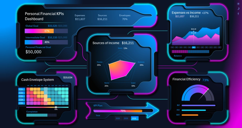
This dashboard template also has an attractive neon-style design version for presenting and standing out from the competition.
There's also a light design version for comfortable work during the daytime:
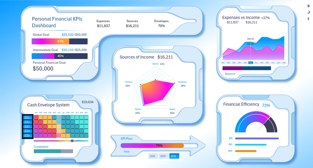
You can download and improve this template to fit your needs. For example, you can make all the visualizations tied to each envelope. But for that, you'll need to modify the structure of the source data table a bit. And don't forget to refresh all pivot tables with CTRL + ALT + F5:
Download the Cash Envelope System dashboard template in Excel 
Excel's capabilities provide the potential to implement the most unconventional ideas in personal finance management. Importantly, all of this can be done without using macros. Basic knowledge of pivot tables and some formulas is enough. It's also important to study chart settings in greater depth to get results like these. There aren't too many of these settings — to see for yourself, we recommend watching the video on our YouTube channel Excel Visual.
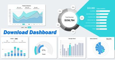
Data Visualization Charts for Interactive Report Creation in Excel.
Dashboard Templates