Quick credit usage analysis for small business in Excel
Not all Excel dashboards need to be comprehensive data visualizations. In business, the speed of effective decision-making and responsiveness is often more valuable. Minimum data, maximum value! This is especially relevant for small businesses, where even minor changes can have a greater impact. The following example presents an Excel template for a small dashboard designed to quickly assess the efficiency of using credit capital and monitor debt load through key summary KPIs.
Credit Utilization Tracker Dashboard in Working Capital
This mini dashboard template lets you quickly evaluate in Excel whether there were critical financial mistakes or sales spikes influenced by credit usage. For instance, when a bank loan is used to support seasonal sales or maintain financial stability during cash flow gaps. Borrowed funds in working capital require constant monitoring. If you had to use additional bank financing, you need to keep a close watch on it at all times.
List of indicators to evaluate the potential of quick-use mini dashboards:
- Monitoring the structure of basic expenses.
- Analyzing monthly revenue and profit trends.
- Available capacity and usage level of borrowed capital.
- Break-even point tracking.
- Sales plan performance.
- Profit margin.
- Current total debt amount.
Let’s look at the full structure of the small dashboard used to monitor critical business indicators in Excel.
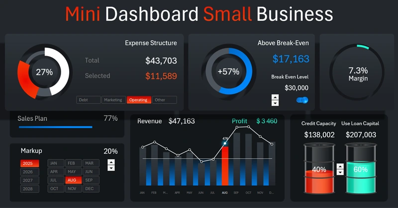
Small Business KPI Control Panel
The structure of the small dashboard is conditionally divided into two main parts:
- Dashboard header – interactive KPI card panel.
- Template body – data visualization with infographics.
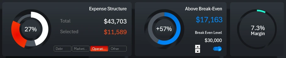
Expense Segmentation by Basic Categories
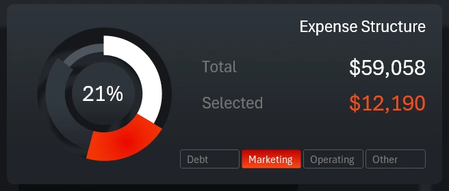
The first KPI card in the header visualizes expenses broken down into segments. The key thing to watch for: what share of expenses is taken up by debt obligations – highlighted in white to stand out from other categories.
The button block on the card does not apply to the entire dashboard. It works locally within the visualization block and is used to toggle between categories. You can select and analyze multiple expense categories at once by holding the CTRL key while using the tool.
Break-Even Control
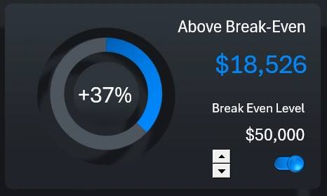
The central card is designed to monitor revenue above the break-even point for small businesses. The blue chart shows how much the break-even point is exceeded in relative terms. The blue number displays the absolute value – the difference between revenue and the break-even point.
This visualization block includes two controls: a counter and a toggle switch. Both controls affect the entire dashboard. The counter allows you to adjust the break-even level. The toggle switch hides the direct line on the main central dashboard visualization block. The break-even level is presented as an annual average.
Margin Indicator
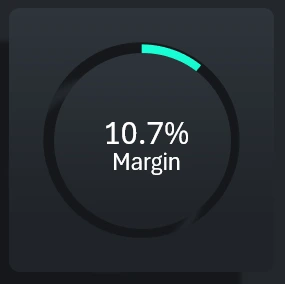
The last chart in the dashboard header shows the margin. This is the main profit indicator and a very sensitive metric when it comes to using borrowed working capital. Even if the sales volume plan is met and revenue is above the average break-even level, a negative margin means the business is unprofitable, not creditworthy, and on the path to bankruptcy. On the other hand, if the sales plan is not met but the margin is positive – the situation is not that bad, and there’s still potential to increase profit through additional credit investment to boost sales volume.
Next, we move to the second part of the dashboard, where more detailed data visualizations reflect the development of a small business under the influence of bank loans.
Sales Plan Progress Bar and Control Panel
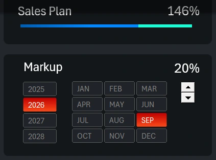
The sales plan is analyzed using a progress bar made from a structured horizontal bar chart. If the plan is overachieved (as shown in the image), the 100% completion portion remains blue, and the overachievement portion is highlighted in green. It’s crucial to monitor the sales plan. If the margin is relatively high but sales are low, it could mean the markup was increased to improve creditworthiness, which caused a drop in sales but raised the margin. As a result, total profit shrinks, and there’s a risk of revenue falling below the break-even point. Don’t forget that part of the profit must go toward paying loan interest.
Below is the data selection block for reporting periods: year, month, and quarter. There’s also another control – a counter for adjusting markup. This allows you to quickly model various small business scaling scenarios using additional credit resources.
Monthly Expense and Revenue Dynamics Analysis
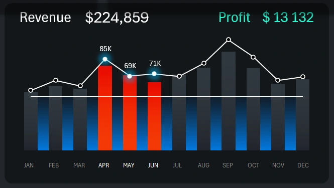
The central visualization block presents the dynamics of revenue changes in relation to expenses. It also displays the average annual break-even level as a horizontal white line on a blue background across all months. You can disable or adjust the break-even level in the central KPI card.
This block includes buttons for selecting reporting periods. The buttons are placed along the X-axis of the combined bar chart. Each bar includes a label showing the corresponding month. This setup is implemented using Excel PivotTable slicers, which support multi-selection. You can select multiple months for simultaneous analysis by holding down the CTRL key on your keyboard. For example, the illustration shows data selected for the second quarter only.
Infographic for Managing Credit Funds in Working Capital
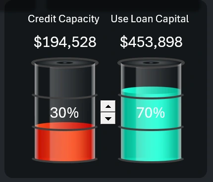
This infographic block allows you to manage the injection level of additional financing into working capital through small business credit.
It’s important to understand that when managing risks wisely, you should not use the full credit capacity at 100% right away. First, you should always keep a reserve for unexpected situations. Second, this approach is often inefficient and leads to reduced margins—because the more credit capital is used in operations, the more profit must be spent on loan interest payments.
Additionally, this block allows you to simulate different scenarios. For example, operating without credit or using only 50% of available credit capacity.
Mini Dashboard Presentation for Quick Small Business Analysis
As you can see, the relevance of such compact dashboards is very high! They might even be more popular than complex multi-screen templates with many visualization blocks and various types of charts and graphs.
Download the mini dashboard for quick small business analysis in Excel 
These templates with compact data visualization design are convenient for use on tablets and mobile devices, so they’re always within reach. That way, you can constantly keep your finger on the pulse of your small business. More similar compact dashboards with critical indicators are coming soon.

Data Visualization Charts for Interactive Report Creation in Excel.
Dashboard Templates