Exponential Moving Average Calculation in Excel Download
Exponential Moving Average (EMA) is an indicator for the technical analysis of statistical data on price dynamics in financial markets. The main difference between EMA and the standard Moving Average (SMA or simply MA) is that EMA gives more weight to recent data.
Let's explore Excel formulas for building EMA and MA indicator curves. As an example, we will create a template for practical use of the exponential moving average on a Bitcoin price chart in Excel. We will also examine Excel's capabilities for developing custom indicators with formula-based settings using statistical functions. Some strategies will even be suitable for safe futures trading. A ready-made template with formula examples can be downloaded as a single Excel file at the end of the article.
Example of Exponential Moving Average Calculation Formula in Excel
The EMA is calculated using a recursive formula:
Where:
- EMA_t — the current EMA value;
- P_t — the current price value (or other indicator);
- α (alpha) — the smoothing coefficient:
Where:
- n — EMA period (e.g., 10, 20, or 50 days);
- EMA {t-1} — the previous EMA value.
Now let's translate this formula into Excel format. But first, we'll create a template with initial data for examples and chart construction.
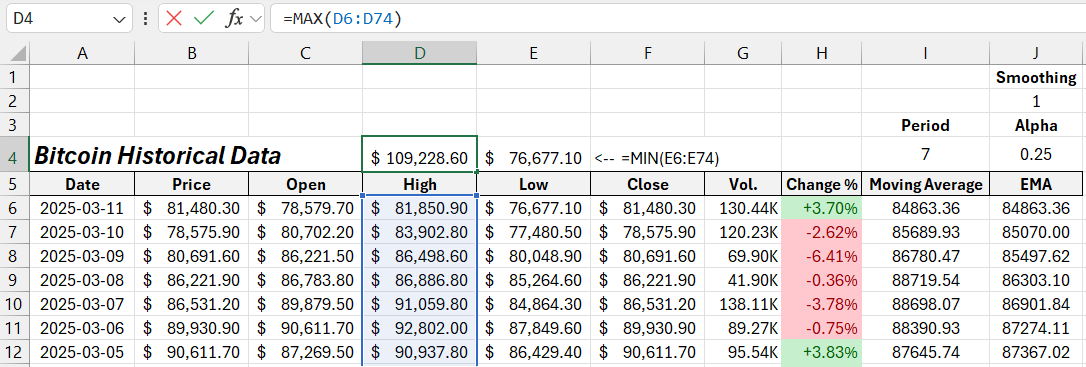
From a popular online financial market resource, we downloaded a assets futures price table for the past couple of months into the Excel range A5:H7:
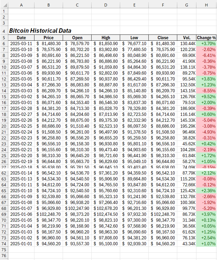
Note: The price values in column B are based on closing prices (they are identical)—a common practice in financial market analysis.
This table will serve as our data source for creating EMA indicator formulas in Excel.
The first step to easily understand the material is to create a formula for a standard MA curve based on current prices. EMA is an advanced version of the moving average indicator. For a comparison, see the technical specification table below.
Differences Between EMA and SMA Indicators
| Characteristic | EMA | SMA |
| Data Weight | More weight on recent values | Equal weight for all values |
| Response to Changes | Faster response to new data | Slower response to changes |
| Line Smoothness | Less smooth | More smooth |
Truth is known through comparison! Let's move from theory to practice immediately.
How to Calculate a Simple Moving Average (SMA) in Excel
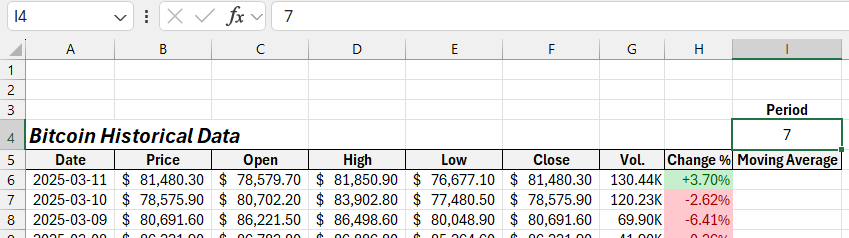
In cell I5, add a header for a new column in the original table and name it "Moving Average." In cell I4 above this column, enter a numeric value, for example – 7. We will use this number to specify the number of periods for the MA indicator curve. This value will be passed as an argument to the formula, but it is separated into a cell to allow for easy adjustment of the period length.
Next, fill the range I6:I74 in the last column with the following formula for the standard moving average in Excel:
=AVERAGE(OFFSET(B6,0,0,$I$4,1))
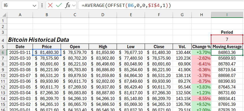
As a result, we obtain moving average values for a seven-bar period. By changing the value in cell I4, we can adjust the number of periods for the MA. Now, based on the obtained data, we will construct the exponential moving average curve.
How to Calculate the Exponential Moving Average in Excel
Add another column and name its header "EMA." The first cell should contain the same value as the first cell of the adjacent MA column. So, simply reference cell I6.
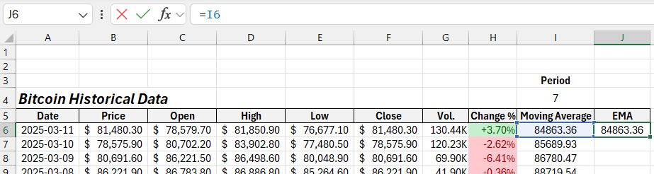
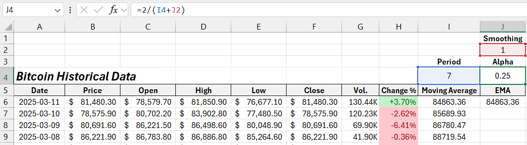
The formula to calculate EMA values will include an additional setting besides the period – smoothing. One of the formula’s arguments will refer to a separate cell to allow users to adjust this parameter. So, enter the value 1 in cell J2. Increasing this value will smooth the EMA curve for different trading strategy settings.
This parameter will be processed by a special formula that calculates the alpha parameter in a separate cell, J4. The EMA formula in Excel will reference this alpha parameter.
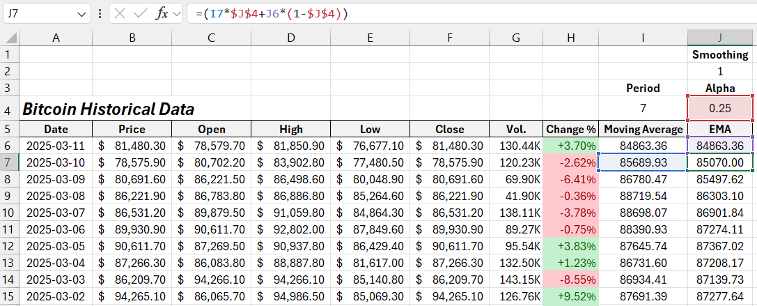
To fill all remaining cells in the last column within the range J7:J74, use the following formula to calculate the exponential moving average in Excel:
=(I7*$J$4+J6*(1-$J$4))
The most important step now is to plot the indicator charts and overlay them on the assets futures price chart based on the source table.
How to Create a Candlestick Chart in Excel
Each Stock Chart in Excel does not support creating combined charts. Therefore, we will use two separate charts overlaid on different layers. It is crucial to align the Plot Area and match the XY axes accurately. Let’s go through how to do this.
First, create a Stock Chart based on four price columns:
- Opening price.
- High price of the bar.
- Low price of the bar.
- Closing price.
How do you create a candlestick chart in Excel? It’s very simple! Follow these easy steps. Select the range of cells C5:F74 and choose the tool: Insert → Charts → Stock → Open-High-Low-Close:
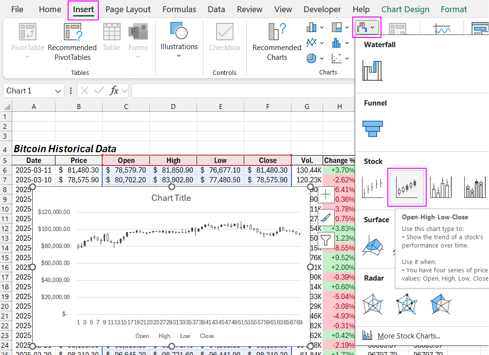
The candlestick chart in Excel is ready! Now, let's customize it.
Customizing the Candlestick Chart in Excel
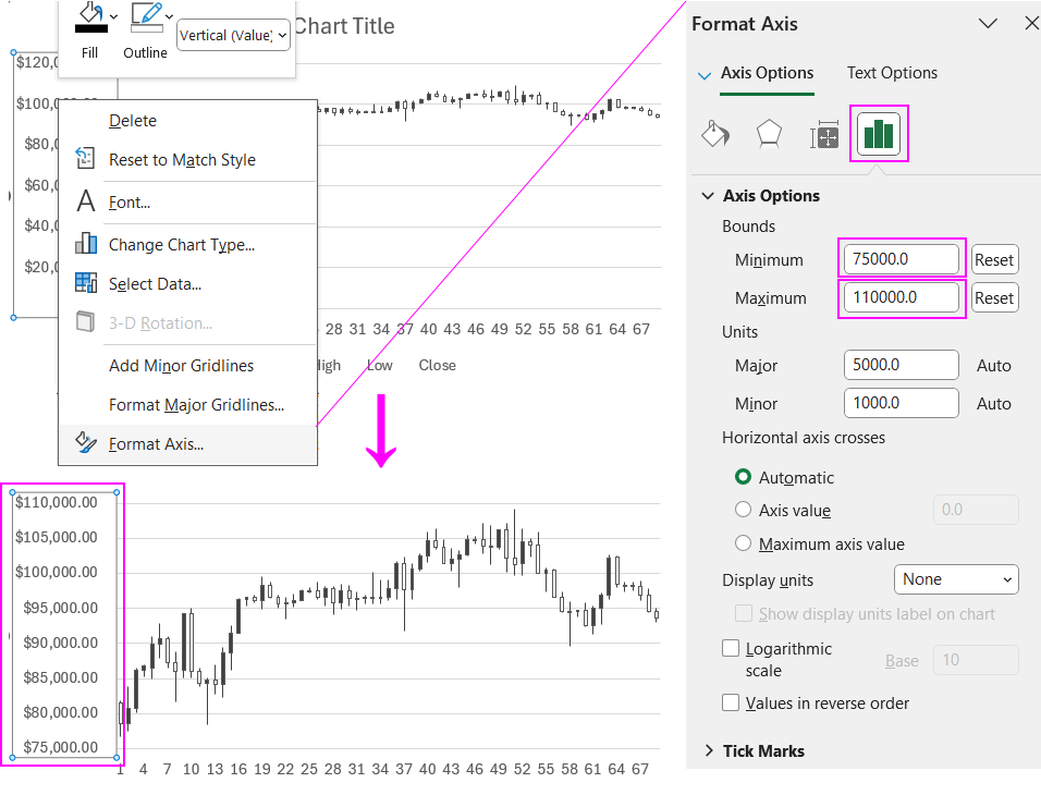
First, set optimal values for the Y-axis. We need to determine the maximum and minimum price values on the chart. The maximum value is found in the High column, and the minimum is in the Low column, respectively.
Based on these values, specify the minimum and maximum values for the Y-axis on the Stock Chart. Right-click on the Y-axis and select "Format Axis" from the context menu.
For better clarity, change the day values on the X-axis to dates. To do this, left-click on the stock chart to activate it and select: Chart Design → Data → Select Data.
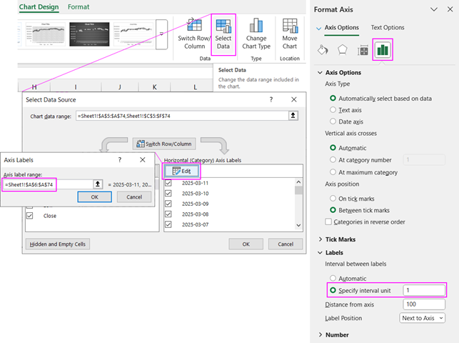
In the pop-up window, click "Edit" and in the Axis label range input box, enter a reference to the range of cells containing the date values:
=Sheet1!$A$6:$A$74
Also, don’t forget to adjust the data label settings for the X-axis. Open the "Format Axis" window and, in the "Labels" section, select the "Specify interval unit" option. Once the input box becomes active, enter the value 1. Now each candlestick will be labeled with its corresponding date on the X-axis.
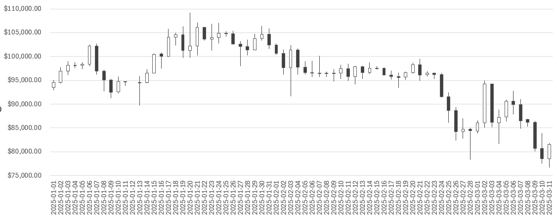
Note: The date order runs from right to left, as do all the values on the chart. This is the standard chart format for futures markets. The most recent and relevant values should be on the right side. Keep this in mind when overlaying the EMA curve chart! You will need to reverse the X-axis settings to achieve the correct order for the curve plot.
Exponential Moving Average Chart in Excel
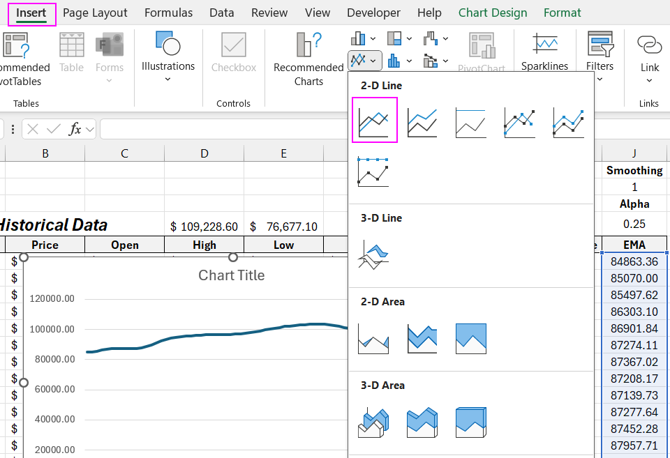
How to create an exponential moving average (EMA) chart in Excel? – It's very easy! Select the range of cells where the EMA formula returns its values in the last column of the table (J6:J74) and choose: Insert → Charts → 2-D Line.
The EMA chart is ready! Now we need to customize it to correctly overlay it on the candlestick chart we created earlier.
First, adjust the minimum and maximum values on the Y-axis, as we did before: MIN 75,000 and MAX 110,000.
Important! It is crucial to reverse the order of values on the X-axis. To do this, enable the "Categories in reverse order" option in the X-axis format settings:
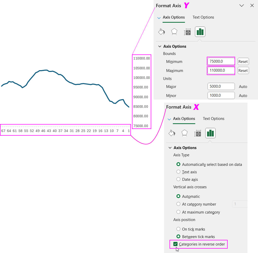
The candlestick chart is plotted from right to left, as is common for stock charts used in technical analysis of futures market prices. Therefore, our EMA indicator in Excel must also be plotted from right to left.
Next, set the chart background to a transparent fill color and remove any unnecessary elements.
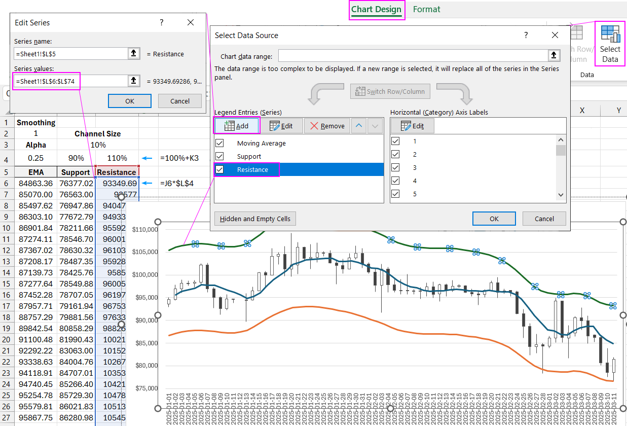
Now, let’s correctly overlay the exponential moving average chart onto the candlestick chart in Excel.
When overlaying, ensure that the visualization areas (Plot Area) on both charts align perfectly and completely.
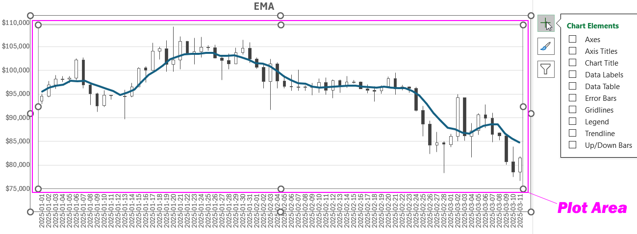
The exponential moving average indicator in Excel is now complete!
How to Create an EMA Channel in Excel
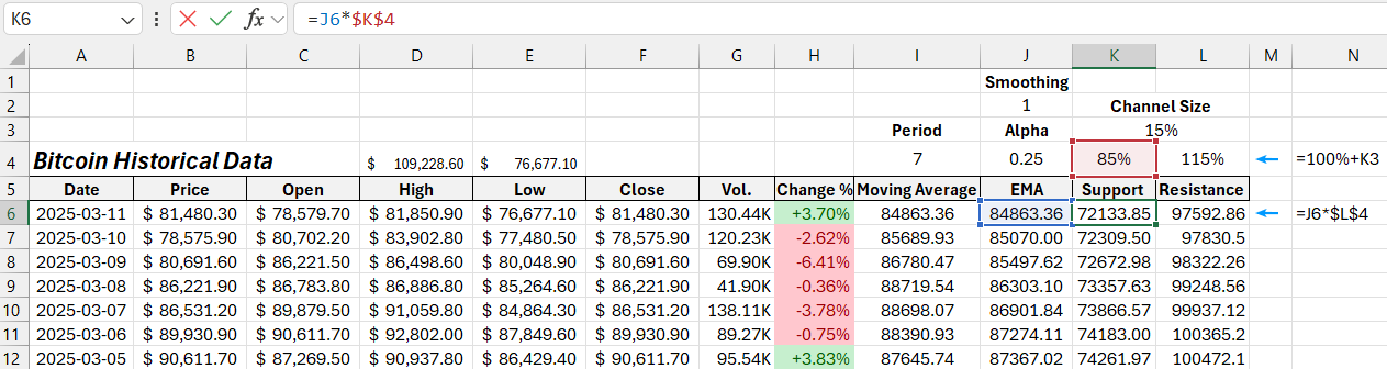
Now, let's modify the indicator by creating a channel based on the EMA curve. To do this, we need two additional columns with formulas to calculate the lower deviation (support level) and upper deviation (resistance level) of the channel.
We should also allow the channel width to be adjustable. So, we will set the channel width in a separate cell (K3).
Below this cell, we'll input formulas to calculate the support and resistance levels’ deviations from the moving average.
For example, if the channel width in cell K3 is set to 15%, the following formulas will apply:
- In cell K4:
=100%-K3returns 85%; - In cell L4:
=100%+K3returns 115%.
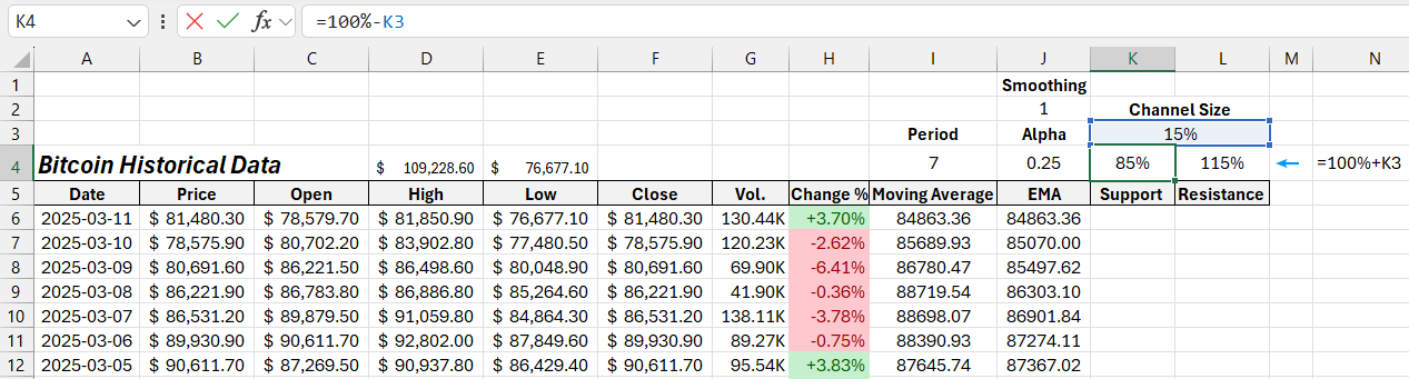
Now, fill both columns with a simple formula that multiplies the EMA value by the deviation percentage. Use cell K4 for the support level (=J6*$K$4) and cell L4 for the resistance level (=J6*$L$4). Populate the full ranges K6:K74 and L6:L74:
Based on the calculated data in these two new columns, plot two additional lines representing a 15% deviation above and below the EMA. Add these lines to the chart to form the EMA channel:
At first glance, it may seem simple to set equal margins from the average value to form a range and consider everything outside as statistical outliers. However, this approach is not suitable for practical business data analysis! Using this method can lead to cumulative errors during planning and implementation of business strategies. To solve this problem accurately, you should use the QUARTILE function—a more advanced calculation.
Learn how to calculate quartiles in Excel and what they represent by visiting this guide on quartiles in Excel.
Indicator Formulas in Excel for Safe Futures Trading
Following this principle, you can create not only EMA indicators in Excel but also your own custom indicators based on unique formulas.
Statistical Function: MEDIAN
A very simplified example is to use the MEDIAN function:
=MEDIAN(OFFSET(B6,0,0,$I$4,1))
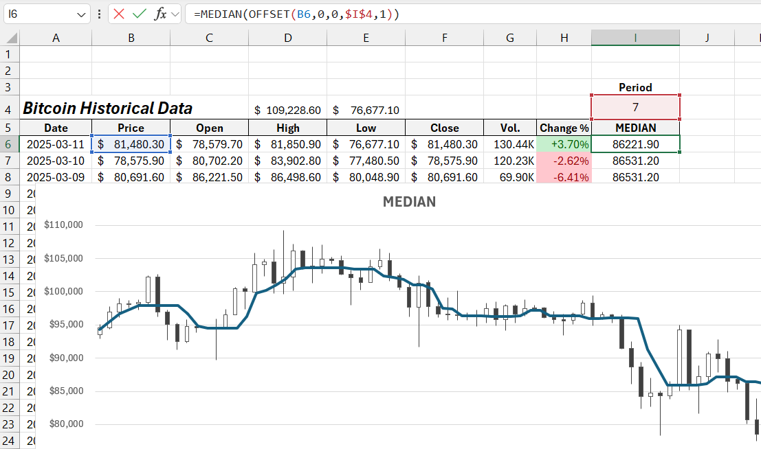
Unlike the AVERAGE function, the MEDIAN function calculates the average value in a special way. It sorts all values in ascending order and returns the middle value. This simple method allows filtering out statistical outliers. In technical analysis, this is an effective tool to exclude false breakouts of support and resistance levels. The AVERAGE function calculates the arithmetic mean, meaning that a significant statistical outlier can heavily distort the average value.
In other words, if one person eats a beef patty and another only eats a bread bun, the AVERAGE function would suggest that both are eating a burger—which is far from the truth.
Formula with the MODE Function for Market Profile Analysis
Another interesting Excel function for market profile analysis is the MODE function, which identifies the most frequent price within a specified period. This function can also be adjusted to filter market noise in futures trading.
=IFERROR(1/(1/MODE(ROUND(OFFSET(B6,0,0,$I$4,1),$I$2))),NA())
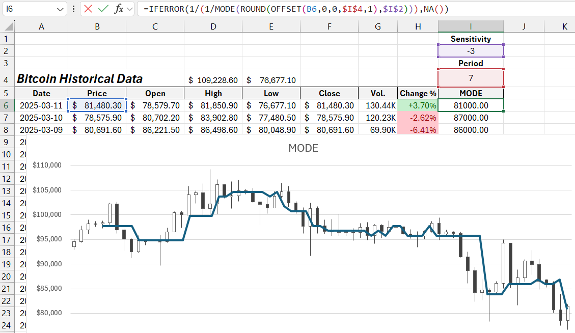
By changing the value in cell I2, which contains the sensitivity coefficient, the formula filters market noise on the assets futures price chart.
Market profile analysis is based on identifying the price mode—the level where the price was most frequently traded within a specific time range. It is a well-known fact that the mode of the current period never stays at the same level as the mode of the previous period. The mode always changes.
Thus, the market profile and the price mode allow us to predict future price movements. While some may believe this is impossible, consider this:
It is pointless to try predicting exactly where the price will be next month—even market makers do not know that. However, if we focus on predicting where the price will NOT be, we gain valuable insights to improve trading strategy efficiency. This formula helps you develop a safer futures trading strategy.
Many criticize futures trading due to leverage risks, but it is invaluable when used for its primary advantage—hedging through short positions. In skilled hands, futures hedging is a powerful tool to significantly reduce losses on a spot account. Use futures trading safely and for its intended purpose!
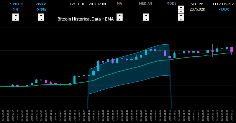
Exponential Moving Average Dashboard for Market Analysis
Combining all useful indicators on a single chart can result in information overload—a common mistake among beginner traders. Excel allows you to create an interactive dashboard to analyze price movements in futures markets for any financial instrument. You can toggle different indicators on and off and combine them into various trading strategies.
Download the Exponential Moving Average Indicators for Excel 
By mastering the material in this article, you can independently develop your own indicators based on custom algorithms without programming knowledge. Excel formulas and statistical functions simplify this task significantly. And by leveraging the advanced capabilities of artificial intelligence like ChatGPT, you can create tools for the most reliable trading strategies.

Data Visualization Charts for Interactive Report Creation in Excel.
Dashboard Templates