Create Interactive Charts with Animated Buttons in Excel
Let's consider an example of developing animations for interactive design elements in Excel data visualization. This time, we will configure rarely used functions for design in Excel. New ideas for presenting useful charts.
Configuring Source Data for Presentation
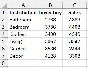
We start by preparing and modeling the source data. There is a table with two types of similar values that will be presented on one chart but on different layers for comparison.
At this stage, it is important to note that the chart's functionality will be extended with custom formulas. We will provide the user with the ability to disable the display of any layer on the chart with a single click, without navigating through settings. Instead, we will offer our own interface elements—animated toggle buttons.
We will create cells with data on the status of the two toggles. If the value is TRUE, it means it is on, and if FALSE, it is off.
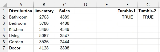
In this case, we need to prepare the source data for the chart before visualization using simple logical formulas. It is the formulas, not macros, that will implement the animation.
Formulas for Animating User Buttons in the Visualization Interface
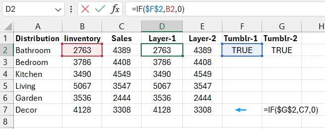
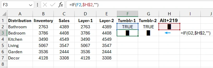
We will create the toggles using text elements and a special character rectangle. It needs to be entered into a cell using the alt-code—key combination Alt+219 (█). The logical formula:
=IF(F2,$H$2,"")
Formula Description:
If the toggle is in the on state (TRUE), the text (█ - rectangle character, keyboard input code Alt+219) from cell H2 is displayed; otherwise (FALSE), an empty string "" is displayed.
Now, we will create reverse formulas in cells F4 and G4:
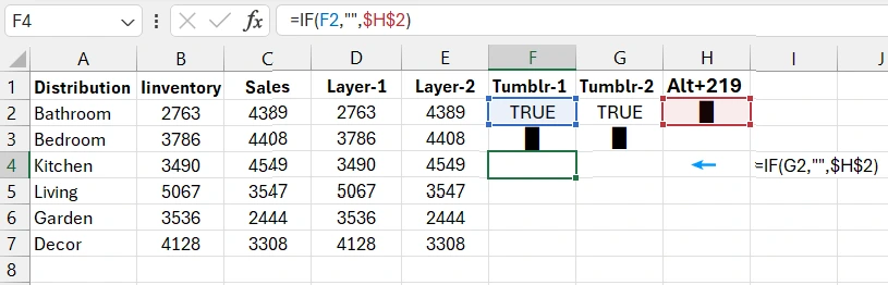
We need reverse formulas to display the toggle buttons in the off state. The logic in the reverse formulas is simple. When the value in cell F2 or G2 is TRUE, an empty string is returned, and when it is FALSE, the text from address H2 is returned.
Designing Toggle Buttons from Vector Shapes
Now we will demonstrate the rarely used settings for creating an interface with a dynamic data visualization design. We will construct the design for the first toggle from Excel vector shapes. First, create a rounded rectangle.
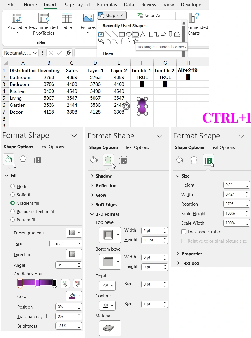
With the rectangle selected, press the keyboard shortcut CTRL+1 and fill in the parameters on all three tabs in the additional window as shown in the picture above.
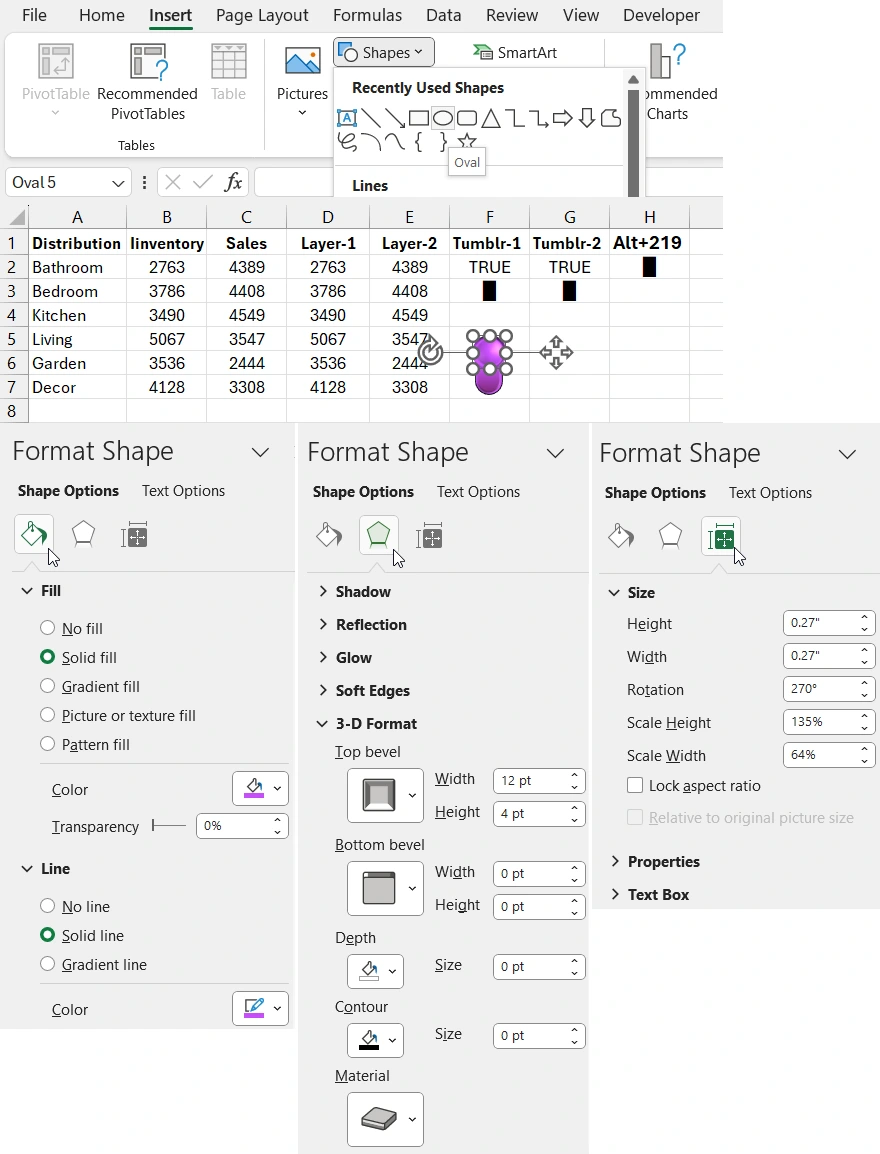
Next, place a circle shape on top of the rectangle with its own color, size, and effect settings.
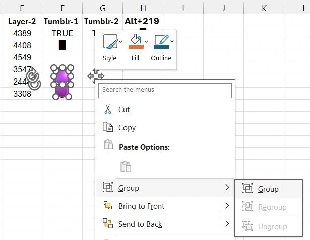
Now group all the shapes into one object. Select all the shapes by left-clicking while holding down the CTRL key on the keyboard. Or simply select one shape and press the CTRL+A shortcut. Then right-click the selected shapes to open the context menu. Choose the option "Group – Group." Or select the tool "Shape Format" - "Arrange" - "Group."
Attention! Copy the created group of shapes to the clipboard (CTRL+C). Then create a "Text Box" object. Instead of filling in the content of the "Text Box" object, specify the reference to cell F3.
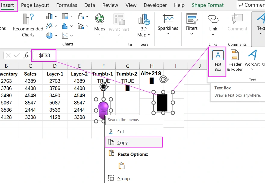
Now the content of cell F3 should be displayed in the "Text Box" object, which is the rectangle symbol. Next, format the text in the object.
Select the "Text Box" object with a single left-click and press the CTRL+1 shortcut to open the additional "Format Shape" parameter window. In the additional window, first, set a transparent background!!! for the "Text Box 1" text object. Then switch to the "Text Options" tab and in the "Text Fill" section, choose the "Picture or texture fill" option. Then, below in the "Picture source" area, click the "Clipboard" button.
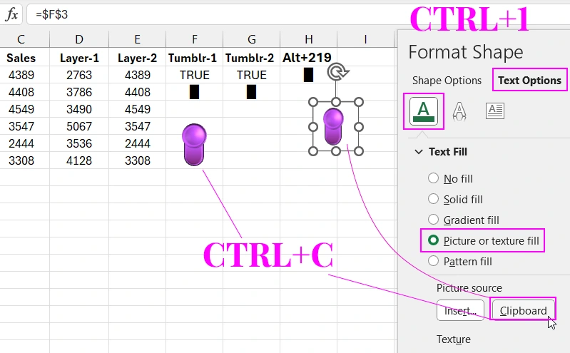
As a result, the text in the "Text Box" object will be filled with the group of toggle shapes.
Creating Animation for Toggle Buttons in Excel
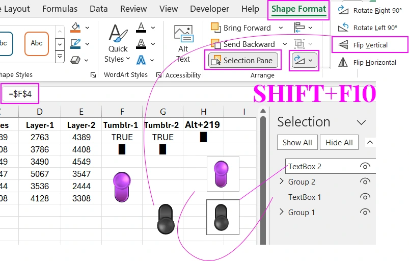
We model the appearance of the toggle button for the OFF state. Similarly, create another group of shapes and a text object, but with dark colors. It is important to note that the group of shapes for the OFF button must be flipped 180 degrees, and the text object "TextBox 2" should refer to cell $F$4 with the reverse formula. To do this, select the tool from the additional tab of the main menu "Shape Format" - "Arrange" - "Rotate Objects" - "Flip Vertical".
Thus, we have two animation frames for different toggle states. What should we do next?
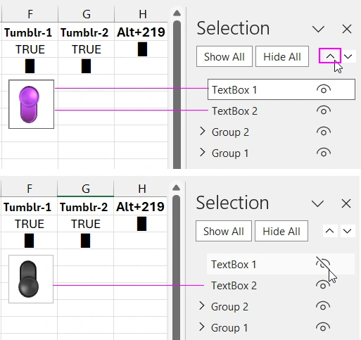
We need to overlay the two text objects so that the second created text object "TextBox 2" is located under the first text object "TextBox 1" on the bottom layer. To do this, use the additional window "Shape Format" - "Arrange" - "Selection Pane" - "Selection" with the up and down arrow buttons to manage the order of object placement by levels. The button in the ON state should always be in the foreground.
Now we just need to animate by changing the value in cell F2 and the formula in cell F3. To change the value in cell F2 from TRUE to FALSE and back, use the standard Excel tool: "Developer" - "Controls" - "Insert" - "Check Box (Form Control)".
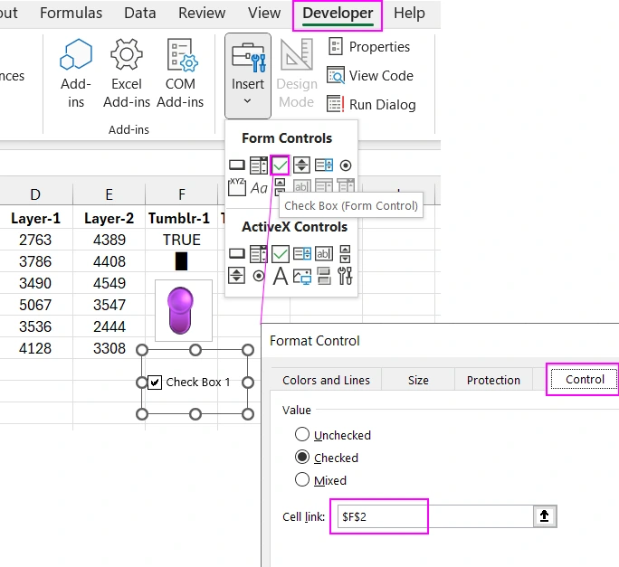
In the appearing "Format Control" window, go to the "Control" tab and in the "Cell Link:" input field, specify the reference to cell $F$2. When clicking on the "Check Box 1" object, the value in cell F2 will automatically change from TRUE to FALSE and back.
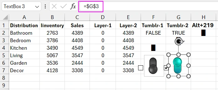
Now overlay the "Check Box 1" object on the text objects and group all 3 objects into one group. As a result, we get a fully functional toggle button with an animation effect of state change.
Similarly, create a second toggle with a different color, different cell references in the text objects (G3 and G4), and "CheckBox" G2. We did it:
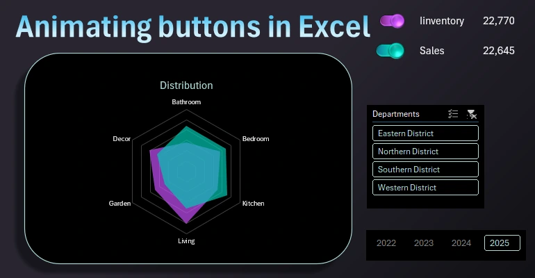
Now proceed to creating a chart for presenting the distribution of values by categories. Select the cell range D1:E7, specially prepared as the chart's source data, and choose the tool: "Insert" - "Charts" - "Waterfall" - "Radar" - "Filled Radar".
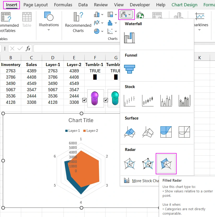
Next, you need to customize the appearance of the "Radar" chart.
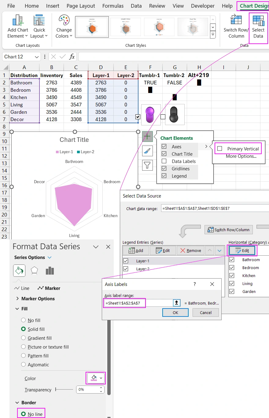
The picture above clearly shows that when one of the toggles is switched, the visualization layers on the Radar chart are disabled or enabled. You can then create a dynamic design and effectively use data visualization in your presentations.
Standard MS Excel tools offer a wide range of ideas to unleash your imagination's potential. Undoubtedly, there are certain limitations, but much can be achieved. In the following articles, we will expand the possibilities of presentations with new solutions. There are many ideas yet to be realized in Excel even without using macros.
For example, entire dashboards with interactive functions can be created as described in this article:
 Dashboard for managing KPI plans in Excel.
Download Radar chart template with button animation in Excel 

Data Visualization Charts for Interactive Report Creation in Excel.
Dashboard Templates