Download the interactive calendar with heatmap in Excel
A calendar heatmap in Excel is a convenient tool for analyzing data by days, weeks, and months. It allows you to instantly see periods of high and low activity and identify patterns in daily and monthly metrics. This type of visualization is especially useful for interactive reports and dashboards.
Excel Template for an Interactive Calendar Heatmap
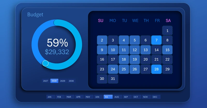
A calendar with a heatmap of daily activity levels for each month is a very convenient and useful tool for presenting data. It helps detail changing information and makes it visually easy to perceive. It is very easy to navigate visual data that contains deviations from average values. Such deviations are easy to notice in a visualization and difficult to detect in standard numeric tables.
This is the essence of data visualization. Imagine if a car dashboard displayed all the same values but only in tables instead of charts. How much more time would be required for the driver to read and analyze the data? Not to mention the extra mental energy required.
This type of chart is very often used where monthly data is presented by calendar days. It appears in almost every second monthly or annual interactive report. Therefore, it is important not only to have a ready-made calendar heatmap template that you can download at the end of the article, but also to learn how to build this chart yourself in Excel. For this, use the visual video tutorial, which shows the entire development process step by step. The video demonstrates a visualization block with a budget expense progress chart and a calendar heatmap of daily spending activity throughout the month.
All stages of data visualization development in the training video:
- Formulas for building an interactive heatmap chart in Excel.
- Creating a standard clustered chart and configuring its parameters.
- Drawing shapes in different colors to fill the histogram clusters based on conditions.
- Conditional display formula for the heatmap clusters.
- Using pivot table slicers to control the heatmap.
- Modeling the design of the interactive visualization block using shapes.
- Configuring the control panel button design with sizes and placement.
- Adding data labels linked to formulas that generate calendar day numbers for the month.
- Formula table for the budget spending progress chart.
- First, creating a standard donut chart template in Excel.
- Adding a data series to create a decorative cursor.
- Adjusting the XY axes for precise cursor positioning.
- Setting sizes, colors, and shadows.
- Testing the operation of the calendar heatmap chart in Excel.
An example of how a calendar heatmap can be effectively used on a dashboard:

Download the personal finance management dashboard in Excel
Using a calendar heatmap in Excel makes data analysis more visual and faster. Color coding of the calendar grid by cells helps instantly highlight key periods and make informed decisions based on visual patterns. This tool increases the effectiveness of dashboards and analytical reports. It also reduces the user’s analytical workload.


Data Visualization Charts for Interactive Report Creation in Excel.
Dashboard Templates