Epic task burndown chart in Excel for dashboards
For adaptive project management, it is essential to monitor not only the task completion rate but also the balance between newly added work and actual delivery. The epic task burndown chart in Excel is implemented as a customized bar chart, where each sprint is represented by a structured multi-layer column.
Architecture of the customized epic bar chart in Excel
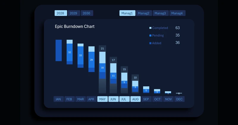
Each column represents a single sprint and consists of three clusters:
- Bottom – newly added tasks.
- Middle – tasks in progress.
- Top – completed tasks.
Each bar in the epic chart highlights on hover, while the top-right corner displays summarized sprint task data in absolute values as the chart legend. Since each vertical bar consists of three functional clusters, the summary information describes the status of each layer:
- Bottom cluster — volume of added tasks within the sprint.
- Middle cluster — number of tasks currently in progress.
- Top cluster — number of completed tasks.
When multiple bars are selected simultaneously, the indicators are automatically aggregated in the summary legend, enabling analysis of combined results across several sprints.
The lower clusters intentionally do not display value labels inside the columns to reduce visual overload. Absolute values of added tasks are accessible through the interactive legend when selecting one or multiple sprints.
Dynamic updates and the role of the chart in Agile management
The chart automatically updates when switching the year or manager on the dashboard. This ensures instant adaptation of the visualization to the selected analytical context.
See how the epic chart is effectively applied within an Excel dashboard in practice:
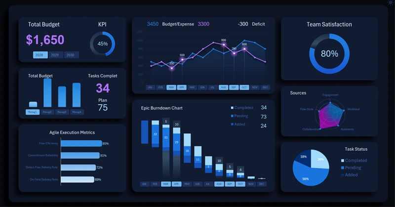
Download the project management dashboard template in Excel
This type of visualization is widely used in Agile approaches, where maintaining a sustainable team cadence, controlling incoming task flow, and tracking actual performance across iterations are critical success factors.
The epic task burndown chart in Excel is more than a simple graph—it is a structural sprint control tool. The customized three-level bar architecture allows analysis of the balance between task inflow, processing, and completion. Automatic data updates and metric aggregation make it an effective instrument for monitoring the stability and maturity of the Agile process.
 Download the epic task burndown chart in Excel
Data Visualization Charts for Interactive Report Creation in Excel.
Dashboard Templates