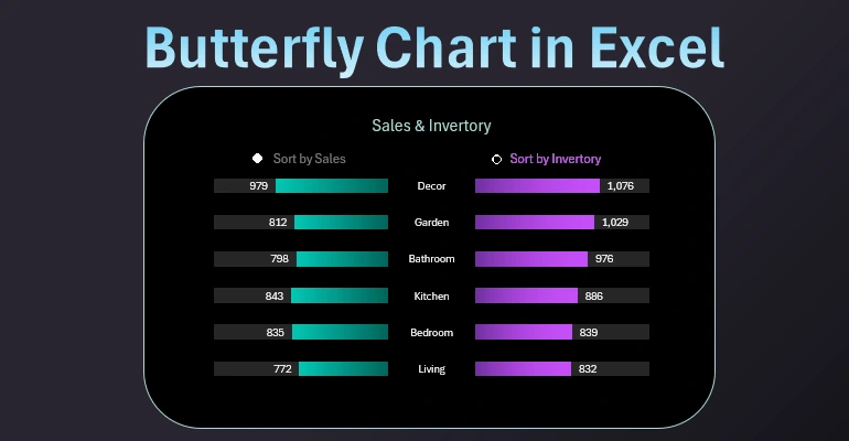
How to Create a sorted Butterfly Chart in Excel by descending
How to create a butterfly chart with the ability to sort by the left or right wing at the user's choice? This can be realistically implemented in MS Excel using standard tools without macros. The point is that a butterfly chart is usually not sorted. If sorting is done, it is mostly in descending order. But it can only be implemented for one wing to maintain data accuracy. We will customize our smart butterfly, which will flutter its wings by sorting either the left or the right wing. We will implement all this using the user interface for data visualization management. It will be both effective and practically useful.
How to sort in descending order using formulas in Excel
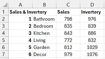
A butterfly chart requires at least 2 columns of original similar data. In our original table, there are 3:
- Product categories.
- Sales volume.
- Inventory stock.
We immediately proceed to sorting and preliminary preparation of the original data. First, we create the first additional table to sort all values by the second column "Sales" in descending order. Let's call the first additional table "Sort by Sales". For sorting, we use smart formulas that can sort duplicates (if any):
Formula in the first column of the additional table "Sort by Sales":
=INDEX($B$1:$B$7,SMALL(IF($C$1:$C$7=G1,ROW($C$1:$C$7)),COUNTIF($G$1:G1,G1)))
Formula in the second column – usual sorting of values in descending order:
=LARGE($C$2:$C$7,A2)
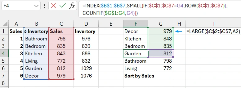
Note! Additional sorting tables should start from the first row. They use a complex formula that can correctly and efficiently handle duplicate values when sorting. Detailed description in this article: How to sort data with duplicates for Excel chart.
Example of an Excel formula for sorting data in descending order
Similarly, we build the second additional table for intermediate sorting of inventory in descending order. Let's call the second additional table "Sort by Inventory":
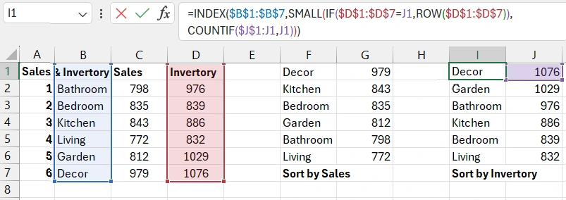
Next, we need to create an intermediate table that will be automatically populated with pre-sorted data from the first additional table "Sort by Sales" or the second "Sort by Inventory".
How to select data from two tables based on a condition
The choice of the table for filling will depend on the value in cell C9 (1 or 2).
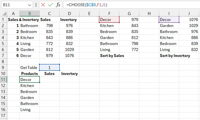
Formulas for filling the "Sales" and "Inventory" columns:
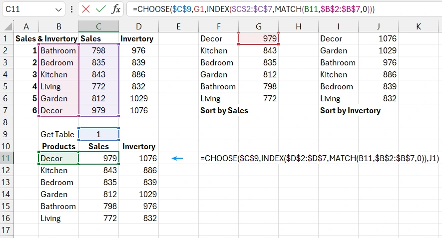
=CHOOSE($C$9,G1,INDEX($C$2:$C$7,MATCH(B11,$B$2:$B$7,0)))
=CHOOSE($C$9,INDEX($D$2:$D$7,MATCH(B11,$B$2:$B$7,0)),J1)
Now let's add a control element to the value in cell C9.
How to create interactive sorting control in an Excel chart
Select the tool: "Developer" - "Insert" - "Form Control" - "Option Button (Form Control)".
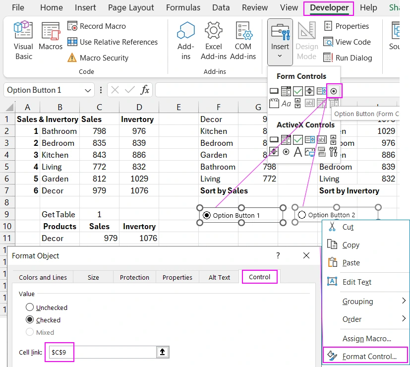
Right-click on the "Option Button" element and in the context menu that appears, select the "Format Control" option. In the "Format Object" window that appears, on the "Control" tab, in the "Cell Link:" input field, specify the link to cell C9.
Now, when switching the "Option Button" elements, the value in cell C9 will automatically change to 1 or 2. Accordingly, the values in the intermediate table will be updated.
Next, we proceed to create the final table for the butterfly chart template.
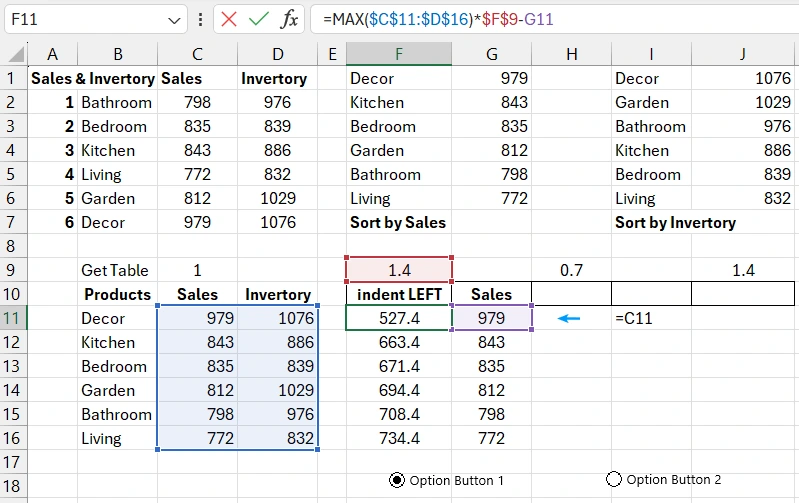
Preparing original data for the visualization template
The first column determines the size of the left wing margin for each bar. We can control the size by specifying the desired value in cell F9. Depending on the design and length of the labels, we may need to increase or decrease the margin. It is quite rational to provide this option. As philosophers say, "You may not use the opportunity, but it should be there!". Formula for calculating the left wing margins:
=MAX($C$11:$D$16)*$F$9-G11
In the next column, we simply refer to the second column "Sales" of the intermediate table.
Formula for calculating margins in the central part of the butterfly chart, between the bars at the location of the category labels:
=MAX($C$11:$D$16)*$H$9
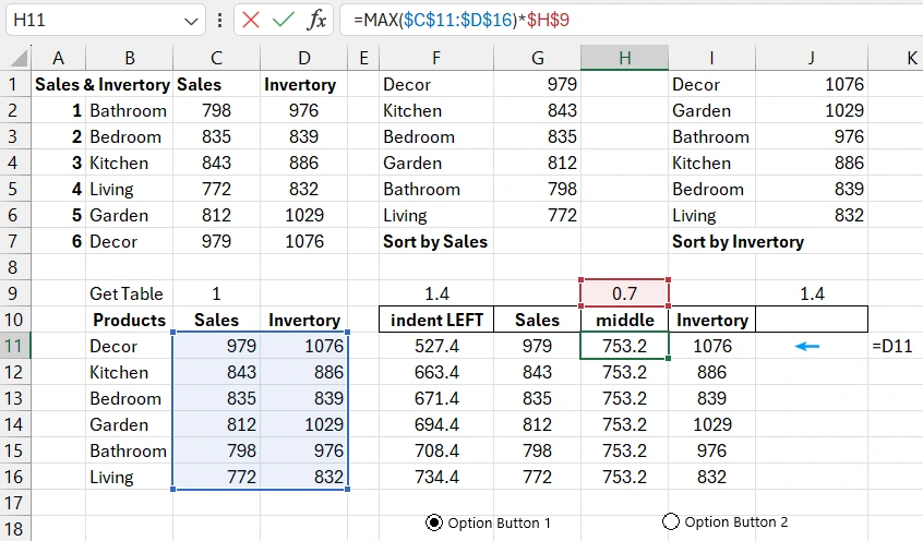
In the next column, we simply refer to the third column "Inventory" of the intermediate table.
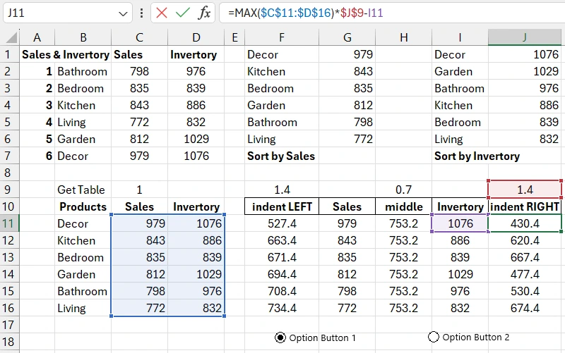
We fill the last column with formulas for calculating the right wing margins:
=MAX($C$11:$D$16)*$J$9-I11
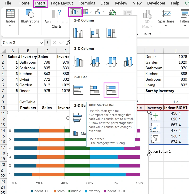
Now, based on the final table, we build a horizontal bar chart template from which we will create a butterfly chart.
Creating a Butterfly Chart Template with Interactive Sorting
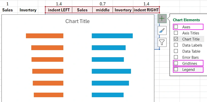
Select the range of cells F10:J16 and choose the tool: "Insert" - "Charts" - "2-D Bar" - "100% Stacked Bar".
Now, to make the chart look like a butterfly, we will make some adjustments to its parameters.
Butterfly Wings Bar Chart
Click the vertical Y-axis once with the left mouse button and press the CTRL+1 hotkey combination. In the additional "Format Axis" window that appears, in the "Axis position" section, select the "Categories in reverse order" option so that the bars are arranged in reverse order.
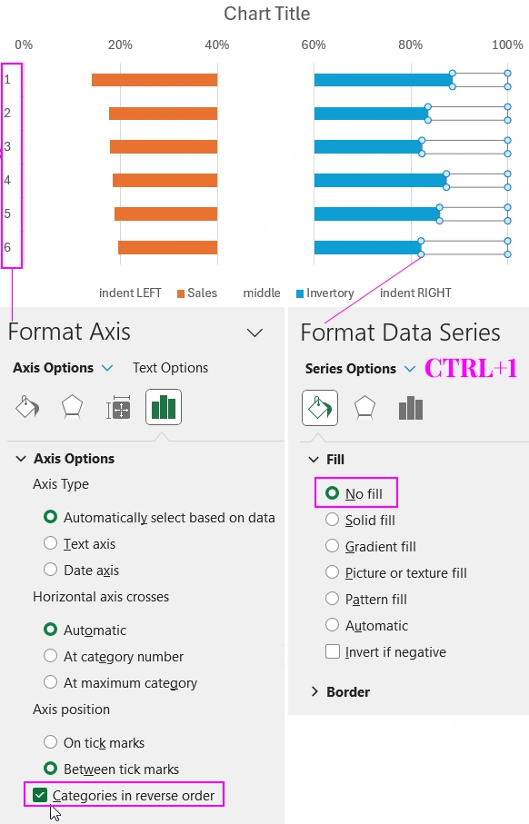
Click the bars of the last data series once with the left mouse button and press the CTRL+1 hotkey combination. In the additional "Format Data Series" window that appears, in the "Fill" section, select the "No fill" option.
Perform these same actions for the central and far-left bars. The bars should be transparent for the data series:
- indent LEFT;
- middle;
- indent RIGHT.
Later, we will color them in one color that matches the overall color palette of the visualization.
Now click on the big plus button that appears when you click once on the chart area. In the dropdown context menu that appears, uncheck the "Axes", "Gridlines", and "Legend" options.
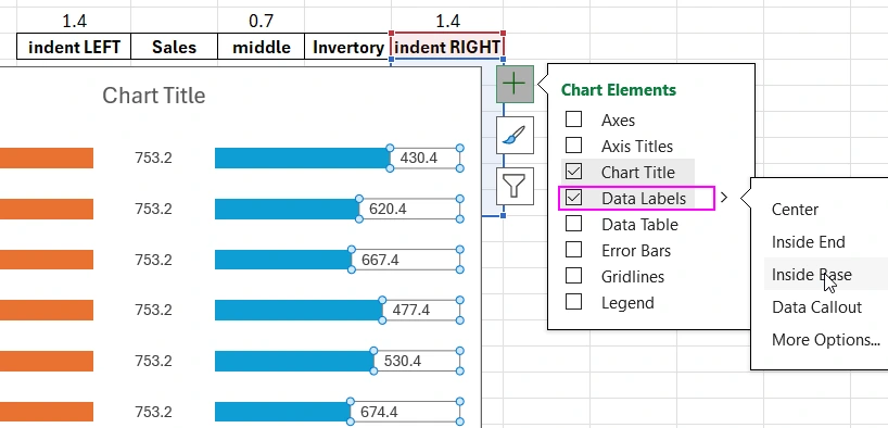
Next, we move on to the important part – adding data labels. First, we simply enable the data labels display mode only for the rows with a transparent background fill.
Adding and Setting Up Horizontal Bar Chart Data Labels
Click on the big plus button near the chart again and check the "Data Labels" option, and from the dropdown menu, select the option for:
- indent LEFT – "Inside Left";
- middle – "Center";
- indent RIGHT – "Inside Base".
Next, we need to change the data sources in the label settings. To do this, click the central data labels once with the left mouse button and press the CTRL+1 hotkey combination or right-click on the labels and select the "Format Data Labels" option from the context menu. In the additional window that appears, in the "Label Options" section, check the "Value From Cells" option and click the "Select Range" button. A new "Data Label Range" window will appear, and in its only input field "Select Data Label Range", specify the reference to the range of cells in the first column of the intermediate table: =Sheet1!$B$11:$B$16.
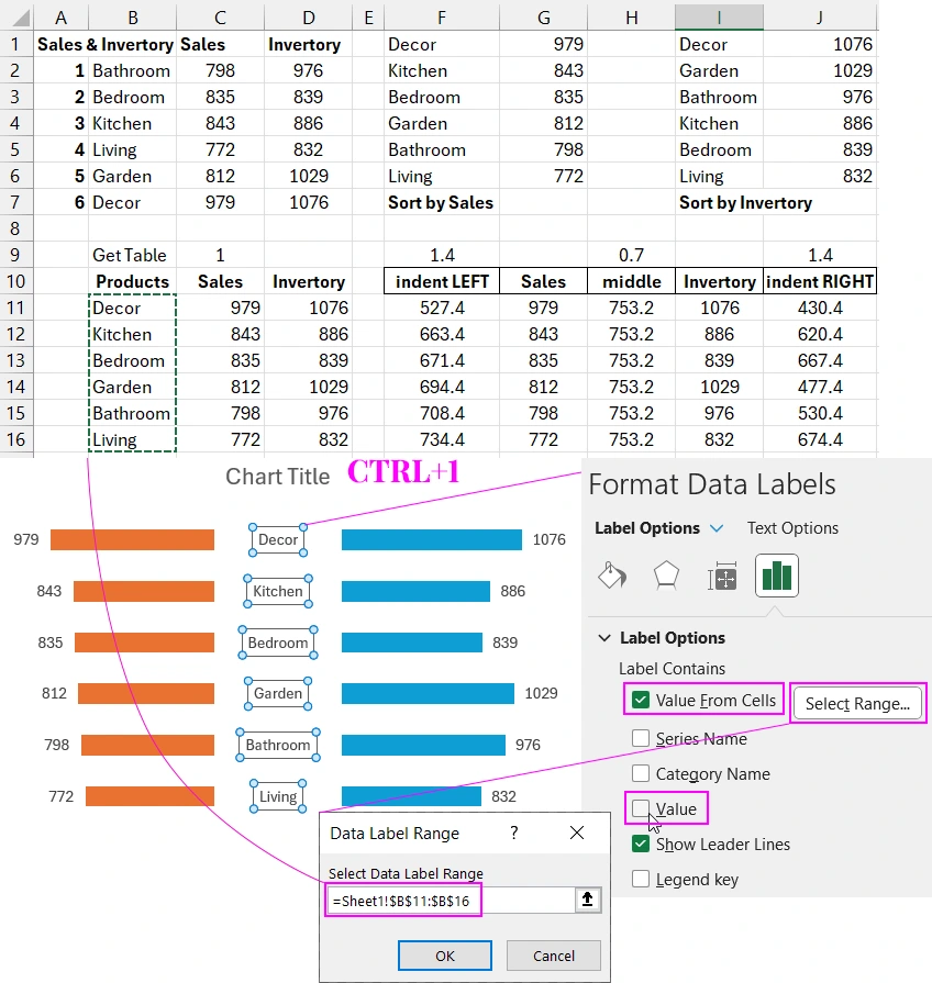
Perform these same actions for the labels on the left and right wings of the butterfly chart. Just correctly specify the references to the corresponding ranges of the intermediate table:
- Left wing: =Sheet1!$C$11:$C$16.
- Right wing: =Sheet1!$D$11:$D$16.
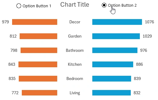
As a result, we get an interactive butterfly chart template that can sort data visualization by the left or right wing under user control.
Presentation of the Butterfly Chart Design
Use the color scheme shown in the picture below as an example for decorative visualization design.
Using this template, you can sort data in descending order on a butterfly chart by the left or right wing. This is very convenient for visual data analysis. This template can be used in the development of interactive dashboards:
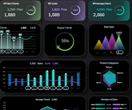 Dashboard for managing KPI plans in Excel.


Data Visualization Charts for Interactive Report Creation in Excel.
Dashboard Templates