Beautiful Sales Project Management Dashboard in Excel
An interactive dashboard template for managing retail projects. The dashboard is designed to visualize key sales metrics and overall project manager performance. The beautiful design and all interactive features are implemented using formulas and standard Excel tools.
Sales Project Management Template Presentation in Excel
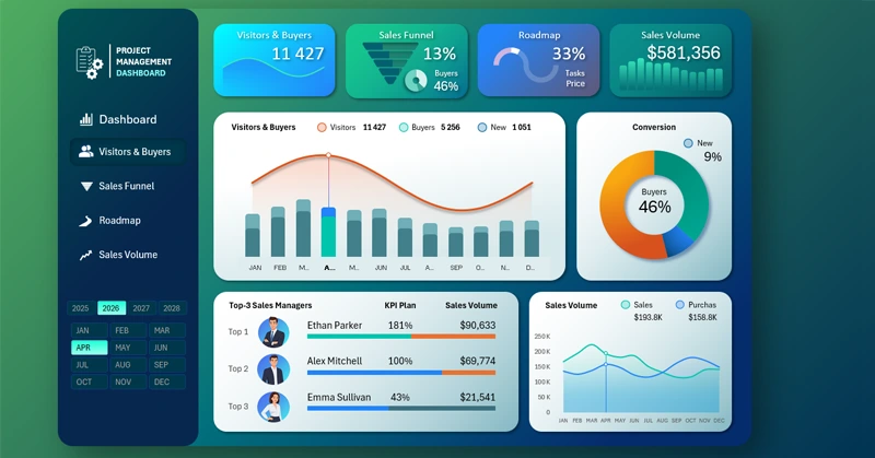
This is a multi-screen dashboard template. There are 4 main screens:
- Visitors and Buyers
- Sales Funnel
- Project Roadmap
- Product Sales Volume
There are also 3 additional screens to switch between layout variations:
- +2 design variations for the main dashboard;
- +1 variation for the sales volume screen.
To switch between layouts, click the bottom block in the right corner. Other screens don't have such display options. This feature is implemented only for the main and last screens.
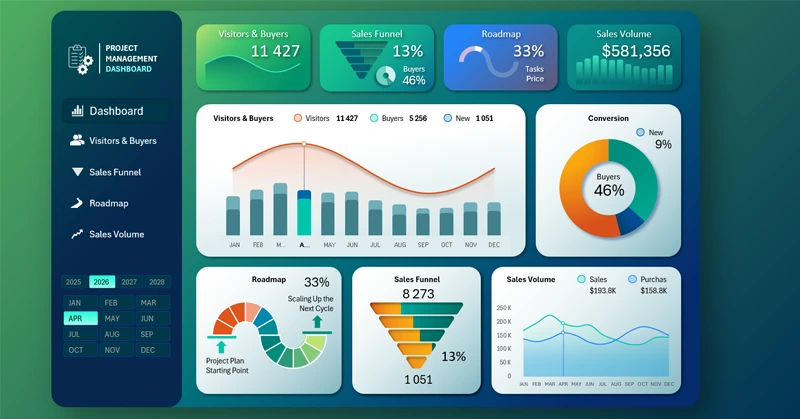
The main page includes 5 visualization blocks and 4 mini visualizations on header cards. On the left, there is also a menu block and a control panel for selecting the reporting period.
Dashboard Cards with Interactive Sparklines
The dashboard header also functions as a menu and allows you to switch between screens:
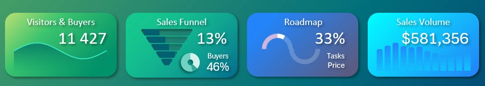
Cards with summary values actually work as menu buttons. All mini data visualizations on the cards are interactive and reflect the real data shown on the dashboard. These are not just decorative icons—they are full sparklines to present summary values. When the reporting period changes, all mini visualizations update automatically based on the displayed values. This development approach is truly commendable.
Monthly Conversion Dynamics from Visitors to Buyers
The first two visual blocks are intuitively linked. They are used to analyze store visitor-to-buyer conversion:
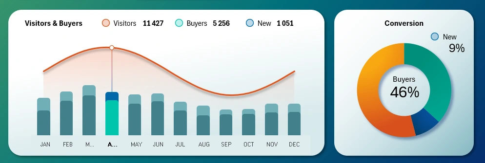
The line represents the total number of monthly store visitors. The bar chart shows the number of repeat and new customers. Remember, more than 60% of profits come from repeat clients.
This block contains interactive buttons to switch between months right on the chart. You can also use the control panel on the left, but it's more convenient to interact directly with the chart during analysis—especially when selecting multiple months at once.
The block on the right shows the same data in a compact, readable format. This chart doesn't track monthly trends but appears on every screen to maintain focus on conversion. Showing the full trend on every screen would overload the reports. A compact and informative design is the better choice here.
Interactive Project Roadmap in Excel
Next visualization block is the project roadmap:
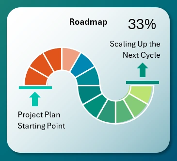
Download Roadmap Chart Template in Excel
The main dashboard displays only the overall progress status of the project plan. For detailed analysis, go to the roadmap screen where you'll find all sequential tasks with corresponding key performance indicators.
Dynamic Sales Funnel in Excel
It's also important to analyze how customers move through the funnel stages:
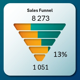
This is where new customers are generated, so the process deserves special attention. The default funnel view is shown on the main dashboard and as a mini interactive card in the header. For detailed analysis, switch to the dedicated screen.
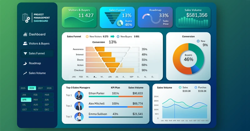
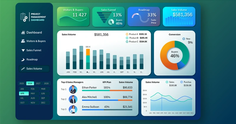
Retail Volume Analysis
The final analysis block shows the relationship between purchases and product sales:
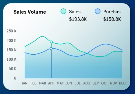
This visualization helps keep your finger on the pulse of the project. It's an important metric, but not overexposed. This dashboard focuses on project management, and in that context, sales and procurement volumes help confirm management effectiveness. This block can be replaced by two other options on the main dashboard:
- Sales volume segmentation by product categories
- Top-performing managers by KPI
Next, we’ll review each screen in more detail.
Dashboard for Analyzing Visitor to Customer Conversion
This section includes a ranking of the top 3 managers with the highest KPI performance. Note that the progress bar visualization intuitively reflects three portions of the KPI plan:
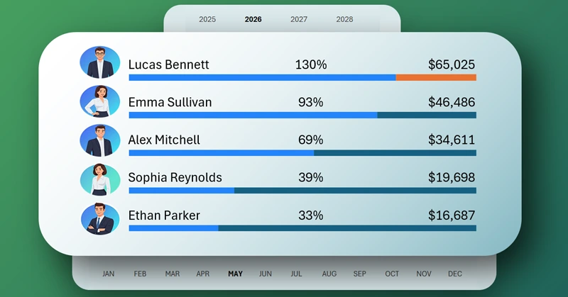
Manager Ranking Chart Template
- Actual performance (blue color or green for the top manager).
- Remaining to meet the plan (platinum color).
- Overachievement (orange color).
Each manager deserves their own reward. You can’t reward all managers equally—it kills motivation and discipline. Fairness is the foundation of discipline in project management.
Sales Funnel Analysis Dashboard in Excel
The sales funnel is an incubator for nurturing new customers. It's essential to track and carefully guide store visitors at every stage of the funnel. Keep in mind that repeat customers do not go through the sales funnel, so their count should be excluded from the total number of store visitors. Naturally, the funnel conversion rate is much lower than the overall conversion rate of visitors into buyers because it excludes repeat customers. And while repeat customers generate over 60% of profit, no project can scale without acquiring new ones. After all, in any business, the most important word is—customer!
Retail Sales Volume Analysis Dashboard in Excel
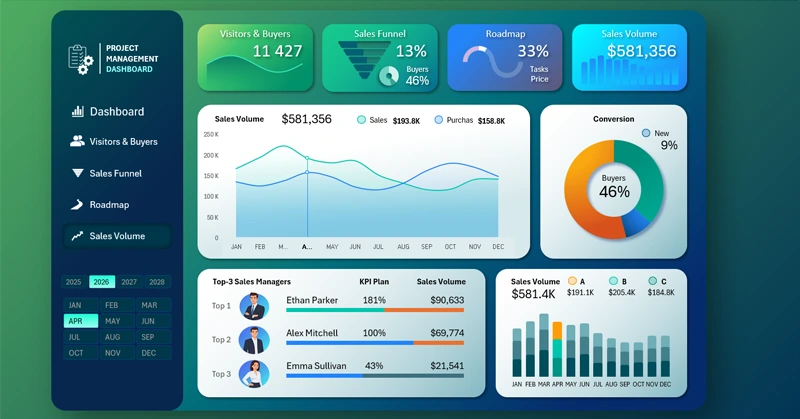
This dashboard provides a detailed analysis of key sales department metrics. The screen has two layout variations for visualizing sales data in the main block. The current variation allows you to track year-over-year changes in the ratio between purchases and actual sales.
To analyze retail volume segmented by basic product categories, switch to the second variation screen by clicking the visualization block in the lower right corner:
Download the Excel project management dashboard template 
So within a single dashboard and design template, we gain the ability to conduct more detailed analysis of such a crucial indicator—sales.
Managing sales means managing the project, and vice versa. These are interconnected concepts.

Data Visualization Charts for Interactive Report Creation in Excel.
Dashboard Templates