Data rating chart for visualization download in Excel
Examples of constructing non-standard charts with standard Excel tools. They are effective to use as elements to complement data visualization compositions. All examples of rating charts can be downloaded for free in Excel in one file at the end of the article.
Visualizing Rating Data in Excel
First we will model the situation. The summary report contains 4 indicators that need to be represented beautifully as one of the interactive elements of dashboard visualization in the form of a rating. In order to graphically present the final numbers of the ranking indicators on the dashboard, you can use simple standard solutions that the universal Excel program offers by default:
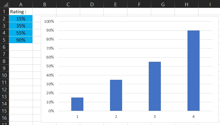
It looks simple, informative, but not beautiful. But any beauty is always a source of energy for everyone. Naturally, a dashboard with a nice design (without sacrificing readability) is more attractive and it is pleasant to work with for every user.
Using different combinations of charts, stylishly decorated with figures, you can achieve good results in the design of data visualization. For example, let's present these same totals on a nicer-looking data ranking chart:

This is already a more interesting visualization of the same raw data. The Ranking Chart is presented as a pedestal for 4 places (from first to fourth). If you "polish" the design a little more, you will get an even more beautiful presentation. For example, adjust the color palette, change shapes and proportions, etc.:
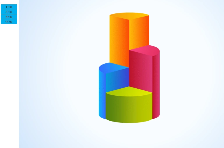
As a result, the visual ranking is even better. After all, without polishing, not even a diamond shines, and perfection has no limits. But the main thing is not to overdo it.
Using elements of infographics in the diagram designer
And if you add elements of infographics, we betray more sense invested in the subject of the presentation ranking. After all, to transfer the meaning graphically is much easier and more concise than words. For example, as described in the article: Simple example of creating elements of infographics.

The pedestal ranking of indicators can also be beautifully displayed not only in a group of columns, but also in rows. Example with description: Ranking Chart for data visualization.

It is impossible to implement in Excel any task of interactive data visualization or infographics. There are highly specialized tools for that, such as Power BI. But the standard Excel chart builder tools provide enough tools to create interactive visualizations above the entry level. It all depends on your imagination and the power of creative inspiration.
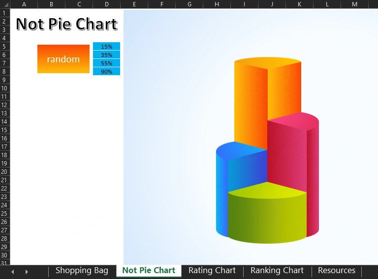
All of the above examples of data ranking charts can be downloaded in a single file below the link. Each chart is on a separate worksheet that is signed according to its name:
 Download the data ranking chart in Excel
To present the interactivity of the example, a "random" button has been created. When you click on this button, the blue table with the original values is filled with random numbers (but no more than 100). No macros are used in this file, and all automation is implemented with Excel formulas.
Use these rating chart templates freely for your needs and requirements. At least for inspiration.

Data Visualization Charts for Interactive Report Creation in Excel.
Dashboard Templates