Ranking chart for data visualization download in Excel
To compose an informative visualization of data, you often have to present on your graphical reports - ranking totals. This example offers one option for a stylish design of graphs in Excel to visualize ranking information.
Where do you start to create a ranking chart for data visualization?
Ranking the raw data implies determining the order in the database, taking into account the ranking. For example, under basic conditions of ascending sorting of data, the items with the lowest value are assigned a rank of 1. But there may be more complex conditions and requirements when ranking the data.
Design is an attempt to bring order to a small piece of the universe.
One of the most important functions of data visualization is to simplify the perception of information. But let's not forget that simplicity is what the user gets, and for the graphical report presentation designer, all the complexity of its implementation. After all, it is much harder to simplify than to complicate.
Interesting fact! Above the entrance to the Design Museum in London always hung the inscription "Evolution is simplification, not complication."
Everyone knows that the path of evolution is in the direction of development from the simple to the complex. But it is important to note that the main goal of evolution is simplification. That is why the simpler and easier it is for the user to work with visualization of large amounts of data, the harder it is for the developer to create a high level of ease of use of the same data.
How to achieve ease of use and beauty of data perception. The way for a designer-developer of data visualizations is to cut off everything unnecessary as much as possible without damaging the functionality of the informative design.
When asked by Michel Angelo how he creates such beautiful sculptures, he replied, "I just take a stone and cut off everything superfluous."
Examples of data ranking infographic elements in Excel
To present the ranking of data in Excel reports, you can construct all sorts of ideas for data visualization charts. And everything can be implemented with standard Excel tools:
- To create charts: "Insert"-"Charts"-"Insert Graph Chart".
- To draw with vector graphics: Insert-Illustrations-Figures.
When you combine these tool sets, you can create stylish charts of different types with different forms of visual representation of ranking data. For example:

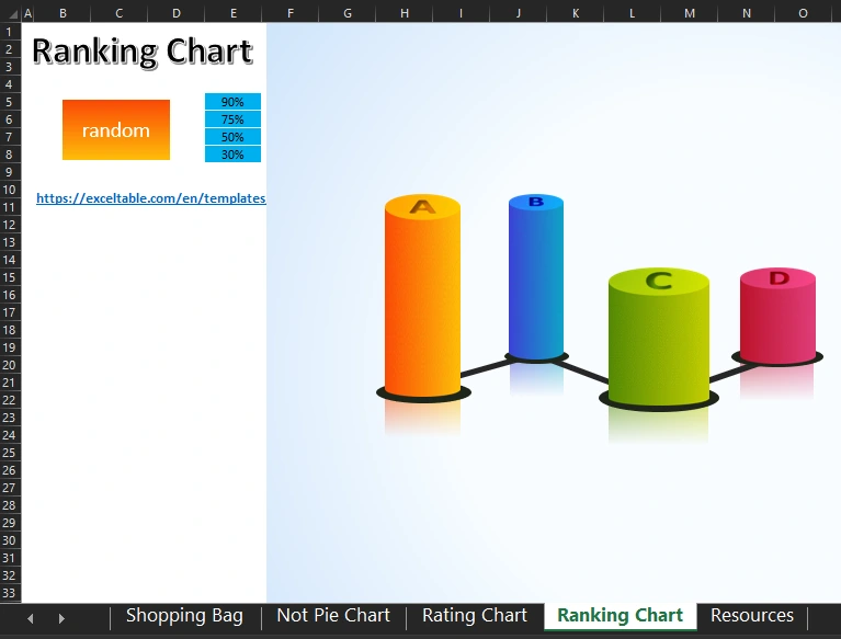
Ranking Chart by four product groups (A; B; C; D).

Data ranking chart for visualization in Excel.

A simple example of how to create Shopping Bag style infographics for the sales ranking.
As seen from the above examples Excel provides quite a wide range of opportunities for the realization of creative ideas in the field of interactive data visualization. In order to understand the principles of constructing interactive elements of the presentation download all ready-made examples that are on different sheets in one file below the link:
 Download a beautiful ranking chart in Excel
The last sheet contains the finished shapes and groups of shapes that were used to build all these charts. Some complex vector shapes were created in the program PowerPoint, which is also part of the MS Office package. It is also worth remembering that Excel has support for importing vector graphics from other programs and graphic editors. You can also use raster drawings for diagrams, but they are subject to pixelation when scaled.

Data Visualization Charts for Interactive Report Creation in Excel.
Dashboard Templates