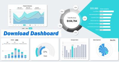
Download Dashboard Company Financial Stability in Excel
An example of how to create dashboards in Excel for monitoring, analyzing, or presenting key financial stability indicators of a company. In today’s financial world, it is crucial for businesses to maintain a stable financial position in the long term. It’s essential to keep your business resilient to financial crises and rapid market trends. Monitoring a company’s financial indicators is important for this purpose. A basic tool for this is the dashboard. Let's take a look at a dashboard template created in MS Excel as an example.
Visualization of Key Financial Indicators in Excel
At the top of the dashboard, there are two charts of financial indicators that should not exceed 50% in their values:

- Debt-to-Equity Ratio – the ratio of total debt to the total equity of the company. Investors tend to ignore companies if their debt-to-equity ratio exceeds 50%, due to the high risks and low financial stability. On the other hand, a ratio of 5% might be too low, indicating underutilization of growth opportunities.
- Operating Expense Ratio – the proportion of the company’s revenue allocated to operating expenses (salaries, rent, utilities, and other ongoing costs). If this ratio exceeds 50%, it indicates low operational efficiency and overall business profitability. The risk of investment loss significantly increases in such cases, as there are also variable and unforeseen expenses. A portion of the revenue should also be allocated for reinvestment in the company’s business development. A 5% ratio might be too low, suggesting insufficient reinvestment in essential operating expenses, such as marketing, market research, and strategic business development.
Monitoring the debt-to-equity ratio helps assess financial stability, analyze risks, and attractiveness to investors or creditors, and control the costs of servicing borrowed capital.
Monitoring the operating expense ratio allows you to evaluate the company’s operational efficiency, control expenses, analyze profitability levels, and forecast financial results.
Gross Profit Margin
The next indicator, gross profit, shows how much money remains with the company after covering direct costs for producing and selling its goods or services. This should not be confused with net profit, which is calculated after deducting all expenses, including taxes, interest on loans, depreciation, and more.
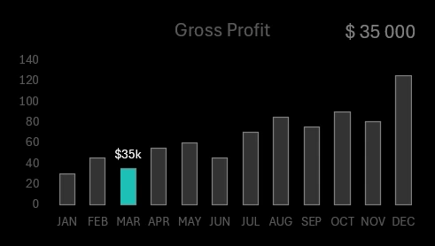
Gross Profit Calculation Formula:
Gross Profit = Revenue − Cost of Goods Sold
Why analyze gross profit:
- Assess business profitability.
- Analyze pricing and cost efficiency.
- Calculate gross margin.
Gross profit only accounts for the cost of goods or services sold, making it a key measure of core business efficiency. To evaluate a company’s profitability, net profit, which considers all expense aspects like operational, variable, unforeseen costs, taxes, debt servicing, and more, should be used.
Accounts Receivable Turnover Ratio
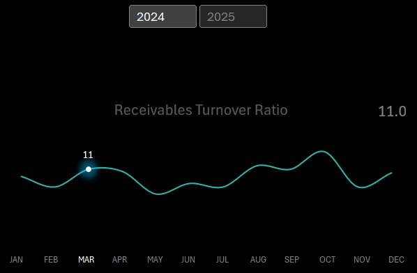
This tracks how quickly the company collects its accounts receivable from business clients. It is calculated as the ratio of net revenue to the average accounts receivable over a period.
Formula:Accounts Receivable Turnover Ratio = Net Revenue / Average Accounts Receivable
Do not confuse net revenue with net profit. Formula:
Net Revenue = Total Revenue − Returns and Allowances
The net profit formula is provided above. It is a more comprehensive measure, taking into account all aspects of the company’s operations.
Optimal values for the Accounts Receivable Turnover Ratio:
A minimum value of 6 or lower indicates that the company is effectively collecting accounts receivable from its business clients, significantly reducing the risk of cash flow gaps and enhancing overall company liquidity.
A maximum acceptable value of 12. Any value exceeding this suggests frequent breaches of the company’s credit policy with business clients, potentially leading to strained customer relations and even legal costs. Alternatively, a strict credit policy might limit sales growth opportunities due to stringent credit terms.
This section of the dashboard contains control elements. The horizontal X-axis consists of buttons to switch between monthly indicators across the entire dashboard. Above this chart, there are buttons to switch indicators by year.
Gross Margin Trend
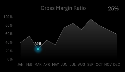
Gross margin shows what final portion of revenue constitutes the company’s profit after covering the costs of producing goods or services.
Gross Margin Formula:
Gross Margin = (Gross Profit / Revenue) * 100%.
Here’s a simple example:
- Company Revenue - $1,000,000.
- Gross Profit - $400,000.
The main goal of this indicator is to determine how effectively the company generates gross profit for every dollar invested in producing goods or services.
GETPIVOTDATA Function for Excel Dashboard Development
For the development of a dashboard template to monitor key business financial stability indicators, Excel pivot tables were used along with the GETPIVOTDATA function designed for data extraction. The structure of the dashboard’s interactive features looks as follows:
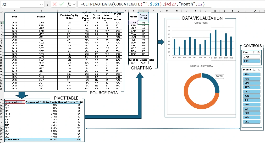
The GETPIVOTDATA function is the most popular for dynamic chart formulas based on data retrieved from pivot tables.
Presentation of Key Financial Indicators on an Excel Dashboard
All these important financial indicators are useful to harmoniously combine into a single presentation report for monitoring and analysis.
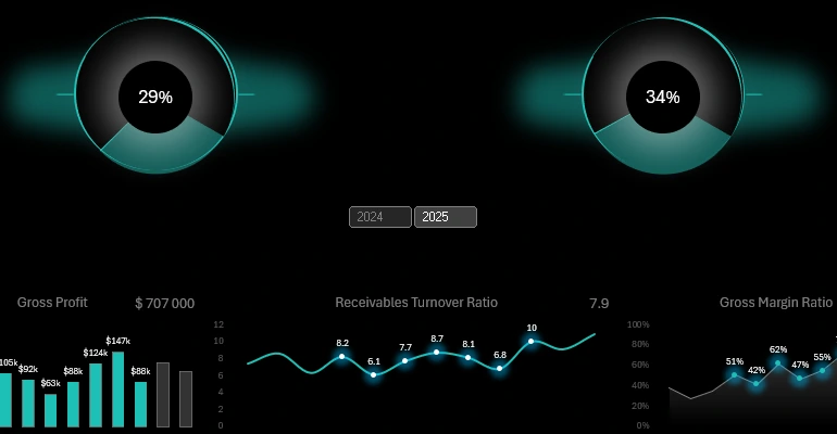
Download the Business Financial Stability Dashboard in Excel 
Feel free to use this template for your own presentations or reports. Add your own indicators to expand the effectiveness of monitoring your business’s financial stability. More financial templates for data visualization in Excel will be available on the site.
