Excel Dashboard for Effective Personal Finance Management
Allow us to introduce an Excel dashboard for effective personal finance management with a stylish design in three color palette versions. What is the secret of its effectiveness? This advantage is provided by the template's constructive interactivity. Next, let's look at how and in what way this makes a difference…
Automation as the formula for effective financial management in Excel
This dashboard template is designed for tracking personal financial expenses and savings toward personal goals. Manage and receive – that's the main rule embedded in the concept of its data visualization. To effectively manage your expenses and progressively gain the compounding effect of capital, it makes sense to use automation as a software tool for personal finances.
Automation is stronger than willpower
Most small expenses we make automatically. This is often exploited by the parties who want to sell to us painlessly, without the sting of parting with hard-earned money, but on an ongoing basis.
Interesting fact! There's a psychological effect called the "Latte Factor" – a concept popularized by financial author David Bach: small daily expenses (like takeout coffee) may seem insignificant, but over 20-30 years, with compound interest, they can add up to hundreds of thousands of dollars in lost savings.
What a personal finance dashboard in Excel can do
Please note! Acting on autopilot is highly effective because it reduces resistance for the same repeated efforts. This effect can also be made to work not only against you, but in your favor.
Useful hack! In your banking app, set up an automatic monthly transfer of a fixed amount to a savings account for personal finances. According to behavioral economists (Richard Thaler and others), people save significantly more money when contributions happen automatically ("pay yourself first") than when they need to consciously decide to set money aside every time. Set the threshold at 10%. If you can live on 100%, then you can certainly live on 90% – this won't pose a risk to your financial security. On the contrary, this approach will strengthen your financial stability.
The more automation tools you use, the more effectively you'll manage your personal finances and achieve your goals. This dashboard template is one such tool, allowing you to:
- Develop financial strategies for growing personal capital. It's not about accumulating a large amount of capital, but about learning to use it effectively. So said John Davison Rockefeller – the first official dollar billionaire in history.
- Effectively track and manage expenses.
- Regularly fuel yourself with motivation to reach your goal by watching the progress fill up in the data visualization.
Our brain loves to fill things in, and this can be used by showing it real statistical data in the form of a progress bar. Our brain also loves solving solvable problems. Set goals for yourself – and you'll get energy. It's important that goals be ambitious, but achievable.
The difficulty of achieving personal goals is primarily influenced by time. By managing deadlines, you manage the difficulty of tasks. If we had unlimited time, we would achieve all our goals with 99% probability. As Arnold Schwarzenegger said: "The point isn't just to make progress, but to make progress fast." A man who realized himself as an outstanding athlete, an iconic actor, and an influential politician.
To work with time and deadlines, the dashboard offers you interactive controls – slicers for pivot tables. You can select different time periods: month, quarter, year, and half-year, and the dashboard will update all statistical data on expenses and income automatically and accordingly.
The ratio of effort to progress determines effectiveness
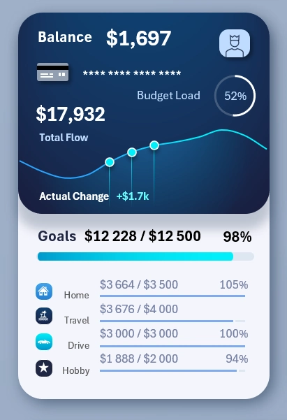
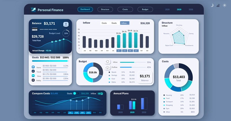
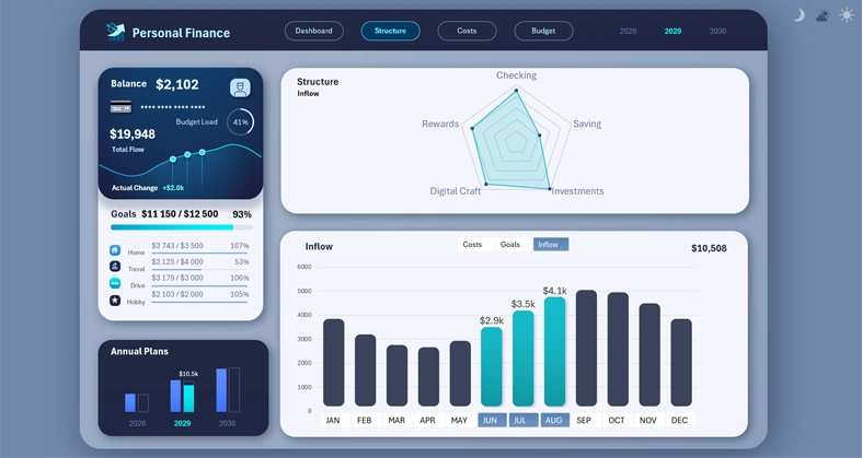
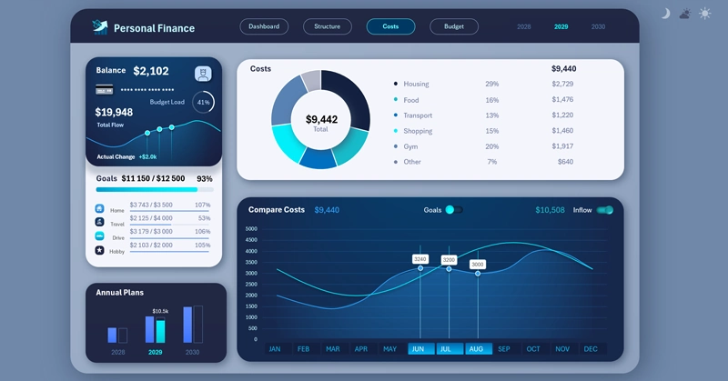
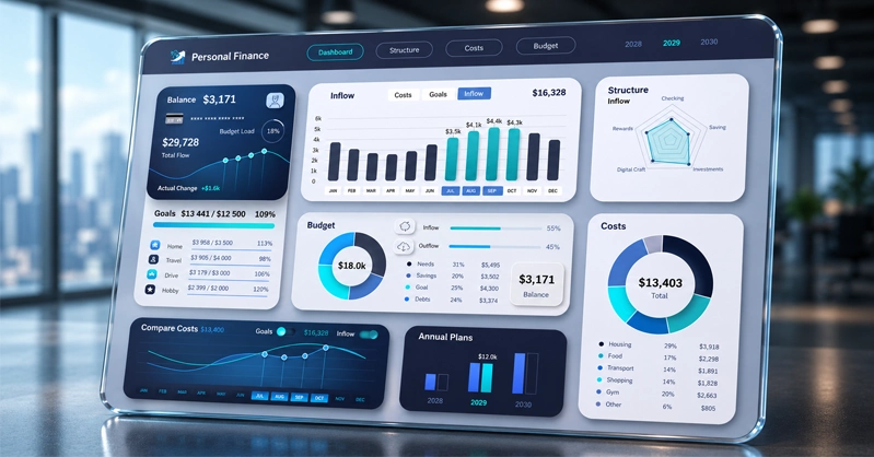
At the very beginning of the visualization template, in the upper left corner, the main summary information about personal expenses and progress toward financial goals is presented:
This dual block contains important summary information, and it's shown on every dashboard screen. The upper part of the block visualizes overall expense information, while the lower part shows progress toward goals.
The effectiveness formula is simple:
That's why we need to compare both of these parameters in parallel, in order to obtain and maintain the best effectiveness ratio.
Expense summary analysis block:
- Balance – the current remaining balance of financial funds in the account.
- Budget usage – the share of this remaining balance in the total budget for the current period. In other words, what percentage of the planned budget is left versus what has already been spent.
- Total flow – working capital as the sum of incoming and outgoing flows.
- Recent change – an indicator of the dynamic change in working capital as a percentage for the selected period, compared to the previous equivalent period (3 months, a quarter, or any other selected period).
Progress summary analysis block:
- An overall progress bar showing the total achievement of all goals as a percentage.
- Four goals, each with its own progress bar for accumulated funds.
There shouldn't be too many of them – 4 is already close to the maximum.
Interesting fact! There's a phenomenon known as the Paradox of Choice – behavioral economics research shows that when employees are offered too many retirement savings plan options, participation in savings programs drops. People put off deciding instead of choosing something, anything.
In this template, goals aren't sorted, but the video tutorial at the end of the article shows how, within this same template, you can create a goals block with a feature to sort by descending accumulated amounts.
You can also sort by plan size (that is, the cost of each goal). To do this, you only need to change a single second argument in the SORT function, which determines the sorting column in the source values. Instead of 2, specify column number 3. =SORT($K$20:$M$23,3,-1)
If you need to sort by the percentage of goal plans completed, then some preliminary processing of the source values is required, where the completion percentage for each goal is also specified. That is, add another column with formulas for calculating percentages, and then in the SORT function, expand the reference range of source values and use column number 4 in the second argument.
We strongly recommend watching the video tutorial at the end of the article, where the process of creating the descending goal-sorting formula is shown in detail.
Interactive analysis of the dynamics of structures: goals, expenses, and income
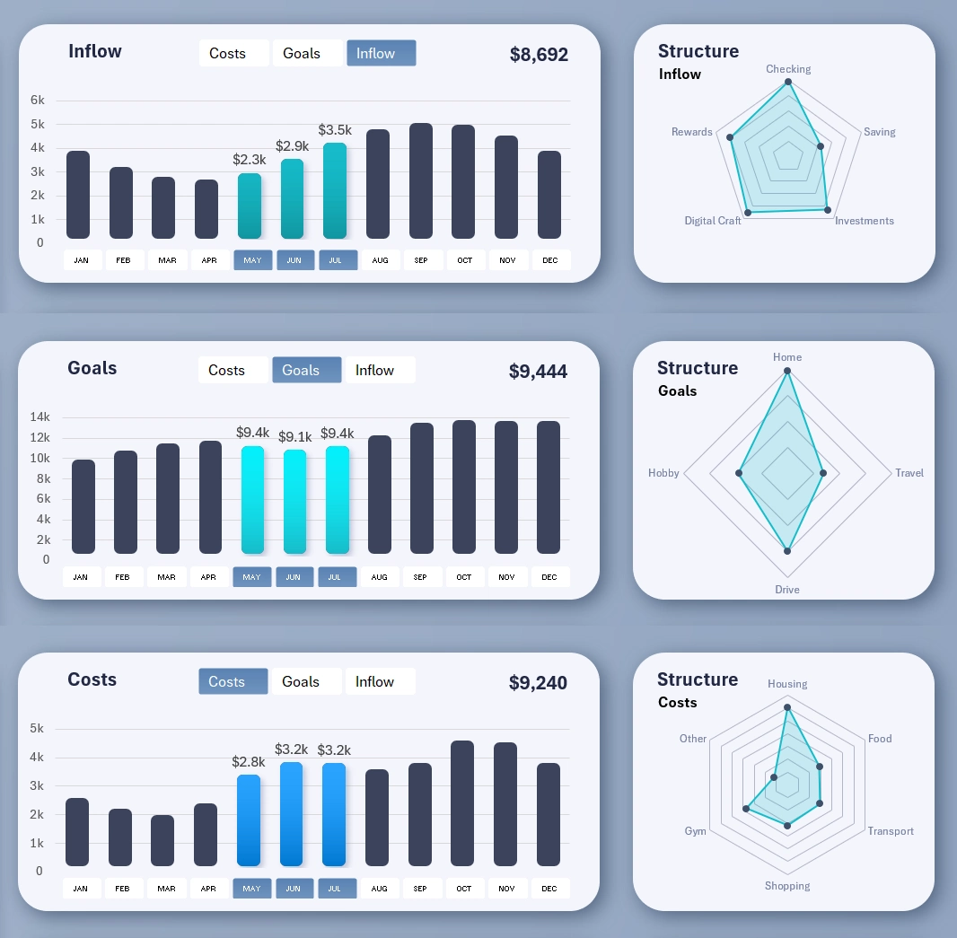
The image shows how the data changes in the visualization for the dynamics and structure blocks when switching between display modes for different data categories.
These two visualization blocks are interconnected. On the left, a multi-bar chart shows the dynamics of change for three basic indicators:
- Expense level.
- Goal progress.
- Income level.
To cleanly display all three indicators in one visualization block, a set of toggle buttons is used to switch between the different indicators within the same visualization block. This solution helps avoid the clutter that arises when all types are shown simultaneously on one bar chart. Even with columns grouped by month, the clutter is unavoidable. Filtering and segmentation are the best solution.
This set of buttons works only locally; its control is limited to the boundaries of the two visualization blocks. At the same time, the lower set of buttons (in the area of the value labels on the X-axis) for switching between months has global influence. Its reach extends to the entire dashboard, all its screens, and all its charts. When you switch months, all the data on the dashboard updates automatically and accordingly.
On the right is a Radar-type chart. It shows the distribution of values for each sub-structure nested within each basic indicator. For example:
Expenses – have a structure of six child categories of indicators:
- Household.
- Groceries.
- Transportation.
- Purchases.
- Health and wellness.
- Other.
Goals – a structure of four categories:
- For the home.
- For travel and leisure.
- For transportation.
- For hobbies.
Income – a structure of five categories:
- Salary.
- Savings.
- Investing.
- Digital freelance work.
- Bonuses and rewards.
The data on the radar chart updates according to the basic-indicator toggle above the bar chart on the left. This technique is implemented in Excel through named ranges with formulas, which are used in place of cell range references for the radar chart's series. It's shown in detail in the video tutorial below this article.
An entire screen is dedicated to the block analyzing the dynamics and structure of the basic indicators, for a full deep-dive into exploring relationships, correlations, and points of growth for applying effort:
A separate screen allows you to effectively present data on the dynamics and structure of the basic indicators without extra information. It also works well as a standalone interactive report.
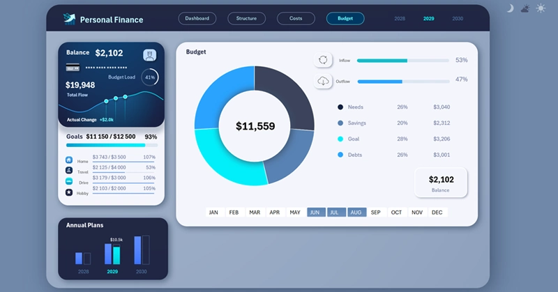
Visualizing the structure of the planned personal finance budget
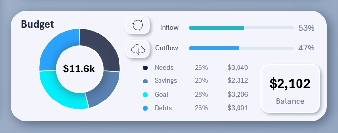
Here the visualization is extremely simple. Two progress bars are shown for the volume of personal capital inflow and outflow. The chart segments budget spending by basic personal finance categories:
- Essential needs.
- Savings – how much to set aside for an emergency cushion and passive income.
- Goals for personal growth and/or fulfillment.
- Debt repayment.
The remaining budget capital isn't included in the structure; it's displayed separately as a child block labeled "balance."
For an effective presentation of the state of your personal finance budget, use a separate dedicated dashboard screen:
Comparative expense analysis
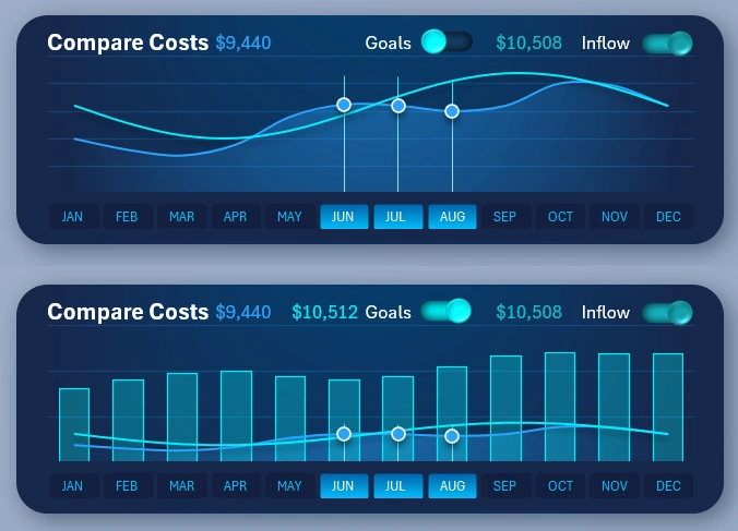
An important interactive visualization that helps in developing strategies for growing personal capital. The visualization block has toggle switches for the types of indicators shown in the comparison chart. The images show why such toggles are added – to remove visual clutter and improve data readability.
The image below shows what the comparative analysis would look like without the ability to turn off data in the visualization. If all the toggles are turned on, the user gets information overload. It's better to give them an interactive way to customize the comparative analysis to their specific conditions and needs, for comfortable and effective work.
Please note! The image below also tracks the dynamics of goal accumulation relative to expenses. But why does the accumulation fluctuate? Simply because in real life, sometimes you have to borrow from yourself when unexpected expenses come up. That is, part of the set-aside funds was withdrawn to cover unplanned expenses or due to an unexpected drop in income.
Still, despite all these helpful improvements, it's more convenient to work in comparative-analysis mode on a separate, dedicated dashboard screen:
To switch to this screen, use the main menu and click the Expenses button.
Annual savings toward financial goals
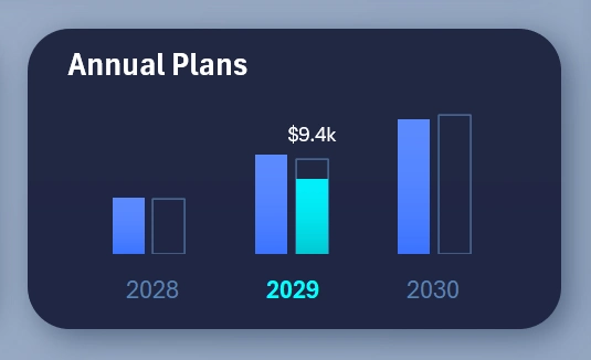
A summary bar chart of capital accumulated toward personal financial goals.
Please note! The uniqueness of this bar chart is that it traces the history of how the goals column was filled in, as of the selected month or period on the dashboard. The bar chart structure consists of three types of columns for visualization:
- The first, blue column – the annual expense level.
- The second, transparent column – the amount that has been saved toward achieving the goals.
- The green column, acting as a highlight cursor for the selected year – the current level of goal accumulation as of a specific month or any other reporting period.
If a period at the beginning of the year is selected, the green column will be at a relatively low level, while if it's closer to the end of the year, the transparent column will be nearly full. Sometimes the accumulation level fluctuates, during those difficult periods when part of the set-aside funds had to be spent. That's how it goes in real life.
Expense structure distribution chart
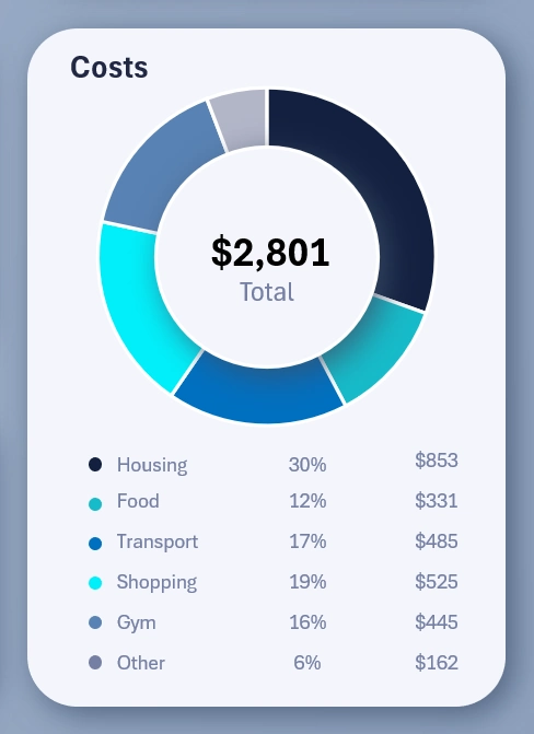
The final visualization block is quite classic, but always useful. It shows expenses distributed by chart segments, for a clear visualization of the volume of funds relative to other expenses and to the overall total.
A presentable dashboard design for comfortable work
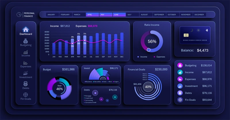
The dashboard template includes 3 design versions at once for comfortable work at different times of day and conditions: night, day, and evening. Here's what the other two design versions look like, for a bright sunny day and for deep night:
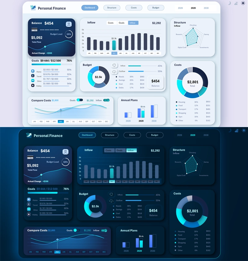
The dashboard template features various ideas implemented in Excel, offering interesting solutions in the field of data visualization presentation:
Download the Dashboard for effective personal finance management in Excel 
Together with you, we're starting a series of developing and publishing personal finance management dashboards in Excel. New, interesting solutions for interactive data visualization will be presented. You'll learn to create functional templates for reports and presentations without using macros. Follow our updates on social media under the name Excel Visual, where announcements are regularly posted, and you can leave your suggestions for improving the templates in the comments.

Data Visualization Charts for Interactive Report Creation in Excel.
Dashboard Templates