Personal Finance Capital Accumulation Dashboard in Excel
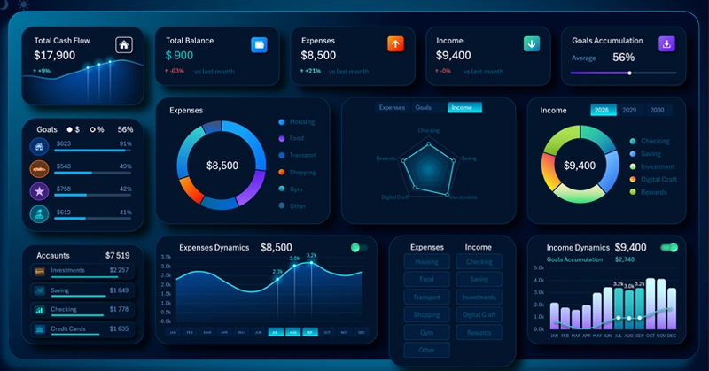
An Excel dashboard for effective capital accumulation through personal finance management. The key feature is an exclusion and filtering panel for income and expense metrics to identify the best capital growth points. The dashboard helps pinpoint in Excel the most significant income and expense sources that have the greatest impact on the speed of accumulation. A scientific approach to improving efficiency through exclusion.
How to Accelerate Personal Financial Capital Accumulation in Excel
Many people want to build wealth to meet their needs and achieve self-fulfillment. The first thing that comes to mind is starting a business. But what if that's far from the shortest or most effective path?
One of the most surprising facts in personal finance is this:
The savings rate typically has a stronger impact on the speed of capital accumulation than business returns.
Most people think the opposite: the key is to create a high-yield source of capital. But the math tells a different story.
Imagine two people who made different strategic choices.
| Parameter | Strategy A | Strategy B |
| Financial goal | $100,000 | $100,000 |
| Savings rate | 10% | 50% |
| Real annual return on business investment (after all expenses and taxes). | 15% | 7% |
Despite the fact that the first person invests far more successfully, the second will often accumulate significant capital sooner. The reason is simple: they invest five times as much money each year by cutting expenses.
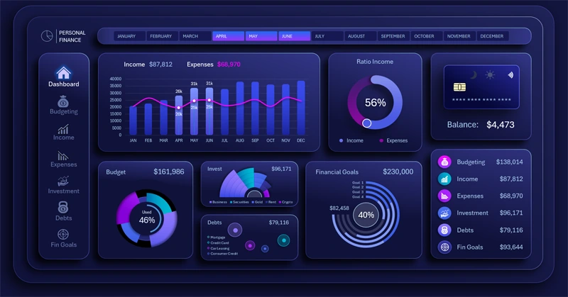
What a personal finance dashboard in Excel can do
Why this works
In the early stages, capital is very small.
If you have:
- $20,000 in capital;
- you save $12,000 per year + $20,000 in existing capital;
- you invest $12,000 per year + $20,000 in existing capital.
You will earn just $3,200 on investments, while new contributions total $12,000.
That means 79% of capital growth came from savings, not the market.
Only after decades does this dynamic shift: investment income begins to outpace new contributions.
This leads to an interesting conclusion.
For the first 10–15 years, wealth is built not so much through investing as through:
- increasing income;
- controlling expenses;
- maintaining a high savings rate;
- investing consistently.
Only then does compound interest start working in your favor.
There's an even more interesting observation!
Increasing the return on a private business from 10% to 20% looks impressive.
But increasing the savings rate from 10% to 20% can cut the path to financial independence almost in half.
Starting from the same baseline conditions:
- Income: $100,000
- Time horizon: 5 years
- Savings rate: 10%
- Return: 10%
and modeling two strategies:
- Increasing the annual return.
- Increasing the annual savings rate.
The results are as follows — a comparison table:
| Parameter | Baseline | Strategy A. Double the return | Strategy B. Double the savings rate |
| Income | $100,000 | $100,000 | $100,000 |
| Time horizon | 5 years | 5 years | 5 years |
| Savings rate | 10% | 10% | 20% |
| Return | 10% | 20% | 10% |
| Final capital | ≈ $67,000 | ≈ $81,000 | ≈ $134,000 |
| Gain vs. baseline | — | +$14,000 (+21%) | +$67,000 (+100%) |
What's interesting
The effect becomes even more striking here:
- Doubling the return from 10% to 20% increased the final capital by approximately 21%.
- Doubling the savings rate from 10% to 20% nearly doubled the capital.
Over the first five years, the additional contribution from a higher return amounts to roughly $14K, while increasing the savings rate delivers approximately $67K in additional capital — nearly 5 times more.
We are constantly told about the power of compound interest, but that power only materializes over decades. So what should people do who are ready to act effectively right now?
Don't rush to quit your job and go all-in on your own business if your goal is to accumulate personal financial capital quickly.
That's exactly why Warren Buffett often repeats a thought many people underestimate: the most powerful factor in building wealth is time, not finding the "perfect" investment. A high savings rate lets you make the most of that time while compound interest is still gaining momentum.
And that's where the personal finance and private capital accumulation dashboard comes in.
The key feature of this dashboard is the ability to exclude income and expense line items for deep analysis of strategic models aimed at maximum efficiency.
How do you improve efficiency in anything? By identifying what matters most. An effective strategy always follows the path of growth points — the metrics that most clearly correlate with the effect driving the target result. This raises a natural question: "How do you find and identify these growth points?" A scientific approach is recommended — through exclusion. If we remove an income or expense item and the bottom-line metric barely changes, there are no key growth points there. But if the picture shifts dramatically, that's the point where the majority of effort should be concentrated. In simple terms, this is the "amplify your strengths" strategy — focus on advantages, not weaknesses.
Efficiency is the art of applying less effort to achieve better results!
Analyzing the Structure of Core Expense Categories
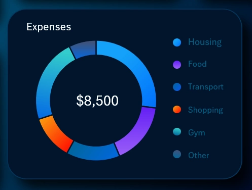
A standard donut chart controlled by the exclusion panel. The chart segments expense shares that dynamically update based on the selected reporting period on the dashboard.
The overall expense change dynamics are shown below on a line chart:
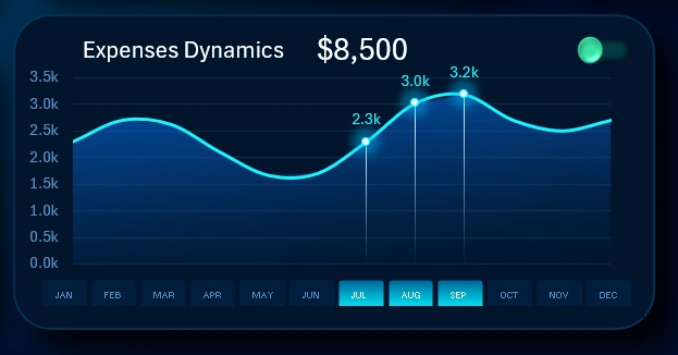
Where month name labels would normally appear on the line chart's X-axis, there are buttons for managing reporting periods and switching between months across the entire dashboard. The authority of the month-switching buttons extends to the entire dashboard, all its child screens, and all data visualization blocks, which update automatically and accordingly under their control.
Selecting multiple months simultaneously lets you define custom reporting periods. For example, in the image, 3 months are selected at once — representing the third quarter. You can also specify a half-year, a full year, or define custom internal reporting periods such as peak sales months, anomaly spikes, seasonal dips, and so on. To do this, hold down the CTRL key on your keyboard while clicking months with your mouse. This is standard behavior for pivot table slicer buttons in Excel.
By using the metric exclusion panel, you can analyze dynamics individually for each core expense category or for entire expense groups. This is especially convenient on a dedicated screen focused entirely on expense structure:
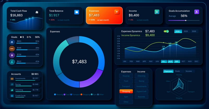
Note! Using the exclusion panel, one core expense category — Shopping — has been excluded. It previously appeared as an orange segment on the chart; now that same color highlights the corresponding button on the exclusion control panel.
Additionally, the line chart curve has changed. It now reflects the dynamic total across only 5 expense categories.
The Radar chart has also changed. The Shopping category now equals zero in the visualization, and its marker is positioned as close to the center as possible — at the minimum value of zero.
This same image demonstrates the function of enabling the income dynamics curve on the line chart for comparative analysis. This screen contains no income information, making that feature especially useful here.
Analyzing the Dynamics and Structure of Income Sources
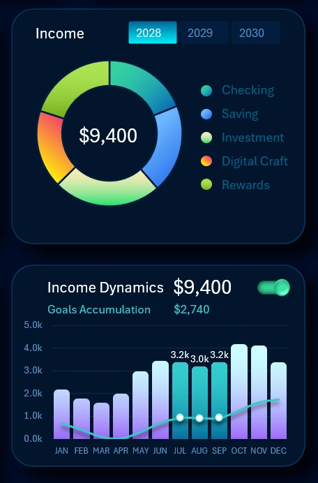
Income is presented on the dashboard in the same way as expenses, following the same principles. The key difference is the curve on the combined income dynamics analysis chart. There, instead of expenses, the accumulation metric dynamics are used for comparative analysis.
It's worth noting right away that this is where the buttons for switching metrics by year are located. The authority of the year-switching button block also extends to the entire dashboard and all its child screens with visualizations. You can also perform multi-year data selection simultaneously for several years, or cumulatively for all three years at once, by holding the CTRL key on your keyboard while toggling the pivot table slicer buttons in Excel.
Exclusion-based analysis can also be performed for income categories on a dedicated child screen of the dashboard:
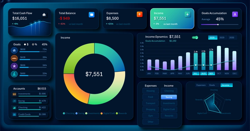
Note! When the income source "Savings" is disabled, the corresponding blue segment is removed from the chart. The matching button on the exclusion panel is now highlighted in the same blue color.
As a result, the bars on the bar chart have also changed along with the accumulation dynamics curve, reflecting the new calculations without that one income source.
On the Radar chart, the income level metric from dividends or interest on savings in deposit accounts or brokerage Treasury bond accounts has dropped (depending on the savings type, the scenario can be modeled differently).
Yes, this screen does not include expense data for comparative analysis the way the previous one does. But that's not necessary here. If you need to perform a comparative analysis of income and expense dynamics together, simply switch to the expense dashboard screen.
Personal Financial Goal Achievement Ranking
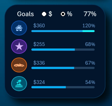
The goal ranking displays plan completion progress toward personal financial goals as a percentage. The ranking is sorted in descending order, but you can sort not only by plan completion percentage but also by accumulated amounts. To do this, use the toggle and select the [$] symbol instead of [%].
The financial goal accumulation visualization block has its own dedicated report screen:
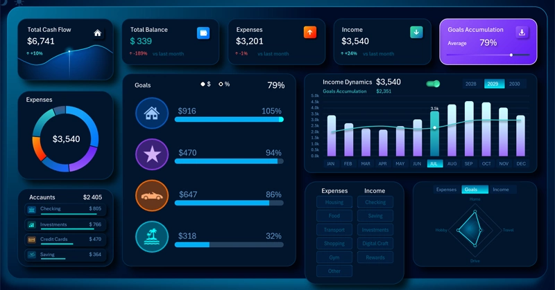
Metric values are displayed in two columns. The left column shows accumulated amounts for each financial goal, and the right column shows the plan completion percentage as of the currently selected reporting period.
If the accumulated amount for a goal exceeds 100% of the plan, the over-achievement portion is highlighted in light green. In this example, there is a 5% over-achievement on the home savings goal, set as of July 2029 (as shown in the image). All goals are sorted in descending order by plan completion percentage. The informative thematic icons corresponding to each goal are sorted automatically and accordingly. When the month or other reporting period changes, the ranking is re-sorted along with the icons.
The Radar chart shows the distribution of accumulated capital across goals.
In the dashboard header, the KPI card in the upper right corner features a progress bar showing the average overall plan completion across all goals simultaneously. The image shows a value of 79% plan completion for financial goal accumulation.
If we use the income source disable buttons, this will correspondingly affect the personal capital accumulation statistics within each goal. The ranking will be re-sorted, and the accumulation dynamics curve will decline to varying degrees depending on the strength of that growth point.
Total Turnover of Personal Finance Funds
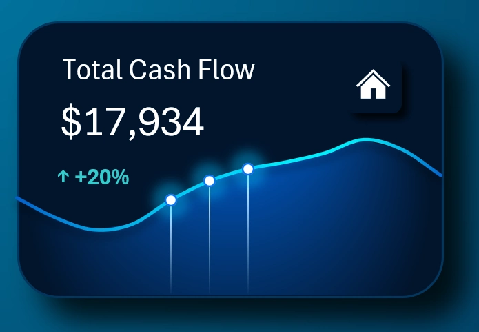
The total capital flowing through the cash stream within the capacity of personal finance income and expense opportunities. Helps assess your capital throughput for the current month.
The metric is presented as a line chart, but it also has a dedicated screen for report presentation and convenient analysis:
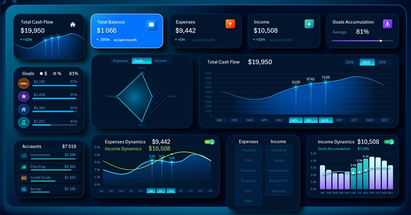
Here is a full combination of charts related to the overall personal cash flow. But the largest portion of the screen is occupied by a line chart showing the dynamics of working capital turnover for the current reporting period — for example, the summer season as shown in the image.
Account Balance Status Across All Account Types
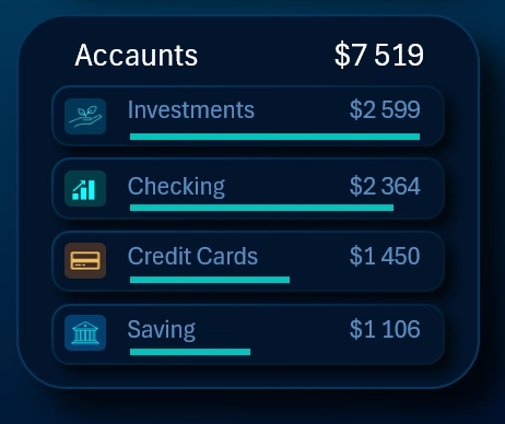
Supporting information on balances across different accounts, as well as an overall total combined balance. For convenience, accounts are also sorted in descending order like a ranking. There are no plan targets here — sorting is done by amount only, but the informative thematic icons are also sorted automatically and accordingly by ranking when balances change.
Dashboard Design for Personal Finance Management in Excel
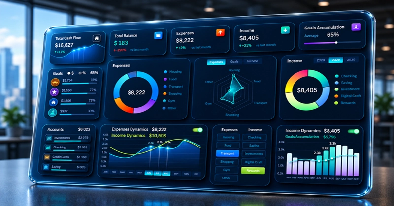
Software developers should care about their target users. That means paying special attention to the front end — and design in particular. The user should not only get the desired result, but also enjoy an aesthetic experience throughout the process. Usable user experience must also be kept in mind. For example, always offer different design versions for use at different times of day and under different conditions. For daytime use, when bright sunlight is coming through the window, you can switch to the light version of the dashboard:
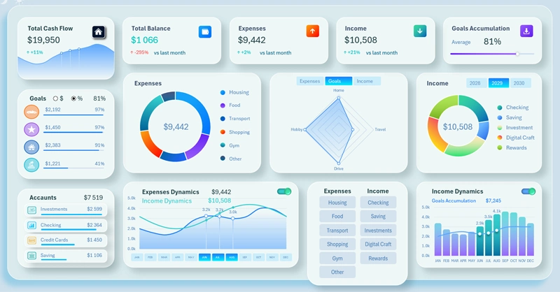
Design should sell users a rational pleasure that powerfully captures attention. Selling is the final — and most rewarding — part of development.
Download the Free Personal Finance Management Template in Excel 
We continue our series of dashboards dedicated to personal finance management in Excel. Each new template will have its own unique features and advantages. Leave your feedback and suggestions in the comments on the Excel Visual social media pages. And feel free to ask questions.
Data Visualization Charts for Interactive Report Creation in Excel.
Dashboard Templates