Download interactive HR Dashboard in Excel with Game Design
An HR dashboard is a compass in the world of personnel management. Given the volume of data in modern times, the benefits of a dashboard for an HR manager, capable of engaging in work processes like a game, are invaluable. Thanks to data visualization, there is no need to absorb large volumes of information to assess the current situation and determine the correct direction for the development of the company's personnel management. It's better to focus initially on key performance indicators and delve into details only when necessary. Life should be playful! People are the main resource of a successful business. They need to be cared for, which requires effective management of their professional potential, work time, and even emotional energy. Personnel should be valued, nurtured, and provided with the best conditions for productivity. Let's look at how our interactive HR dashboard template can help analyze management tasks.
Game Design Interface of HR Dashboard for Personnel Management
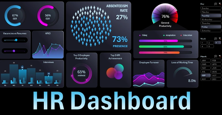
The interactive HR dashboard with a game interface seamlessly combines several key functions:
- Presentation of metrics.
- Work report.
- Interface for managing HR processes.
Based on these facts, the technical task plan should be accordingly developed. We recommend considering an interesting dashboard template for analyzing personnel management processes that resemble a game.
The structure of the dashboard consists of ten blocks and a side panel for selecting data for different accounting periods: month, week, day.
Let's start the overview with the attractive visualization design found outside the blocks.
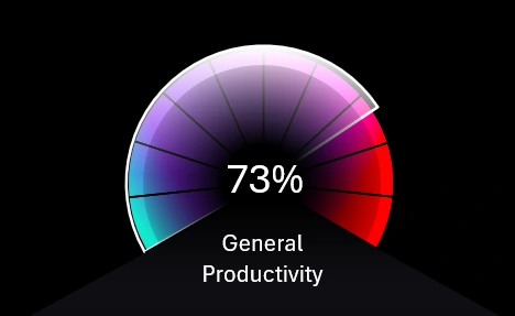
General Productivity
How to Create Speedometer Chart in Excel for Dashboard
An effective game design chart for analyzing the overall productivity metric of the company's employees. It is created using a combination chart and vector shapes in Excel.
ABSENTEEISM RATE
How to make Waffle Chart in Excel for Grid Dashboard
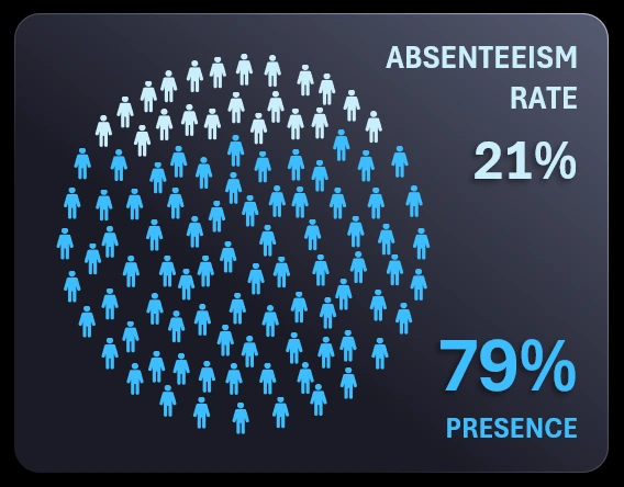
The main central block informs us about the number of employees who were not present at the workplace during a specific period. Statistics for this metric are usually collected using bracelets, chips, cards, etc. This is a very valuable metric for every business owner. The visualization is done in the style of a Waffle Chart but with a slight design twist. It’s quite original to make a Waffle Chart in the shape of a circle – it looks interesting and fresh. This can also be implemented using MS Excel without macros, just formulas.
EER and ESR
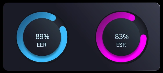
Two crucial metrics that every employer should consider are: EER - Employee Engagement Rate and ESR - Employee Satisfaction Rate. The statistics for these metrics are collected using various methods, with the most popular being surveys. The visualization design is simple – the play of colors and shadows creates a beautiful style even in MS Excel. All necessary tools are available in the standard set of all MS Office applications. Nothing complicated.
Vacancies vs Resumes
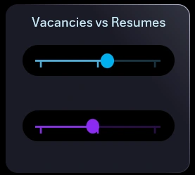
The ratio of open vacancies to new resumes received in the HR department. This block visually displays the total values without numbers and serves as a supplement to the following block with a more detailed data presentation.
APJO
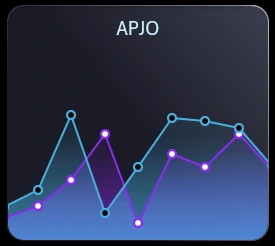
Applicant to Job Ratio – here we can see the dynamics of changes in the number of new open vacancies relative to new resumes received. This and the previous visualization blocks always work well together.
Interviews
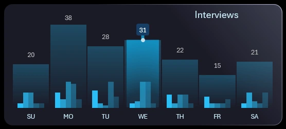
An interesting combined weekly chart. There are only 5 interviewers in the HR department who conduct interviews daily. The smaller bars on the histogram show the number of interviews conducted by each interviewer. The larger bars show the total daily numbers of interviews conducted by all interviewers. The day of the week selected by the user on the HR dashboard panel is highlighted in bright color. In this case, Wednesday was chosen – the number of interviews conducted was 31. The most interviews were conducted by interviewers number 3 and 4. The block provides a maximum amount of information, game-like interactivity, plus feedback, all combined in one data visualization block.
Top 3 Employee Productivity
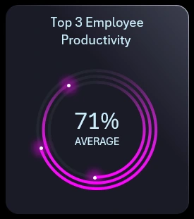
Visual analysis of the gap between the achievements of the top 3 most successful employees. For example, the number of sales. The most successful employees are the most demanding in terms of working conditions. This is quite justified and deserved. It is impossible and unnecessary for an HR manager to equally distribute attention and privileges to all employees, just as it is impossible to award bonuses equally. This could negatively impact staff motivation. If there is a large gap in achievements among the top sales leaders, the HR manager should delve into finding cause-and-effect relationships. Possible reasons could include violations of working conditions, unfair internal competition, poor adaptation of indirectly related newcomers, and more.
Top 3 KPI Achievement
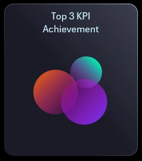
This is a similar indicator to the previous one but focuses on results rather than performers. Essentially, it shows the top 3 results for strategic business goals. For example, expanding the client base, scaling logistics, increasing production, etc.
Employee Turnover
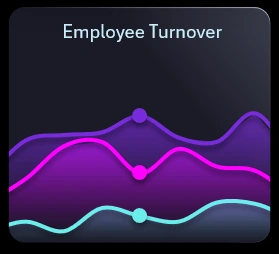
A very popular indicator for large companies. It always grows proportionally with the company's development. This visualization shows turnover rates across three job ranks. Typically, the lowest rank has the highest turnover rate. The chart color is purple.
If only one day of the week is selected, markers appear on the visualization as shown in the image above. If two or more days are selected on the dashboard control panel, the markers disappear.
Loss of Working Time
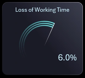
The standard for this metric can vary greatly depending on the business specifics. I cautiously note that, on average, working time losses should be within 3%-5%, but this is very conditional. It is related to employee productivity, and when its values are off the charts, it is urgent to find cause-and-effect relationships and responsible workers, even those indirectly related to the incident. Prolonged exceeding of the norm is unacceptable and can lead to irreversible consequences for the business! Working time losses are not always within the HR specialists' responsibility, but if risks are high, everyone will be at fault.
Filling Vacancies & Adaptation & Education
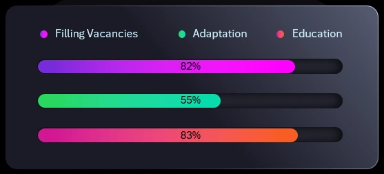
A block for three interconnected metrics related to overall employee productivity. Each name speaks for itself. It is worth noting how formulas are used to implement color highlighting of percentages that change when exceeding 45% for better readability on a dark and light progress bar background.
Button Block
The dashboard control panel needs no description. Each block of buttons allows you to create your own combination of data selection: day of the week, number of full and/or incomplete weeks of the month (4-6), and month. You can make multi-data selections using several buttons within each block simultaneously. For example, simultaneously for several days, weeks, months, or for a whole year.
As shown in this example, even such a universally accessible analytical tool as MS Excel can be used to create a useful dashboard for an HR manager. Its capabilities can be expanded. For simplicity, all interactive functionality is implemented using formulas, pivot tables, and standard tools without macros or add-ons.

