Employee performance Dashboard Excel template free download
Employee performance evaluation plays an important role in team management and improving work efficiency. Financial rewards in the form of Payroll should directly depend on this HR metric. To improve the efficiency of analytical processes and timely assessment, you can create an Excel dashboard to visualize key performance indicators (KPIs) by job category. Interactive data visualization features for task performance will provide a clear picture of how the budget is being used for the largest and most important expense category – employee salaries. Let's look at an example of how such a dashboard can look in Excel.
Example of an Employee Performance Dashboard in Excel
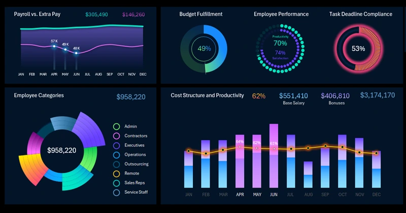
This example shows a simple square dashboard for evaluating employee performance. The template can be easily adapted to the company’s needs: it includes charts, graphs, and controls for selecting data over different reporting periods (months, quarters, years). It also allows segmentation of all dashboard data by employee categories, making the report clear and understandable even for management. With this Excel dashboard, you can quickly determine:
- which category is working most efficiently;
- where and when productivity declines are observed;
- how performance changes during different seasonal periods.
The simple square layout of the report consists of four visualization blocks. A square dashboard is a term used by data designers to describe a dashboard grid (data visualization panel) built in a structure with an equal number of blocks in height and width, most often in square form. For example, in this template, the square grid is 2 x 2 visualization blocks. Other square grid dashboard templates may be 3 x 3, and rarely 4 x 4. This approach visually simplifies the perception of even complex information. As a result, the interactive report format intuitively feels familiar and user-friendly. It's a technical design trick that works effectively – nothing more.
Next, let’s take a closer look at all the features of this simple but very useful dashboard template.
Interactive Visualization of Employee Task Completion Report in Excel
The top-left corner is traditionally where the most important information is placed on a dashboard. In our example, that’s financial information — specifically, expenses for Payroll, bonuses, or reward payouts. Money is always important, even lunch conversations about it tend to get intense. The name of the first block speaks for itself: Payroll to Bonus Ratio.
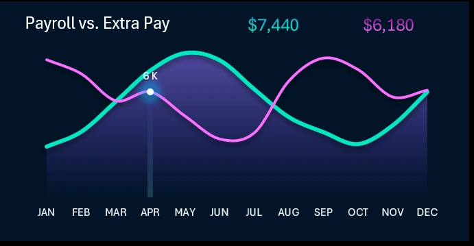
When the data selection filters change, the graph values update automatically. You simply choose the month, year, and/or category. The dashboard also supports multi-selection, allowing, for example, three months to be selected for a quarterly analysis. All data is interconnected and filtered accordingly. The interactive control buttons are located in other blocks that we will cover next.
For a more detailed analysis of salary and bonus indicators, you can check another dashboard template from the catalog on this website: Payroll Summary Report in Excel.
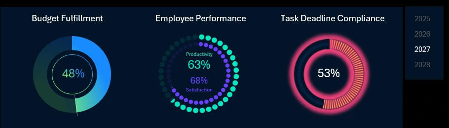
Employee Efficiency Profitability Analysis and Monitoring
How to Create Beautiful Pie Charts in Excel
Three summary charts based on key task performance indicators:
- Share of the budget allocated for financial rewards.
- Ratio of two levels: employee productivity and satisfaction.
- Task completion timeliness before the deadline.
Dashboard summaries are always placed at the top, with detailed data closer to the bottom.
Data year-switching buttons are located to the right of this block.
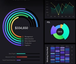
Employee Category Segmentation
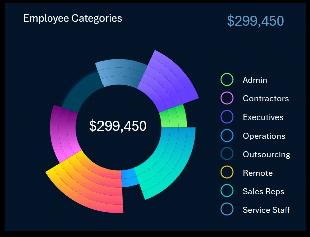
This block analyzes the distribution of the budget allocated for Payroll and additional financial rewards across different employee categories.
A simple question for an HR specialist: why should different employee categories be rewarded differently? The answer is one word — motivation!
This visualization block includes a set of buttons that also act as dashboard control elements. All data is linked to this block as well. It's very convenient. If we select one employee category, the entire dashboard now focuses on that category. All metrics are filtered accordingly. This mechanism allows us to implement pivot tables and data slicers in Excel. Moreover, multi-selection is also supported here. That means the dashboard can focus on three selected categories at once.
Payroll to Employee Productivity Ratio
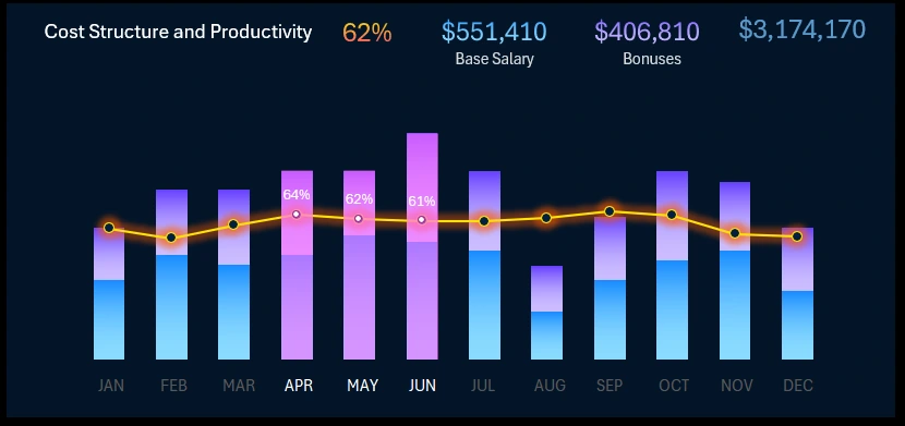
This block allows you to track the monthly dynamics of the Payroll to productivity ratio throughout the year. The block also includes control buttons. The screenshot shows an example of multi-selection — three months selected to represent Q2. Dynamic summary labels are updated automatically at the top of the visualization block.
Employee Productivity and Payroll Expense Report Presentation
Creating such a dashboard in Excel does not require any programming skills. Basic knowledge of standard Excel tools and a good color palette are enough. As a result, you get a presentation that not only attracts attention but also delivers a solution.
Download the Employee Performance Dashboard Excel Template 
Overall, this is a convenient tool for visually analyzing key performance indicators. It helps quickly identify Payroll budget overruns and team productivity declines. Make informed management decisions to improve overall efficiency. Develop strategies for motivation and goal achievement.
Thanks to the free template, you can adapt the visualizations to your company's needs — add new metrics, change chart formats, and set filters by departments or periods. All done without using macros.
Download the ready-made template, simplify analysis, and make your employee performance evaluation process more transparent and efficient. At the very least, you'll save time creating an interactive visual report in Excel from scratch.

Data Visualization Charts for Interactive Report Creation in Excel.
Dashboard Templates