$100K Excel Investment Dashboard for Template Developers
A useful Excel Dashboard for finding the best solutions to reach financial independence in the shortest possible time. When data visualization clearly shows the key factors influencing the growth of your investment capital and which scenario is best to apply, it not only boosts motivation but also increases the energy to take action. 2 investment strategies, 3 different tactics to choose the most optimal path that fits your specific conditions. This is a logical continuation of the article on the path to financial freedom for an Excel dashboard developer. This template provides a solution for how to effectively manage $100,000 in personal capital to achieve financial independence.
Where to invest $100K and how much you can earn from it
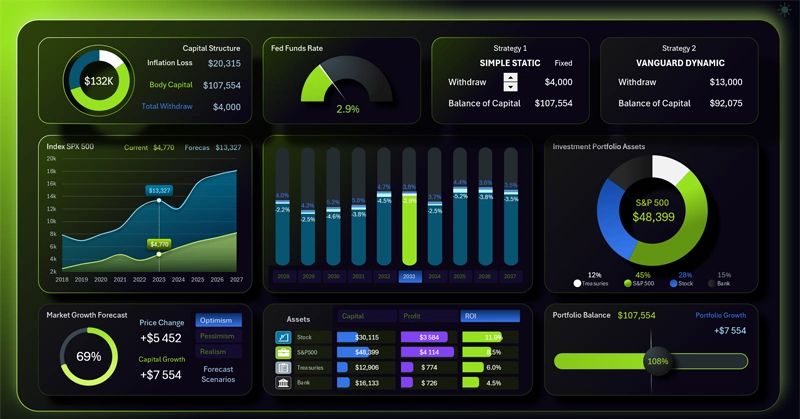
The world is ruled by strength! Where does strength come from? Stable strength comes from accumulation — this is the skill of managing resources. How do you know you possess this skill? If your resources grow in the long run, then you have it. But there's even better news. The accumulation process can be many times faster when strengthened with attention. Where attention goes, energy flows. Data visualization allows you to effectively manage your attention, and therefore your energy, and therefore the growth of your strength.
This dashboard is specifically designed for the long-term preservation and accumulation of financial resources, regardless of inflation rates or fluctuations in financial market conditions. Even in the most unfavorable scenarios, your personal capital can grow with effective management and control. Moreover, throughout the entire accumulation journey, you can regularly receive a stable income from this capital.
"Capital is just a tool. In the hands of someone who knows how to use it, it should create value" — Warren Buffett.
The dashboard template involves using two strategies for accumulating capital and regularly extracting profit from it:
- Simple Static — a fixed amount or a fixed percentage is withdrawn from the capital each year (there's an option to switch modes), regardless of market growth or decline and inflation levels.
- Dynamic Vanguard strategy from an investment fund — Vanguard (the world's second-largest fund by assets under management). A more complex but more profitable strategy that lets you extract maximum efficiency from your capital under any financial market conditions.
The first strategy is built on the fixed 4% withdrawal rule from the initial investment amount. The 4% rule is one of the most popular concepts in retirement planning and the FIRE movement (Financial Independence, Retire Early). The best minds in investing, based on many years of statistics on financial market price movements, have already calculated and unanimously concluded that the 4% rule is the most optimal withdrawal rate for passive investing and extracting maximum profit from capital.
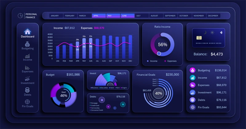
Excel Personal Finance Dashboard Template and Overview
The 4% rule shows the fixed amount (4% of your initial invested capital) you can withdraw each year to live on, so that the money will very likely last at least 30 years through any market fluctuations and inflation losses (and won't run out during your lifetime).
The developers of this dashboard invite you to evaluate the possibilities of capital preservation if the 4% withdrawal is calculated not from the initial investment amount, but from the current capital balance. That is, on the dashboard you can analyze what will happen to your investment portfolio if you withdraw an amount tied to the current size of the invested funds each year. With this approach, the capital is preserved not just for 30 years, but forever! However, in the first 10 years the total earnings will be lower, although over the longer term both the capital and the withdrawal amount will only grow. That's because the investment principal will also grow faster.
Top employees at the Vanguard investment fund improved the profitability of the 4% rule through flexible withdrawal conditions. They propose not withdrawing a fixed amount or a fixed percentage, but adjusting the annual withdrawal relative to market conditions. If markets fall, withdraw up to 1.5% less. If markets rise, withdraw up to 5% more.
Everyone gets richer in rising markets, but true entrepreneurial ability shows itself when you're able to generate profit in falling markets.
Over a 10-year period, the most profitable strategy is, of course, the Vanguard method.
How to earn that kind of capital by developing Excel templates is described in detail in the previous article:
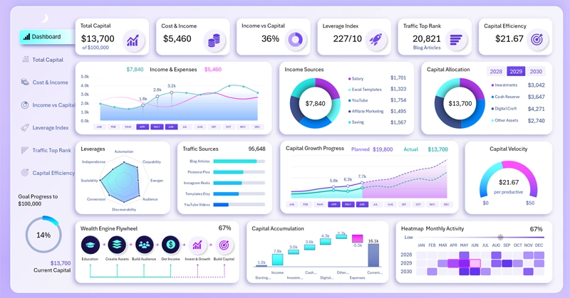
How to Make $100K Developing Excel Dashboards
The dashboard's capabilities include different forecasts of financial market price changes for the next 10 years, with 3 scenarios at once:
- Optimistic.
- Pessimistic.
- Realistic scenario.
These forecasts were compiled using AI. You can enter your own projected market price values on the "Data" sheet in this Excel file.
The dashboard clearly shows that over a 10-year period, the Vanguard strategy wins under any scenario. But if the planning period is longer than 30 years, then in any case our proposed strategy — withdrawing 4% of the current capital balance as of the current year — wins. And this strategy wins on two criteria at once:
- Capital growth will be higher.
- The amount of annual withdrawals will also be higher.
Many people don't plan to hold capital for more than 30 years. Moreover, they want to withdraw not just the profit, but the capital principal itself, so they can spend more money during their lifetime. That's why this strategy isn't right for everyone.
After all, income in an investment account is still unrealized profit. This money only becomes real private capital after all investment assets are sold and the funds are withdrawn to your personal account or into cash. Or even better, into durable goods with a long service life.
In simple terms, numbers in a brokerage account aren't money in your pocket.
Visualizing capital management on the Excel dashboard
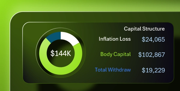
In the upper left corner is a summary cash flow chart. Here the entire working capital is segmented into three categories:
- The amount of capital lost due to the depreciation of money from annual inflation.
- The current balance of the investment capital principal.
- The total amount of funds withdrawn during the selected reporting period on the dashboard.
The sum of all these values is shown in the center of the chart as the total cash flow.
This is what the structure of current working capital, built from personal savings, looks like.
Current inflation rate
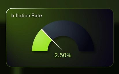
The gauge chart shows the current inflation rate, which relentlessly eats away at accumulated capital every year. It can consume almost all of your capital if it's not invested. It's worth noting that the market price movement scenarios include a correlation between the inflation rate and rising or falling markets.
Current and forecasted stock market indicators
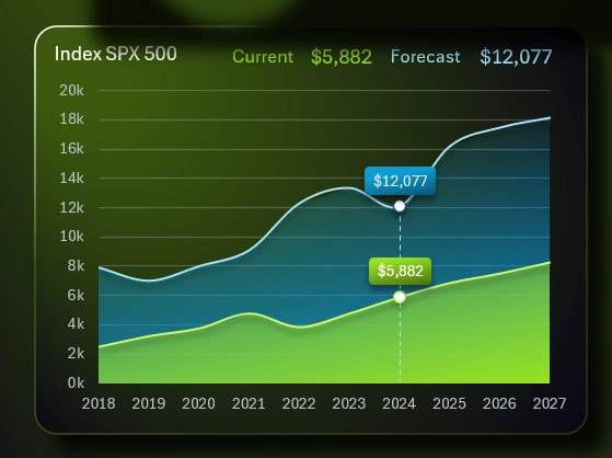
This dashboard analyzes the stock market using the price movement of the SPX500 index — the combined market capitalization of more than 500 top US companies, divided by a divisor for convenient display of price dynamics. In addition, the S&P 500 index makes up the largest share of the personal investment portfolio. Index investing is always a safe form of investing thanks to asset diversification. Every investor's task isn't to make money, but to preserve capital. A top investor always earns less than a top businessman, but more efficiently.
The upper blue curve is the expected price forecast for the next +10 years. The lower yellow curve is the current SPX500 index price over the past 10 years.
When you switch the forecast scenario, only the upper curve changes. The dynamic labels at the top of the chart always show only the latest price for the selected period.
Strategy scenario management
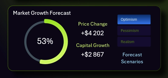
Below is a block of forecast scenario switch buttons, along with summary information about changes in the market and capital. Excel PivotTable slicer buttons are used to switch between scenarios.
No one can say exactly what SPX500 index prices will be over the next 10 years, so it's better to build 3 market behavior models at once. This lets you be prepared for different situations for effective capital management and helps you stay calm as an investor without harming your emotional health. You should always have an answer for at least 2 scenarios: what to do in the worst-case and best-case scenarios, in order to preserve capital and not miss out on all the potential profit.
The chart shows how much the market has changed from the date of your first capital investment (in this example, 2028) to the currently selected period. This Excel chart can also display negative values in red and values above +100% in a white bar on the scale.
You can also see how many points the SPX500 index price has changed. Accordingly, taking this fact into account, along with inflation and the withdrawal amount, the current capital balance also changes. How much it has changed is shown as a numeric value in this same visualization block.
Simple fixed withdrawal amount or percentage strategy
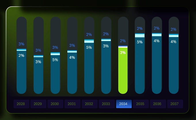
The first strategy is quite simple to use, but simplicity is always a guarantee of reliability. In the center of the dashboard is a bar chart that tracks the state of capital as different conditions change:
- changes in stock market conditions;
- the annual withdrawal amount;
- inflation.
At the bottom, instead of X-axis labels, there are buttons under each bar for switching between years on the dashboard.
For a more detailed dive into this report, there's a whole separate child screen dedicated to it. Use the dashboard's main menu (KPI cards) to switch:
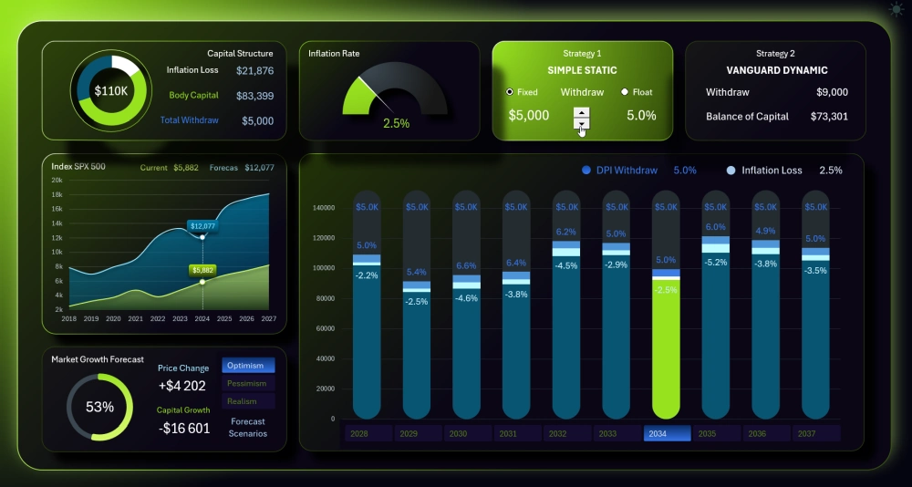
The histogram consists of three layers:
- Bottom layer — personal capital balance.
- Middle layer — the amount of annual losses from inflation (-2.5%).
- Top layer — the withdrawal share of capital (locked-in profit) (5%).
The annual capital balance level floats proportionally to changes in the projected S&P 500 price on the line chart to the left.
The numbers at the very top of each bar are the total monthly withdrawal amount. If Fixed mode is on, it stays the same and is tied to the initial invested capital amount. In this example, it's $5.0K (as shown in the image).
This dashboard lets the user change the withdrawal amount. For example, the image shows a withdrawal amount of $5,000 from an initial capital amount of $100,000. That's now a 5% rule. You can use the spinner control to adjust the amount up or down. Notice that a 20% increase in the withdrawal amount didn't have a major impact on capital, but also note this assumes the optimistic scenario for the future market outlook.
Our simple fixed percentage withdrawal strategy
Now let's look at how Floating mode works — a different tactic within the first strategy:
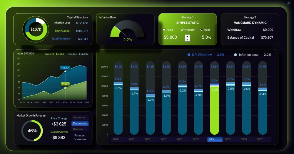
Let's switch the mode to Floating and set the scenario to Pessimistic. We'll leave the fixed withdrawal percentage at 5%. When you switch the mode, you can immediately see that the annual withdrawal amounts have changed (the topmost labels on the histogram). They used to all be the same; now they're all different. What's become the same now is the monthly percentages (the middle-level labels).
In this example we're using a fixed percentage of 5%, but according to our strategy, you should use 4% — over the long run this will have a huge impact on the monthly withdrawal amount and on capital growth. This approach is the shortest path to financial independence, although it lags behind other methods in the early years. In other words, if you plan to invest for more than 30 years, the floating withdrawal amount tactic for a fixed percentage under the first strategy will be simply irreplaceable and the best choice.
As Charlie Munger says in his books on investing: "Patience always beats genius over the long haul."
You should always have an investment plan. Every experienced investor is always looking for the best entry point and the best exit point in their investments.
Setting the withdrawal share as a fixed percentage of the current capital balance is the most resilient of all the strategies on this dashboard. Your capital will always be preserved and, on top of that, will generate profit. At first the profit won't be significant, but after some time it will be the largest withdrawal amount of all the options offered. It's the initial period that has the greatest impact on the final result. This effect is very clearly tracked in the following bar chart under the second strategy.
Vanguard's strong strategy for withdrawing earned capital
In the dashboard's main menu, switch to the next child screen — the Vanguard dynamic strategy:
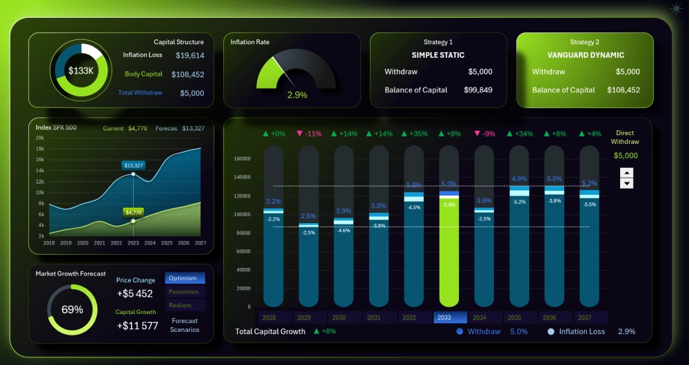
Here a dynamic approach is offered for setting the withdrawal amount of the capital share as locked-in profit. To do this, the user can set the withdrawal amount separately for each bar of the selected code. Use the spinner control on the right under the "Withdrawal Management" label to do this.
To make it easier to tell which year was favorable and which was unprofitable, the percentage change in market price fluctuations is shown above each bar.
Two auxiliary horizontal lines have also been added here. They display support and resistance levels based on the minimum net capital value and the maximum gross capital value. This makes it easy to track the fluctuation channel of your personal financial assets' value. Ideally this channel should be as narrow as possible, with withdrawal amounts within it as large as possible. This can indicate good capital preservation and growth, as well as a solid financial reward.
While managing the withdrawal amount, you can track the strength of the influence of earlier periods. In the early years, even the smallest changes in the withdrawal amount have the strongest impact on the portfolio balance in later years. But this influence weakens significantly with each passing year. So a rational conclusion follows: the closer we are to the start of the investment period, the less we should withdraw. And conversely, the closer we get to the end of the period, the more we can afford to lock in profits.
Structure of a safe investment portfolio
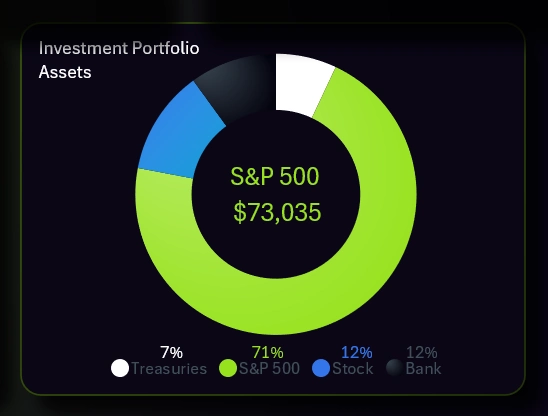
This dashboard provides an example of a private investor's portfolio segmentation structure across the following financial assets:
- Short-term bonds — highly liquid assets that, while not high-yield, are always available for use in urgent situations. During financial crises, short-term bond returns can outperform most top stocks.
- S&P 500 index investing. A very reliable asset backed by strong diversification. This asset isn't high-yield, and sometimes returns can even be negative. But over the long term, its overall return outperforms most investment funds. This has already been publicly proven.
- Stocks of top companies. Risky, high-yield investments. Even safe portfolios should include a small percentage of high-yield, if risky, stocks. Sometimes these are exactly what saves the entire portfolio's returns, and if they drop, the portfolio won't suffer significant damage since their share is too small to have a major impact. Remember the risk/reward ratio rules.
- Bank deposits. No matter how much they're criticized, we still recommend not neglecting their use, even in small amounts. Even the most advanced and aggressive investor always keeps some money in bank deposits or savings accounts. The main mistake is viewing a bank deposit as a wealth-building tool. If you instead view it as a protection tool and a source of quick cash, everything falls into place.
Interesting fact! One of the most famous bets in financial history! Warren Buffett made it in 2007 (for the period from 2008 through 2017 inclusive) for $1 million.
The essence of the bet:
- Buffett's bet: A simple S&P 500 index fund (with minimal fees) would outperform the professionals over 10 years.
- The hedge funds' bet: A team of 5 professionally managed hedge funds (highly paid managers, analysts, complex strategies) would be able to beat the market.
Results after 10 years (2008–2017):
The result was a landslide victory for Buffett and the plain S&P 500 index:
| Instrument | Average annual return | Total 10-year growth |
| S&P 500 (Buffett) | ~7.1% per year | 125.80% |
| 5 Hedge Funds (Opponents) | ~2.2% per year | +36.3% (the best of the 5 funds returned +87.7%, and the worst just +2.8%) |
It's important to note that this ten-year period included the severe 2008–2009 financial crisis, and despite that, the S&P 500 index still delivered excellent returns of +125.8% over the period. In the long run, no single company can move faster than the entire market, since that would require it to keep growing for decades on end.
Progress bar for personal capital accumulation through investing
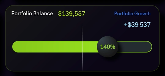
It's simple here. Right below the portfolio structure chart is a progress bar, split exactly in half by a white vertical line. At that line is the value representing 100% of the initially invested capital. If the progress bar's indicator shifts to the right, we're looking at capital accumulation strength. If it shifts to the left, we're looking at the drawdown level of the overall investment portfolio. A drawdown is a temporary condition as long as the capital is still alive and hasn't been withdrawn by more than 50%. Every investor has experienced a drawdown more than once. It's important to keep this factor in mind so you don't make emotional decisions and lock in a loss prematurely.
Smart table with column sorting
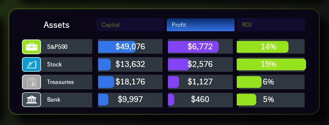
The dashboard also includes a comparison table of financial assets from a private investor's investment portfolio.
Each asset is compared across 3 indicators:
- The current balance of funds invested in the asset.
- The locked-in profit for the same selected period.
- ROI — the return on each dollar invested, in %.
To sort assets by their best value for each indicator, use the button block in the table header. This button block works locally, and unlike the other buttons, its effect doesn't extend to other elements of the dashboard.
A stylish design for the capital growth calculator in Excel
This dashboard has its own character, matching its purpose and range of capabilities. It deserves its own unique and appealing design. What's more, working with a dashboard like this will likely require extended periods of time. That's why it makes sense to also give the user a light version of the design for use during the active part of the day, when the sun is still high:
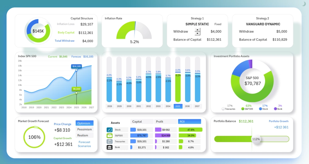
This dashboard definitely has a lot of potential, and it can still be expanded further. The topic of private investing is only just being explored here, but there are still plenty of ideas for improvements and new features. There's no limit to perfection. We'll keep developing this topic together with you. Let us know in the comments on our social media what you'd like to see improved. In the meantime, try out this free template and see its potential for yourself:
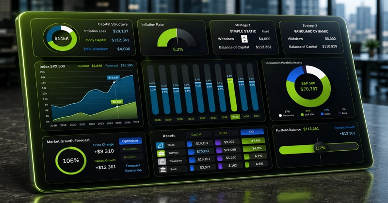
Download Dashboard for managing a personal investment portfolio in Excel 
You can try improving this template yourself with new features for analyzing private investing. This dashboard answers the question of where to invest $100K to achieve financial freedom. But another dashboard has already been published that answers the question of how to earn that $100K by developing Excel dashboard templates. That template was logically and sequentially the first one presented in our project:
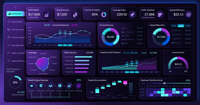
How to Build $100K in Capital for Developing Excel Dashboards
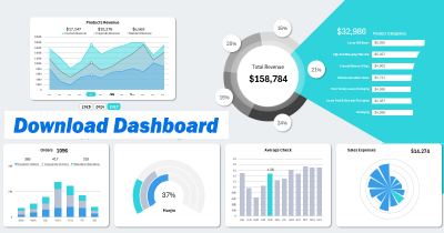
Data Visualization Charts for Interactive Report Creation in Excel.
Dashboard Templates