Excel KPI Dashboard for Template and Course Sales Growth
Excel dashboard for tracking the growth of template and course sales with KPI plan progress control. The dashboard's capabilities allow you to flexibly configure monthly achievement levels to meet sales plans
Why an Excel KPI dashboard is more valuable than a $100,000 goal
Never set yourself a goal of earning $100,000 from developing and selling Excel dashboard templates! If you do, you will most likely never reach that goal. Here's why.
What is a KPI plan?
Instead of setting yourself a financial goal in dollars (for example, $100,000 in 3 years), set a goal to sell 4,000 copies of 100 unique templates at $25 per copy.
This is your KPI (Key Performance Indicators) plan.
$100,000 or selling 4,000 template copies — sounds like the same thing, right? NO! The difference is colossal! Never confuse leading metric indicators with lagging ones.
What does a leading metric indicator mean?
Selling 4,000 template copies is a leading indicator — it's a result that acts as a cause, not a consequence. Which means you have control over this goal. And you can have a huge influence on the final result:
- develop 100 unique dashboard templates in 3 years;
- improve your sales funnel for 4,000 template copies;
- optimize the pricing landing page for the dashboard collection;
- increase the visitor-to-buyer conversion rate;
- attract more targeted traffic.
Each of these levers is in the hands of your own efforts.
What is a lagging metric indicator?
A financial goal of $100,000 in money is a lagging indicator metric. It's a consequence, not a cause! And you can barely control it directly, because it's influenced by dozens of factors unrelated to your efforts:
- people's purchasing sentiment;
- market conditions;
- changes in social media and search engine algorithms;
- changes in the strength and number of competitors;
- sales seasonality;
- macroeconomic factors.
You can do everything right and still not reach the goal, simply because the world won't factor you into its plans. This happens very often, and it's normal!
This is the trap of chasing money as a goal. You're striving for something that depends on a hundred variables you don't control — instead of a single variable that you do control. You put in a huge amount of effort, and sometimes even financial investment, into something you have no direct influence over. The result is burnout and demotivation.
Don't scatter your energy, time, and financial resources. Approach the choice of where to apply your effort carefully and responsibly.
This is exactly what KPI dashboards are for. Data visualization helps boost motivation, and a KPI dashboard lets you keep it high over the long haul. It gives you confirmation that you're approaching a correctly set goal — one you have influence over. Which means you can take full responsibility for the result.
KPIs are always about decomposing a result into intermediate goals. Breaking down a big, hypothetically vague, uncontrollable dream goal into small, specific, controllable actions, carried out according to a clear and structured sequence plan.
Remember, your task according to the KPI plan:
- Not "earn a specific amount of money," but "sell 4,000 copies of different templates at a specific price."
- Not "grow the business," but "increase conversion from 2% to 3%."
- Not "build a course empire," but "launch 3 courses that convert template buyers at 8%."
Money is what happens after you've correctly set up and executed the plan. Metaphorically speaking, to clarify the essence, money is a receipt issued as confirmation, not the goal itself. Money is merely a positive side effect of your true goals. They are true not because they're higher than money, but because you have direct influence over these goals.
Don't deceive yourself — in this world there is very little we can have direct and immediate influence over, so direct your attention there, and therefore your energy too. Be effective, and to do that, manage your attention with the help of data visualization.
Instructions for using the KPI dashboard in Excel

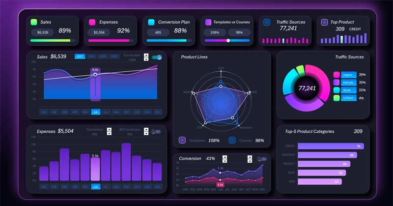
The dashboard header contains KPI cards with sparklines and progress bars. Each card also functions as a main menu item and is linked to a corresponding screen for switching into detailed analysis mode. On the cards we see not only the value, but also the progress of KPI plan completion relative to that value, thanks to data visualization.
Let's take a detailed look at the purpose and practical application of each dashboard screen.
Analysis of sales growth plan performance
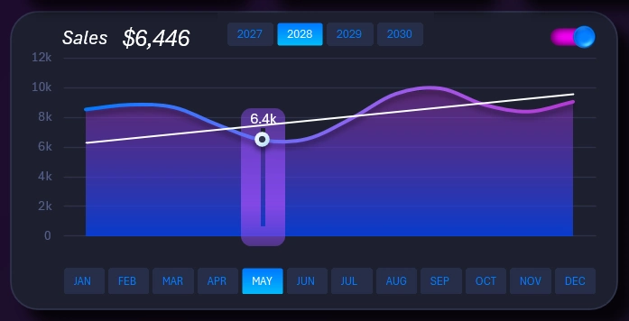
The first visualization block shows sales dynamics on a line chart. The diagonal white straight line is the level at which the value confirming KPI plan completion is located. The level slopes from a lower to a higher value, to orient toward growth.
The block contains many interactive elements. Instead of labels on the X axis there is a block of buttons for switching between months. Above that are buttons for switching between years. These buttons' authority extends across the entire dashboard. Use them to control the dashboard. Set the reporting periods for the data sample across all visualization blocks.
In the top right corner there is a user toggle for turning the plan level on the visualization on and off. This toggle's authority is limited and does not extend beyond this block. It functions locally and only affects one visualization block.
To manipulate the plan level for the purpose of optimizing growth strategy, use the corresponding screen by clicking on the first card in the dashboard header:
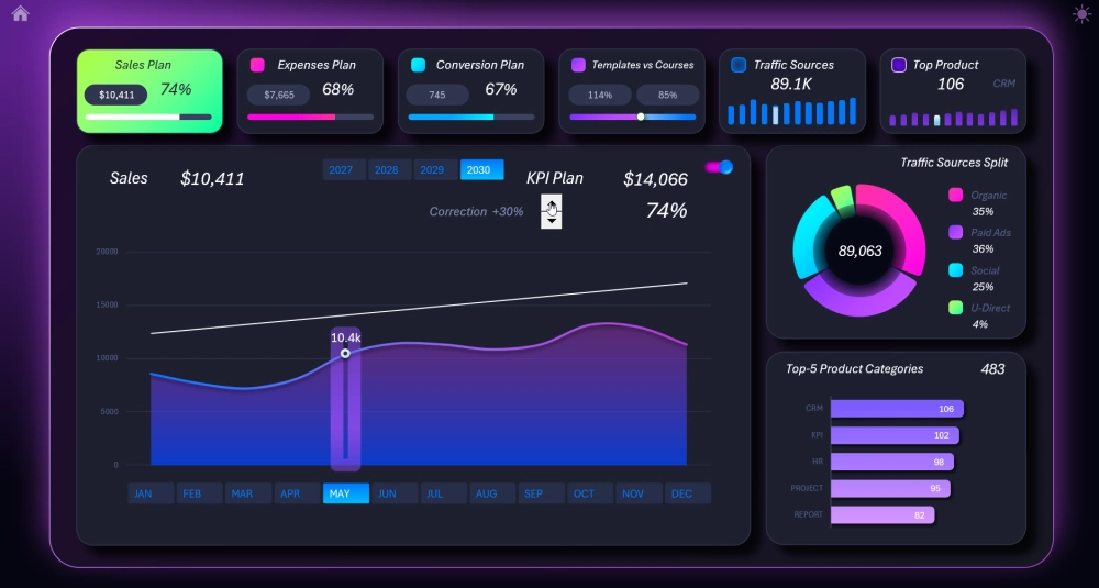
Here you have the ability to manage the plan level by making your adjustments on a large, convenient line chart.
Monthly expense KPI plan control using levels
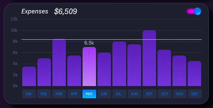
An interactive bar chart with a cursor for exposing values for the selected reporting period displays monthly expenses. The horizontal straight line is the set boundary value according to the plan. Naturally, spending activity may vary from month to month. Consequently, KPI expense plan levels can differ. They can be adjusted, but to do that, go to the corresponding screen using the dashboard's main menu:
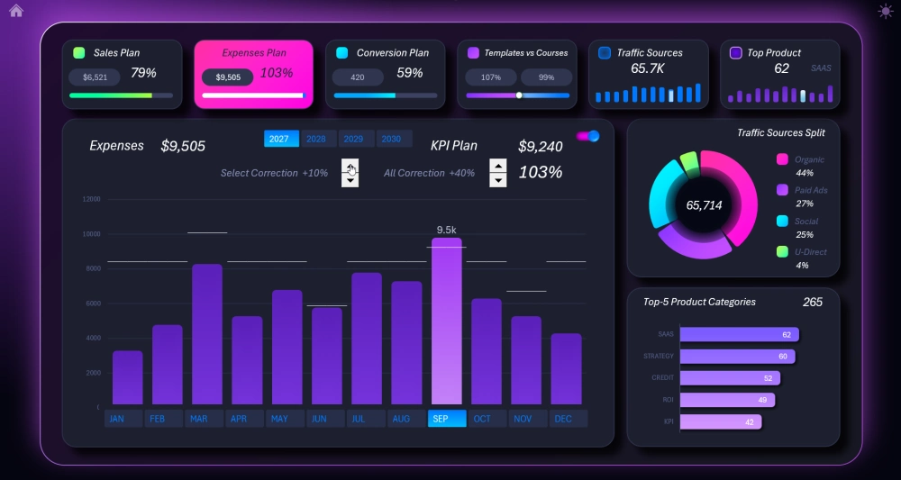
This time, the in-depth analysis screen allows the user not only to change the overall plan level, but also to configure it individually for each month (as shown in the picture above).
To change the plan level for a specific month:
- Select the desired month with the cursor using the buttons on the X axis.
- Use the first control (counter on the left) to change the level of the horizontal line segment for that month.
The second "counter" is designed to control all levels at once when adjusting expense plans.
Comparative analysis of two product lines: Templates vs. Courses
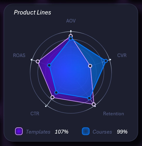
A radar chart lets you compare the sales results of two product lines across 5 quality metrics as plan completion:
- AOV — average order value.
- CVR — conversion rate.
- Retention — customer retention (the percentage of customers who return for a repeat purchase).
- CTR — click-through rate on the product cover.
- ROAS — return on ad spend / return on advertising investment.
For a detailed analysis, use the corresponding screen:
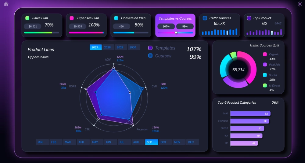
Here you can see the exact percentage values of plan completion for quality metrics for each product line.
Conversion after the last stage of the sales funnel
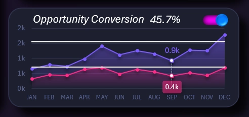
Opportunity is the last stage of the sales funnel. The customer is guided through the funnel by marketers, and only then do salespeople convert these potential customers into buyers. That's why this KPI report is for salespeople. Two plan levels are used here at once, but plan completion is measured by the lower one. The upper level is more intended for attracting and retaining potential customers.
You can manage and adjust the levels on the conversion screen:
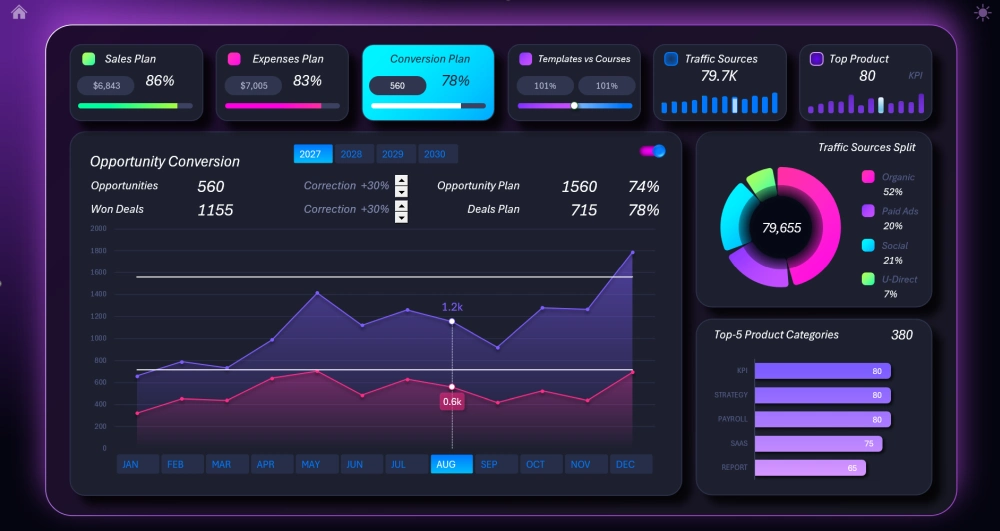
Here the chart appears large and convenient to work with. Each level has its own control for adjusting the plan.
Chart of acquired traffic distribution by source
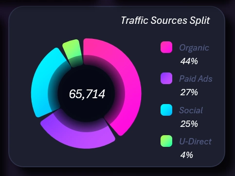
Distribution charts are always useful for finding and evaluating sales growth points. These are important supporting metrics. For a detailed analysis, open the child screen on the dashboard:
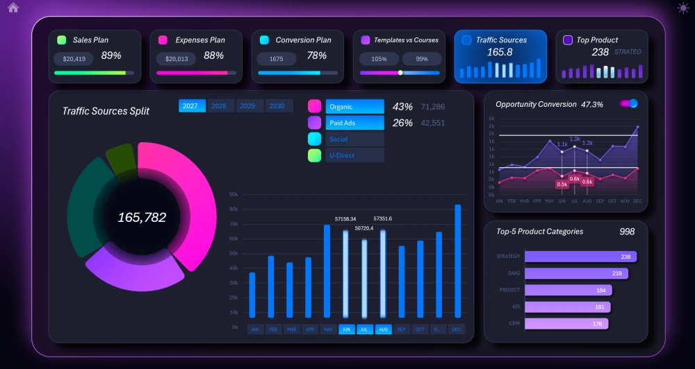
Here you can expose each segment individually or a group of selected segments. The bar chart shows the total number of visits corresponding to the selected traffic sources.
Ranking of best-selling categories
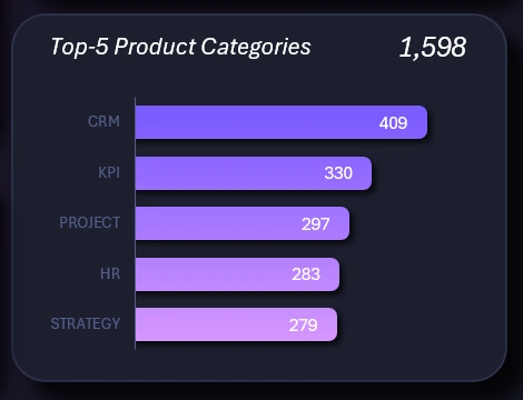
The horizontal bar chart shows a ranking of the top 5 best-selling dashboard template topics. The ranking is calculated by number of sales for the selected reporting period on the dashboard and is sorted in descending order:
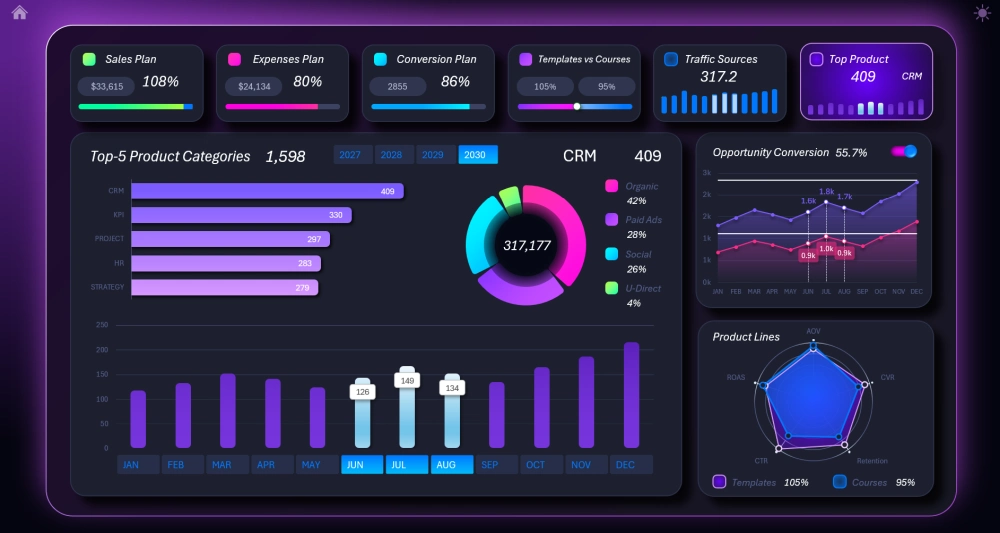
On the child screen, the ranking is shown against the backdrop of a bar chart of monthly sales dynamics for the top-1 best-selling topic. For example, if a different topic takes the top ranking spot next month, the bar chart will automatically rebuild according to the dynamics of that new leading template and/or course topic in the ranking.
Design of the KPI dashboard for sales growth analysis in Excel
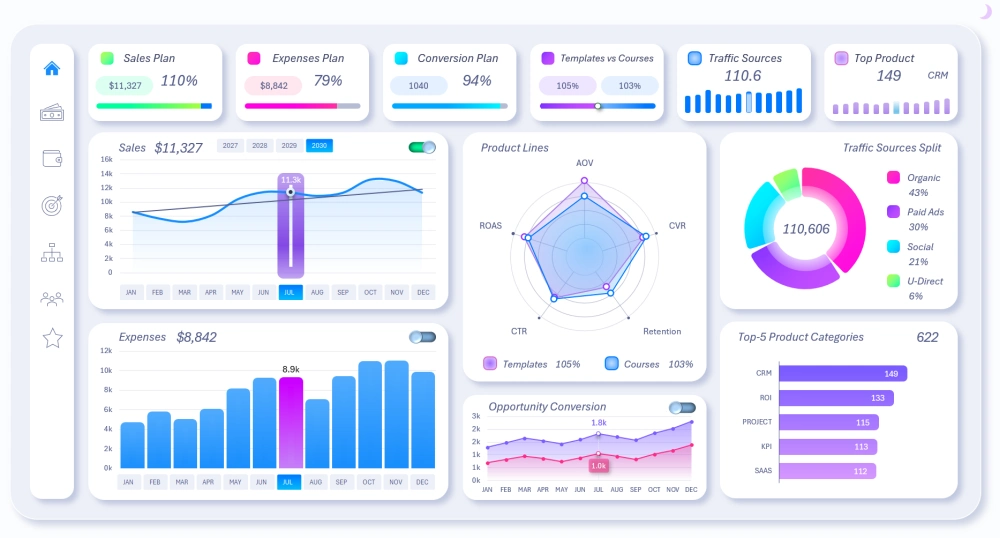
The dashboard template has two design versions for working during the day or at night, at the user's choice. As you can see in the image, the light design version even has an additional side control panel in the style of tablet interfaces.
You can download the ready-made template to improve and optimize the dashboard for your specific conditions. Freely add panels and change the source values to fit your reports:
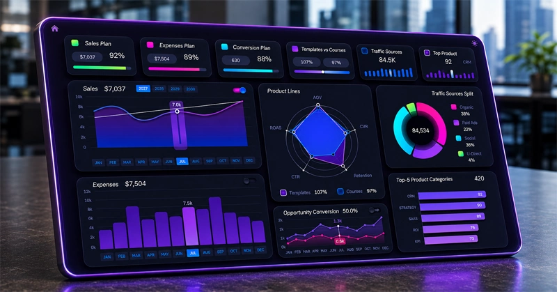
Download the KPI dashboard for template developers in Excel 
This is the fourth and final design version in the series of dashboards for monetizing the creative work of Excel template developers. This site now has 4 published templates that guide an Excel dashboard developer toward financial independence step by step.
Dashboard developer collection for monetizing finished templates:
- Dashboard for building personal finance capital in Excel.
- Personal finance template for Excel dashboard developers.
- Dashboard for a $100K investment portfolio for an Excel developer.
- Excel dashboard for template and course sales growth (this template).
Manage your personal finances in Excel: from expense tracking to your first $100,000 in capital.
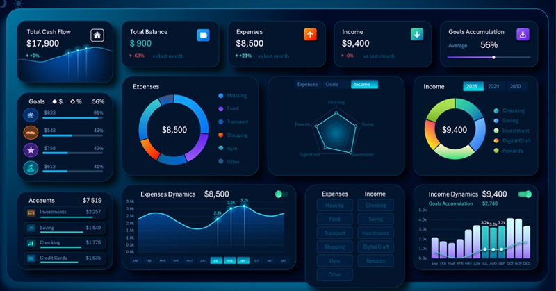
Dashboard for building capital in Excel
An Excel template for managing your personal budget, from an Excel dashboard expert.
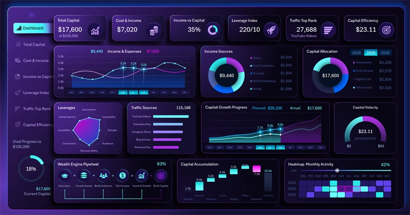
Get the personal finance template from an Excel dashboard template developer
An analytical Excel dashboard for tracking and allocating a $100,000 investment portfolio.
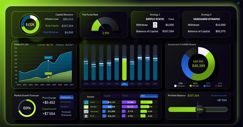
Download the Excel dashboard for a $100K investment portfolio
Each dashboard as a tool will be useful at a specific stage along the full path toward achieving your goal. You can use them all and share your impressions with us on our social media.
Data Visualization Charts for Interactive Report Creation in Excel.
Dashboard Templates