Dynamic charts for building dashboards in Excel
Data alone doesn't explain anything — its shape does. The same sales table, turned into a line trend, a bar chart, or a radar chart, tells three completely different stories. That's exactly why choosing a chart type for a dashboard isn't a matter of aesthetics, but a matter of managerial meaning. Good visualization works like a well-designed road sign: it's understood instantly, with no instructions and no prior briefing needed for the audience.
Interactive charts for the Excel Dashboard
A gallery of charts for Excel dashboards: a combined bar chart with a trend line, a radar chart for multidimensional comparison, a gauge-style KPI indicator, an animated progress chart, and an activity heat map — each type solves its own analytical task.
 How to make Dynamic Doughnut Chart in Excel for Dashboard.
Create a template for a dynamic doughnut chart. Download an example of interactive data visualization using a pie chart for presentations.
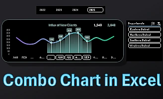 How to make a Combination Chart in Excel step by step.
Secrets of creating combination graphs in Excel. Download a ready-made template for a simple understanding of all the steps of the principles of constructing interactive visualization.

Data Visualization Charts for Interactive Report Creation in Excel.
Dashboard Templates