Mastering Excel Charts and Tutorials for Stunning Visuals
Charts are powerful tools for transforming raw data into insights. In this guide, you'll discover the best techniques for creating impactful Excel charts, from basic bar graphs to advanced combo charts. Start visualizing your data like a pro!
Excel Charts for Better Data Visualization
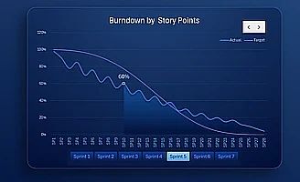 Dynamic Excel Burndown Chart for Agile Project Management.
Create a dynamic Burndown chart in Excel for projects managed under Agile methodology. Track sprint progress, plan deviations, and team velocity in real time.
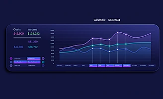
 Excel Dashboard for Team Engagement Dynamics.
Interactive dashboard for analyzing employee engagement dynamics in a project. Evaluate activity levels, contributions, and participation trends in Excel.
 Epic Agile project management dashboard in Excel.
Dashboard template with an Epic Burndown chart based on Agile project management methodology in Excel. Real-time control of sprint progress, workload volume, and workflow deviations.
 Medical dashboard in Excel for patient history analysis.
Dashboard for patient medical history analysis in Excel. Visualization of vital signs, condition dynamics, and key medical data in a single control panel.
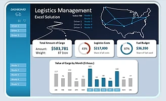 Consolidated Excel dashboard for logistics route analysis.
Mini dashboard for analyzing logistics routes in Excel by drivers and reporting periods. Track transportation efficiency, delivery times, and key metrics in a single visual panel.
 Consolidated Excel dashboard for logistics route analysis.
Summary data visualization of product cards on an Excel dashboard for assortment management. Track sales and key metrics on a single screen.
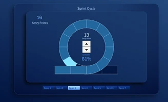 Agile Sprint Cycle with task update functionality in Excel.
An example of a Sprint Circle chart with flexible adjustment of the number of tasks in the flow without interrupting the cycle execution process. Dynamically changeable data arguments in Excel charts.
 Interactive Sprint Cycle infographic in Excel dashboard.
Sprint Circle chart designed as a planet orbit infographic for project visualization. A clear example of visual design for Agile task and sprint management, available for download in Excel.
 Agile Sprint Circle in Excel Project Management Dashboard.
Create and use an interactive and flexible Sprint Circle in Excel for clear project management. Track progress, tasks, and key Agile team metrics.
 Interactive Excel dashboard with a Sprint Circle chart.
An example of a ready-made dashboard with a Sprint Circle in Excel for agile project management using the Scrum methodology. Track tasks, timelines, and KPIs in an interactive and visual format.
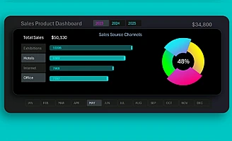 Dynamic Donut Chart with a cursor in Excel.
Interactive composition of a donut and column chart for visualizing data segmentation in Excel. Examples of infographic capabilities for interactive reports and dashboards.
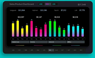 Excel Template for an Interactive Grouped Bar Chart.
Use an interactive column chart with a group cursor for data analysis. Informative visualization, convenient filters, and KPI segmentation for reports and dashboards.
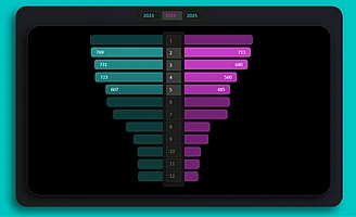 Multi-level Sales Funnel on a Butterfly Chart in Excel.
Sales funnel template based on a butterfly chart created in Excel. This format helps visually compare funnel stages, analyze customer drop-offs, and improve conversion rates.
 Combined Column Chart in Excel for Interactive Dashboard.
Combined bar chart template in Excel for an interactive dashboard. Combining different types of data in one visualization helps analyze metrics more deeply and improve report design.
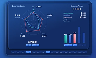 Using a spider chart on an interactive Excel dashboard.
How to use a multi-level spider chart for data presentation on interactive dashboards in Excel. A compact dashboard helps you quickly analyze data and make decisions.
 Download the interactive calendar with heatmap in Excel.
Download the interactive calendar heatmap template for activity analysis and daily monthly data tracking. The color scale helps quickly identify peaks and declines in monthly data.
 Interactive Excel spaghetti chart with line toggle.
Interactive spaghetti chart template in Excel with toggleable lines for convenient trend analysis. This tool helps track metric dynamics and highlight important trends.
 Progress chart for personal financial goals in Excel.
Template of a progress chart for tracking personal financial goals for interactive analysis in Excel. Visualization helps track effort results and makes financial planning clear.
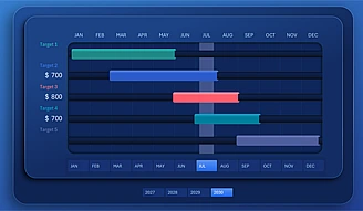 Beautiful and simple interactive Gantt chart in Excel.
A beautiful yet simple Gantt chart template for planning task completion in Excel on the path to achieving goals. This tool helps track deadlines and visualize achievement stages.
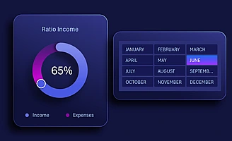 Donut chart in Excel for Dashboard with Beautiful Design.
An interactive customized donut chart template in Excel for visualizing data on a dashboard. The style enhances the dashboard design and makes data pleasant and easy to read.

Data Visualization Charts for Interactive Report Creation in Excel.
Dashboard Templates