Excel Chart Templates for Data Visualization in Reports
Excel chart templates significantly speed up the process of creating analytical reports and improve the quality of data visualization. Using ready-made solutions helps standardize the approach to presenting information and allows you to focus on analysis rather than technical chart setup.
Examples of how to use chart templates for reports in Excel
Using chart templates in Excel makes the data analysis process faster and more structured. Ready-made visual solutions improve information perception, increase report development speed, and enhance the accuracy of interpreting metrics. This approach is especially useful for simplifying report creation for регуляр analytics and building interactive dashboards in Excel.
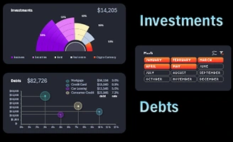 Investment vs Debt Report Excel Presentation Template.
Video tutorial on creating an investment and debt report presentation in Excel. Learn how to efficiently structure data, add charts, and make financial analysis visually clear for decision-making.
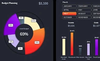 Multi-Level Donut Chart in Excel Template.
A video tutorial with a step-by-step example of creating a dynamic multi-level chart in Excel. How to easily customize a chart to effectively display multiple data points at once in an easy-to-read format.
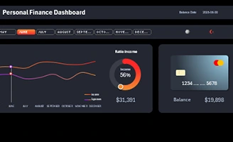 Interactive Income and Expense Chart in Excel.
A video tutorial on creating visualizations of income and expenses data using dynamic charts in Excel. You will learn how to add filters and controls that will allow you to visualize data by month.
 How to use GETPIVOTDATA function to Create Charts in Excel.
Rules for using the GETPIVOTDATA function to develop interactive dashboards based on pivot tables and slicers. Download the dashboard template with function examples.
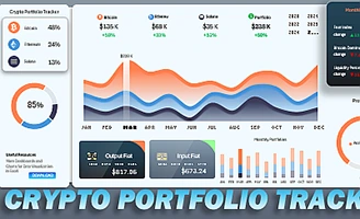 How to use CONCATENATE function for Excel dashboard charts.
Download the template with formulas for implementing multi-criteria search using the INDEX, MATCH, and CONCATENATE functions. This is demonstrated with an example of a cryptocurrency portfolio tracking dashboard.
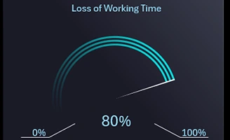 How to Make Progress Doughnut Chart in Excel.
Example of a progressive design chart in minimalist style for presenting data visualization on a dashboard. Download the progressive donut chart template.
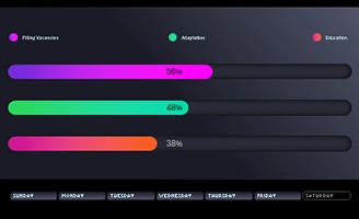 How to create Progress Bar in Excel for Dashboard Presentation.
Download the template of an interactive progress bar with three bands, made from standard data visualization elements. The process of creating a progress bar step by step.
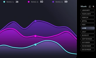 How to Create Weekly Line Chart in Excel for Dashboard.
An interesting design solution for presenting weekly data on a line chart. Download a beautiful chart template for an interactive dashboard.
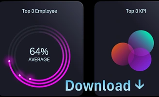 Doughnut and Bubble Chart for Excel Dashboard Template.
Download a template for presenting three key indicators on two different types of visualization charts. Create stylish designs for donut and bubble charts.
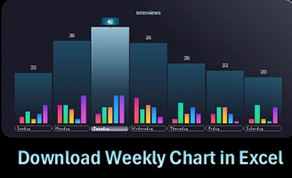 Download Interactive Weekly Sales Chart in Excel.
A combined chart template for a convenient visual analysis of weekly sales with daily and intraday bars. An example of how to make a weekly chart.
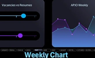 Download weekly line Chart in Excel for dashboard.
An example of how to create a weekly line chart in Excel to visualize data for a selected accounting period with interactive capabilities. Download a weekly chart template with a stylish design.
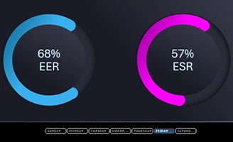 How to make Progress Circle Chart in Excel for Dahboard.
A step-by-step example of creating a pie chart for visual analysis of the progress of KPI indicators on an HR dashboard. Download the progressive design Doughnut Chart template.
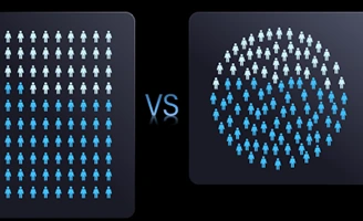 How to make Waffle Chart in Excel for Grid Dashboard.
Download interactive waffle chart templates for data visualization. 3 examples of how to create a grid graph in Excel in different ways using PowerPoint.
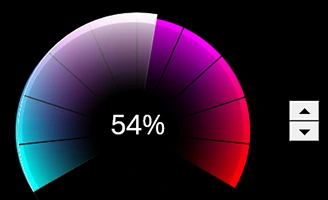 How to Create Speedometer Chart in Excel for Dashboard.
An example of how to make an interactive speedometer chart in a 3D game design style. Free template of a beautiful Gauge Chart for dashboard presentation.
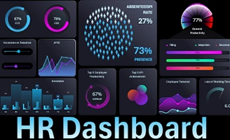 Download interactive HR Dashboard in Excel with Game Design.
An example of an HR dashboard data visualization template for working with gamification elements. Interactive analysis of data on employee involvement in the company’s work processes.
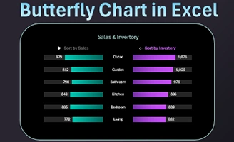 How to Create a sorted Butterfly Chart in Excel by descending.
Download a template for an interactive butterfly chart with the function of sorting in descending order by left or right wing. An example of sorting formulas for presenting dashboards.
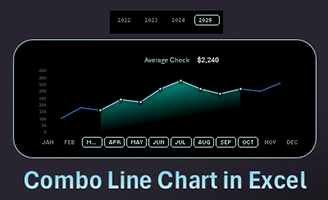 How to Make a Line Graph for data comparison in Excel.
Download an interactive line chart template for your dashboard. How to create a combination line graph for a data comparison visualization presentation.
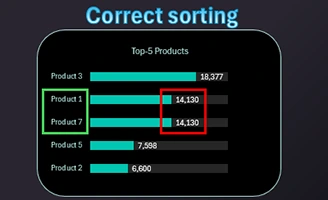 Handling duplicate values during sorting on Chart in Excel.
How to correctly sort using formulas when there are duplicate values in the source data table? Download a template for formulas for sorting duplicates with visualization of a graph of the ranking of the top 5 indicators.
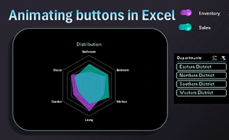 Create Interactive Charts with Animated Buttons in Excel.
An example of developing animated buttons from shapes and formulas. Download an interactive visualization with a unique design of data switches on a Radar chart.
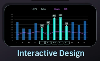 How to Create a Custom Combo Bar Chart in Excel step by step.
Download a combination bar chart template with interactive design. How to make functionally useful data visualization for a dashboard in Excel.
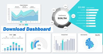
Data Visualization Charts for Interactive Report Creation in Excel.
Dashboard Templates