Dynamic Excel Charts Templates for Creating Dashboards
Get Excel Chart templates for crafting professional dashboards. Simplify data visualization with ready-made templates that are fully customizable, making it easy to create impactful reports and presentations. These customizable templates simplify data visualization, making it easy to track performance and present insights in a clear, impactful way.
Collection of chart templates made in Excel
Templates allow you to customize visualizations to suit specific goals and audiences: you can easily change colors, chart types, and metrics, as well as add interactive elements or filters. This makes reports not only visually clear but also dynamic, enabling quick data analysis, comparison of performance over different periods, and informed decision-making based on up-to-date information.
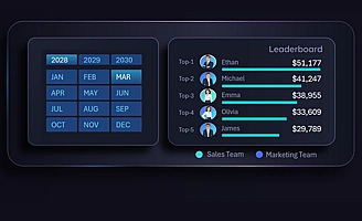 Employee Leaderboard with sorting functionality in Excel.
Interactive employee ranking in Excel with Top 5 leaders for sales and marketing departments. Users can switch between departments to evaluate the impact of top performers on results.
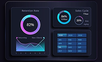 Line chart of customer churn and acquisition in Excel.
Analysis of customer retention and new customer acquisition in Excel using line charts. The intersection point of these charts represents the equilibrium point. Designed to evaluate marketing effectiveness.
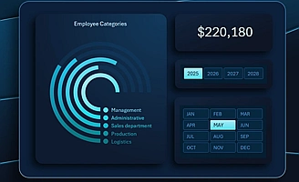 Radial Bar Chart for Teal Organization Metrics in Excel.
A radial bar chart helps determine the distribution ratio of resources across different departments in Excel. A template with a radial chart, interactive filters, and pivot table-based controls.
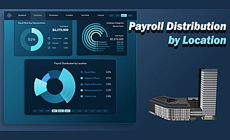 Customized Cost Distribution Chart in Excel.
Example of presenting payroll fund distribution analysis in Excel across offices, branches, remote employees, and outsourcing to control cost structure using a single chart.
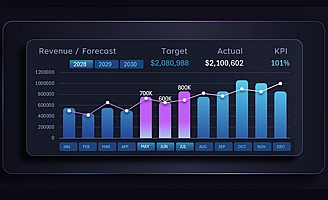 Combo bar chart for revenue forecast analysis in Excel.
Template of an interactive bar chart for analyzing revenue plan performance and sales forecasting, combined with a line chart and interactive X-axis labels in the form of data control buttons with a cursor.
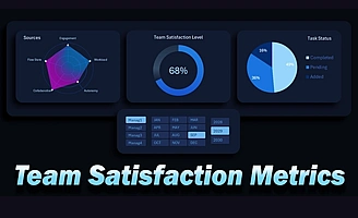 Team Satisfaction Charts for Excel Dashboard.
Mini dashboard for analyzing team satisfaction levels and task execution using pie and radar charts to evaluate key performance drivers. Template of dynamic charts powered by pivot tables.
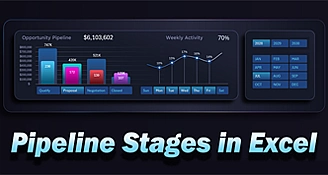 Visualization of final stage of sales funnel in Excel.
Visualization of the deal finalization process at the last stages of the sales funnel in Excel. Analysis of the Opportunity stage using two-level charts and sparklines of activity by days of the week.
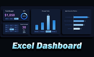 Excel Mini Dashboard control panel using buttons Template.
Control panel template for a dashboard managing the relationship between budget and team KPI results. The panel includes manager selection, budget analysis tools, KPI indicators, interactive filters, and performance visualization.
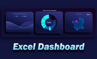 Chart templates for resource and cost control in Excel.
Excel dashboard for analyzing resource accumulation and project cost control with interactive charts. Example of a modern chart design template in Excel – free download.
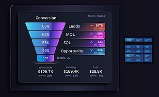 Dynamic Sales Funnel in Excel for conversion analysis.
Sales funnel for managing lead conversion with tracking of all CRM stages and evaluating deal performance through key metric visualization. Example of how to build an interactive sales funnel in Excel.
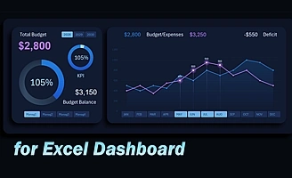 Monthly budget expense control in Excel based on plan.
Line chart for controlling budget expenses relative to the monthly spending plan in Excel. Designed for analyzing and identifying budget deficits in a project management dashboard.
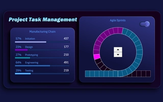 Sprint Cycle Chart in Excel for Agile data analysis.
Sprint circle chart template with story points visualization in an interactive infographic format for Agile cycle analysis in Excel. Effective for use in report presentations.
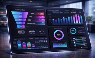 Excel CRM Dashboard for sales analysis in Small Business.
CRM dashboard template for monitoring sales performance in Excel with interactive visualization of key performance indicators, customer funnel metrics, and deal dynamics
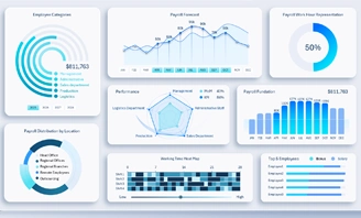 Excel Payroll Dashboard Template for a Teal company.
Excel dashboard template for payroll calculation in a self-managed organization in Teal style. The main visualization focus is on data transparency and emotional engagement.
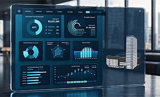 Excel Dashboard for Small Business Payroll Fund.
Excel dashboard template for optimizing payroll fund expenses. The visual report helps analyze the largest cost category in small businesses — employee salaries.
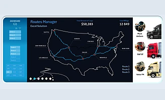 Interactive logistics route Map Chart visualization in Excel.
Example template of an interactive Excel map for analyzing the economic efficiency of U.S. logistics routes. Segmentation by drivers, trucks, and routes without macros.
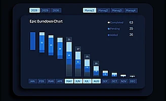 Epic task burndown chart in Excel for dashboards.
Interactive epic task burndown chart designed for Excel project management dashboards. Analyze added, active, and completed tasks by sprint with automatic updates.
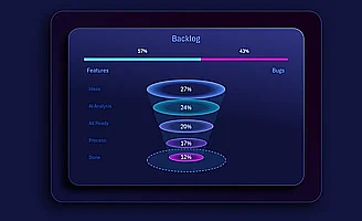 Task progression Funnel in Excel for backlog.
Interactive backlog task funnel for monitoring workflow from idea to implementation. Used in dashboards to analyze priorities, bottlenecks, and process disruptions in Agile, Scrum, and Kanban environments.
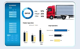 Simple Logistics Expense Dashboard in Excel.
Simple dashboard template for analyzing logistics expenses and profitability in Excel. Monitor transportation costs, cargo volume and weight, truck depreciation, and budget allocation in a clear visual format.
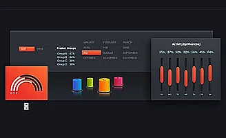 Data visualization composition for a sales dashboard in Excel.
Thoughtful composition of visualization blocks with interactive data elements for constructing a sales dashboard in Excel. Balanced KPIs, charts, and structure for clear analysis of sales activity and performance indicators.
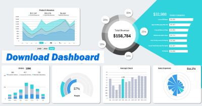
Data Visualization Charts for Interactive Report Creation in Excel.
Dashboard Templates