Download templates in Excel with examples and description
How to create a report presentation with data visualization? Best examples of structured information analyzes with a description of practical application.Ready-made reports for visual presentation of data
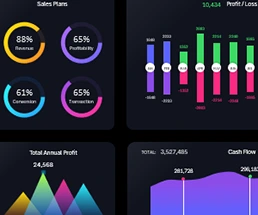
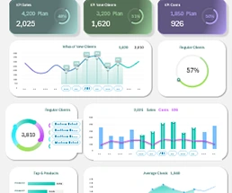 Data visualization of KPIs in Excel to increase sales by 100%.
Download a free report template for managing KPIs plans in Excel. How to effectively double your sales using data visualization for business intelligence?
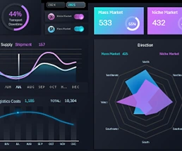 Benchmarking Logistics for Niche vs Mass Products in Excel.
Download a dashboard template for managing commodity logistics in the niche and mass markets. How do these markets differ in terms of transport logistics?
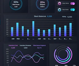 Excel Dashboard of inventory management reports sample.
Download a dashboard template for inventory control using data visualization. Comparison of products for niche and mass markets in warehouse reserves.
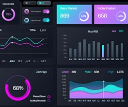 Comparison of sales in niche vs mass market on Excel Dashboard.
Download Dashboard Template for Comparative Analysis of Product Sales in Niche and Mass Markets. Advantages and Disadvantages of Mass Consumption Goods.
 How to use tools to create BI dashboard template in Excel.
An example of practical use of a business intelligence dashboard for presenting a report and visual analysis of data on key indicators. Download a ready-made bi-presentation template.
 Using Business Intelligence Dashboard with Excel for report.
What is Business Intelligence Dashboard and how to use it? Why is the data visualization market expected to see a surge in growth in the near future? Download the BI dashboard template in Excel.
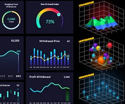 The Best cryptocurrency portfolio Dashboard design in Excel.
Beautiful and modern visualization design can tell a story about changes in source data. Download the template and effectively manage information to achieve results.
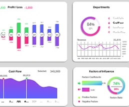
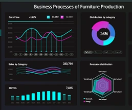
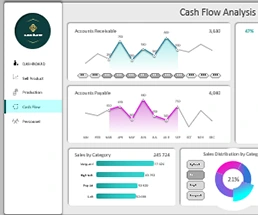 Sample Excel Dashboard for Cash Flow Analysis Report.
Download a data visualization template for financial statements on cash flow and business performance. The template contains 5 dashboards on different screens.
 Free Download 5 business dashboard templates in Excel.
An example of using modern design for traditional reports with data visualization. Download a template of five dashboards in one summary business analysis.
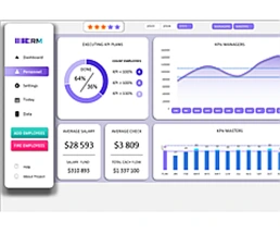 How to create a KPI dashboard in Excel Template free.
KPI dashboard is a powerful tool for assessing, analysis and managing your business's success. Download a free PivotChart template for an example.
Excel Dashboard Templates for Business

Data Visualization Charts for Interactive Report Creation in Excel.
Dashboard Templates