Powerful Features for Data Visualization Dashboard in Excel
Excel is more than just spreadsheets—it’s a powerful tool for creating insightful and interactive dashboards. With built-in functions, dynamic charts, and automation capabilities, Excel enables users to visualize complex data and make informed decisions. Whether you're tracking business performance, analyzing trends, or presenting reports, Excel has everything you need for effective data visualization.Essential Excel Tools for Data-Driven Dashboards
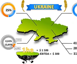 Excel Presentation of cost of arable land in Ukrainian.
Investment analysis template with data visualization. Infographics of indicators of the price growth potential in the next 10 years for investment objects such as arable land.
 Cloud Audit Dashboard download free in Excel.
A visualization template for monitoring the effectiveness of cloud systems in small businesses. The benefits of clouds: resource elasticity, load redistribution, mobility, cost optimization.
 Beautiful dashboard for brand strength analysis in Excel.
Download a beautiful dashboard for visual analysis of the baseline power of building and promoting a brand. What is a brand and why do small businesses need one? What is marketing?
 Create Infographic Charts from Excel data template.
Describe an example of how to create an interactive infographic using vector shapes and standard charts. Download infographic and data visualization templates.
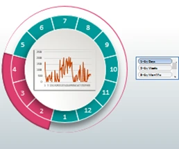
 Data rating chart for visualization download in Excel.
Construct visualization of rating charts in different ways using a combination of several histograms and vector shapes in one group.
 Ranking chart for data visualization download in Excel.
Download several examples of nicely designed ranking charts in one file. Basic principles for creating beautiful data visualization or infographic designs.
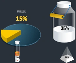 3D infographics for Excel presentation cheese sales report.
An example of how to make a delicious dashboard infographic with interactive presentation for artisan cheesemakers to get a useful Cheese Board.
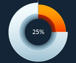 Easy example of 3D Pie chart with value than 100% in Excel.
How to show a value greater than 100% on a chart in Excel? Ideas and a list of financial indicators in relative values for practical application of a percentage chart.
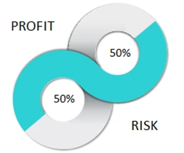 Excel Comparison Chart Template with Examples free download.
A simple example of a combination of charts to beautifully visualize a comparison of two values. Download template for Pareto's law presentation and risk management benchmarking.
 Associative techniques for visualizing data sampling in Excel.
Download A simple example of mastering the techniques of associative techniques in infographics and data visualization. How to segment data by time period: day, week, month?
Excel Dashboard Templates for Business

Data Visualization Charts for Interactive Report Creation in Excel.
Dashboard Templates