Excel Data Visualization for Clear and Impactful Insights
Data visualization in Excel transforms raw numbers into clear and meaningful visuals. By using charts, graphs, and dashboards, you can communicate insights faster and more effectively. This approach helps businesses and professionals spot trends, compare metrics, and make informed decisions with confidence.How to Create Effective Data Visualizations in Excel
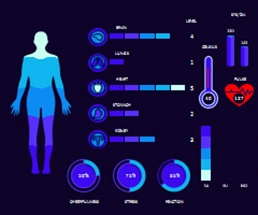 Medical Dashboard for analysis of patient history in Excel.
Download a medical dashboard for free to visualize patient history and health status data. Visual analysis of basic human health indicators in Excel.
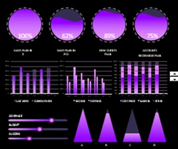 Comparative analysis of sales by day of the week in Excel.
Download a dashboard for comparative analysis of sales with distribution by day of the week. Data visualization with animation in report presentation.
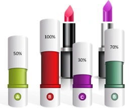 5 beautiful ideas for creating interactive infographics Excel.
Ideas for creating beautiful, interactive infographics right in your presentations. Graphic resources, components for building groups of shapes and ready-made cliparts free download.
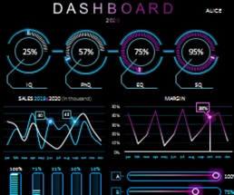 Business Intelligence Dashboard for manager and sales in Excel.
A useful dashboard for building beautiful, presentable reports with interactive features. The role of emotional and other business intelligence in the performance of trade managers.
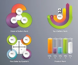 Dashboard for analyzing sales ranking factors in Excel.
Download a ready-made example of a dashboard template for quickly creating beautiful presentations of reports and analyzes with data visualization. How to quickly make beautiful infographics from ready-made cliparts?
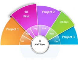 Beautiful chart for presentation of reports in Excel.
A beautiful presentation template with an interactive diagram. How to make a beautiful report with visualization of financial planning data for the second half of the year?
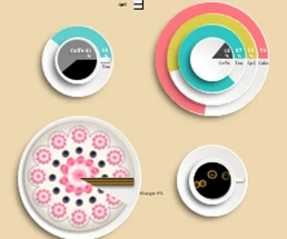 Download Cafe Products Sales Analysis in Excel template.
An example of data visualization for analytical reports on doing business in a cafe. Dashboard in the style of infographics free download in Excel.
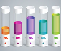 Chart with data visualization for laboratory work in Excel.
An example of a beautiful data visualization for a simple bar graph. The implicit but very important advantages of a beautifully designed visualization. How to love job?
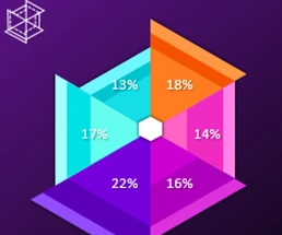 Petal Pie Сhart and benchmarking in Excel.
An example of creating and using a pie chart from a petal. Download an interactive template with data visualization on a pie chart for comparative analysis.
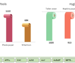 Shapes in charts and graphs for report presentation in Excel.
Download an example report presentation template with data visualization decorated with vector shapes. How to transfer a vector drawing from Adobe Illustrator to MS Excel or MS PowerPoint?
Excel Dashboard Templates for Business
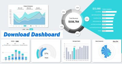
Data Visualization Charts for Interactive Report Creation in Excel.
Dashboard Templates