How to create a column chart and to combine it with a line in Excel
Column chart in Excel is a way of making a visual histogram, reflecting the change of several types of data for a particular period of time.
Is very useful for illustrating different parameters and comparing them. Let’s consider the most common types of column charts and learn to make them.
How to create a column chart that updates automatically?
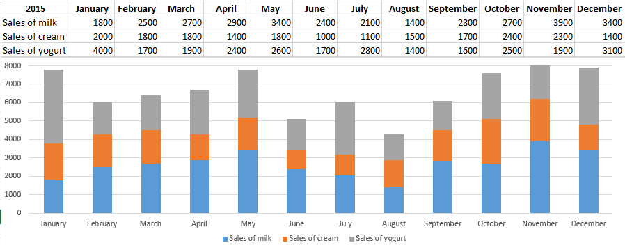
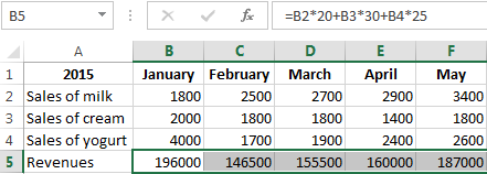
We have data on sales of different dairy products for each month in 2015.

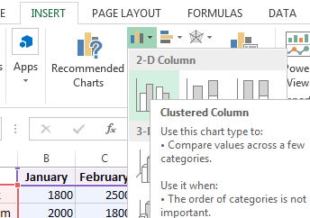
Let’s create a column chart which will respond automatically to the changes made to the spreadsheet. Highlight the whole array including the header and click tab «INSERT». Find «Charts»-«Insert Column Chart» and select the first type. It is called «Clustered».
We have obtained a column whose margin size can be changed. This chart clearly demonstrates the highest milk sales in November and the lowest cream sales in June.
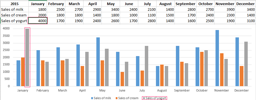
If we make changes to the spreadsheet, the column will also change. By way of example, let’s substitute 4000 for 1400 in yogurt sales. We can see that the «Sales of yogurt» has risen.
Stacked column chart
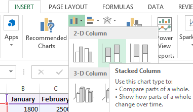
Let’s consider making a stacked column chart in Excel. It is another column chart type allowing us to present data in percentage correlation. It is created in the similar way, but a different type should be chosen.
We have obtained a chart showing that, for example, in January, milk sales were higher than those of yogurt and cream while in August a small amount of milk was sold compared to other products, and so on.
Column charts in Excel can be changed. If you right-click on the empty area of the chart and select «Change Type» (OR select: «CHART TOOLS»-«DESIGN»-«Change Chart Type») you can modify it a bit. Let’s change the stacked column to the normalized one. As a result, we have almost the same column with Y axis reflecting percentage correlations
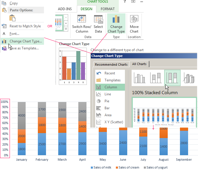
Similarly, we can make other changes to the graph.
How to combine a column with a line chart in Excel?
Some data arrays imply making more complicated charts combining several types, for example, a column chart and a line.
Let’s consider the example. To begin with, add to the spreadsheet one more row containing monthly revenue.
Now change the current type. Click on the empty area and select: «CHART TOOLS»-«DESIGN»-«Select Data». You will see a field offering to choose a different interval. Highlight the whole spreadsheet again, but this time with the revenue row.
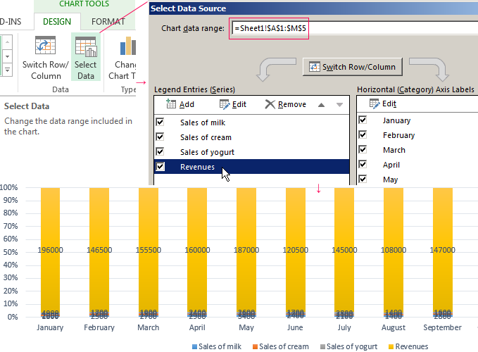
Excel has automatically expanded the value domain in Y-axis, therefore the data on sales volume are at the very bottom in the form of inconspicuous columns.
However, this histogram is incorrect as it contains numbers expressed both and in quantity (liters). Therefore, you need to make changes. Transfer the revenue data to the right side.
- Again select «CHART TOOLS»-«DESIGN»-«Change Type».
- In window select «Clustered».
- Click on the plus sign next to the histogram and uncheck: «Data Labels».
- Right-click the revenues columns, select Format Data Se and indicate «Secondary Axis».
- Done.
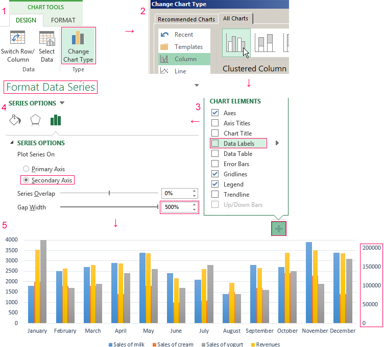
You can see that the histogram has changed immediately. Now revenues column has its value domain (in the right).
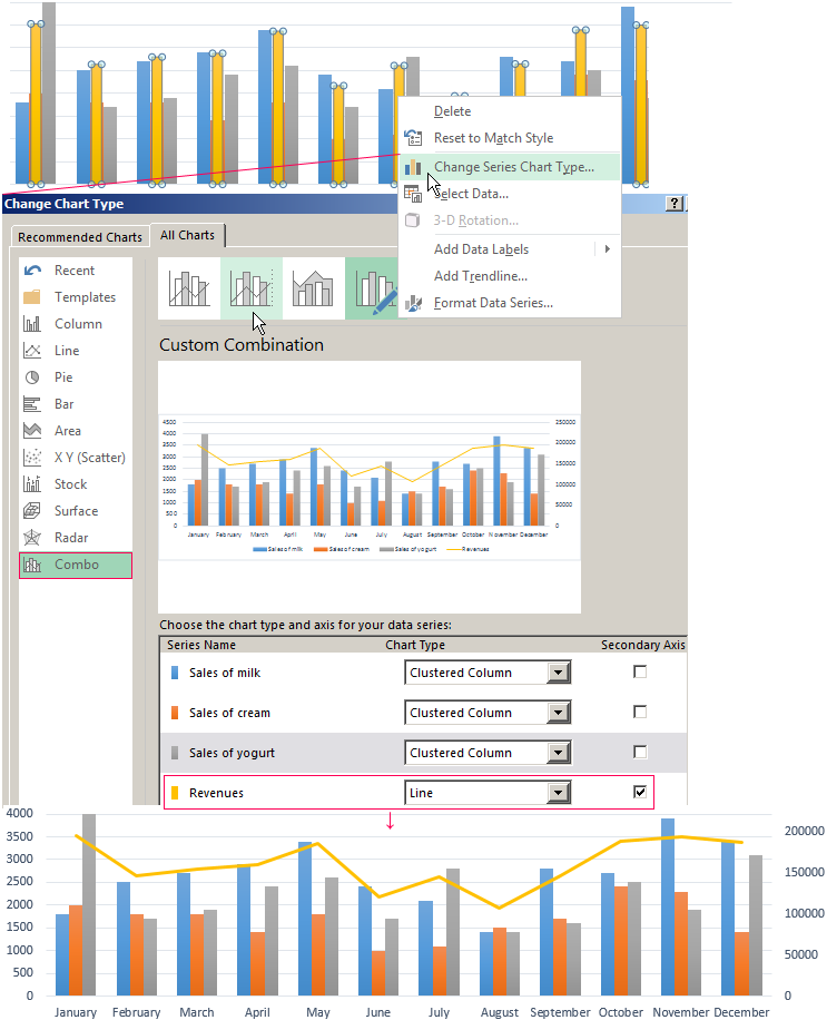
However, this variant is not convenient as the columns almost fuse together. Therefore make one more additional action: right-click the revenues columns and select «Change Series Type». In the appeared window, select the type «Combo»-«Custom Combination».
We have obtained a rather visual graph featuring a combination of a line. We can see that the maximal revenue was in January and the minimal one – in August.
In the similar way, you can combine any other types of charts.

Download beautiful templates and speed up report creation in Excel.
Download Templates