Beautiful chart for presentation of reports in Excel
An example of a beautiful interactive chart with data visualization for presentations in Excel. Another way to beautifully present your financial statement with infographic controls for functional visual analysis.
Beautiful presentation of financial planning report in Excel
In an example of using the functionality of a beautiful diagram for a presentation, we will immediately simulate the following situation. Let's say you need to beautifully present your financial planning report for the second half of the year in Excel.
The model of the situation is as follows. The joint-stock company is completing the first half of the year and is already preparing for the effective implementation of the last two quarters and the successful completion of the year in the summer. For this, the results of the first half of the year are being summed up and a financial planning strategy for the second half of the year is being developed.
Specifically, in this example, it is necessary to correctly choose the safe moments for carrying out important operations associated with significant costs of the enterprise. Namely: payment of dividends to shareholders and payment of bonuses to employees of the company.
The interests of employees are very important, they cannot be ignored and it is important to take into account on a par with other interests. For example, the world famous entrepreneur from China - Jack Ma, who founded the global joint-stock company Alibaba Group, takes into account the interests of counterparties in the next priority. In the first place are the interests of customers, in the second place the employees of the company and only in the third place are the interests of shareholders taken into account. After all, shareholders are generous and kind when things are going well, but as soon as the financial crisis begins, they are all the first to leave the company.
This year, the company must manage to complete 3 more projects, each of which will bring income by replenishing the company's budget. Against their background, it is necessary to determine the dates of such significant expenses of the company as bonuses to employees and dividends to shareholders.
As a rule, the strategy is built on the basis of statistical data for the previous indicators of the accounting period. For this, statistical indicators were collected for the second half of the year over the previous 5 years. As statistics show, the company has successfully closed 3 projects in the last 6 months in each year. But the size of the projects varied significantly, and accordingly their deadlines. Therefore, for the purpose of financial security, the enterprise cannot afford to spend annual large expenses on payments on the same date, for the same period of time.
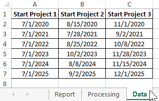
Data on the duration of projects in the second half of the year for the previous 5 years were pre-filtered and collected in one table. And then they are used as input values for a template with a beautiful chart as an infographic of a visual, interactive, financial report. Therefore, in the template, first, the table is filled with initial indicators on the “Data” sheet:
Now the values of the project deadlines in the second half of the year should be processed and prepared for visualizing the infographic data. This whole process takes place on the Processing sheet:
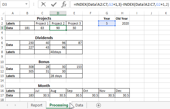
Formulas with the INDEX function refer to the original values of the "Data" worksheet table for selection by condition. After that, arithmetic calculations with dates are performed. As a result, new tables are formed for the construction and beautiful informative design of diagrams.
Presentation of the report on a beautiful chart in Excel
The beautiful diagram consists of 6 auxiliary diagrams. All of them interact with the user interactively through animation. To interactively control a beautiful presentation, 5 elements of interaction with the main diagram are used:
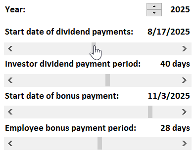
All scrollbars and the counter change the likely future and some already received past important values, and with them the appearance of the chart changes accordingly.
List of changeable values for visual strategy analysis
- Year.
- Start date of dividend payment.
- Investor dividend payment period.
- Start date of bonus payment.
- Employee bonus payment period.
The values of all these important indicators, the user has the ability to change the presentation in real time. This increases the richness of visual analysis of infographics. By visually managing many elements of the diagram, you can quickly and efficiently find the best solution without resorting to complex mathematical calculations. Which, in turn, contributes to well-coordinated work and the speedy adoption of a one-voice decision at the meeting right during the presentation.
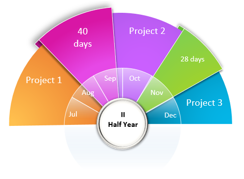
As a result, we get a beautiful diagram - an analytical tool for presentations:
 Download a beautiful chart for report presentations in Excel
To disassemble a presentation diagram into parts and understand the principles of its operation, use the window to manipulate elements on an Excel worksheet. To open the "Selection" window, press the Alt + F10 hotkey combination. This template is completely open and does not contain macros. All functionality is implemented using formulas and standard controls for values in Excel cells. All of them are available on the "DEVELOPER" tab in the "Controls" - "Insert" tool section.
