Benchmarking sales with data visualization in Excel
It is very important to regularly perform a comparative analysis of sales by day of the week on one chart. Use the free weekly benchmarking benchmark for Excel sales for free. It conveniently visualized sales values for a specific week ordinal in the current and previous month.
Excel weekly sales benchmarking guidelines
 Advanced sales comparative analysis products download in Excel.
It is better to compare weekly sales figures not with the previous week, but with the week in the previous month of the same serial number. Indeed, the indicators of different weeks in the same month will differ significantly under the influence of various fundamental factors. For example, at the end and at the beginning of the month, sales usually increase, since most buyers receive a salary in this period of time. Consumers go to stores and buy food for a whole month.
For the same reason, it is important to perform a comparative analysis correctly when conducting an advertising campaign or at the time of transition of seasonal periods of trade. The effectiveness of the advertising company will be more clearly expressed and objectively analyzed if we take the indicators of the current week and for the week with the same serial number in the previous month. During the transition from an active sales season to an inactive one or vice versa, we will clearly determine the reasons for a surge or decline in sales for the week if we compare accounting periods with a small distance in time.
Each month may contain up to 6 incomplete weeks. Accordingly, each week in the month has its own serial number 1-6 (or 1-5 and 1-4 in February of a non-leap year, it all depends on the calendar month). For example, in 2021, 2 months with incomplete 6 weeks: May and September, and in 2020, 3 such months: March, August, November. Therefore, with an objective analysis, we compare the first week of the current month with the first week of the previous one, the second with the second, etc.
Naturally, sometimes it is not possible to compare with the first and last days of the weeks, since they are often incomplete. Therefore, in order not to get confused in periods, it is convenient to use data visualization for the report. In this template for a comparative analysis of weekly sales by day, it is clearly visible where on the timeline are both seven-day accounting periods in the current and previous month. And also on the chart with regions, we have the opportunity to overlay sales figures with transparent layers for a detailed comparison of deviations in one direction or another, which is especially convenient for comparative visual analysis of the sales report.
Data visualization in benchmarking sales in Excel
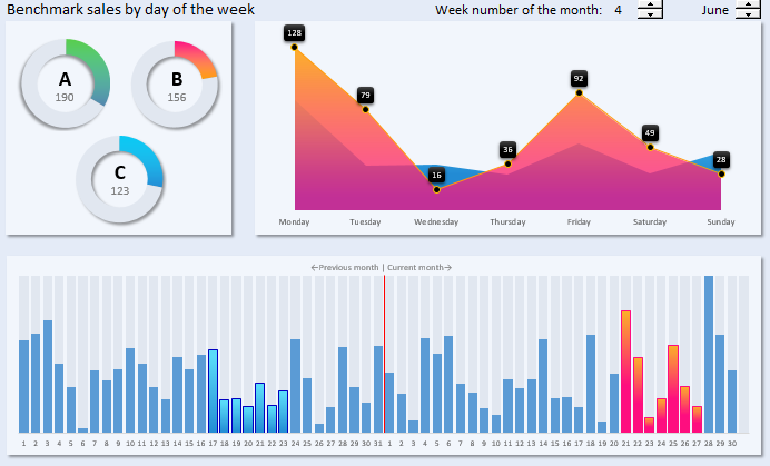
Consider the structure of the template for a comparative weekly analysis of sales in more detail. The main unit is a chart with areas in 2 transparent layers of quantitative indicators of sales by day of the week from Monday to Sunday:
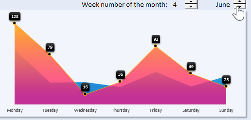
In the foreground, the crimson transparent layer represents the values for the selected week in the current month. Markers have data signatures with the current values of pieces of goods sold for each day.
In the background, through the transparent first layer, we see the second blue layer of the chart with areas on which the results of quantitative sales of goods for the same serial number of the week are shown, but in the previous month.
At the top of the comparative block are the data controls of the whole dashboard. Here, using counters, we are able to switch between the serial numbers of the weeks in the month and between the months themselves. When a user interacts with controls interactively, the values in the cells that are associated with them change. After that, all data on the dashboard is automatically updated due to the recalculation of the formulas on the "Processing" sheet. Thus, we get an interactive template with automatic updating of data on charts without using macros.
Below is a block with a timeline, which the red line accurately divides it into 2 full months:
- The selected current month is on the right.
- The previous month is on the left.
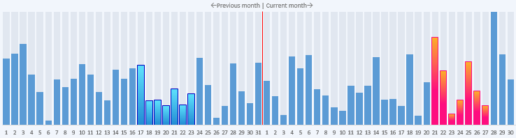
The entire timeline block is presented as a bar chart.
The timeline itself makes the visualization of report data more informative. Here we clearly see where for two months there have been compared 2 accounting periods of one week duration. The border between the two months current and previous is the red line. When choosing the serial number of the compared weeks, the histogram columns corresponding to the days are automatically painted in the right and left parts of the week. On the right side for the current month, scarlet and on the left side of the timeline for the previous month, blue, respectively. Everything is clear and understandable at first sight - it is very convenient. Everything should be simple and beautiful, because this is the magic!
The third block contains additional information on the activity of total sales for three groups of goods for the period of the selected week of the current month:
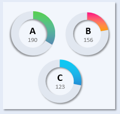
Each chart belongs to its product group A, B, and C. The filled share with color is the quantity of goods sold per week, and not the filled share is the quantity of goods in stock balances.
The combined all three blocks form an integral picture of the visualization of data from a comparative analytical report on the quantitative sales of goods of an enterprise:
 Download Benchmark Sales in Excel
Fill this template with your source data on the “Data” sheet and use it to present your reports with comparative analyzes. On the “Processing” sheet, you can improve the functionality of the analytical report with data visualization using your own formulas. Perfection cannot be embodied in reality, it is unattainable as a goal, it must remain in the mysterious womb of eternity.
