The Best cryptocurrency portfolio Dashboard design in Excel
Investment assets are evolving towards the growth of blockchain technologies. Today marks the beginning of the era of the digital future, and cryptocurrencies are becoming an integral part of the modern investment portfolio. In this context, we are creating new analytical tools and consolidated reports to adapt to the new possibilities of investing in the current realities of the financial world. Presented here is a consolidated report embodied in the new design of the Crypto Dashboard Tracker. The data visualization of the cryptocurrency investment portfolio allows for the development of a strategic audit of blockchain technologies right in an Excel file.
Excel Data Visualization Design Ideas for Crypto Portfolio Dashboard
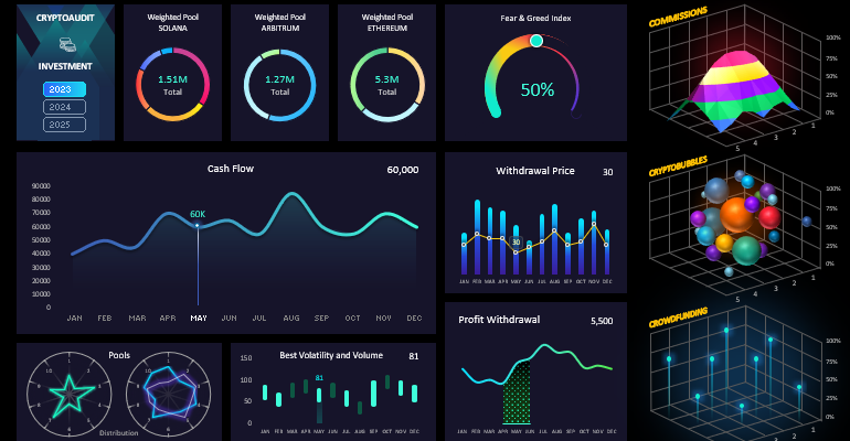
The Crypto Dashboard Design features interactive capabilities for effective visual analysis in managing investment assets of various categories in the blockchain sector. For instance, in the upper part of the dashboard design grid, there are similar chart blocks for analyzing the distribution of shares of different types of tokens and cryptocurrencies across weighted liquidity pools:
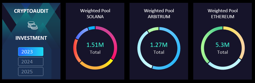
Weighted liquidity pools differ in their ability to provide crypto assets not in pairs, as in classic pools, but with more than two tokens in one pool. Their advantage lies in the flexibility of adjusting the risk-to-reward ratio for any weighted pool. In other words, each weighted pool represents an entire index investment portfolio. Essentially, the user has the ability to create sets of assets for index investing. During sharp fluctuations in the most volatile market, thanks to weighted pools, your portfolio will always remain resilient to deep manipulative drawdowns. The main difference between an investor and a businessman is goal-setting. The businessman's task is to earn capital, while the investor's task is to preserve capital. It's always better for an investor not to lose than to earn. If an investor knows how not to lose capital, they are already wealthy, as all that remains is to scale the investment portfolio. In modern finance, there are many effective tools for scaling capital in a short period. And we're talking not about simple interest but about DeFi.
In this panel, in the first block under the logo, there are interactive dashboard control buttons for filtering and selecting source data by years.
Fear & Greed Index
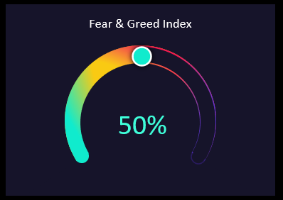
This provides statistical information on the fear and greed index for the selected period chosen by the dashboard user. It is known that at low greed values, it is better to buy, and at high index values, it is better to sell.
Cash Flow
The largest crypto data visualization block on the dashboard:
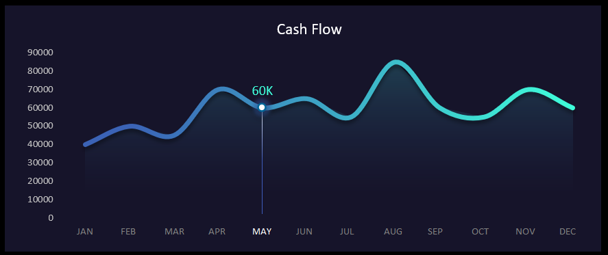
This section presents information on the crucial cash flow indicator. The main feature of this block is the presence of interactive buttons with month names. If in the previous blocks we specified the year, here the user makes a selection by months. Excel's slicing capabilities allow for multi-selection simultaneously for several months. To do this, simply hold down the CTRL key on the keyboard while clicking the left mouse button during month selection.
Withdrawal Price Tracker
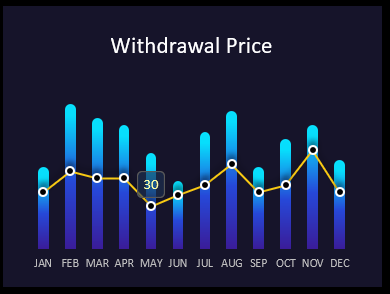
The blue bar chart shows the maximum prices during profit withdrawal periods. The yellow curve represents the actual price at which the profit was converted and withdrawn in dollars. As seen on the chart, it was not possible to fix the profit at maximum market prices for cryptocurrencies relative to the dollar every month. Nevertheless, the presence of monthly incomes is pleasing. They may be unstable, but they exist.
Profit Withdrawal
Dynamics of changes in the volume of withdrawn profit:

Here, we observe the monthly volumes of withdrawn profit directly. Data selection by years and months is done using control elements in other blocks: the logo block and Cash Flow.
Radar-Style Charts
Analysis of the distribution of crypto assets across classic pools:
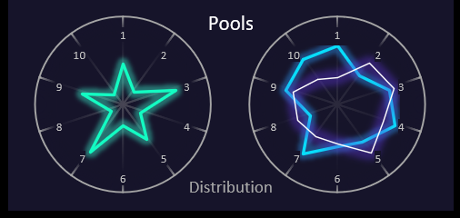
The left radar presents the distribution of assets across ten classic pools. The right radar shows the distribution across ten pools (blue curve) with the possibility of forking (neon curve shows the rewards level).
Best Volatility and Volume
The final bar chart is designed to analyze periods with active volatility and high trading volumes of crypto assets in the cryptocurrency market:
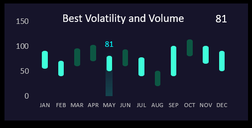
One can always trace the regular correlation between market activity and returns from cryptocurrency investments. Especially on decentralized platforms.
Isometric Data Visualization on Crypto Dashboard
On the right side of the dashboard, there are 3 blocks in isometric 3D graphics style. The first 3D isometric chart allows analyzing levels of the highest and lowest transaction fees for crypto assets across different networks:
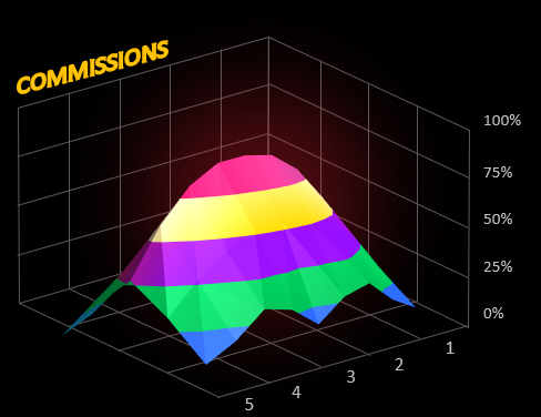
In different blockchain networks, transaction fees can vary based on network loads, causing transaction fees to sharply increase. They often correlate with market activity, but exceptions can occur. The dashboard visually informs:
- about transaction expenses;
- during which time periods;
- under what cash flows;
- at what levels of volatility activity and trading volumes.
For an investor, expense control is always more important than resource savings!
The next type of data visualization has already become popular, and we also include it in the dashboard composition. It's crypto bubbles:
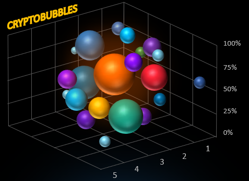
The popularity of this bubble chart lies in its simplicity and easy visual analysis. Each bubble color corresponds to a token or coin of a cryptocurrency. The size of the bubbles represents the trading volume in the specified time period. The vertical position of the bubble on the Y-axis indicates the percentage change in the asset's price.
Data visualization should not be exact; it should be easily perceptible to quickly focus the analyst's attention on the most important data changes. Accuracy will be provided by meticulous analysis when delving deep into the required direction towards the important part of the source data at a specific moment.
The last visualization block on this dashboard presents risky investments in crowdfunding presales on whitelist projects at the earliest stage of development:
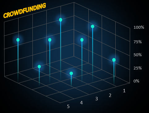
Investing in risky projects should not exceed 10% of the total share of the investment portfolio. However, a share of risky investments should be present in every investment portfolio for risk diversification and potential missed profit.
Designing a Dashboard for Cryptocurrency Investment Analysis
New market conditions for investors require new solutions. We recommend a dashboard template for analyzing an investment portfolio in cryptocurrencies made with standard Excel formulas:
 Download The Best Crypto Dashboard Design template in Excel
The world is changing dynamically every day. The rapid leap in progress in the blockchain technology field has become possible thanks to the popular trend in blockchain technology. Following it, artificial intelligence has also actively developed. Big and abrupt changes always require new solutions. Each solution is a new opportunity that can be realized, including with standard tools like MS Excel.
