Business Intelligence Dashboard for manager and sales in Excel
Dashboard with data visualization for analyzing the correlation of IQ levels with the sales performance of managers. You can download a ready-made dashboard template for the presentation of a report on the analysis of the intelligence of sales personnel and sales performance in Excel at the end of the article. But first, let's consider the interactive functionality and principles of building visualization using the example of the model of the relationship between smart coefficients and sales in practice.
Modern analysis of sales force efficiency in Excel
This dashboard in Excel allows you to perform visual analysis to assess the effectiveness of sales personnel management.
The model of the situation for the practical application of the dashboard is as follows. The sales department employs 10 managers. Each manager has his own sales performance indicators as each of them has its own advantages and disadvantages. Some of the managers are generally out of place or are selling the wrong types of products under ineffective pressure from management. Other salespeople need just a little nudge in the right direction to maximize new results.
From the situation described above, the question arises, how can all this be determined? Psychology comes to the rescue. Most large companies employ at least one psychologist among their employees. And this is a wise decision! It has long been proven that a person spends most of his energy on the psyche. Also, certain patterns of correlation between the relationship between business intelligence and successful human performance were noticed.
At first, the emphasis was placed on the IQ indicator. Many executives began hiring coaches to improve their IQ levels. Regular IQ tests were conducted to analyze the mental growth of employees and the effectiveness of coaching. But in practice, many HR managers have often argued about the IQ approach to sales growth. And not in vain! After all, Dr. Goleman later proved that a person's success depends 4 times more on the level of the emotional intelligence quotient EQ than on IQ.
High emotional intelligence is determined by the ability to manage, create, and control emotions. After all, business is not only numbers and cold calculations, but also emotions that cannot be calculated with formulas. If business success was guaranteed by accurate calculations, then mathematicians would be the best businessmen. In fact, any business is based on the sale of goods or services. After all, any sale is primarily an emotional decision of the consumer's choice.
Emotions are the main source of energy. All living things in this world are constantly fighting for energy, so there is no other world except the emotional one! Create, control and manage emotions = manage energy. The higher your EQ, the better your ability to work with your energy and your counterparties (customers, employees, business partners). Consequently, people with high EQ scores have a higher chance of success in sales and therefore in business.
Coefficients for determining the level of business intelligence of a manager
Modern methods for the effective management of sales personnel necessarily include several intellectual tests at once to analyze the indicators of the intellectual level of employees in various important areas. The most popular smart Q tests are coefficient determination:
- IQ - mental intelligence (mind, logic, analytical forecast).
- PhQ - physical Intelligence (fitness, health, comfort and discipline).
- EQ - emotional intelligence (self-management, understanding oneself, understanding others, the ability to build relationships, the skills to create a suitable atmosphere).
- SQ - spiritual intelligence (values, principles, beliefs, morality).
To track the dynamics of the correlation between improved sales results and the intellectual growth of managers, it is very effective to use tools for visual analysis. As an example, a dashboard will be presented with data visualization for all business intelligence ratios and performance indicators in sales. For convenient and efficient work, the dashboard is equipped with some interactive features. But first things first.
Preparing baseline data for comparing IQ and sales levels
To build a visualization of comparative multilevel analyzes, it is necessary to pre-prepare and well structure all different initial data into one integral system. In order not to create a complex large table with a large number of flags for the interconnection of different initial information, all incoming data was split into several small tables. This not only improves readability, but also makes it easy to master the capabilities of the dashboard template. All of these tables are on one sheet "Data", but with large amounts of data, they can be divided into separate sheets for ease of use. In this example, the initial data looks like this:
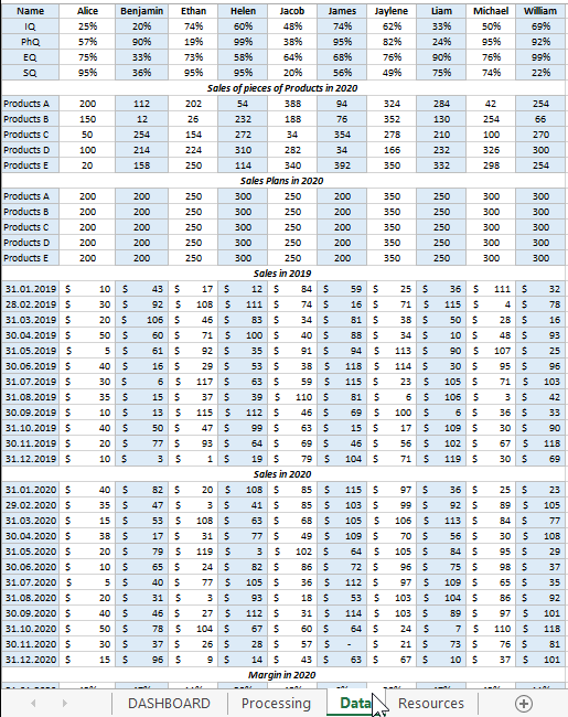
All initial information is divided into 6 tables:
- Managers
- Sales of pieces of Products in 2020
- Sales Plans in 2020
- Sales in 2019
- Sales in 2020
- Margin in 2020
All tables, before displaying data for dashboard visualization, form a general relationship, and all this happens on the "Processing" sheet:
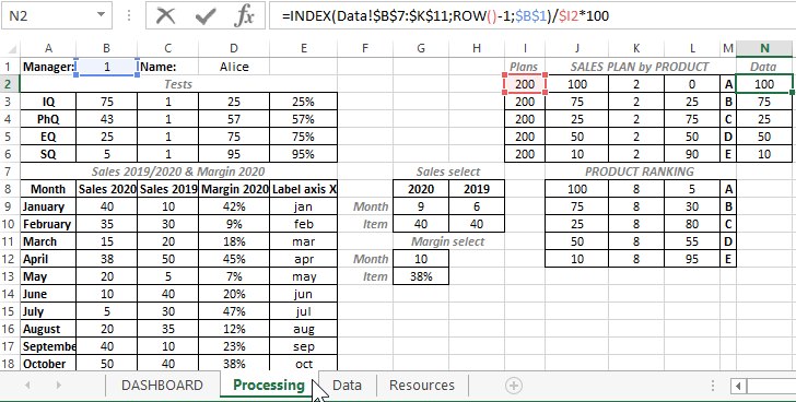
With the help of complex formulas, the selection of the initial values from the “Data” sheet is made for further calculations and calculations. On the “Processing” sheet, preparation is being made to visualize the comparison of the indicators of managers' IQs with their indicators of the dynamics of productivity growth.
Download dashboard of business intelligence and sales performance in Excel
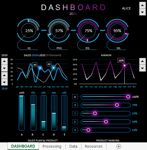
The structure of the interactive dashboard for comparative visual analysis consists of 5 blocks.
The first block looks like a panel of diagrams with a visual display of 4 indicators of intellectual coefficients of managers:
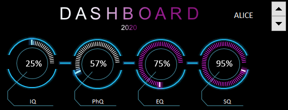
The same block contains the first and main control for switching between managers (counter in the upper right corner). In fact, this is an element of control of the whole dashboard, since when using it, all information about the intellectual abilities and dynamics of sales is completely updated for each manager separately.
As a dashboard user, a business manager or sales manager has the ability to visually analyze the strengths and weaknesses of each sales manager. And after the analysis, make important decisions:
- Which training or coaching course to send an employee to to improve his efficiency.
- What group of products the manager should sell.
- How to set sales plans for specific product groups.
- How to motivate.
- When to punish.
- Where to set goals for promotion.
- At what level is his dismissal deadline.
The second block "SALES 2019 & 2020 (in thousand)". Here is a chart for a comparative analysis of monthly transactions for the current and last year:
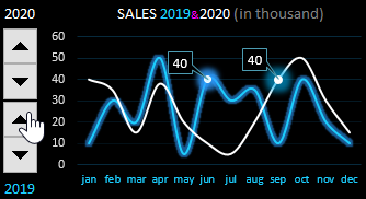
For the convenience of working with this block and effective presentation of the report, cursors are provided for the control of two interactive elements on the right. By managing them, you can focus on important points in the dynamics of the presentation of indicators.
Third block "MARGIN":
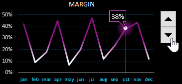
The block is similar to the previous one, but displays the percentage of the share of the margin (net profit) received by the firm from the manager's effective trading activity. A very mercantile schedule, but this is business and nothing personal.
The fourth block "SALES PLAN by PRODUCT":
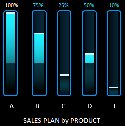
Here are presented the performance indicators of sales plans for 5 different groups of goods (A, B, C, D, E). If the plan is 100% fulfilled, then the top labels of the histogram columns are highlighted in white. If the plan is overfulfilled, the signature is colored red. In this case, it is worth paying attention to the setting of the plan level, perhaps it should be revised for the next accounting period for the current manager.
The fifth block "PRODUCT RANKING":
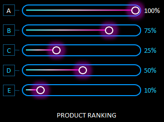
All product groups are ranked here. Their rating is determined as a percentage. 100% has a headliner (the best selling product group). The rest of the products are assigned the share they occupy in comparison with the leading group.
For example, group B did not have enough 25% to make the same result as the flagship - group A. Group E needs to sell exactly half more to reach leader A.
Together, the blocks are harmoniously combined into a convenient interactive-driven intelligent business dashboard:
 Download dashboard for analyzing business intelligence in Excel
The last sheet "Resources" contains graphic elements from figures made in MS PowerPoint, which is also included in the MS Office package. Unfortunately, you cannot create shapes of this complexity in Excel yet.
This dashboard does not contain macros, all interactive controls are implemented using standard Excel tools on the "DEVELOPER" - "Insert" tool tab.
