Download Cafe Products Sales Analysis in Excel template
Discoveries and free report template with data visualization in the style of infographics for presenting data on doing business in a cafe. You can download an Excel file with interactive charts from the link at the end of the article.
Dashboard template for analyzing the accounting of sales of products in a cafe
To get acquainted with the principles of operation and the structure of the template, we will simulate the situation. According to the accounting data for a period of 12 months, the following data was collected on the sales of products in the cafe. All of them are structured and collected in one table on the "Data" sheet for entering incoming data into the template. The table consists of the following columns:
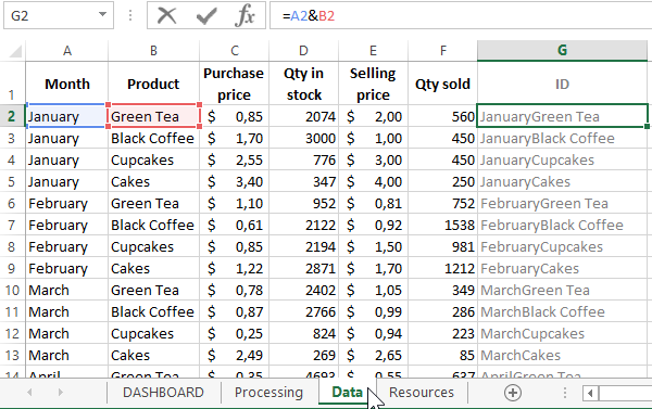
- Month - to select the analyzed accounting period.
- Product - the name of the products sold in the assortment of the cafe.
- Purchase price - delivery cost.
- Amount of leftovers - how many items are in the warehouse.
- Retail price is the selling price.
- Quantity sold - how many products were sold in pieces.
- ID - an auxiliary column for convenient data selection using the formula of the INDEX and MATCH functions according to several conditions on the "Processing" sheet.
Before outputting data to the main sheet "DASHBOARD" in a graphical form with interactive elements, you should first select and process incoming data from the sheet "Data". All this is implemented on the Processing intermediate sheet using formulas and tables:
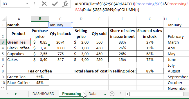
Further, the processed data is transmitted and used in a graphical report in the form of a dashboard. Let's analyze its contents in more detail.
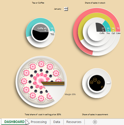
Dashboard in the style of infographics for the analysis of sales of goods in a cafe
The dashboard structure is simple and consists of four blocks of diagrams. Each diagram is responsible for its own segment of accounting data for visual analysis of the current state of the business as of the selected accounting period (in this case, the month).
The first block "Tea or Coffee". Uses a combination of donut and pie charts to visualize its data segment:
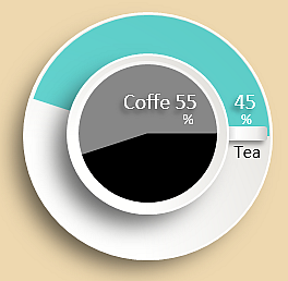
Here, a comparative analysis of two products is performed: coffee and tea. The infographic diagram of the block diagram is made in the form of a coffee cup on a saucer. In most Eastern and Slavic countries, tea is drunk from saucers. And coffee from saucers is not sung anywhere. Therefore, it was decided to present data on tea sales on a silver platter, and on a cup - on coffee. The result is an original, creative, and readable infographic-style data visualization. It is easy to perceive, looks beautiful, convenient to use - as a result, it is pleasant to work with.
This block in this template displays the ratio of financial indicators for coffee and tea sales in a cafe. If you need to compare other indicators of these products in this way, you should change the references in cells B6 and B7 on the sheet "DASHBOARD" to the corresponding values obtained from the sheet "Processing".
The second block is "Share of sales in stock". Informs about the ratio of the number of products sold to their stock balance in the current month in relative values - percent.
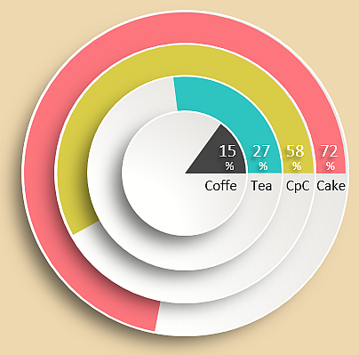
Infographics are made in the form of saucers or plates, stacked in a pyramid on a beige tablecloth of a table in a cafe. Beautiful data visualization is fully consistent with the topic of the report. Performing such a comparative visual analysis is not only convenient, but also aesthetically pleasing.
The third block "Total share of cost in selling price". These are the indicators of costs and the share of business margins:
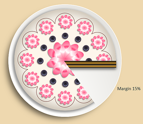
The empty part of the cake symbolizes the margin (net profit) that the business owner took for himself. The piece of cake itself without margin should be taken as the size of the cost of the products sold in the cafe in relation to the amount of net profit. As you can see from the example, in January the business margin was 15%. Accordingly, the required investment volume was equal to 85% of the proceeds.
The diagram looks like a piece of cake. As it turns out, implementing such an interactive infographic in Excel is a daunting task. As a result, the chart can only be used to display the proportion of values on the chart within 68% -98%. This may well be a margin, since it cannot exceed 100% and very rarely is below 68%.
The fourth block "Share of sales in assortment". This block shows a bubble chart of bubbles in a cup of coffee:
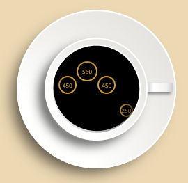
The first, second, third and fourth bubbles correspond to the four types of products sold in the cafe: Coffee, Tea, Cupcakes, Cakes. The size of the bubbles on a bubble chart visually informs us about the highest and lowest sales in the number of pieces of a particular product.
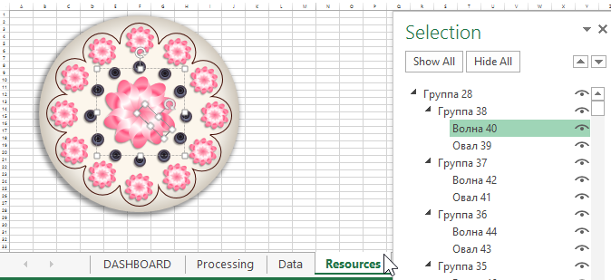
It is an open source template available for free download and is created in the most versatile analytical program Excel. The template is interactive, functional, but does not use macros. You can easily change and expand it to fit your needs. Dashboard for a cafe will lead as an example and ideas for inspiration. The last sheet "Resources" contains all the shapes for drawing a cake on a pie chart:
The general picture of an infographic-style dashboard template looks like this:
 Download dashboard for analysis of sales accounting for cafe products in Excel
Feel free to use my infographic style report template for your commercial and non-commercial purposes. All resources are available to you. I wish you have a better dashboard than mine.
