Chart report on financial results of company download in Excel
Standard Excel tools, you can create beautiful graphical reports from boring monotonous data tables. In such graphical reports, you can use the controls making them also interactive. There is no need to resort to VBA macros. You just need to select the controls for the values on the tab “DEVELOPER” in the group of tools “Controls” - “Insert”. Let’s take a closer look at the graphical report, and at the end of the review you can download the finished example in the Excel file.
How to make a chart report without using macros in Excel
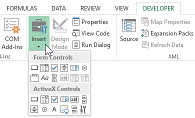
As you can see from the animated *.gif image above, for the interactive interaction with the report data, built-in Excel value control elements (2 counters and 2 flags) are used. All these and other elements are located on the tab of the DEVELOPER toolbar:
Not all, but most of these controls in their properties have the option “Cell link:”, as shown in the figure below:
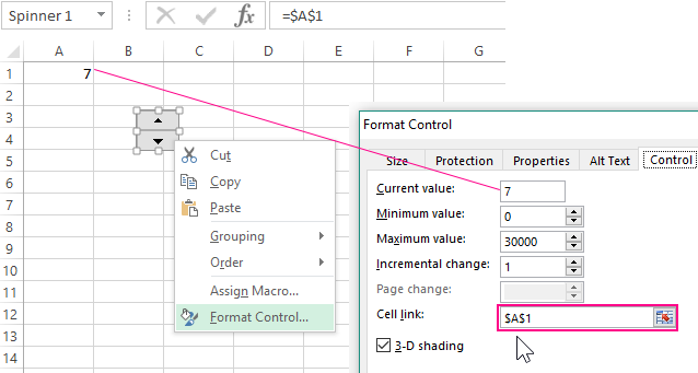
If we provide a link to the cell we need, then when interacting with the element, we change the values in the same cell. The conditions and parameters of changes are configured in other options of the element.
This approach opens up wide interactive possibilities without using VBA macros! After all, controlling the value of at least one cell, we can, with the help of many formulas, construct an entire program in Excel without programming! Next, consider a simple example.
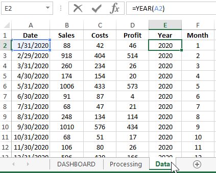
For example, simulate a situation. Suppose on the “Data” sheet we have a table with statistical values of the monthly financial indicators for the company's sales:
Even based on this primitive data, you can already build many reports. In this example, we should visually present the data like this:
- Correlation of volatility with dynamic fluctuations of average monthly sales, expenses and profits.
- Dependence and correlation of markup and margins at different average indicators for sales, expenses and profits.
- What and how is the markup and margin different in numbers and visually.
Before displaying dynamic changes on the chart and giving them user interactivity, it is necessary to process and prepare the initial data using formulas. All this is implemented on the sheet "Processing":
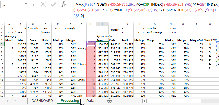
Pay attention to cells A1, B1, D1 and E1. These cells are referenced by their respective controls from the DASHBOARD sheet. They change the values in these cells, and then the formulas of the “Processing” sheet recalculate their values referring to the same cells. As a result, all graphs and charts on the DASHBOARD sheet are automatically redrawn with respect to data changes in the calculation results by formulas. Therefore, the graphs and charts refer to the same results.
Thus we get the program in the form of an interactive report. We can safely call this graphic report template in Excel a program, despite the fact that when we created it, we did not use the VBA macro programming language. After all, the essence of any program is data processing, it does not matter what kind of program: games, working with databases, ERP or CRM systems, etc. Each program, by its nature, receives data at the input, and outputs the result of its processing at the output. And it doesn’t matter for users in which programming languages and which technologies the program was created and the quality result is important, as well as for everything to be fast, simple and beautiful. After all, this is magic.
Having dealt with the device of the template for a graphical report on the financial results of the company, you can change it to reconfigure for other types of reports based on the same source data. For example, in the profit graph, you can change the links not to the average values by Approximation, but to the actual ones, while not changing the average expense graph. As a result, we get another type of graphical presentation of data: Report on the method of average costs plus profit in Excel.
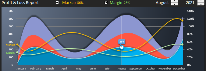
You can also abandon a number of graphs of average monthly sales indicators in order to change the semantic design of areas on the tab “CHART TOOLS” - “DESIGN” - “Type” - “Change Chart Type”.
In the window that appears, for the series of average expenses and average profit, apply the chart type “Stacked Area”:
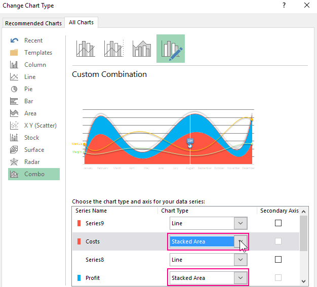
Thus, the values of these two indicators will be added to the third indicator “Average monthly sales”:
Profit + Costs = Sales Amounts. And combining the formulas and graphs of this template, you can create many other graphical reports on the same statistics.
Download example chart report in Excel
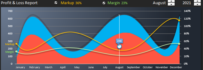
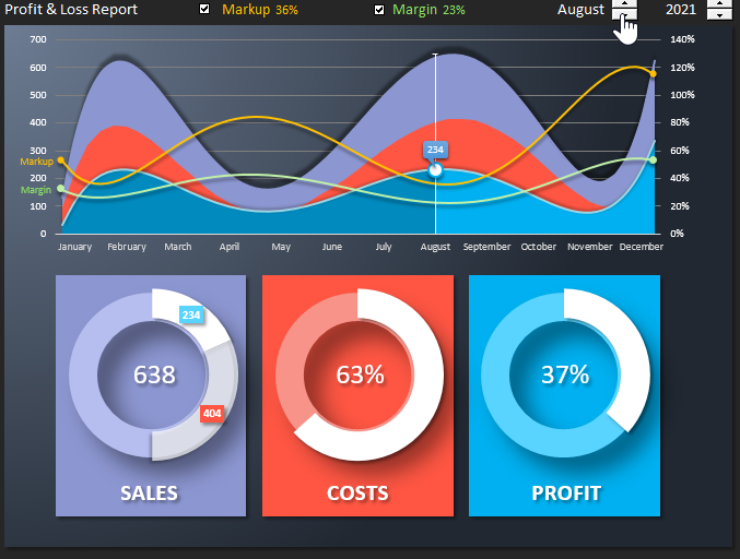
We will briefly review the initial version of the graphic report template on the financial results of the company in Excel. And in the end, you can download an example template from the link to the Excel file for a detailed and practical introduction to the principles of operation and formulas. On the main sheet of "DASHBOARD" there are 2 main blocks of visualization of company activity data for the last 5 years (from 2020 to 2025).
- The first block contains a chart with areas and controls for a graphical report. Using the interactive controls, you can switch by year, move the cursor by month and enable or disable markup and margin curves:
- In the second block are 3 charts with average sales, expenses and profits for each month. When you move the cursor on the upper chart by months, the chart data in the lower block is updated automatically:
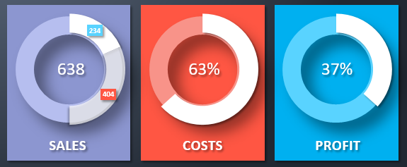
- the first chart shows the ratio of profit, expenses and sales;
- the second chart shows the share of expenses in sales;
- the third is the share of profit.
This is a fairly simple example that clearly demonstrates how to create graphical interactive reports with animated data visualization without using VBA macro programming in Excel. If desired, and a certain level of skills, you can create even more complex and functionally beautiful reports than this:
 Download chart report on financial results of company in Excel
In the following articles, we will repeatedly consider the creation of interactive reports, dashboards, examples of data visualization with charts and graphs in Excel without using macros. In the security policy of many companies, it is forbidden to run macros from files in any Excel format. But thanks to built-in special tools and formulas, you can do without programming to make interesting reports. Anyone who knows how to present their work is moving up the career ladder faster than anyone!
