Chart with data visualization for laboratory work in Excel
The power of beauty improves data visualization. Love for the beloved business is where meaning and pleasure intersect. In today's world, people often choose a job where there is more meaning than pleasure. That is more income than joy from work processes. And there is no mistake in this choice. You just need to create the conditions to love a job that brings a lot of meaning to a person’s life. The wise man was once asked: “What is more important: do what you love or love what you do?”. To which he replied: "An intelligent man does what he loves, a brilliant man is able to love everything he does!". Beautifully said, but how to implement and apply it in practice? Consider an example in Excel on this topic.
Benefits of beautiful charts with data visualization in Excel
This example presents a beautiful visualization of data that can add a positive element to the game in boring reports. Most often, he lacks an element of the game to turn any work into a favorite. The more often you use the elements of the game in your work, the more you will love it. Highly paid and boring work gives a lot of sense, but little pleasure. The game has a lot of fun, but little sense. Where there is neither one nor the other - this is creative slavery. In conditions where these two factors will intersect (meaning and pleasure), there will be love for your beloved work. To practice their intersection in working with documents, use positive data visualization as a tool. This is the third important feature of graphical visualization in Excel. We list them all in order.
The main advantages of the practical application of data visualization in work and business:
- Fast decision making. This advantage allows you to show a quick reaction to successful actions. The graphical representation of the data is hundreds of times faster, more efficient and more pleasant to process. Man perceives the world primarily graphically. By its nature, creates associative pictures when capturing the world in its thinking.
- Great motivation. Nothing more strongly motivates since, a visual display of the process of changing the result in a positive or negative direction. This has been proven in practice in the field of motivation using data visualization elements. Beat repeatedly received high indicators of motivation to work: both for project managers and for ordinary employees of companies. As soon as a person visually observes changes in indicators of his work processes leading to (or from) a result, his body abruptly gains a thirst for ACTION! It can no longer be in a calm state, it needs to get changes in reality. This is very important with the perception of happiness. And happiness is the most important need for each of us. The faster and more significant changes occur in our lives, the more we feel happiness.
- Enhances the pleasure of work. A well-implemented data visualization should add game elements to the most boring reports. Visualization should be not only useful, but also enjoyable - this increases its value to the highest level.
The following is an example of a typical bar graph of five columns. But it is framed so well that it can not be called a banal schedule. With a beautifully designed histogram, it is not only easy to evoke positive emotions during the presentation of report indicators, but it is also very pleasant to work with it in the process of data analysis. Use this template in your work as a tool for realizing the 3 advantages of visualization described above. So you can quickly and easily fall in love with even the most boring office work. Indeed, in this way you will create a place in it for the intersection of meaning and pleasure.
Lab solution with data visualization in Excel
How to apply and practically introduce the element of the game in boring reports and financial analyzes? For example, we give a simple laboratory work on the microeconomics of investments. For a better perception of the example, we simulate a fictional situation.
There is data on the efficiency of using the investment portfolio, which consists of 5 investment objects. Profit is dripping for each investment object, but in different periods of the seasonality of the year with different dynamics and profitability. It is necessary to determine in which quarter of the last year which investment objects of the portfolio were the most effective and which were the least. For performance indicators, the values of margin are responsible. As you know, margin is the share of net profit received from invested funds after deducting all types of expenses and checks. Since margin is a share, it cannot exceed 100% and cannot be less than 0%. Therefore, this histogram is quite suitable for comparing margin indicators for investment objects, which include an investment portfolio.
In this template, the source data is filled in on the “Data” sheet:
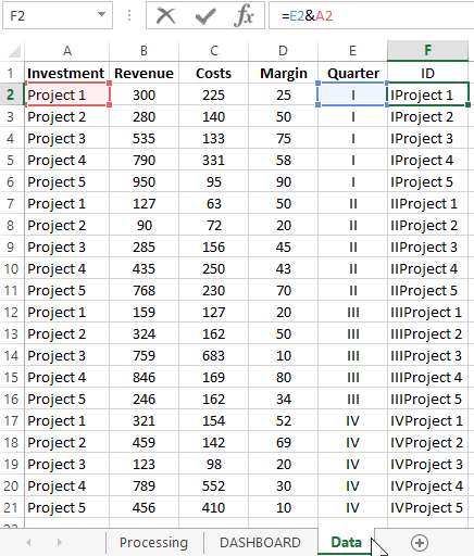
The last column “ID” is filled with a formula that combines the values of the column “Investment” and “Quarter” to be able to select data from the table under several conditions.
It should be noted right away that margin indicators are somewhat overstated even for the riskiest investment portfolio in the most successful year.
Interesting fact! According to statistics, the most risky investments do not exceed a yield of 70% per annum. More is probably an illegal business.
All processing of the initial values is performed on the "Processing" sheet using the formulas:
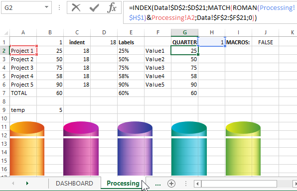
There are also the necessary graphic elements from vector shapes for a beautiful design of the rows on the histogram columns.
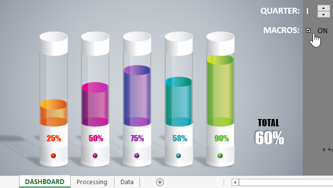
Data visualization with an unusual histogram and its control panel are on the main DASHBOARD sheet:
 Download lab chart in Excel
When you turn on the MACROS mode, animation will be added to fill the histogram columns when switching between quarters. In cell Q23 opposite the inscription "pace animation" you can specify the desired animation speed.
In general, this template works fine without using macros, especially since for some users it may seem superfluous. The science of socionics claims that all people are divided into at least 8 categories, so all felt-tip pens are different in taste and color. In addition, some security policy companies do not allow the use of macros in electronic documents.
Free download and use this template with data visualization for your analyzes and laboratory work with and without the use of macros. In any case, it will work. If desired, change it to your needs.
