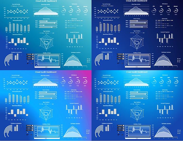
Cloud Audit Dashboard download free in Excel
Modern cloud technology allows small and medium-sized businesses to reach a new level. Fast and stable Internet technology 5-G, is actively gaining popularity around the world. Now there is no need for deferred transactions by replicating databases in ERP (Enterprise Resource Planning) and CRM (Customer Relationship Management) software systems.
Today, successful businesses run everything on the fly thanks to the cloud. For growing businesses in today's tough competitive environment - the speed of customer service is a key factor that determines its survival. Therefore, it is impossible to ignore the analytics of enterprise cloud resources. Let's take a look at an example of a cloud audit dashboard in Excel, the template of which you can download for free at the end.
Practical application of cloud audit in Excel
Cloud auditing provides comprehensive information on the efficiency of using and storing databases of ERP or CRM systems in the clouds of corporate networks. After all, it is always not enough to have a strong tool, it is even more important to learn how to use and apply it effectively. In today's business today, budgets allocated to forcing customer service must pay off under close scrutiny. And you also need to track performance metrics for the proper use of cloud technology, so that data doesn't linger somewhere in endless synchronizations.
The cloud audit presentation dashboard in this example consists of twelve visualization elements:
- DayLoad Average.
- Cloud Days Activity
- Perfomance
- Received/Transferred
- Device Activity
- Soft Activity
- Operational Efficiency
- Type DataBase
- Income & Expenses
- Database Accumulation
- Stability of Work
- Full Weeks DataBase
Below we will briefly consider each of them separately to understand the principle of building and using the dashboard template, which can be downloaded for free at the end of the article.
12 visualizations for analyzing cloud resource processes
This time, the raw data for the template is on four sheets:
All of the raw data is processed before being output to the visualization on one "Processing" sheet.
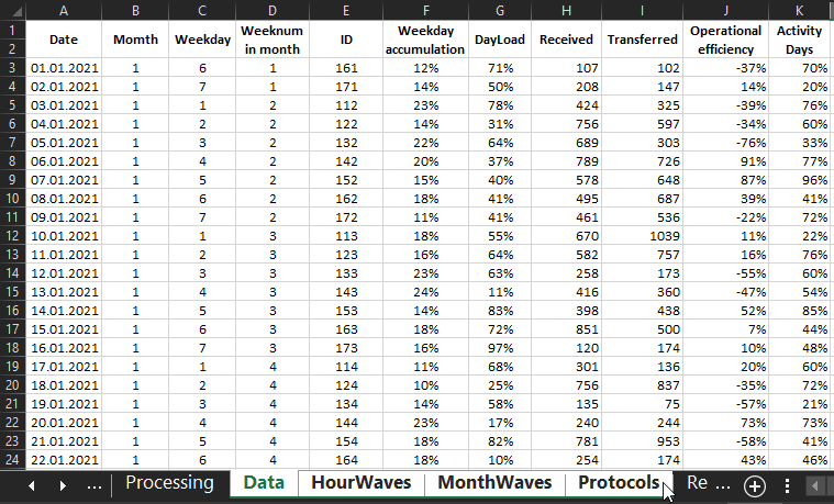
1 The first visualization item is "DayLoad Average":
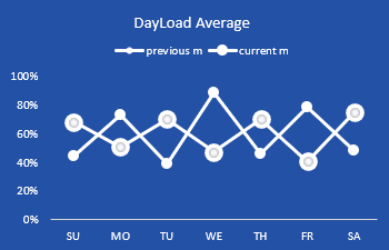
Here is the average of the total load on the cloud system by day of the week for this month and the previous month (for comparative analysis). Its source data is in the range of cells: =Processing!H23:K9
2 The second data visualization element is Cloud Days Activity:
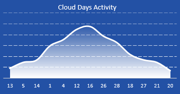
Here is the bell-shaped curve distribution of the key days of the current month of active and passive cloud usage. The logic of the bell-shaped distribution is in the traditional style. Closer to the center are the highest key values, and at the edges are the lowest. From the left edge to the center are the dates of the first half of the month, and from the center to the right edge are the dates of the second half of the same month. The data for building the bell curve are in: =Processing!Q32:S44, the data for their calculations and calculations in: =Processing!G32:P62.
3 The third element of the dashboard is "Perfomance":
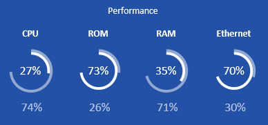
Here everything is simple and straightforward. It displays the values of the hardware load on the private cloud server in this month and the previous month, where the cloud technology is applied. The load parameters are taken into account as a percentage of the maximum load allowed by the technical characteristics of the cloud server:
- CPU - CPU.
- ROM - hard drives.
- RAM - RAM.
- Ethernet - networking devices.
The white scale and the upper value is the current month, and the transparent scale and the lower value is the previous month. The range of processed data to build is located at: =Processing!H64:K67. This block will be useful if you have your own private cloud server for an internal corporate network for a medium-sized business. Or if you buy cloud hosting on a budget plan with certain hardware resource limitations for small businesses.
4 The next element of data visualization is Received/Transferred:
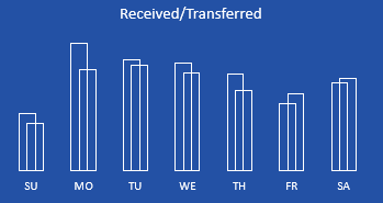
Here it's even simpler - indicators of the amount of incoming and outgoing traffic for 1 month and segmented by days of the week. Data range: =Processing!L23:M29.
5 "Device Activity":
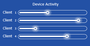
Cloud usage activity by connected device in the current month. In this example, there are only 4 devices on the dashboard and each device has used the cloud with different activity during the month. The range of data for plotting: =Processing!R48:U51.
6 Soft Activity:
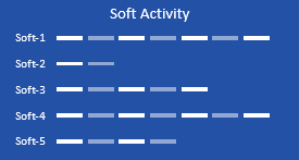
Program activity in using the clouds for the current month. Only 5 plugins with different activity are represented. This chart is similar to the previous one, only here we apply not a relative, but a 10-point activity rating system from 0 to 10. For example: Soft-1 scored 7 points, and Soft-2 only 2 points. Range reference: =Processing!R48:U51.
7 "Operational Efficiency":
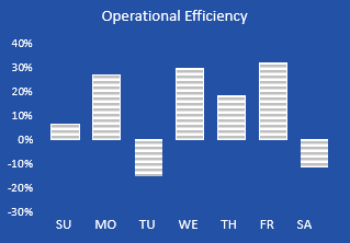
This visualization element is used to analyze the overall final efficiency of the funds and resources invested in the use of cloud technology during the month. And segmented by day of the week, to identify or control outsider days. If the efficiency score is positive, the chart automatically draws the column up, and if it is negative, it draws the column down. The range of the chart: =Processing!O23:R29.
8 "Type DataBase":
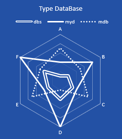
Analysis of transactions of different types of database used by 6 protocols: A, B, C, D, E, F on a Radar type chart. The more often the type of database uses certain protocols, the higher its activity in relation to the same protocols. For example, as shown in the picture above, this month's database SQLBase (*.dbs files) most actively uses 3 protocols: B, D and F. And the format of the database program Microsoft Access (files such as *.mdb) - protocols to a greater extent A, C and E, to a lesser extent B and F. And the protocol D is practically not used. In general, the radar type chart always has a very informative data visualization, for which it is worth mastering and appreciating. The main thing is not to go beyond brevity. The range of cells with values for constructing the Radar chart is at =Processing!R53:X58.
9 An interesting visualization element on the dashboard is Income & Expenses:
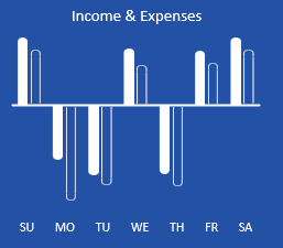
Income and Expenses figures are presented by pair for the month and segmented by day of the week. But the main feature of this chart is that if income exceeds expenses, then their pair of columns is drawn upwards. If the expenses exceed the income - the pair of columns is drawn down. To see the table structure for this clever chart, follow this link: =Processing!R66:AF72.
10 Even more interesting is the "Database accumulation" chart:
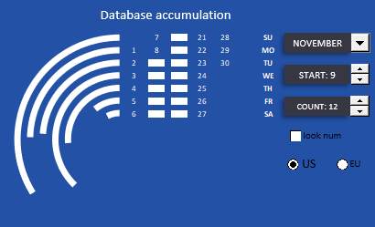
This visualizes the process of data cloud accumulation over the course of a month by day of the week. An important feature is the ability to segment the data selectively by groups of days, to cover only a fraction of the days of the month. Each arc bar shows the accumulation of a selected number of days of the week. For example, the figure above should read as follows - the report includes:
- one second Sunday of the month;
- one third Monday;
- two Tuesdays (II and III);
- two Wednesdays (II and III);
- two Thursdays (II and III);
- two Fridays (II and III);
- two Saturdays (II and III).
All in all, a segment consisting of a group of 12 days, starting from the 9th day of the month, is chosen for visual analysis.
In the same interesting block of the dashboard are the controls for interactive visualization:
- selecting the starting date;
- filling the group with the number of days;
- switching on or off the display of day numbers under the markers;
- switching between calendar formats (first day of the week: Sunday US or Monday EU).
And also a control element of the whole dashboard for selecting the month for its subsequent visual analysis.
11 The next no less interesting block is "Stability of Work":
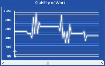
This visualizes a cardiogram of the overall stability of all of the cloud's software organs during that month's 8-hour workday. All based on logging data. All the data is presented by the minute and segmented by the hour. The amount of data is quite large for a small block section, so you can't do without the interactive chart functionality here as well. At the bottom there is a scroll bar of screens by cardiogram. One screen holds 60 minutes, that is 1 hour. Each screen is numbered at the bottom above the arrow indicating its ordinal number (e.g. 4h as above in the picture). The higher the value, the higher the total load level.
12 And finally the last block "Full Weeks DataBase":
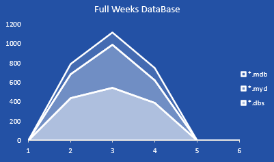
Here the dashboard presents data on the types of database format usage for only full weeks of the current month. Each calendar month has a maximum of 6 incomplete weeks, so the X-axis shows 6 divisions. If the number is not divisible by 1,5 or 6 is incomplete (i.e. less than 7 days), then the value on the Y axis is 0. As you can see in the chart, there are only 3 full weeks in the month of November 2021 (second, third, and fourth week of the month = 7 days).
All the charts on the cloud audit dashboard are colorless and done in the style of white outlines. If you want in this design approach, you can style the backgrounds and change them as skins:
- The sky is thinking about rain.
- Night sky.
- Dawn romance.
- Light through the sky.
 Download cloud audit dashboard in Excel
The ability to use different skins for one dashboard template is very convenient to present to different groups of users with different tastes and perceptions of the world. After all, having a choice is always a good thing! Never ignore something that makes you smile in your choices.
