Excel Comparison Chart Template with Examples free download
Original chart in the style of the infinity symbol or a link to visually compare two interrelated values with analytical meaning. Another element for creating creative design in infographics will add to your collection of Excel cliparts and templates. This chart idea can be used in presentations of comparative analysis or correlation of two values. Let's look at 2 practical examples of data visualization on the topic of Pareto rule and risk management.
Visualizing Pareto rule on a comparative chart in Excel
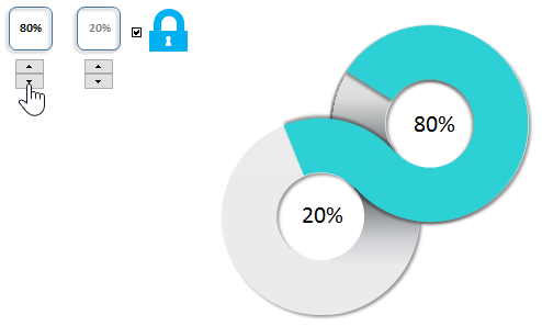
The harmonious merging of two pie charts forms several associations in everyone's imagination at once. For example, the infinity symbol, the number 8 or the link, etc. Perhaps the simplest example of applying such a creative data visualization design is the Pareto law representation of interrelated empirical values (obtained experimentally).
Recall that Pareto law of distribution says: "only 20% of all invested efforts get you 80% of the result, while the remaining 80% of efforts get you the remaining 20% of the final result".
Interesting fact! The universal principle of distribution according to the Pareto rule was noticed in 1941 by Joseph Juran, an American expert in the field of quality. He also suggested that it be called a law after the Italian engineer, economist, and sociologist Vilfredo Federico Damaso Pareto, who was born in France in Paris (15.07.1848-19.08.1923). Pareto was a critic of democracy calling it "plutodemocracy," arguing that such politics has its own universal law in which the elite always cheats the masses. In one of his works he gives the example of how in Italy 20% of elite households receive 80% of the income.
The structure and principle of a comparison chart in Excel
When the first value changes, the second value changes proportionally. Accordingly, there are visual changes in the two pie charts:
In a similar way, using the same template, you can present two interrelated values of the law of the golden ratio 62% by 38%, etc. But if necessary, this template also provides the ability to compare two independent values that are not correlated in any way.
As you can see in the figure there is an additional button with the "lock" icon. This switch can be used to unlink the two values. This makes it possible to separately change the two values independently of each other:
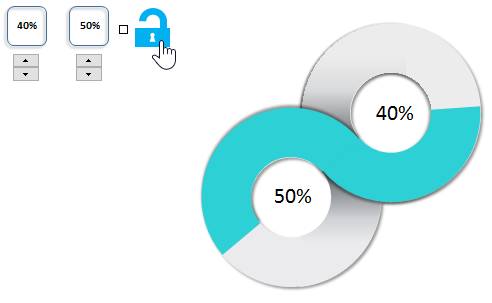
This allows you to use the data visualization template in Excel for other purposes, where the values are absolutely not correlated with each other.
Comparison chart for risk management plan analysis
As a second example, let's consider a more complicated version, but very close in subject matter. The principles of Pareto law have been used extensively to perform benchmarking in a wide variety of industries. According to this law, when we undertake new initiatives, we need to initially put at least 5 tries in any new project to test our strategy and get the result. In fact, this confirms the fact that nothing in our life is predetermined.
And it really is. Look at how the nature of the world around us works. On apple trees, the number of apples greatly exceeds, the required number of new trees. There are millions of sperm in the male reproductive system and billions of stars in the universe. Could the nature of our world be so wasteful? Absolutely not. The fact is that nature itself does not know what the exact outcome of our world's survival and sustenance will be. There is only an assumption that a certain amount of spending will produce an average positive or negative result.
In the exact science of mathematics there is a whole section, probability theory, where random events are studied.
It follows from all this that after planning a strategy and before starting to implement it, you cannot exclude such an important stage as testing.
A simple example of visual benchmarking in Excel
There are 2 heat maps in the input data to evaluate the results on a 5-point system. This evaluates the risk and return of the strategy according to the 12 proposed models of its implementation:
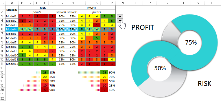
Everyone has long known that the higher the profitability of an investment project, the higher its risk of not recovering the investment in full. Conversely, the more reliable an investor's strategy, the less profitable it is. Sometimes the profitability is so low that there is no point in even starting a project.
Two tasks for visual benchmarking in Excel:
- Task 1. You need to conduct and present a comparative analysis to select the best strategy models that are worthy of investor strategy testing.
- Task 2. Select the top 5 strategic investment models to test.
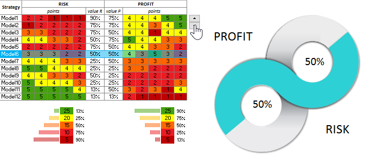
A heat map gives good visual detail, but it shows the big picture less well. By moving the table cursor with a standard control in Excel, we make a selection of values from the middle of the table to display on the infinity symbol style chart. With a comparison chart, we quickly visually notice the advantages and disadvantages in different strategic models. For example, the second model is better than the first and third. And the most attractive to any investor is model number 11. But of course it still needs to be tested. But it is certainly in the top five.
Also it is necessary to note that in risk management the chance of 50% to 50% is zero, not 50%:
 Download a 20/80 comparison chart in Excel
That's why you can't win at roulette with a doubling strategy by betting on the same color (red or black). After all, the same time heads or tails can fall up to 17 times in a row. And this is a significant amount for a very risky doubling. After all, if a $2 profit is doubled just 48 times, you get the amount of the world's financial capital (all the money in the world). That's the magic of numbers! Success to you in the beginnings of new projects and a lot of positive test results. Although they will be about 20/80.
